In the intricate world of graphic design and print production, achieving color consistency is paramount for brand recognition and professional output. Often, designers find themselves working with the subtractive CMYK color model, only to realize the necessity of translating these colors into the standardized Pantone Matching System (PMS) for critical applications. This guide delves into the fundamental differences between CMYK and Pantone, explains why conversion is crucial, and provides actionable methods for achieving accurate color translation.
Understanding the Color Models: CMYK vs. Pantone
The foundation of understanding CMYK to Pantone conversion lies in grasping the distinct nature of each color system.
CMYK: The Workhorse of Process Printing
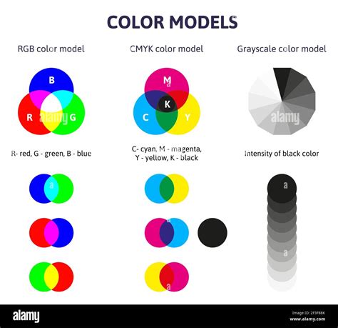
CMYK stands for Cyan, Magenta, Yellow, and Key (Black). These are the four primary ink colors used in subtractive color mixing for professional printing. In this model, colors are produced by layering these inks on a white substrate (like paper), where each ink absorbs certain wavelengths of light and reflects others. The more ink you add, the darker the resulting color becomes, ultimately approaching black.
- Subtractive Nature: CMYK is a subtractive color model. When white light hits the printed surface, the inks absorb specific portions of the light spectrum. For instance, cyan ink absorbs red light, magenta absorbs green light, and yellow absorbs blue light. Black ink is added to deepen shadows and create richer blacks.
- Process Colors: CMYK inks are known as "process colors." This means that a wide spectrum of colors is achieved by printing tiny dots of each of the four process inks in varying proportions and patterns. These dots are so small that the human eye perceives them as a solid color from a distance.
- Variability: While CMYK is highly versatile and cost-effective for full-color printing, its exact output can vary. Factors such as the specific ink formulations used, the type of paper stock (coated vs. uncoated), the printing press calibration, and even environmental conditions can influence the final appearance of a CMYK color. This inherent variability is a primary reason why precise brand colors can be challenging to maintain using CMYK alone.
Pantone: The Universal Language of Spot Colors
The Pantone Matching System (PMS) is a proprietary color space used in printing. It is a standardized system that consists of over 2,000 pre-mixed inks, each with a unique identification number.
- Spot Colors: Pantone colors are known as "spot colors." Instead of being created by mixing four process inks, each Pantone color is a single, specific ink that is mixed according to a precise formula. When you specify a Pantone color, you are requesting a particular, pre-defined ink.
- Consistency: The primary advantage of Pantone is its unparalleled consistency. When a Pantone color is specified, the expectation is that it will look the same regardless of the printing location, the printer, or the paper type (though specific Pantone guides exist for different paper stocks, like coated and uncoated). This makes Pantone the industry standard for ensuring brand color fidelity.
- "C" for Coated: You will often see a "C" at the end of a Pantone name, such as "PANTONE 185 C." This designation, like "PANTONE 185 C," stands for "Coated." It indicates that the color is intended for printing on coated paper, which typically has a glossy finish that makes colors appear more vibrant and saturated. For uncoated paper, you might see a "U" designation (e.g., PANTONE 185 U).
Why Convert CMYK to Pantone? The Imperative for Consistency
The fundamental difference in how CMYK and Pantone colors are produced leads to a crucial question: why convert from CMYK to Pantone? The answer lies in the pursuit of absolute color consistency and brand integrity.
- Brand Identity: For companies, maintaining a consistent brand color across all marketing materials, products, and digital platforms is non-negotiable. A logo that appears as a specific shade of blue on a business card must match the blue on a website, a product packaging, or a company uniform. CMYK's inherent variability can lead to subtle, yet noticeable, discrepancies in these brand colors, diluting brand recognition and professionalism. Pantone provides the definitive "color fingerprint" that ensures this consistency.
- Eliminating Guesswork: Without a standardized system like Pantone, designers and printers would have to rely on visual matching, which is subjective and prone to error. Lighting conditions, the age of color swatches, and individual color perception can all lead to misinterpretations. A CMYK to Pantone converter offers an objective, data-driven approach to identifying the closest official Pantone match.
- Clear Communication with Printers: When you specify a Pantone color to a printer, there is no ambiguity. The printer knows precisely which ink to use, eliminating the need for complex discussions about CMYK percentages that might be interpreted differently across various print facilities. This direct communication prevents costly errors and ensures that the printed output aligns with expectations.
- Design Flexibility and Control: While CMYK is excellent for full-color images, converting to Pantone allows for greater control over specific, critical hues. It expands your color options beyond the limitations of standard CMYK mixing, enabling you to achieve unique and impactful brand colors.
- Cost-Effectiveness for Specific Applications: While CMYK is generally more cost-effective for large runs involving a wide range of colors, using a single or a few Pantone spot colors can sometimes be more economical for simpler designs or when absolute color accuracy is prioritized over a full-color spectrum.
Methods for Converting CMYK to Pantone
There isn't a direct, one-to-one mathematical conversion from CMYK to Pantone because they are fundamentally different color systems with different gamuts (the range of colors they can produce). However, various tools and methods can help you find the closest Pantone approximation for a given CMYK value.
1. Using Online CMYK to Pantone Converter Tools
Digital converters are the most accessible and often the quickest way to find potential Pantone matches. These tools employ sophisticated algorithms and extensive color libraries to bridge the gap between the two systems.
- How They Work: These tools typically first convert your input CMYK color into a digital RGB (Red, Green, Blue) value. RGB is often used as an intermediary because it's the standard for digital displays. The converter then compares this RGB value to a database of official Pantone colors and their corresponding RGB equivalents. The "distance value" or "similarity percentage" indicates how closely the suggested Pantone color matches your original CMYK input.
- Inputting Values: You will usually be prompted to enter your CMYK values as percentages (0-100%) for Cyan, Magenta, Yellow, and Black. Some tools allow you to adjust a "distance" parameter; a smaller distance value generally yields a closer, more precise match, while a larger value may offer a broader range of acceptable matches.
- Tool Capabilities: Reputable CMYK to Pantone converter tools are designed to handle different CMYK color profiles, considering the specific color gamuts and characteristics of various profiles to ensure more accurate and consistent conversions.
2. Utilizing Design Software (Adobe Illustrator/Photoshop)
Professional design software like Adobe Illustrator and Photoshop offer built-in tools to assist with CMYK to Pantone conversion.
Using Adobe Illustrator:
- Open Your Project: Ensure your desired project is open in Adobe Illustrator.
- Select the Object: Select the object or artwork whose color you wish to convert.
- Access Swatches: Go to the "Window" menu and select "Swatches." This will open the Swatches panel.
- Recolor Artwork: Navigate to the "Edit" menu, then select "Edit Colors," and finally "Recolor Artwork."
- Limit Colors (Optional but Recommended): In the "Recolor Artwork" dialog box, you can choose to limit the color reduction to the specific colors in your selection to isolate the color you want to convert.
- Assign New Swatch: Click on the color you wish to convert within the dialog box. Then, click the "Assign New Swatch" button (often represented by a small swatch icon).
- Select Color Book: In the swatch selection dialog, choose the appropriate Pantone color book for your application. The "Pantone Color Bridge Coated" is a common choice for seeing how Pantone colors will render in CMYK.
- Find the Match: Illustrator will suggest the closest Pantone match. The Pantone swatch name will appear when you hover over it in the Swatches menu.
CMYK to Pantone | Converting colors in Adobe Illustrator
Using Adobe Photoshop:
- Open Your Image: Open the image or graphic in Adobe Photoshop.
- Access Color Picker: Double-click on the color swatch in the Tools panel to open the Color Picker.
- Enter CMYK Values: Input your CMYK percentages into the respective fields.
- Find Pantone Match: Look for a button or option within the Color Picker that allows you to find the closest Pantone match. This might involve clicking on "Color Libraries" or a similar option, where you can then select the desired Pantone book.
- Select Pantone Book: Choose the appropriate Pantone library (e.g., Pantone+ Solid Coated). Photoshop will then display the closest Pantone color(s).
3. Consulting Physical Pantone Color Charts or Books
For critical print jobs, especially those where absolute color accuracy is paramount, using a physical Pantone color guide remains the gold standard.
Types of Guides: Pantone offers various color books and fan decks, categorized by paper type (coated, uncoated, matte) and application (e.g., graphics, textiles). It is crucial to use the guide that matches the paper stock intended for your print job. For instance, if you are printing on glossy, coated paper, you would use a Pantone Coated guide.
How to Use:
- Identify CMYK Values: Determine the CMYK values of the color you want to match.
- Locate Color: Flip through the pages of the appropriate Pantone Color Book until you find a swatch that visually matches your CMYK color as closely as possible.
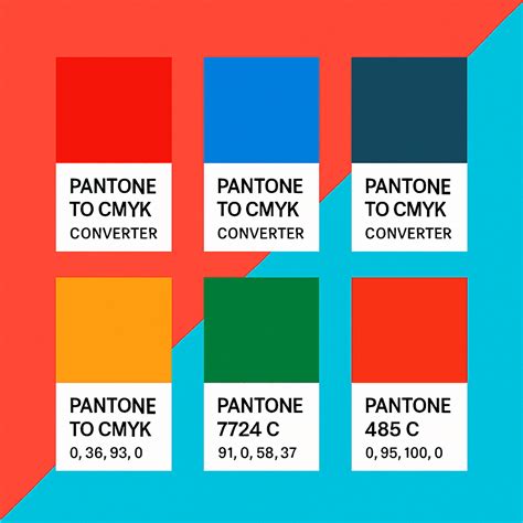
- Note the Code: Once you find a close match, note the official Pantone color code (e.g., PANTONE 185 C).
- Verify Information: Each Pantone swatch usually provides additional information, including its CMYK equivalent (for comparison) and RGB/HTML values.
Limitations: Physical color charts can be affected by ambient lighting, the age of the swatches, and wear and tear, which can subtly alter their appearance. Therefore, while they are essential for final verification, digital tools can be helpful for initial matching.
Understanding the Nuances of Color Matching
It's important to acknowledge that CMYK to Pantone conversion is not an exact science. The differing gamuts of the two systems mean that a perfect match is not always possible.
- Gamut Differences: The range of colors a CMYK system can reproduce is different from that of the Pantone system. Some vibrant colors achievable with specific Pantone inks may be outside the reach of standard CMYK printing, and vice versa.
- Approximation: Converter tools and color charts provide the closest possible match. The "distance value" or "similarity percentage" offered by converters helps quantify this approximation.
- The Role of Paper: The choice of paper significantly impacts color reproduction. Coated papers generally allow for more vibrant and saturated colors than uncoated papers, affecting how both CMYK and Pantone colors appear. Always refer to the appropriate Pantone guide for your intended paper type.
Best Practices for CMYK to Pantone Conversion
To ensure the most accurate and effective color conversions, consider these best practices:
- Know Your Target Output: Understand where and how your design will be printed. Specify the intended paper type (coated or uncoated) and consult the corresponding Pantone guide.
- Use Reputable Tools: Employ reliable online converters and industry-standard design software.
- Verify with Physical Swatches: For crucial brand colors, always cross-reference digital matches with a physical, up-to-date Pantone color guide.
- Communicate Clearly: Provide printers with official Pantone color codes. If using CMYK values for a print job, clearly state the specific CMYK color profile you are using (e.g., SWOP v2, FOGRA39).
- Limit Pantone Colors: For most printing processes, it's advisable to limit the number of spot colors used to 1-2 to manage costs and complexity.
- Understand "C" vs. "U": Always pay attention to whether the Pantone color is specified for coated ("C") or uncoated ("U") paper.
By understanding the fundamental differences between CMYK and Pantone, and by employing the right tools and methodologies, designers can confidently bridge the color divide, ensuring that their creative visions are translated into consistent, impactful, and professional print outputs. This meticulous attention to color detail is vital for maintaining brand identity and achieving the highest standards in graphic design and print production.