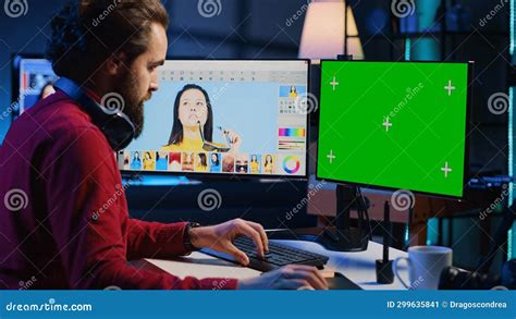
Photographers constantly strive to create outstanding and captivating images. Even when an initial shot isn't perfect, remarkable results can still be achieved in post-production through techniques like color grading. This process enriches a composition's vibe, evokes new feelings, or enhances the mood of the original picture. Color grading has become so popular that it's now a staple in photo editing software and even social media apps, often manifested as filters. If you admire an Instagram filter, you can replicate or even improve upon it using color grading in Photoshop or Lightroom. This guide will explore how to color grade using Photoshop's built-in tools, specifically the Camera Raw filter, and introduce Optics, a powerful Boris FX plugin that can significantly enhance your photography composition skills.
Understanding Color Grading in Photography
Color grading is a post-production process focused on manipulating the color of an image to enhance its appearance and alter the perceived mood of a scene. With photo editing software, you gain control over the color hue, saturation, and luminance of various elements within a photograph, including shadows, highlights, and mid-tones. This technique is widely used in both photography and filmmaking to achieve specific aesthetic goals. For instance, movies like "Blade Runner" employ a distinctive color grade that immersizes the viewer in a cyberpunk city, while "The Twilight Saga" utilizes cold, desaturated colors to cultivate a dark and mysterious atmosphere. Observing stills from these and other cinematic works reveals how integral color grading is to how we perceive and interpret a composition.
Color Correction vs. Color Grading: A Crucial Distinction
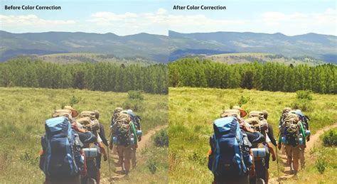
While often used interchangeably, color correction and color grading serve distinct purposes. Color correction is primarily about fixing and balancing colors within a photograph to achieve a natural, true-to-life appearance. This involves addressing issues like incorrect white balance, which can lead to unnatural skin tones, or over-saturation that can overshadow image details and realism. Underexposure, resulting in dark images with muted colors, and inconsistent color tones across a series of images are also common problems addressed by color correction.
Two highly effective methods for color correction in Photoshop are using adjustment layers or editing directly within Adobe Camera Raw. Both approaches offer extensive control and flexibility without permanently altering the original image data, thus preserving its integrity.
Adjustment Layers: These edits are applied to a separate layer within the image file, leaving the original background layer untouched. Accessing these tools is straightforward via the Adjustments panel. Multiple adjustment layers can be stacked for more complex editing scenarios, and layer masks allow for precise application to specific image areas.
Adobe Camera Raw (ACR): This Photoshop plugin is a robust tool for making both color and tonal adjustments. Its interface features a large preview image alongside adjustment tools organized in a logical workflow. Despite its name, ACR can edit JPEG and TIFF files in addition to raw camera files. Generally, it's advisable to use adjustment layers or ACR for color correction rather than the commands found in the "Image > Adjustments" menu, unless a specific adjustment is unavailable elsewhere.
Furthermore, working with Smart Objects in Photoshop offers another layer of non-destructive editing for layers. Among Photoshop's most powerful tools for both correction and grading is the Curves tool. While often used for contrast adjustments, Curves is exceptionally effective for color correction. Mastering its use also deepens one's general understanding of image editing.
Correcting color in images involves removing unwanted color casts. The "unwanted" aspect is key, as some color casts are desirable - for example, the warm hue of a sunset. However, one might wish to remove the blue cast that can pervade photos taken on overcast days or in hazy conditions. The specific content of a photo dictates the editing approach; not every image requires extensive color correction.
The histogram, a visual representation of an image's tonal distribution, is invaluable for understanding color casts. When examining the red, green, and blue (RGB) histograms simultaneously, one can quickly identify if an image has a color cast. In a neutral image, all three histograms will appear very similar. A black and white RGB image perfectly illustrates this neutrality.
For precise color correction, the mid-tone eyedropper tool within Levels or Curves can be employed. By clicking on a portion of the image that should be neutral gray, any existing color cast can be corrected. It's often beneficial to click in several different areas to achieve the desired result. For instance, if a gravestone appears too green, clicking on it with the mid-tone eyedropper in Curves or Levels can correct the magenta cast.
The Info palette further enhances precision by allowing evaluation and editing based on numerical RGB values. When no alternative version of an image is available for comparison, it might appear acceptable initially. However, accurate color correction relies on the presence of "neutral" areas within the image - pixels with identical RGB values (e.g., 128, 128, 128). Images lacking such neutral tones are challenging to correct accurately, whether done manually or with automated tools.
Consider a photograph of a hotel in Switzerland. By hovering the eyedropper tool over a diffuse white highlight (with RGB values in the 230s or 240s), and then holding Shift to create a sample point, the Info palette will display its RGB values. Repeating this for a mid-tone area and a shadow area (e.g., a trash bag with values around 10-30) provides crucial data. If the blue channel consistently shows higher numbers than red or green across these samples, it indicates a cold, blue cast throughout the image. Conversely, a low RGB value in a channel suggests an opposite color cast: low red indicates cyan, low green indicates magenta, and low blue indicates yellow. This principle applies to areas that are intended to be neutral in color.
To correct such a cast using Curves:
- Open a Curves adjustment layer.
- Hold Ctrl + Shift (Cmd + Shift on Mac) and click on the mid-tone sample point. This places sample points on each of the three RGB curves.
- Select the red channel to illustrate.
- For highlights (your first sample point), adjust the top-right point on the red, green, and blue curves individually. Moving it left or down along the graph's edge will alter the color. For example, moving the highlight point left adds blue; moving it down the right edge increases yellow. These adjustments are typically subtle.
- Repeat this process for the mid-tone and shadow sample points, ensuring all chosen neutral points become neutral. The bottom-left shadow point is moved up or right, and the mid-tone point is adjusted up or down.
- If the color appears wayward, the initial sample point may not have been neutral. Ensure sample points are free from color noise or reflected color.
- Once corrections are complete, sample points can be removed by holding Ctrl + Alt (Cmd + Option on Mac) and clicking on them, revealing a scissor icon.
The result is a color-corrected image where the blue cast is removed, allowing other colors to appear more naturally. A word of caution: editing endpoints of the curve line affects all highlights and shadows. Conservative edits are recommended. Avoid selecting the highest RGB value as the target for highlight channels, as this could blow out detail. Similarly, while shadow flaws are less noticeable, adjusting all shadow RGB points to the lowest value risks blocking detail. These correction methods work best with naturally occurring color casts. In mixed lighting conditions with drastically different light sources (e.g., incandescent and daylight), a more painstaking approach using layers in Photoshop or the adjustment brush in Lightroom is necessary. Experimenting with Curves for color correction can significantly improve certain images.
Merely hovering the eyedropper tool over an image while observing the numbers in the Info palette can reveal a great deal about its color balance.
Color Grading in Lightroom: A Step-by-Step Approach
This guide outlines the process of color grading in Adobe Lightroom, requiring only Lightroom and your photographs.
Step 1: Import Your PhotoBegin by importing your images into Adobe Lightroom via "File > Import Photos and Video." Working with RAW format files is generally recommended for optimal editing results in Lightroom.
Step 2: Prepare Your Photo for Color GradingNavigate to the "Develop" panel. Here, you'll find various tabs containing color tools. Adjust initial settings such as contrast, exposure, white balance, tint sliders, and the tone curve. Editing your photo before the main color grading process ensures balanced colors and good exposure, providing a solid foundation for adding a more dramatic and cinematic look. Whether this step is necessary depends on the initial quality of the photo; if it's already well-balanced, you might proceed directly to color grading.
Color Grading in Lightroom like a PRO Colorist.
Step 3: Access the Color Grading ToolIn the "Develop" panel, scroll down to locate and click on the "Color Grading" tab. If you are using an older version of Lightroom Classic (2020 or earlier), this tool will not be available. Instead, you will find the "Split Toning" tool, which offers similar functionality but with more limited options compared to the modern Color Grading panel.
The Color Grading tool offers several workflow options. The default view presents the three-way color wheels, a common interface found in many photo editing applications.
Step 4: Utilizing the Color WheelsIn the three-way color wheel view, you can independently adjust the mid-tones (top wheel), shadows (left wheel), and highlights (right wheel). Each wheel features a small circle in the center that acts as a handle. Dragging this handle changes the hue (color shade). Moving the handle from the center towards the edge increases saturation, while the slider at the bottom of each wheel controls luminance. These controls apply to all color wheels.
For example, in landscape photography, it's common to add orange or yellow tones to the highlights to impart warmth to a sunset image, while simultaneously applying a blue tone to the shadows to deepen the night sky.
Step 5: Blending and Balance SlidersLocated below each color wheel are the "Blending" and "Balance" sliders. The Blending slider determines the degree of overlap between the color wheels. Increasing blending results in a smoother transition between tones but can also mix the colors more intensely. The default setting is in the middle, allowing for adjustment as needed. The Balance slider controls the relationship between highlights and shadows; adjusting it to the left favors shadows, while moving it to the right emphasizes highlights.
Step 6: Export Your Graded ImageOnce you are satisfied with the color grading, export your newly enhanced image in your desired format.
Color Grading in Photoshop Using the Camera Raw Filter
Photoshop also provides a powerful color grading tool accessible to all users through the Camera Raw filter. As with Lightroom, working with RAW format files is recommended for superior results, although JPEGs can also be used.
Step 1: Import Your Media for Color GradingOpen your image file in Photoshop via "File > Open." Select the photo you wish to color grade and click "Open." Perform any necessary basic edits before proceeding to color grading.
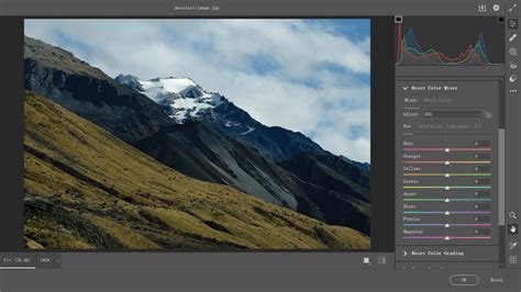
Step 2: Accessing the Camera Raw FilterThe color grading tool in Photoshop is located under "Filter > Camera Raw Filter." Within the Camera Raw filter window, you will find a comprehensive suite of color-related tools, including basic white balance adjustments, temperature, tint, the tone curve, a color mixer, the color grading section, and effects, among others.
Step 3: Navigating the Color Grading ToolClick on "Color Grading" to reveal its settings. If you are familiar with color grading in Lightroom or other editing software, the interface will likely feel intuitive. The process involves using three-color wheels: one for shadows, one for mid-tones, and one for highlights. To add a blue tone to the shadows of a night shot, for instance, select the shadows color wheel and move its central handle.
Adjusting the color tone (hue) is done by dragging the circle. Moving the handle closer to the wheel's edge alters the saturation, and the slider beneath each wheel controls luminance. At the bottom, blending and balance settings allow you to fine-tune how the color wheels interact and balance the different tonal ranges.
Step 4: Exploring Alternative Color Wheel ViewsBeyond the default three-way color wheel view, Photoshop offers additional options for greater control. By changing the icon above the mid-tones wheel (next to "Adjust"), you can access more detailed views of each color wheel. The "Global" wheel view enables quicker color grading by applying a pre-established balance across mid-tones, shadows, and highlights. This view is ideal when you have a specific color in mind for your scene and don't require granular adjustments. It's important to note that you don't need to utilize every view or wheel for effective color grading; often, adjusting only the shadows and highlights is sufficient to introduce warm and cool colors. Experimentation with the tool is key to discovering exciting effects.
Step 5: Export Your Graded ImageSave or export your color-graded photo in your preferred format, such as PNG.
Enhancing Color Grading with Optics by Boris FX
Optics by Boris FX is a versatile tool available for Lightroom and Photoshop (and as a standalone application) that excels at creating captivating cinematic effects and improving photo composition. Working with Optics is designed to be both simple and enjoyable. While it takes time to familiarize yourself with its extensive tools and experiment with parameter tweaks to achieve unique looks, the results can be stunning.
This guide provides the fundamentals for color grading in Lightroom or Photoshop using Optics.
Step 1: Integrating Optics into Lightroom and PhotoshopImport your photos into Photoshop or Lightroom. In Lightroom, right-click your image and select "Edit In > Boris FX Optics." In Photoshop, navigate to "Filter > Boris FX > Optics." For non-destructive editing in Photoshop, it's highly recommended to convert your photo to a Smart Object by right-clicking the layer and selecting "Convert to Smart Object" before applying Optics. If you are using the standalone application, simply run Optics and open your photos via "File > Open."
Step 2: Discovering Optics Filters and PresetsOptics offers a vast array of filters categorized into ten distinct groups, providing natural, bold, and eccentric looks. Within each category, you'll find thousands of customizable presets. A significant advantage of Optics is its visual, real-time application of filters without lengthy rendering times. The "Color" category houses tools like the tone curve and color wheels, while "Grads/Tints" provides dedicated color grading filters that can be applied and modified.
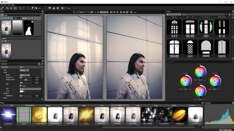
Step 3: Color Grading with OpticsThe primary advantage of using Optics over Photoshop or Lightroom's built-in tools is the ability to achieve significant results quickly. Instead of manually selecting colors and attempting to match a desired aesthetic, you can select a preset as a starting point, saving considerable time. For example, Optics includes a "Sunset" filter with presets specifically designed for images featuring grass and sky, or sunsets over water. If a preset isn't perfect, you can fine-tune its parameters in the right-hand panel, adjusting color, opacity, highlights, and more to create custom looks. Taking the time to explore all the tools and presets within Optics before undertaking a major project is highly beneficial, as its extensive offerings provide endless creative possibilities for color grading.
Step 4: Exporting Your Work Back to Your Host ApplicationTo return your color-graded work to Lightroom or Photoshop, click "Apply" in the bottom right corner of the Optics screen. You will instantly be back in your host application, ready to continue editing or apply other effects. If using the standalone application, export your work via "File > Save As."
Final Thoughts on Mastering Color Grading
Learning color grading can initially seem daunting, but it's a skill that yields substantial improvements in your photography over time. While the steps for adjusting colors are straightforward, achieving the precise color tones you envision requires practice and an understanding of color theory. Familiarity with complementary colors and the strategic use of masks to isolate color grading to specific image areas will significantly enhance your results.
Consider exploring Optics for a fast-processing color grading tool with thousands of presets designed to captivate your audience.
Frequently Asked Questions (FAQ)
What is the Difference Between Color Correction and Grading?Color correction aims to balance colors for a natural look, fixing issues like incorrect white balance or color casts. Color grading, on the other hand, is a creative process to alter the mood and aesthetic of an image, often for stylistic or cinematic purposes.
How can I ensure accurate color representation on my monitor?Calibrating your monitor is essential for accurate color representation. This process ensures that the colors you see on your screen closely match industry standards, leading to more predictable editing results.
What are some common color issues in photography?Common issues include unnatural skin tones due to incorrect white balance, oversaturation that detracts from realism, underexposure leading to dark and muted images, and inconsistent color tones across a series of photographs.
How do Levels and Curves differ in Photoshop?Levels provide a straightforward way to adjust the intensity of shadows, mid-tones, and highlights. Curves offer a more detailed and nuanced approach, allowing for precise control over the tonal range and color balance of an image by manipulating a graph.
When should I use the Color Balance Adjustment Layer?The Color Balance Adjustment Layer is useful for global changes or for more precise control by selecting specific color ranges. It's particularly effective for achieving natural-looking skin tones and can be adjusted non-destructively.
What is the role of the histogram in color correction?The histogram visually represents the distribution of tones and colors in an image. By examining the RGB histograms, you can quickly identify color casts and understand the overall tonal range, guiding your color correction efforts.
tags: #color #correcting #in #photoshop