Understanding and effectively utilizing color modes within Adobe InDesign is a fundamental skill for any designer, especially for those aiming for professional print or digital output. This guide delves into the intricacies of color in InDesign, moving from the foundational concepts to advanced applications, ensuring clarity for users with existing InDesign knowledge and providing valuable insights for even the most experienced professionals.
The Essence of Color Modes in InDesign
At its core, a color mode dictates how colors are represented and interact within a digital environment, and crucially, how they will translate to physical outputs. In InDesign, this understanding is paramount for achieving predictable and accurate results, whether your final destination is a vibrant digital display or a meticulously printed brochure.
RGB vs. CMYK: The Primary Dichotomy
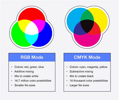
The two most prevalent color modes encountered in InDesign are RGB and CMYK.
RGB (Red, Green, Blue): This additive color model is the standard for digital displays. It works by emitting light, combining red, green, and blue light sources in varying intensities to create a spectrum of colors. Because RGB color is created via colored light, not colored ink, it is optimized for digital and web design, not print design. Therefore, you should only be looking to use an RGB Color Mode when creating designs for digital publishing (e.g., eBooks) or for online use (e.g., websites).
CMYK (Cyan, Magenta, Yellow, and Key/Black): This subtractive color model is the standard for professional printing. It operates on the principle of inks absorbing certain wavelengths of light and reflecting others. When you set colors in your InDesign document to CMYK color swatches, you create a Process Separation. This means that all the CMYK colors on your layout will be printed onto one plate during the printing process, in one single print run. By choosing Print from the Intent drop-down menu when creating a new document, InDesign automatically sets the Color Mode of the new document to CMYK, ensuring that as you work on your print documents, you are sticking to CMYK colors.
Understanding Spot Colors
While CMYK is the workhorse for most print jobs, there's another crucial color concept to grasp: Spot Colors.
Spot Color: When you define a color in your InDesign document as a Spot Color, that color will be printed using a specific, pre-mixed ink, rather than being created by combining the process CMYK inks. This means the color will be pulled onto a separate printing plate and will have to be printed during a separate print run. Pantone is an international color-matching system that gives standardized color pigments a unique number. Pantone colors are more complex than CMYK colors and can be made up from a combination of 13, rather than only 4 (for CMYK), base pigments.
If you’re creating an InDesign layout that uses more than three colors, you shouldn’t normally need to use any Spot Color, unless you want to create a particularly special color effect with a Pantone, metallic, or fluorescent ink. This is because the printer would have to perform a separate, additional print run for each Spot Color you apply to the document, which adds time and money to the print job. If you do want to use a Spot Color in your design and keep your printing costs down, the best thing to do is create a black and white document which just uses one single pop of color, which you can set as a Spot Color. And the other key thing to remember is that you should never print in RGB color, unless you want some very unpredictable results.
Applying and Managing Color in InDesign
InDesign offers a robust suite of tools and panels for applying, defining, and managing colors, ensuring precise control over your document's aesthetic.
The Color Panel and Swatches Panel
The Color panel and Swatches panel are your primary interfaces for working with color.
Color Panel: You can mix colors by using the Color panel. Choose a Lab, CMYK, HSB, or RGB color model in the Color panel menu, and use the sliders to change the color values. Position the pointer over the color bar at the bottom of the panel, and click to select a color from the Color Picker. You can add the current Color panel color to the Swatches panel at any time. If you select an object that currently uses a named swatch, editing its color using the Color panel changes the color of that object only.
Swatches Panel: While the Swatches panel is the recommended panel for working with colors, you can also mix colors by using the Color panel. The Swatches panel allows you to save and organize colors, gradients, and tints, making them readily available for application. You can add named swatches to the Swatches panel by clicking "Add CMYK Swatch," "Add HSB Swatch," "Add RGB Swatch," or "Add Lab Swatch" in the Color Picker.
Applying Color to Objects
When you apply color in InDesign, you can choose if it affects the object's stroke or fill. The stroke is the border of an object, while the fill is the background.
Fill and Stroke Boxes: The Fill and Stroke boxes in the Toolbox or a panel indicate the color or gradient applied to the fill or stroke of an object. You can select the Fill box or the Stroke box to make it active. Then, you can apply a color or gradient from the Swatches panel, the Color panel, or the Gradient panel.
Drag-and-Drop Application: An easy way to apply colors or gradients is to drag them from a color source (like the Swatches panel or the Color panel) directly onto an object or a panel. This drag-and-drop functionality allows you to apply colors or gradients to objects without first selecting them, streamlining your workflow.
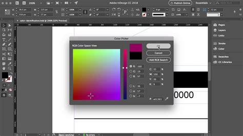
Color Picker and Numerical Input
The Color Picker provides a visual interface for selecting colors, allowing you to choose from a color field or specify colors numerically.
Visual Selection: In the Color Picker, you can click or drag inside the color field to visually select a hue and saturation. Color slider triangles indicate the color’s position in the color field. You can also click inside the color spectrum to select a color.
Numerical Input: For precise color control, you can enter values in any of the text boxes for different color models (RGB, CMYK, HSB, Lab). You can also apply color values using hexadecimal RGB code in the Color Picker, New Swatch, and Edit Swatch workflows. When using the Color Picker in a New Swatch workflow, you can click the screengrabber, hold down the mouse button, and click anywhere on the screen to view the hex color value from any source.
Advanced Color Techniques and Workflow Enhancements
Beyond basic color application, InDesign offers advanced features to enhance your color workflow and achieve sophisticated visual effects.
The Color Theme Tool
The Color Theme tool is a powerful feature that allows you to extract color palettes directly from your InDesign documents.
Extracting Themes: You can extract color themes from selected areas, images, or objects in your InDesign document. You can also choose a color from an image, the whole image, or the whole layout. Basically, you can generate color themes from any colors in your artwork. A color theme is made of five different colors.
Adding Themes to Swatches: Once extracted, these color themes can be added to your Swatches panel, either as individual swatches or as a color group. Colors picked and added to swatches honor document intent and automatically convert to the appropriate color space before being added to swatches or dropped on other objects. Shift+Clicking on an area with the Color Theme tool allows you to pick a single, precise color as the base for the theme.
Color Theme Tool InDesign 2021
Blending Modes and Transparency Effects
Blending modes and transparency effects offer dynamic ways to interact colors and create sophisticated visual depth.
Blending Modes: Blending modes, accessed through the Transparency settings (Object > Effects > Transparency), determine how the colors of an object interact with the colors of the objects beneath them. "Normal" is the default, but options like "Multiply," "Screen," "Overlay," and "Hard Light" can produce a wide range of interesting effects. For instance, applying a black rectangle with the "Multiply" blending mode over an image can effectively darken it without simply reducing its opacity, creating a more nuanced effect.
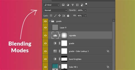
Transparency: Beyond blending modes, the Transparency panel allows for global adjustments to opacity and the application of various blend modes to entire objects or groups of objects. This is crucial for layering elements and achieving a sense of depth and integration.
Color Management and Proofing
For print professionals, accurate color management and proofing are non-negotiable.
Color Management: InDesign's color management system ensures that colors are translated consistently across different devices and media. This involves using appropriate color profiles and understanding rendering intents. CRDs (Color Separation Tables) are PostScript equivalents of color profiles, and their accurate application can vary among printers.
Professional Proofing: To simulate how colors will appear on a specific output device (like a printer), InDesign offers proofing options. Under the Print dialog, you can select "Proof." This allows you to choose a specific profile (absolute colorimetric rendering intent is often used for proofing) to preview the color output. This is vital for understanding how colors will translate from your screen to the printed page, preventing unexpected results.
Understanding Color Conversion: When you print, InDesign converts color data to RGB values using the selected color profiles. This process can vary among printers. For documents intended for print, it's essential to be aware of how colors are converted to the color space of the output device. The goal is to achieve calibrated color output through consistent color setting defaults.
Color Groups for Organization
Effective organization of colors is crucial, especially in complex projects. Color groups in the Swatches panel provide a structured way to manage your palettes.
Creating Color Groups: You can create color groups by clicking the Color Group icon on the Swatches panel. You can then add selected swatches or swatches from selected page items to these groups. This is particularly useful for maintaining brand consistency and easily accessing project-specific color schemes.
Importing and Exporting: Color groups can be saved and imported as .ase (Adobe Swatch Exchange) files. This allows for seamless exchange of color palettes across different Adobe applications like Illustrator, ensuring a unified color strategy throughout your design ecosystem.
Gradients and Halftones
Beyond solid colors, InDesign supports gradients for smooth transitions and offers control over halftone screening for print.
Gradients: InDesign allows for the creation and application of gradients, which can be applied to fills or strokes. You can adjust gradient colors, stops, and angles to achieve desired effects. For print, understanding how gradients translate is important, as very dark or long gradients can sometimes lead to banding. Options within the print settings can help manage this.
Halftones: For print, understanding halftones is key. A halftone is a simulation of continuous-tone imagery through the use of dots of varying size or spacing. The printer uses halftone dots to create the illusion of different shades of gray or color. When the halftone dot gets larger, it results in a darker shade of gray. InDesign's print settings allow for control over resolution, screen frequency, and halftoning methods, which are crucial for achieving optimal print results and avoiding moiré patterns.
By thoroughly understanding and applying these color modes and techniques within InDesign, designers can ensure their work is not only visually compelling but also technically sound, meeting the specific requirements of both digital and print outputs. This comprehensive approach to color is a cornerstone of professional graphic design.