The allure of vintage printing, with its distinctive dot patterns and rich textures, has never faded. Halftones, a foundational technique in 20th-century printing, are responsible for this aesthetic. They enabled presses limited to a few basic inks - cyan, magenta, yellow, and black (CMYK) - to reproduce a vast spectrum of colors and shades. By strategically arranging tiny dots of these primary colors, printers could create the illusion of continuous tones and complex imagery. Today, this classic printing technique remains a powerful tool in graphic design, pop art, and screen printing, offering a nostalgic yet sophisticated visual language. This tutorial will guide you through the process of creating compelling color halftone effects in Adobe Photoshop, transforming your photographs into distinctive, retro-styled artworks.
Understanding the Halftone Principle
At its core, halftoning is a clever visual trick. Instead of attempting to print continuous tones, which early printing technology couldn't achieve with limited inks, halftones break down an image into a series of dots. These dots, varying in size and density, are then printed using a limited color palette. When viewed from a distance, the human eye perceives these closely packed dots as blended tones and colors, mimicking the original image's depth and nuance.
Early color presses relied on only four inks: Cyan (C), Magenta (M), Yellow (Y), and Black (K). The halftone process involved creating separate dot patterns for each of these colors. These patterns were then layered on top of each other, with specific screen angles for each color to prevent moiré patterns and optimize color mixing. The interaction and overlap of these tiny dots in cyan, magenta, yellow, and black are what allow for the creation of every shade and hue imaginable within the constraints of CMYK printing. This method was revolutionary, enabling printers to achieve a wider spectrum of colors and intricate details than ever before.
The Significance of Halftones in Screen Printing
Halftone patterns are not merely an aesthetic choice; they are a technical necessity and a creative advantage, particularly in screen printing. The depth and texture often seen in screen-printed designs are frequently achieved through skillful use of halftones. While learning how to halftone an image in Photoshop for screen printing might initially seem complex, mastering this skill can elevate a simple image into a screen-printing masterpiece.
Why is halftoning essential for screen printing? It acts as a creative tool that imbues screen-printed images with depth and texture. By converting images into halftones, it becomes possible to reproduce photographs, gradients, and intricate illustrations using the screen printing process, which would otherwise be impossible with a single ink color. Essentially, halftones empower us to use a limited number of ink colors - sometimes even just one - to create the illusion of multiple shades and complex tonal variations. This technique makes a single-color design appear as a multi-layered illustration, breathing life into static images.
Preparing Your Image for the Halftone Effect
Before diving into Photoshop's filters, careful preparation of your source image is crucial. The quality and characteristics of the original photograph significantly impact the final halftone result. It's important to remember that once a design is converted into halftones, making substantial alterations becomes challenging. Therefore, ensuring you have the right image from the outset is a top priority.
Image Selection and Contrast Enhancement
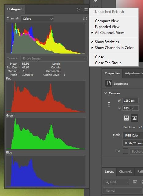
Halftone pattern effects work best on images that possess high contrast. This means there should be a clear distinction between the darkest and lightest areas of your photograph. To optimize your image for this effect, you can utilize Photoshop's tonal adjustment tools. Ideally, the black point slider in your Levels or Curves adjustment should be moved to where the left side of the histogram begins, and the white point slider should be moved to where the right side of the histogram begins. This process ensures that the full dynamic range of your image is utilized, providing the most significant tonal variation for the halftone dots to represent. However, not all images will require adjustments to both sliders; some might already have a histogram that extends fully to the left or right, indicating that the black or white points are already optimally set.
Converting to Grayscale
The first technical step in preparing your image for halftoning is to convert it into grayscale. This simplifies the image by removing all color information, leaving only luminance values. To do this, navigate to Image > Mode > Grayscale. Photoshop will likely prompt you with a dialog box asking if you wish to discard all color information. Confirm this decision by clicking "OK." All colors will disappear from your image, and only black will represent the tonal information.
Before proceeding, it's a good practice to check your grayscale image values. Using Image > Adjustments > Levels (or the shortcut Ctrl+M for Curves), ensure that your black and white areas are well-defined and that there isn't an undesirable color cast remaining from the original image. If there's a mismatch or a slight tonal imbalance, you can make the necessary adjustments here.
Applying the Halftone Filter in Photoshop
Photoshop offers several methods for creating halftone effects. While some filters can produce a basic dot pattern, the most effective and versatile approach for achieving realistic color halftones involves utilizing the Color Halftone filter in conjunction with CMYK color mode.
Method 1: Using the Color Halftone Filter (Recommended for Color)
The Color Halftone filter is specifically designed to simulate the CMYK printing process. However, to achieve the best results, it's essential to understand that this filter works optimally when the image is in CMYK color mode, not RGB.
Convert to CMYK: If your image is currently in RGB mode, you'll need to convert it. To do this, go to
Image > Mode > CMYK Color. Before making this conversion, it's highly recommended to duplicate your image or work on a separate layer to avoid making permanent changes to your original file. In theConvert to Profiledialog box that appears, ensure that theDestination Spaceis set to a standard CMYK profile, such asWorking CMYKorWeb Coated (SWOP) v2. The specific profile might vary depending on your region and intended output. Once converted, your image will now be in CMYK color mode, and you'll see channels for Cyan, Magenta, Yellow, and Black in the Channels panel.Converting images from RGB to CMYK // Photoshop
Access the Color Halftone Filter: With your image in CMYK mode, navigate to
Filter > Pixelate > Color Halftone.Configure the Settings: A dialog box will appear with several settings:
- Max Radius: This setting determines the maximum size of the halftone dots, measured in pixels. A larger radius will result in bigger dots, while a smaller radius will produce smaller dots. The ideal value depends on your image size and the desired aesthetic. Experiment with different values; for large images (e.g., 5000 x 3333 pixels), a radius of 20 might be a good starting point, while for smaller images or a finer effect, you might use values between 4 and 8.
- Channel Settings (Screen Angles): You'll see four fields, one for each CMYK color channel (Cyan, Magenta, Yellow, and Black). Each field allows you to set a
Screen Anglein degrees. These angles control the orientation of the dot pattern for each color. When these angles are set appropriately (often with slight variations, like 15°, 75°, 0°, and 45° as a common starting point, though defaults can also work well), they prevent moiré patterns and ensure the dots overlap correctly to create new colors. The default values are often a good starting point, but adjusting them can subtly alter the visual texture of the halftone. - Dot Shape: While not explicitly a setting in the
Color Halftonefilter itself, the shape of the dots is a crucial aspect of the halftone effect. TheColor Halftonefilter inherently produces dots that, when combined with other filters or adjustments, can be refined to appear more rounded or varied.
Apply the Filter: Click "OK" to apply the
Color Halftonefilter. You will immediately see the image transformed into a pattern of colored dots.
Method 2: Using the Filter Gallery (for Black and White Halftones)
If your goal is to create a black and white halftone effect, or if you prefer a more experimental approach with real-time preview, the Filter Gallery can be utilized.
Prepare a New Layer: Create a new layer above your image layer. Fill this new layer with 50% gray. You can achieve this by setting your Foreground color to 50% gray (Hex #808080) and then using
Edit > FillwithForeground Color. Alternatively, pressDto reset your Foreground and Background colors to black and white, then create a new layer, go toImage > Apply Image, and set theBlendtoAddandOpacityto 50%.Convert to Smart Object: To allow for non-destructive editing and easy adjustments later, convert this gray layer into a Smart Object. Right-click on the layer in the Layers panel and select
Convert to Smart Object.Access the Filter Gallery: Go to
Filter > Filter Gallery. TheFilter Galleryprovides a large preview area and two columns for selecting and adjusting filters.Apply Sketch Filters:
- Expand the
Sketchgroup. - Select the
Torn Edgesfilter. This filter helps to roughen up the blurry squares that might initially appear, making them look more rounded and organic. Adjust theSmoothnessslider (e.g., to 10) and theChalk & Charcoalslider to achieve the desired texture. - You might also explore other filters within the
Sketchgroup or even theArtisticgroup, applying them sequentially or in combination to achieve unique dot patterns.
- Expand the
Adjust Dot Size: After applying filters, you can revisit the Smart Filter settings. Double-click on the filter name in the Layers panel to reopen its dialog box. Here, you can adjust settings like
Size(which controls the dot size) andSmoothnessto fine-tune the appearance of the dots. Lowering theFillvalue (notOpacity) of the layer can also help blend the halftone effect more subtly with the underlying image.
Fine-Tuning the Halftone Effect and Adding Color
Once you have applied the initial halftone filter, there are several ways to refine the effect and introduce color.
Adjusting Dot Size and Spacing
The Max Radius in the Color Halftone filter directly controls the size of the dots. Experimenting with this value is key to achieving the desired density and gradient. A larger radius creates larger, more prominent dots, giving a bolder, more graphic feel. A smaller radius results in finer dots, producing a smoother, more subtle effect. The Screen Angle settings also influence how the dots overlap and interact, affecting the overall texture and color blend.
Creating Black and White Halftones
As mentioned, the Filter Gallery with Sketch filters can create a convincing black and white halftone. After applying the filters and converting the layer to a Smart Object, you can adjust the Fill of the layer to control the intensity of the effect. Lowering the Fill value will make the dots less opaque, allowing more of the underlying image (or a background color) to show through.
Adding Color to Halftone Patterns
There are several effective ways to add color to your halftone effects:
Using Blend Modes: This is a straightforward and effective method for adding color to a black and white halftone.
- Ensure your halftone layer is active in the Layers panel.
- Create a new layer above it.
- In the
New Layerdialog box, change theMode(blend mode) fromNormaltoColor. - Choose your desired color from Photoshop's Color Picker. For richer tones, select a darker version of the color.
- Fill this new layer with your chosen color. The
Colorblend mode will apply the hue and saturation of this layer to the underlying grayscale halftone, effectively coloring the dots without altering their luminance values. You can repeat this process with multiple layers set toColorblend mode, each with a different hue, to create multi-colored halftones.
Leveraging CMYK Separation: When using the
Color Halftonefilter in CMYK mode, the color is inherently built into the dot patterns for Cyan, Magenta, Yellow, and Black. By adjusting theMax RadiusandScreen Angles, you influence how these CMYK dots interact to form a full spectrum of colors.Using Premium Halftone Effects: For advanced users or those seeking unique and complex halftone styles, premium Photoshop actions and textures can be invaluable. Many resources offer pre-designed halftone patterns with various dot sizes, styles (fixed or variable), and color effects. These can significantly speed up the workflow and provide professional-grade results. Examples include actions that apply multiple color halftone effects, dotted halftone textures, or artistic effects that preserve original image colors while introducing halftone patterns.
Preparing for Screen Printing
When preparing a halftone image for screen printing, several specific considerations come into play:
Halftone Frequency (LPI)
Common terms in halftone settings for screen printing include LPI (lines per inch), halftone screen, and halftone frequency, all referring to the same concept: the density of halftone dots per linear inch. A lower LPI results in larger dots, while a higher LPI produces smaller dots. Many screen printing professionals consider an optimal halftone frequency for screen printing to be between 45 to 55 LPI, as this range is suitable for most images and printing conditions. However, the ideal LPI will depend on the desired outcome. For instance, photorealistic images often require a higher LPI, such as 65, to capture finer details.
Screen Mesh Count
Halftone patterns generally pair best with a higher screen mesh count. For robust halftone screen printing practices, a mesh count between 230 and 280 is commonly used. The mesh count refers to the number of threads per inch in the screen fabric. A higher mesh count creates a finer screen, capable of holding and printing smaller halftone dots with greater precision.
Ink, Substrate, and Emulsion
The type of ink and substrate you will be using can significantly affect the final print. Some inks might spread more, filling in the dots, while certain substrates might absorb ink differently. Furthermore, the type of emulsion used in the screen printing stencil plays a critical role. Using a high-quality emulsion that is properly applied can result in a clearer, more detailed halftone print. Inconsistencies in emulsion application can easily lead to distorted or blurred halftones.
Conclusion
Mastering the art of the color halftone in Photoshop is an invaluable skill, particularly for those involved in graphic design and screen printing. It empowers you to transform ordinary images into visually striking, print-ready artworks with a distinctive retro charm. While the process might initially seem intricate, with practice and experimentation, creating sophisticated halftone effects will become a natural and rewarding part of your creative workflow. Whether you aim for a classic pop art aesthetic or a nuanced photographic reproduction, Photoshop's tools provide the flexibility to achieve a wide range of compelling halftone results.