Color theory, a fundamental aspect of visual arts and design, often sparks curiosity and can be a source of confusion, especially when transitioning between different mediums. While a kindergarten art class might introduce the concept of a color wheel using paints and pigments, the principles governing how we perceive and reproduce color in photography, digital displays, and printing are distinct and operate under different systems. This article delves into the intricacies of these color systems, primarily focusing on RGB and CMYK, to demystify their functions and applications.
The Classic Color Wheel: RYB and its Limitations
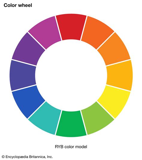
The color wheel most people encounter in their early education is the RYB model, comprising Red, Yellow, and Blue as primary colors. This system is primarily associated with paint and pigment-based art. In this model, mixing primary colors creates secondary colors: red and yellow yield orange, yellow and blue produce green, and blue and red result in violet. When all three primary colors are mixed in RYB, the theoretical outcome is black. However, in practice with paints, this often results in a muddy brown due to the impurities in pigments. This inherent limitation is a key reason why RYB is not the standard for professional printing.
Beyond RYB: The RGB and CMYK Color Spaces
For photography and digital displays, the operative color systems are RGB and CMYK, each with its unique properties and applications. These are often referred to as "Color Spaces."
RGB: The Additive Color Model for Light
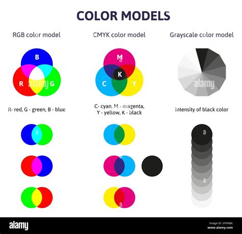
RGB stands for Red, Green, and Blue. This is an additive color model, meaning that colors are created by adding light together. In this system, black is the absence of light. As you add more light, the colors become lighter, culminating in white when all three primary colors are combined at their full intensity.
- Red, Green, Blue: These are the primary colors of light.
- Mixing:
- Red + Green = Yellow
- Green + Blue = Cyan
- Blue + Red = Magenta
- Red + Green + Blue = White
The RGB color space is fundamental to how we experience color on digital screens, including computer monitors, televisions, and smartphones. Each pixel on these devices is composed of tiny red, green, and blue lights that can be adjusted in intensity to create a vast spectrum of colors. The values for each color channel typically range from 0 to 255, with (255, 255, 255) representing white and (0, 0, 0) representing black. This additive nature allows for vibrant and luminous colors, as light is being emitted directly.

CMYK: The Subtractive Color Model for Print
CMYK stands for Cyan, Magenta, Yellow, and Key (which is Black). This is a subtractive color model, primarily used in printing. In this system, colors are created by subtracting light from a white background (typically the paper). Inks are applied to the paper, and these inks absorb certain wavelengths of light and reflect others.
- Cyan, Magenta, Yellow, Black: These are the primary colors used in printing.
- Mixing:
- Cyan + Magenta = Blue
- Magenta + Yellow = Red
- Yellow + Cyan = Green
- Cyan + Magenta + Yellow = Black (theoretically, but often a muddy brown)
Printers use black ink (Key) because mixing cyan, magenta, and yellow inks doesn't produce a pure, deep black. Black ink is crucial for adding detail, contrast, and richer dark tones. In the CMYK model, colors are typically represented by percentages, indicating the amount of ink applied. As more ink is layered, more light is absorbed, resulting in darker colors. When all inks are combined at 100%, the result is black.
Why Different Color Systems Matter
The fundamental difference between RGB and CMYK lies in their approach to color creation: light versus ink. This distinction is critical because the color gamuts-the range of colors that each system can reproduce-differ significantly.
- RGB's Wider Gamut: RGB, being an additive light model, can produce a broader and more vibrant range of colors, often referred to as "brighter" or "more luminous." This is because it directly emits light.
- CMYK's Limited Gamut: CMYK, a subtractive ink model, has a more limited color gamut. It relies on absorbing and reflecting light, which inherently restricts the vibrancy and intensity of the colors that can be achieved on paper. Certain vivid colors, especially neons and bright blues or greens, that appear stunning on an RGB screen can look muted or drastically different when converted to CMYK for printing.
This difference is why it's crucial to use the correct color mode for your project. Designing for a digital screen requires RGB, while designing for print necessitates CMYK. Attempting to print an RGB file without proper conversion can lead to unexpected and undesirable color shifts. The conversion process from RGB to CMYK attempts to find the closest CMYK equivalent for each RGB color, but it's not always a perfect match, and some colors may fall "out of gamut," meaning they cannot be accurately reproduced in print.
The Concept of Hue, Saturation, and Lightness
Beyond the primary color models, understanding core color properties is essential for effective visual design and photography.
- Hue: This refers to the pure form of a color, its actual identity (e.g., red, blue, green). The transition between hues creates an infinite spectrum of colors. For photographers, understanding hues helps in composing shots and anticipating how colors will interact.
- Saturation: This describes the intensity or purity of a hue. A highly saturated color is vivid and pure, while a desaturated color appears more muted, closer to gray. Saturation can be adjusted by adding black (darkening) or white (lightening) to a color. In photography, saturation can be manipulated in editing to enhance or subdue colors.
- Lightness (or Brightness/Value): This refers to how light or dark a color is. It's essentially the degree of white or black present in a color. Adjusting lightness is a common editing technique to bring out details or create specific moods.
Color Temperature and Psychology
Color temperature refers to the psychological or perceived warmth or coolness of a color. This concept is often visualized by dividing the color wheel vertically:
- Warm Colors: Reds, oranges, and yellows are associated with warmth, energy, passion, and can evoke feelings of excitement or comfort.
- Cool Colors: Blues, greens, and violets are associated with coolness, calmness, tranquility, and can evoke feelings of serenity or sadness.
Understanding color temperature is vital in photography and design for setting a mood. A warmer tone can make a photograph feel more inviting and energetic, while a cooler tone can create a sense of peace or melancholy. Digital editing tools and lens filters allow for precise control over color temperature.
The ultimate guide to Color Theory, in just 12 minutes — Photography Visual Patterns #4
Beyond RGB and CMYK: Other Color Systems
While RGB and CMYK are the most prevalent in digital and print design, other color systems exist for specific applications:
- RYB (Red, Yellow, Blue): The traditional model for paint and pigments, still relevant for traditional art forms.
- Pantone Matching System (PMS): A proprietary color matching system widely used in the printing industry to ensure color consistency across different printing processes and manufacturers. Pantone colors are defined by unique numbers, making them a standard for brand identity and precise color replication. This system often uses a wider base of pigments than CMYK to achieve specific, accurate shades.
- RAL Colors: Primarily used for coatings, powder coating, varnishes, and plastics, RAL provides a standardized system for color consistency in industrial and manufacturing contexts.
The Interplay of Color Systems in Photography
For photographers, understanding the relationship between RGB and CMYK is crucial for a seamless workflow from capture to print.
- Capture and Editing (RGB): Cameras capture images in RGB, and editing software like Adobe Photoshop and Lightroom operate primarily in the RGB color space. This allows for the manipulation of hue, saturation, and lightness to achieve the desired aesthetic.
- Display (RGB): Images are viewed on screens, which are RGB devices. The colors you see on your monitor are rendered using the RGB model.
- Printing (CMYK): When an image is prepared for printing, it must be converted to the CMYK color space. This conversion is where potential color shifts can occur due to the differing gamuts. Professional printing services often use specialized inks, including "Photo Cyan" and "Photo Magenta," to improve the reproduction of colors from RGB files.
To mitigate color discrepancies, photographers can:
- Calibrate Monitors: Ensure their display accurately represents colors.
- Use Soft Proofing: Simulate how an RGB image will appear in CMYK within editing software.
- Understand Gamut Warnings: Pay attention to "out-of-gamut" warnings in editing software, which indicate colors that may not print accurately.
- Order Proof Prints: Request a single print of the final image to check color accuracy before a large print run.
The Science Behind Perception: CIE Color Space and Magenta
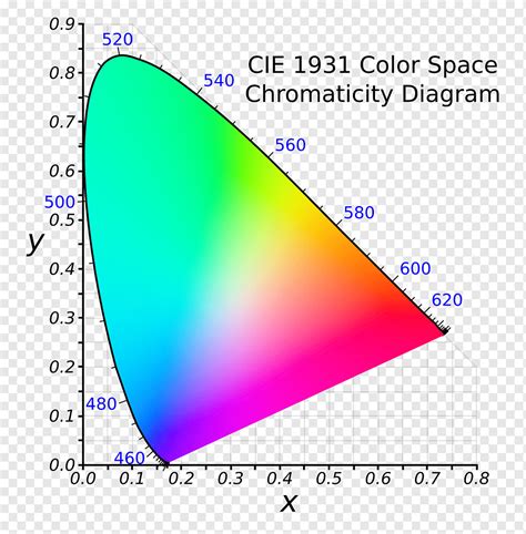
The way humans perceive color is a complex interplay of light wavelengths and our visual system. The CIE 1931 Color System is a scientific model that maps all the colors visible to the human eye. It's important to note that color is not inherently a "wheel" but a spectrum.
Magenta, a color often found in color wheels, is particularly interesting. It doesn't correspond to a single wavelength of light in the visible spectrum. Instead, our brain perceives magenta when it receives stimulation from both red and blue light simultaneously, with little to no green light input. This is why magenta can be thought of as an "imaginary" color, created by our perception rather than a direct spectral phenomenon. This also highlights the limitations of simple color wheels in fully representing the complexity of human color vision.
The CIE diagram illustrates the full gamut of human vision, with RGB and CMYK gamuts depicted as smaller areas within it. This visually demonstrates that neither RGB nor CMYK can reproduce every color the human eye can perceive.
Conclusion: Mastering Color for Impact
Understanding the distinctions between RGB and CMYK, along with the fundamental principles of hue, saturation, lightness, and color temperature, is not merely an academic exercise. It is a practical necessity for anyone working with visual media. Whether you are a photographer capturing a moment, a graphic designer crafting a brand identity, or a web developer building an online experience, a solid grasp of color theory empowers you to make informed decisions. This knowledge ensures that your creations are not only visually appealing but also accurately translated across different mediums, ultimately resonating more effectively with your intended audience and achieving your creative goals.