The world of digital art offers an unparalleled level of creative freedom, and at the heart of this lies the ability to tailor your tools to your specific artistic vision. For users of ibisPaint, a powerful and versatile drawing application, understanding and mastering brush customization is key to unlocking a truly personalized artistic experience. This guide delves into the intricate settings and options available within ibisPaint for creating and refining your brushes, transforming simple lines into sophisticated textures and dynamic effects.
The Foundation: Understanding Brush Pattern and Texture
At its core, a digital brush is defined by how it lays down color on the canvas. In ibisPaint, two fundamental elements dictate this behavior: the Brush Pattern and the Texture.
The Brush Pattern is precisely what it sounds like: the fundamental shape or image that is repeated along the path of your brush stroke. Think of it as the "stamp" that your brush uses. This pattern is defined in the [Shape] tab under the [Brush Pattern] setting. By repeating this chosen pattern, ibisPaint constructs the visible line or stroke you create.
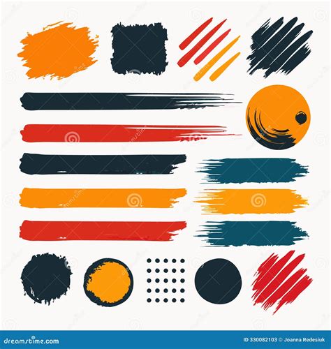
Complementing the brush pattern is the Texture. This setting, found in the [Type] tab under [Texture Pattern], allows you to imbue your brush strokes with the feel of a physical surface. This is crucial for achieving a more realistic or nuanced artistic effect. By applying a paper texture, for instance, your digital strokes can mimic the subtle grain of watercolor paper, the rough weave of canvas, or the smooth finish of Bristol board. This layer of textural detail adds depth and tactile quality to your artwork, moving beyond flat, digital lines.
Sculpting the Stroke: Blurring Shape and Brush Type
Beyond the static pattern and texture, ibisPaint provides sophisticated controls to shape the dynamic behavior of your brush. The Blurring Shape setting, located in the [Fade] tab, directly influences how your brush stroke tapers or fades. This is essential for creating soft edges, feathered lines, or brushes that gradually disappear, mimicking the natural behavior of traditional media like charcoal or pastels.
The [Type] of brush pattern itself offers further control. ibisPaint distinguishes between two primary types for creating custom brush patterns:
Brush Pattern (Mono): This option is designed for creating images that can be used as monochrome brush patterns. These are ideal for creating brushes that rely on shape and opacity for their effect, without introducing color variations from the pattern itself. Monochrome brushes created this way are versatile for line art, sketching, and effects where color is solely determined by the selected paint color.
Brush Pattern (Color): This setting allows for the creation of brush patterns that incorporate multiple colors. When you use a
[Brush Pattern (Color)], the original colors within the pattern image are transformed based on the color currently selected when you apply the brush. This opens up a vast array of possibilities for creating textured, multi-tonal brushes. The initial settings of a brush created using this type will differ depending on the template chosen. For users aiming to create a brush that functions like a stamp, setting the type to[Brush Pattern (Color)]and the template to[Star]is a recommended starting point.
Crafting Your Own Brush Patterns: A Step-by-Step Approach
The ability to create your own brush patterns is where ibisPaint truly shines in its customization capabilities. This process involves drawing directly onto the canvas to define the repeatable element of your brush.
When you select [Edit Pattern], the content you draw on the canvas becomes the brush pattern. This is the core of custom brush creation. However, new users might encounter a common hurdle: the pattern shape not appearing in the test drawing, resulting in a simple line instead. This usually stems from two interrelated factors: brush Thickness and Spacing. If the brush thickness is too thin, or the spacing between pattern repetitions is too small, the individual pattern elements can become indistinguishable, appearing as a solid line. The first and most effective solution is to try increasing the Thickness. The maximum brush thickness can be adjusted within the [Settings] menu, under the [Max Thickness] setting.
Once you are satisfied with your drawn pattern, it's automatically uploaded to the server when you navigate [Back to My Gallery]. Your new brush pattern is then ready for use. Upon selecting "OK," the brush used for the test drawing will be added to the [Custom] tab within the Brush Window, allowing you to access and apply it immediately. It's important to be aware that there's a limit to the number of original brush patterns you can import from other users, so prioritizing your own creations is a good strategy.
The Art of Color Brushes: Harnessing Hue, Saturation, and Base Color
Creating a truly dynamic brush often involves color. When creating brush patterns, the Brush Pattern (Color) option is paramount for patterns with multiple colors. The magic lies in how the [Color of Brush Pattern Image] is transformed based on the [Color Currently Selected] during actual brush use.
Furthermore, you can establish a [Base Color] for your color brush pattern. Within Pattern Editing Mode, you'll find a [Base Color Button]. This base color plays a crucial role in determining how the colors within your brush pattern will appear when you use the brush. The principle is straightforward: if your brush pattern is predominantly red, set the base color to red. If it features a lot of blue, set the base color to blue.
To illustrate, imagine creating a sunflower brush. You would first create a canvas with the type set to [Brush Pattern (Color)]. Then, you'd use the [Base Color] button to set the hue. An effective method is to use the eyedropper tool to pick a representative color from your drawn sunflower pattern. Now, when you test this brush with yellow as your selected color, you'll see a yellow sunflower.
The interplay between the base color and the selected color is fascinating. If your base color is red and you change the brush color to green, the hue shifts. This shift is not arbitrary; it's a calculated change in degrees. For example, changing from red to green might represent a hue shift of 120 degrees. If you then change to blue, the difference in hue between red and blue could be 240 degrees. It's important to note that the colors used in these examples (red, green, and blue) all possess 100% brightness and saturation. A critical limitation to remember is that when using a color brush pattern, the image drawn on the canvas will never appear more vivid or saturated than the original brush pattern image itself. The base color acts as a reference point, influencing the relative color shifts.
Navigating the Color Window: A Deeper Dive
To fully leverage the power of color in your ibisPaint creations, a thorough understanding of the Color Window is essential.
First, select the Brush tool. Then, tap the square icon on the Main Toolbar to open the Color Window. This window presents a comprehensive suite of tools for color selection and manipulation:
- [Current Color]: This displays the color that is currently selected and will be applied by your brush.
- [Previous Color]: This shows the color that was selected at the moment the Color Window was opened.
- [Color Circle and HSB box]: This is the primary interface for selecting colors. You can drag the picker within this area to choose a hue, and adjust the sliders below to fine-tune Saturation and Brightness.
- [Hex Color Code]: This displays the hexadecimal representation of the current color, allowing for precise color input and replication.
- [Hue slider (H)], [Saturation slider (S)], [Brightness slider (B)]: These sliders offer direct control over the three core components of color in the HSB model.
- [Opacity slider]: This controls the transparency of the selected color.
- [HSB/Palette Toggle button]: This button allows you to switch between the HSB color mode and the Palette screen.
- [HSB/RGB Toggle button]: This button enables you to switch between the HSB color model and the RGB color model.
When you want to create a new color, you'll typically drag the picker within the Color Circle and HSB box. Simultaneously, adjust the sliders for Hue, Saturation, and Brightness. HSB stands for Hue, Saturation, and Brightness, and these three components define the color you perceive. As you drag the picker, the Current Color updates in real-time, so pay close attention to these adjustments.
The RGB model, standing for Red, Green, and Blue, represents the fundamental colors of light that combine to create all other colors. To access the RGB sliders, tap the [HSB/RGB Toggle button]. The RGB sliders will then appear. To return to the HSB sliders, simply tap the [HSB/RGB Toggle button] again.
For those who prefer to input colors precisely, you can tap on the [Hex Color Code] to bring up an input dialog, where you can manually enter a specific color code.
Utilizing Palettes and Color History
The Palette Screen is an invaluable feature for organizing and quickly accessing your frequently used colors. Tap the [HSB/Palette Toggle button] to switch to this screen.
The default settings provide a [Color Palette] that you can populate with your favorite colors. To store a color you've created, you can hold down and drag the [Current Color] swatch. This action will automatically take you to the palette screen. You can then drop the color into an open space at the bottom to save it. This is particularly useful for saving color combinations, such as the two colors that make up realistic skin tones, allowing for seamless application in your artwork.
The [Color History] section is a dynamic record of the colors you have recently used during your drawing or painting sessions. By tapping on a color within [Color History], you can instantly reselect it. This feature is incredibly convenient for quickly picking up a color you've just used, eliminating the need to find it again in the Color Circle or Palette. You can store a maximum of 100 colors in your palette.
By systematically exploring and utilizing these brush customization features, ibisPaint users can move beyond generic tools and craft a digital art experience that is uniquely their own, from the subtlest textures to the most vibrant color interactions.