The allure of retro design styles is undeniable, with the halftone effect being a prominent and enduring trend. This technique, characterized by dots of varying sizes and spacing to simulate tones or gradients, has a rich history, particularly in comic books, and its visual impact remains potent. While manually creating hundreds of individual dots is a laborious and outdated approach, Adobe Illustrator offers a powerful, ready-to-use solution. This tutorial delves into achieving the best halftone effect results, navigating the nuances of its application, and exploring various creative avenues.
Understanding the Core of the Halftone Effect
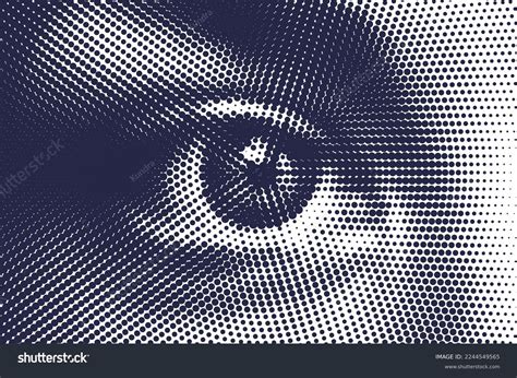
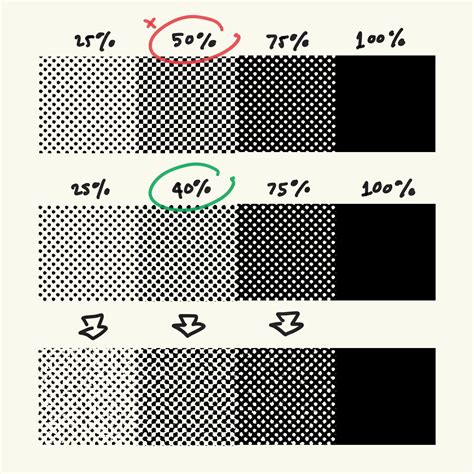
At its heart, a halftone is a visual illusion. It's not about individual dots being shades of black, but rather about how our eyes perceive clusters of uniformly colored dots of different sizes and densities. When these dots are placed close together, they trick our vision into seeing continuous tones and gradients, much like how a newspaper photograph is rendered. This principle is fundamental to understanding why the "Color Halftone" effect in Illustrator behaves as it does.
Step-by-Step Application of the Color Halftone Effect
The process of applying a halftone effect in Adobe Illustrator is remarkably straightforward, yet achieving a truly polished result often requires careful attention to detail. The key is to start with a vector graphic, as raster images will not allow for the seamless manipulation of gradients or the application of the effect in the desired manner.
Step 1: Prepare Your Vector Artwork
The foundation of any successful halftone effect is the artwork to which it will be applied. You have two primary options: either meticulously trace an existing image within Adobe Illustrator or create your shapes and illustrations from scratch. This initial artwork serves as the canvas for the halftone dots.
Step 2: Applying the Effect and Initial Settings
Once your vector graphic is ready, the next step is to select the specific shape or area where you wish to introduce the halftone effect. It's crucial that this selected element is filled with a solid color or, more advantageously, a gradient. If a solid color is used, the resulting dots will all be uniform in size, creating a consistent, almost seamless halftone pattern.
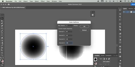
The "Color Halftone" effect is accessed through the Effect menu, typically found under "Pixelate." When you apply this effect, a dialog box will appear with several key settings to adjust. The "Max. Radius" parameter directly controls the maximum size of the dots, influencing the overall density and texture of the halftone. Simultaneously, the "Screen Angles (Degrees)" setting dictates the angle at which the halftone screens are set. These settings are particularly influential when working with gradients, as they determine how the dots are distributed to represent the color transitions.
Navigating the Nuances: Color, Gradients, and Limitations
A common point of confusion arises when users attempt to change the color of the halftone dots generated by the "Color Halftone" effect. The core issue lies in the nature of the effect itself. The dotted pattern produced is not a series of editable paths or shapes; it's a rasterized effect applied to the underlying vector. Consequently, directly altering the color of these dots is not possible through standard fill or stroke adjustments.
The "Color Halftone" effect in Adobe Illustrator functions most effectively when applied to grayscale imagery. While it is technically possible to apply it to other colors, the results are often unpredictable and can deviate significantly from the classic halftone aesthetic. This is because the effect is designed to simulate tonal variations using dot size and spacing, a principle that aligns best with grayscale values.
When a gradient fill is used as the basis for the halftone effect, the dots will vary in size and spacing, directly reflecting the gradient's tonal transitions. This is where the true power of the effect lies in simulating depth and form.
Advanced Techniques and Potential Pitfalls
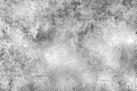
While the Color Halftone effect is a powerful tool, it's not without its limitations and potential challenges. One significant hurdle can arise if you attempt to vectorize the resulting halftone pattern using Illustrator's "Image Trace" feature. This process can sometimes distort the dots, leading to an uneven appearance, and may introduce unwanted shades, meaning not all dots will be of a consistent blackness. Furthermore, there's often a visible background color behind the dots, which can impact the overall composition.
To mitigate these issues and achieve a more controlled and professional outcome, consider the following:
- Work with Grayscale: As mentioned, applying the Color Halftone effect to a grayscale image generally yields the most predictable and desirable results. This allows the effect to accurately translate tonal variations into dot patterns.
- Vectorize with Caution: If vectorizing is a necessary step, experiment with different Image Trace settings to find the optimal balance that preserves the integrity of the halftone dots. Be prepared for some manual cleanup.
- Consider the Final Size: The effectiveness of the halftone effect can be influenced by the final output size and resolution of your artwork. Applying the effect when the artwork is already at its intended dimensions can help prevent unexpected scaling issues.
Alternative Approaches and Illustrator Assets
Beyond the built-in "Color Halftone" effect, Adobe Illustrator offers other avenues for incorporating halftone aesthetics into your designs.
Using Grayscale Palettes: For complex illustrations, creating a defined grayscale palette before applying the halftone effect can significantly improve control over the final look. This ensures that you are working with a consistent range of tones that the halftone effect can effectively translate. When shading, always keep the light source in mind to break down shapes logically and create depth.
Pre-made Swatches and Brushes: For those seeking to expedite the process or explore different stylistic variations, pre-made halftone swatches and brushes are readily available. These can provide a selection of ready-to-use halftone patterns and gradients, saving valuable design time.
External Resources for Halftone Effects: The design community offers a wealth of resources for achieving halftone effects in Illustrator. Platforms like Envato Elements provide access to extensive packs of halftone brushes, patterns, and vector assets. These often include:
- Vector Halftone Patterns: Collections of pre-designed halftone patterns, sometimes with specific themes like succulents or paper textures, offering ready-made elements for incorporation into projects.
- Halftone Textures: Packs containing various halftone textures that can be applied to artwork to impart a retro feel.
- Colored Halftone Patterns: Some resources offer halftone patterns in a variety of colors, moving beyond the traditional black and white.
- Seamless Halftone Patterns: These are designed to tile seamlessly, making them ideal for backgrounds or creating larger graphic elements.
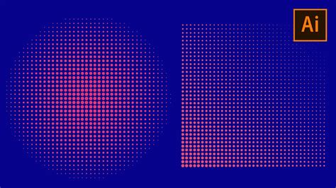
Creating Vector Halftones from Gradients
A particularly effective method for generating editable vector halftones involves a combination of gradients and the "Color Halftone" effect, followed by an expansion of the appearance. This technique allows for greater flexibility and control over the final vector output.
Step 1: Create a Gradient Rectangle
Begin by drawing a rectangle on your artboard. Fill this rectangle with a black and white gradient. The type of gradientâlinear, radial, or even a custom gradientâcan be chosen based on the desired outcome. This gradient will serve as the tonal reference for the halftone pattern.
Step 2: Apply the Color Halftone Effect
With the gradient-filled rectangle selected, navigate to Effect > Pixelate > Color Halftone. In the dialog box that appears, set all the values for "Max. Radius" and "Screen Angles" to a consistent number, such as 32. This value can be adjusted to control the density and scale of the resulting dots. Press "OK" to apply the effect.
Step 3: Expand the Appearance
The crucial step to convert the rasterized effect into editable vector paths is to "Expand Appearance." Select the object with the applied Color Halftone effect and go to Object > Expand Appearance. This action transforms the halftone dots into actual vector shapes, allowing for further manipulation, such as changing their color or applying other effects.
By following these steps, you can create truly vector-based halftone patterns in Adobe Illustrator, offering a high degree of creative control and ensuring scalability without loss of quality. This method is particularly useful for projects requiring precise control over the halftone elements, such as logo design or intricate graphic illustrations.
Create A Comic Style Logo with Illustrator
Fine-Tuning for the Perfect Halftone
Achieving the "perfect" halftone effect often involves a degree of experimentation and patient tweaking of settings. The ideal density of dots, their spacing, and their overall scale are subjective and depend heavily on the specific artwork and the desired aesthetic. Don't be discouraged if the initial result isn't exactly what you envisioned. Investing a little extra time in adjusting the "Max. Radius" and "Screen Angles" can significantly elevate the quality and impact of your grayscale artwork. The beauty of the halftone effect lies in its ability to add a distinctive retro charm and a unique textural quality to designs, making it a valuable technique in any graphic designer's toolkit. The vast array of resources available, from built-in Illustrator features to external asset packs, ensures that there are numerous ways to approach and master this timeless design style.
tags: #colour #halftone #illustrator