Colour separation is a fundamental technique, particularly in the realm of printing, that allows for the independent manipulation of colour information and image details. This process is crucial for achieving vibrant and accurate reproductions of photographic and coloured artwork. Adobe Photoshop plays an indispensable role in this workflow, enabling artists and designers to prepare their files for high-quality print output, especially for processes like CMYK screen printing. This tutorial will guide you through the essential steps of colour separation in Photoshop, from setting up your document to exporting your separated channels.
Preparing Your Document for Separation
The journey to effective colour separation begins with a well-prepared document. For professional printing, especially for screen printing, it is imperative to work with high-quality images.
Image Quality and Dimensions
You’ll need to be working on an A4 size document or larger. Import your chosen image, ensuring it is of high quality. We suggest using an image that is at least A5 size and, critically, set at 300dpi. Working at a lower resolution or with smaller dimensions may result in a significant lack of detail in your final printed output. If you find that the colours in your image appear a little muted, it would be worth increasing the saturation before proceeding.
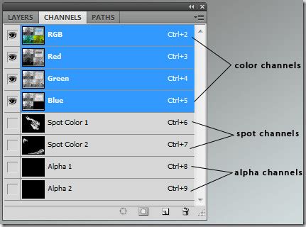
Understanding Channels
The 'Channels' panel in Photoshop is your key to colour separation. To begin the separation process, you need to access this panel, which is typically found on the right-hand side of the screen, though its exact position may vary depending on your version of Photoshop. Clicking on the 'Channels' panel will reveal the individual colour channels that make up your image. For a standard CMYK separation, you will see Cyan, Magenta, Yellow, and Black channels.
Separating Colour Channels
The core of colour separation involves isolating each colour channel into its own workspace. This allows you to treat each colour as a distinct element.
Isolating Individual Channels
To be able to work on each layer individually, we need to separate the channels. By clicking on each channel name (e.g., 'Cyan', 'Magenta', 'Yellow', 'Black'), you will open that specific colour channel into its own workspace. Each tab will have the initial of the colour channel in its title.
Preparing for Halftone Screening
Once you have your individual colour channels, you'll need to prepare them for the halftone screening process, which is essential for printing.
First, ensure your document mode is set to 'Grayscale' after any initial adjustments. Then, you will typically encounter a 'Bitmap' box or dialogue. Within this dialogue, it's crucial to set both your input and output resolution to 300dpi. The method should be set to 'Halftone Screen'. The general rule for setting your frequency (line screen) is to divide your mesh count by three. For example, if you are using a 90T (90 threads per inch) mesh, your frequency would be set to 30 lines per inch. We’ve selected 'Round' as our dot shape, but you could experiment with other shapes that are available to achieve different visual effects.
Important Note: After applying the halftone screening, you must change the mode from 'Bitmap' back to 'Grayscale' for each channel to maintain its suitability for further editing and printing.
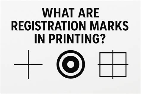
Adding Registration Marks for Precision Printing
Registration marks are vital for ensuring accurate alignment of each colour during the printing process. These marks act as guides, allowing the printer to perfectly overlay each separated colour.
Creating Registration Marks
We now want to add some registration marks to our channels. This will help during the printing process and ensure that each layer will line up correctly. Depending on the size of your image, you may need to increase your document size to accommodate these marks.
Using the Photoshop guides, find the centre of the image both vertically and horizontally. Do this by dragging from the ruler at the top and left-hand side of the artboard. (Press Ctrl-R to add rulers to your artboard if they're not already there). The guide line should snap to the centre when you drag it over.
Using the text tool, add a '+' sign on each side of the image at the centre point. You will need to create four separate text layers for these marks.
Merging and Duplicating Marks
Once you have placed your '+' signs, you may need to rasterize the text layers before merging them. Select all four text layers (hold Shift and click each one), then right-click and select 'Rasterize Type'. After rasterizing, merge these layers together.
Duplicate your merged registration marks layer onto each of the remaining colour channels. Ensure they are centred once they have been applied. To duplicate the layer, select it and right-click. Select 'Duplicate Layer' and choose the document (the specific colour channel) you want to duplicate it to. Repeat this for all remaining colour channels, ensuring accurate placement each time.
Finalizing and Saving Separated Files
With your colour channels separated and registration marks in place, the final steps involve consolidating and saving your files in a format suitable for printing.
Flattening the Image
Once you have added the registration marks to each of your layers, you’ll need to flatten the image. To do this, right-click on a layer within the Channels panel (after ensuring each channel is visible) and select ‘Flatten Image’. This combines all visible layers into a single layer for each channel.
Saving as PDF
Save each channel as a PDF file. It is highly recommended to title the files appropriately, for example, "Your Name/Project Title - Cyan.pdf", "Your Name/Project Title - Magenta.pdf", and so on. This clear naming convention is essential for the printing service to correctly identify and use each film.
If you do not have access to a professional printer, many services offer custom film positive printing and screen making. They can also split your image into CMYK for you if you prefer.
Advanced Colour Separation Techniques in Photoshop
Beyond the fundamental channel separation, Photoshop offers more advanced methods for colour manipulation and preparation, particularly when dealing with specific colour overlays and preparing for screen printing applications.
Layer Styles and Colour Overlay
When preparing artwork for screen printing, you might need to isolate specific colours or apply them with particular effects. One method involves duplicating your original layer. This ensures that the original remains untouched, providing a safety net for your work.
To separate a colour, you can use the Magic Wand tool. This tool allows you to select a specific colour within a defined area, with the 'tolerance' setting controlling the range of shades selected. Once a colour is selected, you can cut and copy it to a new layer using "New Layer via Copy" (Command+Shift+J on Mac, Control+Shift+J on Windows).
After isolating a colour to a new layer, you can apply a "Color Overlay" using Layer Styles. Double-click on the layer to open the "Layer Styles" window, navigate to "Color Overlay," and then click the colour box to select the desired ink colour from the Swatches panel.
To create a base layer that fills in gaps, you can apply a colour overlay to the original duplicate layer. Set the values of CMYK to 0, except for one specific colour that differs from the other separated colours.
Converting to Smart Objects and Blending Modes
For more flexibility and non-destructive editing, you can convert each colour layer to a Smart Object. This allows you to re-edit the layer's contents and effects at any time.
Once you have your colour layers prepared, selecting all four colour layers and setting their blend mode to 'Multiply' can be a crucial step in simulating the final printed output within Photoshop. This blend mode accurately represents how inks interact when layered on top of each other in the printing process.
Saving for Print Production
When saving your final files, especially for professional print services, selecting a preset like ‘High Quality Print’ is recommended. It is also important to untick ‘Preserve Photoshop Editing Capabilities’ to ensure the file is optimized for the printing process and to reduce file size where appropriate, without compromising the visual fidelity of the artwork.
CMYK Separation in Photoshop for Silkscreen
Frequency Separation for Retouching
While the above methods focus on preparing files for print, Photoshop's "Frequency Separation" technique offers a powerful way to retouch images, particularly portraits, by separating texture and colour information. This method allows for independent adjustments to fine details and broader tonal and colour variations.
The Concept of Frequency Separation
Frequency separation is a technique used to separate colour information from the other details of your image so you can adjust details and colours independently of one another. Usually, this results in a high-frequency layer and a low-frequency layer. High-frequency information typically refers to fine details within an image, such as hair, texture, pores, lines, and skin features. Conversely, low-frequency information encompasses the broader colour and tone variations.
With frequency separation, you can retouch either the high or the low frequency without affecting other areas. It's important to note that this technique doesn't apply any actual edits to your work directly but rather sets up layers for subsequent retouching.
Creating and Automating Frequency Separation
Using Photoshop's Actions feature, you can learn how to create frequency separation and automate this process, creating a reusable workflow.
Start: Select Window › Actions, and click 'Create New Action' in the sidebar that appears. Name your action descriptively (e.g., "Frequency Separation").
Layer it: With your image open, right-click the background layer and select 'Duplicate Layer'. Then, click the lock icon on your background layer to allow it to be modified. You will typically create at least two new layers above your original background: one for high frequencies (texture) and one for low frequencies (colour/tone).
Apply it (High Pass Filter Method):
- Select the layer intended for texture (high frequency).
- Go to
Image > Apply Image. - In the 'Apply Image' dialogue, choose the layer containing the colour and tone information (low frequency) in the 'Layer' dropdown.
- Set the 'Blending' to 'Subtract'.
- Set 'Scale' to 2 and 'Offset' to 0. This will create a texture-only layer.
Apply it (Gaussian Blur Method):
- Duplicate your original layer twice. Name one "Low Frequency" and the other "High Frequency."
- Select the "Low Frequency" layer. Go to
Filter > Blur > Gaussian Blur. Apply a blur that softens the details enough to remove sharp edges but retains the overall form and colour. The radius will depend on your image resolution, but a radius of around 5-10 pixels is a common starting point. - Select the "High Frequency" layer. Go to
Image > Apply Image. Choose the "Low Frequency" layer in the 'Layer' dropdown. Set the 'Blending' to 'Subtract'. Set 'Scale' to 2 and 'Offset' to 0. - Set the Blending Mode of the "High Frequency" layer to 'Linear Light'. This combines the texture and colour information back together while keeping them on separate layers.
Replay it: Congratulations, you’ve set up your two layers for retouching. You’ve cracked the seal on the basics of photo retouching. You’ll have a layer for making adjustments to wrinkles, skin, and other fine details (the high-frequency layer), and another for making adjustments to shadow and colour (the low-frequency layer). This setup allows for precise retouching without compromising the integrity of either detail or colour.
By mastering both print-focused colour separation and image retouching techniques like frequency separation, you gain significant control over your visual assets within Photoshop, leading to professional and polished results.
tags: #colour #separation #in #photoshop