Inkscape, a powerful and versatile open-source vector graphics editor, offers a multitude of ways to enhance and stylize your designs. Among its many capabilities, the ability to curve text to fit specific shapes is a highly sought-after skill, allowing for dynamic and visually engaging typography. This tutorial will delve into the various techniques for achieving curved text effects in Inkscape, from simple arcs to more complex deformations, ensuring your text flows seamlessly with your creative vision. We will explore methods that cater to both beginners seeking straightforward solutions and advanced users looking for intricate control over letterforms.
Understanding the Fundamentals: Arched vs. Curved Text
Before diving into the practical steps, it's crucial to distinguish between two common text manipulation effects: "arched text" and "curved text." While often used interchangeably, they represent distinct visual outcomes.
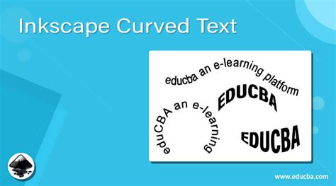
Arched text typically refers to text that follows a simple, often symmetrical, arc. Imagine text arranged along the top or bottom of a circle or ellipse. The primary characteristic is a uniform curvature across the entire text block. This is the most common interpretation when users initially seek to "curve text."
Curved text, in a broader sense, encompasses any text that deviates from a straight baseline. This can include arches, but also more organic, freeform curves, or even text that follows the contours of a complex shape. The key difference lies in the potential for non-uniformity and greater artistic freedom.
The distinction is important because different Inkscape tools and techniques are better suited for each. For instance, a simple arc might be achieved with a basic "put on path" command, while more nuanced curves might require advanced path effects or manual node editing. Understanding this difference will help you select the most appropriate method for your specific design goal.
Method 1: The Classic Arc - Text on a Path
The most intuitive and widely used method for curving text in Inkscape involves placing text directly onto a path, typically a circle or ellipse. This technique is excellent for creating symmetrical, circular, or elliptical text arrangements.
Step 1: Prepare Your Canvas and Elements
Begin by opening Inkscape and creating a new document. For this tutorial, we'll use the "Top Knot" font, but feel free to experiment with any font installed on your system.
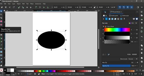
First, we need to create the shape that will guide our text. On the left-side panel, select the Create Circles, Ellipses and Arcs tool. To draw a perfect circle, hold down the Ctrl key while clicking and dragging. For an ellipse, simply click and drag without holding Ctrl. The size and aspect ratio of your ellipse will determine the arc of your text. You can adjust the ellipse's dimensions using the selection arrows at its corners or edges.
Next, select the Create and edit text objects tool (the 'A' symbol) from the left-side panel. Click anywhere on your canvas and type out your desired text. While still in text edit mode, you can select your preferred font from the Font Family dropdown menu at the top of the screen. It's advisable to resize your text so it's in proportion to the ellipse you've drawn.
Step 2: Aligning Text to the Ellipse
Now, it's time to position your text along the drawn ellipse. Create a selection box that encompasses both your text object and the ellipse. Navigate to the top menu and click on Text, then select Put on Path.
At this stage, your text will follow the shape of the ellipse. However, it will likely appear upside down. This is a common occurrence and easily rectifiable in the next step.
Step 3: Adjusting Text Orientation
With both the ellipse and the text still selected, click once more on the combined object. This action will reveal the rotation handles around the bounding box. Grab the top-right rotation handle and drag it around to the left side. This action will flip the text, orienting it correctly along the upper curve of the ellipse.
Step 4: Refining the Arc
The shape of the ellipse directly influences how the text sits on the arch. To adjust the curvature of the text, you need to modify the ellipse itself. Select the ellipse by clicking on it. Using the size adjustment arrows at the corners and sides, resize the ellipse. Making the ellipse smaller will generally create a tighter arc, while a larger ellipse will result in a more subtle curve. Continue resizing and repositioning until you are satisfied with the text's arch.
Step 5: Finalizing the Text Object - Object to Path
To ensure your curved text retains its shape permanently and can be further manipulated as a graphic element, it needs to be converted into a path. If you were to delete the ellipse without this conversion, any edits to the text's shape would be lost.
Select your text object. Go to the top menu, click on Path, and then choose Object to Path. Once converted, the text is no longer editable as standard text; its individual letters are now vector paths. This means you can no longer change the font or edit the words directly. However, you gain the freedom to manipulate each letter independently.
To do this, select the converted text object, right-click on it, and choose Ungroup. This will separate each letter into its own path object, allowing you to move, resize, or even reshape individual letters.
Finally, to treat the entire text block as a single entity again, select all the individual letters. Go back to the Path menu and select Union. This merges all the letter paths into one continuous path object. You can then easily change the color of your text using the color palette at the bottom of the screen. For added flair, you can even experiment with applying gradients to your newly formed path object.
A Better Way To Place Text On A Circle In Inkscape
Method 2: Advanced Control with Path Effects - The Bend Path Effect
While the "text on path" method is excellent for symmetrical curves, it offers limited control over the individual letters once applied. For more intricate bending and a higher degree of manipulation over each character's form, Inkscape's Path Effects offer a powerful alternative. This method allows you to bend text using a visual guide, providing fine-grained control.
Step 1: Input Your Text
Begin by selecting the Create and edit text objects tool (T) and typing your desired text onto the canvas. Ensure the text is exactly as you want it, as this is your last chance to edit the words themselves. You can adjust the font, size, and color using the top settings bar or the Fill and Stroke panel. Double-check for any typos.
Step 2: Convert to Path
Before applying path effects, it's essential to convert your text object into a path. Select your text, then go to Path > Object to Path in the top menu. This transforms the editable text into a series of vector paths, much like in the previous method.
Step 3: Applying the Bend Path Effect
With your text converted to a path and still selected, navigate to the Path Effects panel. If this panel isn't visible, you can open it via Path > Path Effects.
In the Path Effects panel, under the "Apply new effect" dropdown menu, locate and select BEND PATH. Once applied, you'll notice a set of controls appear below the dropdown. Crucially, ensure that the "Edit on canvas" icon (often depicted as a node with arrows) is selected. This allows you to manipulate the effect directly on your canvas.
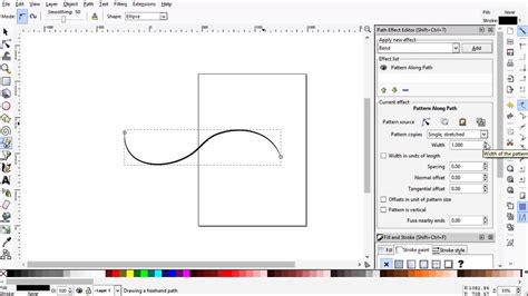
Step 4: Manipulating the Bend
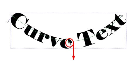
After applying the "BEND PATH" effect, you will see a visual guide - typically a straight green line running through your text, with nodes at its ends and potentially in the middle. This line represents the path along which your text will be bent.
To create the curve, click and drag the node in the middle of the green line. As you drag this node, your text will follow its movement, bending and curving accordingly. You can drag this node up, down, left, or right to achieve various curved shapes. Experiment with different movements to see how the text deforms.
The nodes at the ends of the green line can also be manipulated to adjust the start and end points of the bend, offering further control over the overall shape. You can even add intermediate nodes to create more complex, multi-segmented curves.
Step 5: Refining and Finalizing
Once you have achieved the desired curve, you can click off your text onto a blank area of the canvas to see the final result. The "BEND PATH" effect modifies the existing path of your text.
It's important to remember that after converting text to a path and applying effects like "BEND PATH," the text becomes a graphic object and is no longer editable as text. You cannot change the words or font directly. Therefore, it is highly recommended to duplicate your original text object before converting it to a path and applying effects. This preserves a live text version that you can revert to if you need to make changes to the wording or font later.
Beyond the Basics: Advanced Considerations and Tips
While the methods outlined above cover the most common scenarios for curving text, several advanced considerations can further enhance your workflow and results.
Font Choice and Node Editing
The type of font you use can significantly impact how well it curves. Fonts with sharp, geometric shapes or very simple curves often respond better to basic path manipulation. Fonts with complex, organic curves and serifs, such as Cooper Black, can present challenges. In such cases, extensive node editing might be necessary after converting the text to a path.
Node editing involves directly manipulating the anchor points (nodes) that define the vector paths of your letters. While powerful, it can be time-consuming, especially with intricate fonts. For very precise curves on complex fonts, this manual approach might be the only way to achieve a perfect result, though it requires a good understanding of Bezier curves and path manipulation.
Managing Font Files in Inkscape
A common point of confusion for some users relates to how Inkscape handles fonts. Unlike some other applications, Inkscape doesn't typically manage its own font index separate from your operating system. When you install a font on your PC, Inkscape, like most other programs, can access it. However, issues can arise with font management, particularly when deleting fonts.
If you encounter problems with certain fonts appearing "grayed out" or not being deletable through standard means, it might be due to how the font file is registered with the system. In such rare cases, specialized file management tools that can access system-level or hidden files might be required to fully remove problematic font installations. However, for most users, standard font installation and management through your operating system's font viewer are sufficient. Inkscape itself does not automatically delete font files you've removed from your system.
Organizing Complex Designs
For intricate designs involving multiple curved text elements or flowcharts, it's often beneficial to maintain separate files for reusable components. For example, you might create a master file for common flowchart shapes and connectors. You can then duplicate these elements into individual project drawings as needed. This approach offers greater flexibility and simplifies file management, preventing clutter and ensuring consistency across your designs.
Experimenting with Gradients and Effects
Once your text is curved and converted to a path, it becomes a standard vector object. This opens up a world of possibilities for further styling. You can apply complex gradients, patterns, textures, and even use Inkscape's filter effects to create unique visual styles. Don't hesitate to experiment with different color combinations, gradient types (linear, radial), and transparency settings to make your curved text truly stand out.
By mastering these techniques, you can elevate your Inkscape designs by incorporating sophisticated and visually appealing curved text effects, transforming ordinary words into integral elements of your artwork.