Dark blue, a color that evokes a sense of depth, stability, and authority, holds a significant place in both the digital and print realms of design. Its hexadecimal representation, #00008B, offers a gateway into understanding its composition across different color models. While familiar in the RGB (Red, Green, Blue) space, its translation into the CMYK (Cyan, Magenta, Yellow, Black) model is crucial for achieving accurate color reproduction in print. This article delves into the specific CMYK values of dark blue, exploring its characteristics, historical significance, and practical applications in design.
The Foundation of Dark Blue: RGB and CMYK
In the RGB color space, which is additive and relies on light to create color, the hex code #00008B translates to a precise composition. It is formed by 0% red, 0% green, and 54.5% blue. This dominance of blue, with no contribution from red or green, is what gives the color its characteristic deep, cool tone. The RGB value for this specific shade of dark blue is R:0, G:0, B:139.
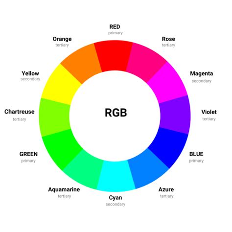
When transitioning to the CMYK color space, which is subtractive and used for printing with inks, the composition shifts dramatically. For hex #00008B, the CMYK values are reported as 100% cyan, 100% magenta, 0% yellow, and 45.5% black. This means that to achieve this specific dark blue in print, a significant amount of cyan and magenta ink is required, with a substantial overlay of black ink to deepen the shade. A slightly different interpretation of the CMYK values for #00008B is C:1, M:1, Y:0, K:0.45, indicating a near-complete saturation of cyan and magenta, with no yellow and approximately 45% black. This discrepancy highlights the nuances in color conversion between different systems and software.
The color #00008B can be conceptually understood as a blend of a pure, vibrant blue like #0000FF (which is 100% blue in RGB) and a very dark, almost black blue like #000017. This conceptual blending helps in visualizing how the pure blue is deepened to achieve the specific shade of dark blue.
Understanding Color Models: RGB vs. CMYK
The fundamental difference between RGB and CMYK lies in their operational principles. RGB is designed for digital displays where colors are created by emitting light. Combining red, green, and blue light in various intensities produces the spectrum of colors visible on screens. Conversely, CMYK is used in printing, where inks are applied to a substrate, and color is produced by subtracting light. White paper reflects all light, and the inks absorb certain wavelengths. Cyan absorbs red, magenta absorbs green, and yellow absorbs blue. Black ink is added to deepen shadows and create richer tones, as combining the three process inks often results in a muddy brown rather than a true black.
The conversion from RGB to CMYK is not always straightforward, as the two models have different gamuts (the range of colors they can reproduce). A color that appears vibrant on a screen might be impossible to achieve precisely in print, and vice versa. Therefore, understanding the CMYK values for a specific color like dark blue is essential for designers and printers to ensure consistency and accuracy in the final printed product.
What Is The Difference Between RGB and CMYK? Color Models and Print
The Hue, Saturation, and Lightness of Dark Blue
Beyond its CMYK and RGB breakdown, #00008B can be described using other color parameters. It possesses a hue angle of 240 degrees, placing it firmly within the blue spectrum on a standard color wheel. Its saturation is 100%, indicating that it is a pure, unadulterated blue with no graying or desaturation. However, its lightness is relatively low at 27.3%, which is why it is perceived as a dark shade. Lightness refers to how close the color is to white or black. A low lightness value signifies a dark color, while a high value indicates a light color.
Shades, Tints, and Tones
To further understand how variations of blue are created, it's important to define shades, tints, and tones:
- Shade: A shade is achieved by adding black to a pure hue. This darkens the color, increasing its depth and intensity, much like how black is added to pure blue to create dark blue from a lighter blue.
- Tint: A tint is created by mixing white with a pure color. This lightens the color, making it paler and more delicate. For example, adding white to blue creates various shades of light blue or sky blue.
- Tone: A tone is produced by adding gray to a pure hue. Gray is a neutral color, and adding it desaturates the hue, making it more muted and less vibrant. This can create sophisticated, subdued versions of a color.
The Psychology and Symbolism of Blue
Blue, in its myriad forms, is a color deeply embedded in human perception and cultural symbolism. It is universally associated with feelings of calmness, tranquility, and serenity, often reflecting the vastness of the sky and the depth of the ocean. This calming effect makes blue a popular choice for environments where relaxation and peace are desired, such as hospitals, spas, and bedrooms.

In design, blue is frequently used to convey a sense of trust, stability, confidence, and professionalism. This is why it's a common choice for corporate branding, financial institutions, and technology companies that aim to project reliability and security. The color blue can also promote a sense of focus and productivity, making it suitable for workspace designs. Tools and platforms like Zoom and Smartsheet leverage shades of blue to foster concentration and efficiency.
Furthermore, blue can be employed to establish a visual hierarchy within a design. Different shades of blue can be used to differentiate elements, with lighter blues drawing attention to prominent features like buttons and headers, while darker blues can recede into the background.
However, the meaning of colors, including blue, is not static and can vary significantly across cultures and historical periods. While Western cultures often associate blue with calmness and trust, ancient Greeks viewed it as a color of the gods and heavens. In some indigenous cultures of the United States, blue symbolizes wisdom, spirituality, and healing. It is crucial for designers working with a global audience to research and understand these cultural nuances to avoid unintended interpretations.
Historical Significance of Blue
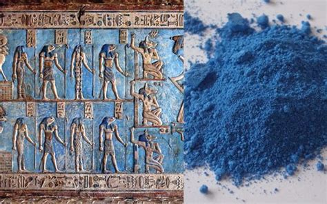
The journey of blue through history is a testament to its enduring appeal and the ingenuity of human civilization. The origin of the color name "blue" can be traced back to the Old French word "bleu," which itself derives from the Proto-Indo-European root "bhel," meaning "to shine."
During prehistoric times, ancient civilizations sought ways to capture this luminous hue. They utilized natural pigments derived from minerals like lapis lazuli and azurite. The ancient Egyptians were particularly enamored with blue, considering it a divine color. Their innovation led to the creation of "Egyptian blue," a synthetic pigment synthesized from silica, lime, copper, and alkali. This remarkably stable pigment was widely used in Egyptian art, jewelry, cosmetics, and even as a decorative element on structures like pyramids.
The ancient Greeks also appreciated blue, incorporating it into their art and architecture. Throughout the Middle Ages and the Renaissance, blue gained an association with royalty and nobility. The rarity and high cost of blue pigments, particularly those derived from lapis lazuli, made them more valuable than precious metals like gold, restricting their use to the elite.
The Industrial Revolution marked a turning point, with chemists discovering methods to produce synthetic blue pigments. This breakthrough made blue more accessible and affordable, democratizing its use across various applications and solidifying its place in the broader spectrum of color.
Practical Applications and Color Combinations
Dark blue, with its hex code #00008B, is a versatile color that can be integrated into a wide range of design projects. Its deep, sophisticated tone lends itself well to applications requiring a sense of authority, elegance, and seriousness.
Complementary and Analogous Colors
Understanding color harmonies is key to creating visually appealing designs. For dark blue:
- Complementary Color: The direct complement of blue is orange. The combination of dark blue and orange creates a high-contrast, dynamic pairing that can be very impactful. This combination is often seen in sports team branding and by famous brands seeking to make a bold statement.
- Analogous Colors: Colors that are adjacent to blue on the color wheel, such as blue-green and blue-violet, create harmonious and pleasing combinations. These palettes tend to be calming and cohesive.
Harmonizing with Dark Blue
When seeking to complement dark blue in a design, several color families can be considered:
- Neutrals: Utilizing neutral tones such as white, gray, or beige alongside dark blue allows the blue to remain the primary focus while providing a sense of balance and sophistication. Beige, for instance, offers a warm contrast that can make dark blue stand out without competing.
- Warm Tones: While blue is a cool color, pairing it with select warm tones can create interesting and inviting compositions. Peach, for example, can introduce a sense of comfort and warmth that contrasts pleasantly with the coolness of dark blue.
- Other Blues and Greens: Exploring variations within the blue family or venturing into blue-green hues can create monochromatic or analogous palettes. Slate blue (#5B7C99) offers a muted, professional alternative, while powder blue (#B6D0E2) provides a more delicate, calming shade. Cerulean (#2A52BE) introduces a touch more vibrancy, akin to a sunny sky, yet remains suitable for professional contexts. Turquoise (#40E0D0), while leaning towards green, retains the relaxed and subdued qualities associated with blue.
- Accents: For a brighter, more energetic feel, yellow can be used as an accent color to inject life and vibrancy into blue designs. Silver, with its cool undertones, can add an air of elegance when used sparingly as an accent. Mustard offers a less vibrant but still impactful pop of color compared to classic yellow.
Colors to Use with Caution
While dark blue is highly adaptable, certain color combinations can be challenging and require careful balance:
- Red: Red, especially in its more vibrant forms like #FF2C2C, can be overwhelming when paired with blue. If not expertly balanced, the combination can appear jarring or aggressive.
- Brown: Although brown might seem like a natural pairing due to its earthiness, its warm tones can sometimes clash with the inherent coolness of blue, leading to an unharmonious effect.
- Highly Saturated Greens: Lime green (#89F336) and other intensely saturated greens can clash with blue, particularly in large design areas, creating visual discord. Mint green (#ADEBB3) can also be overpowering when mixed with blue.
- Gold: While gold can add a touch of luxury, it can clash with blue if not used judiciously as an accent. The specific shade of gold and blue, as well as the proportion in which they are used, will determine the success of the pairing.
Accessibility and Dark Blue
In the realm of User Experience (UX) and User Interface (UI) design, accessibility is paramount. Color choices significantly impact how users interact with digital products, especially those with visual impairments. Plugins are available for design tools like Figma to help ensure that color combinations meet Web Content Accessibility Guidelines (WCAG). These guidelines often focus on contrast ratios between text and background colors to ensure readability.
For instance, text in #0000FF (a pure blue) on a #FFFFFF (white) background generally passes accessibility checks for large text and normal text. However, a contrast checker would reveal that #0000FF text on a #FFFFFF background has a contrast ratio of 2.44:1, which is insufficient for normal text according to WCAG AA standards. This emphasizes the need to carefully select color pairings, especially when dark blue or other deep hues are used for text or critical interface elements. Understanding how colors are perceived by individuals with color vision deficiencies is also an important consideration.
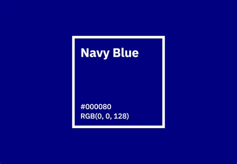
Dark Blue vs. Navy Blue
Dark blue (#00008B) and navy blue (#000080) are often confused due to their close relationship and similar deep, dark tones. While both are dark shades of blue, there are subtle distinctions. Dark blue, as represented by #00008B, can be perceived as slightly richer and perhaps a touch more vibrant than navy blue, which is typically a more muted and deeply saturated dark blue. On the color wheel, dark blue is often positioned to represent elegance, authority, and intelligence. While dark blue can be seen as serious, and in some cultures, like Korea, it is the color of mourning, its versatility as a shade of a primary color allows it to integrate well into most design projects.
Conclusion
The CMYK values of dark blue, specifically #00008B, are 100% cyan, 100% magenta, 0% yellow, and 45.5% black (or C:1, M:1, Y:0, K:0.45). These values are critical for achieving accurate color reproduction in print. Beyond its technical specifications, dark blue carries a rich tapestry of psychological associations, historical significance, and practical design applications. Its ability to evoke calmness, trust, and authority, coupled with its aesthetic versatility, makes it a perennial favorite in the designer's palette. By understanding its composition, symbolism, and harmonious pairings, designers can effectively leverage the profound impact of dark blue in their creative endeavors.