The drop shadow effect in Adobe InDesign is a powerful tool for adding depth, dimension, and visual interest to your text and objects. While seemingly straightforward, users can encounter specific challenges and visual glitches, particularly when dealing with complex documents or when the effect doesn't update as expected. This article delves into the intricacies of applying and managing drop shadows, addressing common pitfalls and offering practical solutions to ensure your designs achieve the desired professional polish.
Understanding the Fundamentals of Drop Shadows
A drop shadow fundamentally adds dimension by casting what appears to be the shadow of an object. In InDesign, this effect can be applied to virtually any element, including text frames, individual text characters, and imported graphics. The primary purpose is to lift an element from the background, creating a sense of separation and depth that can enhance readability and aesthetic appeal.
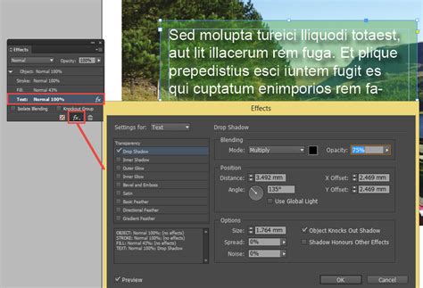
To apply a drop shadow, you typically navigate to the Effects panel (Window > Effects). From there, you can select "Drop Shadow" and customize various parameters such as opacity, color, offset, angle, distance, spread, and size. These settings allow for a wide range of shadow appearances, from subtle, barely perceptible hints of depth to dramatic, stylized shadows that become a design element in themselves.
Applying Drop Shadows to Text Frames and Content
When working with text, it's crucial to understand what element the drop shadow is being applied to. You can apply a drop shadow to an entire text frame, or to specific text within that frame.
If you find that a drop shadow is being applied "everywhere," it's likely that the effect has been applied to a parent object, such as the text frame itself, rather than the specific text content. To rectify this, ensure you select the entire text frame and then remove the drop shadow if it's not intended for the frame. Conversely, if you wish to apply it to the text, select the text content itself before accessing the Effects panel.
Applying a drop shadow directly to a table within InDesign can work effectively and, as some users have noted, "it does not interfere with colors on the page." This suggests that the effect is contained within the table structure itself, without bleeding into other elements. However, if you encounter issues, consider the layer structure of your document. Ensuring the table is on the appropriate layer, whether it's the same layer or a layer beneath other elements, can prevent unexpected interactions.
Navigating Visual Glitches with Drop Shadows
InDesign, like any complex software, can suffer from an assortment of visual glitches. These can range from disappearing text to objects not appearing where they are expected on the page. While many of these are limited to specific combinations of hardware and operating system, one particularly aggravating visual bug affects users on all platforms: how a drop shadow applied to text will not update when the text is edited.
For instance, if you have a multi-line text with a drop shadow applied, and you delete a line of text, the shadow might remain in its original position, no longer accurately reflecting the text's boundaries. This can be incredibly frustrating, especially when the visual representation on screen doesn't match the actual output.

This glitch is primarily a screen artifact. Fortunately, if you export your document to a format like PDF, the drop shadow will typically render correctly in the final output. However, the discrepancy during the design process can be highly disruptive. This particular bug has been described on user feedback sites for years, with users hoping for an official fix that has yet to materialize.
Forcing Drop Shadow Updates: Practical Workarounds
Given the persistence of this visual glitch, several workarounds have been developed to force the drop shadow to update on screen. While not ideal, these methods can help you visualize your design accurately during the editing process.
One common method involves selecting the text frame with the Selection tool, cutting it (Edit > Cut), and then choosing Edit > Paste in Place. This action essentially re-creates the object on the same layer and position, often forcing InDesign to redraw the element and update the associated effects, including the drop shadow. However, this is not always ideal as it can potentially alter the stacking order of objects within your layout, and it becomes more cumbersome if the text frame is grouped with other elements. Nevertheless, it seems to consistently work for updating the shadow.
Another effective technique is to toggle between InDesign's display modes. Switching between "Typical Display" and "High Quality Display," accessible via the View menu, can prompt a screen redraw that updates the text shadows. These commands conveniently have built-in keyboard shortcuts: Command+Option+Z (macOS) for Typical Display and Command+Option+Ctrl+H (macOS) for High Quality Display.
My preferred method, and one that doesn't inherently affect anything else in your layout, is to toggle "View > Proof Colors" on and off. This action forces a screen refresh without altering object positions or stacking. To make this process even faster, you can assign a custom keyboard shortcut to this command, allowing for near-instantaneous updates. The fact that the problem doesn't appear in output made me think of this one. I also considered that turning Overprint Preview on and off would do the same thing, but alas, it doesn't.
How to troubleshoot for Adobe InDesign crash issues
If you have discovered any other reliable methods to make text drop shadows update 100% of the time on screen, sharing them can benefit the wider InDesign community.
Integrating Graphics and Text with Drop Shadows
When your document doesn't already contain a graphic, you can easily import one using InDesign's "Place" function. Navigate to File > Place in the InDesign Control panel, locate the desired file, and double-click its name. Your cursor will transform into a loaded icon. Move this cursor to the intended location or frame on your page and click to place the graphic. You can then adjust its size proportionally by selecting it with the Selection tool and dragging a handle while holding down the Control and Shift keys.
Similarly, if your document requires new text, you can create a text frame using the Text tool from the Tools palette. Once the text frame is established, select the Text tool again, click within the frame, and begin typing. If your text already exists in a word processing document, you can import it using the same File > Place command.
The interplay between graphics, text, and drop shadows is where the visual impact is truly realized. A well-placed drop shadow can make a headline pop, separate a quote from the main body of text, or give a logo a professional lift. However, it's essential to maintain consistency. Applying drop shadows haphazardly can lead to a cluttered and unprofessional design. Consider the overall aesthetic and the hierarchy of information when deciding where and how to use this effect.
Advanced Considerations and Best Practices
Beyond the basic application and troubleshooting, several advanced considerations can elevate your use of drop shadows.
Layer Management and Stacking Order
As mentioned earlier, layer management is critical. Ensure that elements with drop shadows are on appropriate layers. If a drop shadow on a foreground object appears to be interacting negatively with an object beneath it, it might be necessary to adjust the layer order or the drop shadow's parameters (like distance and opacity) to create a cleaner separation. The "Paste in Place" method, while useful for updating, can disrupt stacking, so always double-check the layer order after using it.
Color and Opacity
The color of a drop shadow doesn't have to be black. Using a color that is slightly darker than the background or a muted version of the object's color can create a more sophisticated and integrated shadow. Similarly, adjusting the opacity is key to achieving a natural look. A shadow that is too opaque can look artificial and heavy. Experiment with different opacity levels to find what best suits your design.
Consistency Across Documents
If you frequently use specific drop shadow settings, consider saving them as part of an InDesign library or creating a custom paragraph or character style that includes the drop shadow effect. This ensures consistency across multiple pages or even different projects, saving time and maintaining a cohesive visual identity.
Performance Considerations
While InDesign is a powerful tool, applying numerous complex drop shadows, especially with high opacity and large blur values, can sometimes impact performance, particularly on older or less powerful machines. If you notice significant slowdowns, it might be worth reviewing the number and complexity of the drop shadows you are using. Toggling display modes or using the "Paste in Place" workaround can sometimes help alleviate performance issues by forcing a redraw.
Accessibility
While drop shadows enhance visual appeal, consider their impact on accessibility. For users with certain visual impairments, overly strong or complex shadows could potentially interfere with text readability. Always test your designs with accessibility in mind, ensuring that text remains clear and legible against its background, even with added effects.
By understanding the nuances of the drop shadow effect in InDesign, from its fundamental application to troubleshooting common glitches and implementing best practices, designers can effectively leverage this tool to create visually compelling and professional layouts. The key lies in careful application, consistent usage, and a willingness to employ workarounds when faced with software quirks, ultimately ensuring that the intended design vision is realized in the final output.