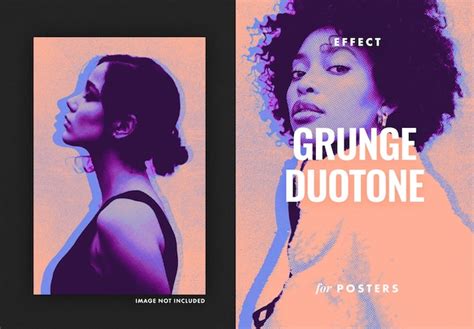
The duotone effect, a striking visual technique that transforms ordinary images into captivating works of art using just two colors, has become a ubiquitous presence in contemporary design. Whether gracing the avatar of your favorite band or the profile picture of a friend, its appeal is undeniable. This effect, at its core, is an image composed of two distinct colors, offering a unique aesthetic that enhances visual impact and strengthens brand identity. Historically, duotone design traces its roots back to the printing industry, where it was initially employed to reproduce photographs using only two ink colors. The evolution of duotone design has significantly expanded its possibilities, unleashing a world of creative potential across various mediums.
Understanding the Duotone Concept
At its fundamental level, a duotone is simply an image created using two colors. In the realm of design, duotone creates a unique visual appeal by altering the original image's color tones and combining two different colors to evoke distinct atmospheres. This technique is particularly effective when aiming for a graphic and eye-catching result, making it ideal for images intended for banners, advertisements, or posters. Duotone coloring is a popular style that involves simplifying the colors in an image down to only two hues; one hue present in the highlights, and another in the shadows. This approach can reshape the color relationships of an image or graphic, providing a new visual experience and attracting the viewer's attention. The popularity of this trend has surged, especially among agencies and smaller brands seeking to establish a strong visual identity.
Strategic Image Selection for Duotone
While technically the duotone effect can be applied to any photograph, its visual impact is significantly amplified when used on simple images with high contrast. If you're interested in trying out this technique, strategic photo selection is paramount. When setting the scene for custom photography intended for duotone manipulation, consider the inherent contrast. Images that already possess strong light and shadow differentiation will naturally lend themselves better to the duotone treatment, requiring less aggressive manipulation to achieve a compelling result.
Method 1: Gradient Map Adjustment Layer (The Modern Approach)
One of the most accessible and effective methods for creating a duotone effect in Photoshop involves utilizing a Gradient Map Adjustment Layer. This approach allows for a dynamic and non-destructive workflow, offering ample room for experimentation.
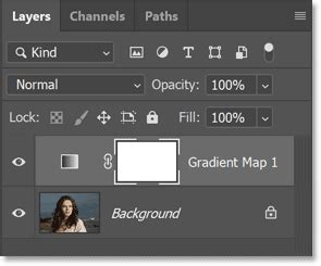
To begin, open your chosen image in Photoshop and create a new Gradient Map adjustment layer. The Properties panel will automatically appear, displaying the Gradient Map settings. Within this panel, you will find a small thumbnail of the gradient, accompanied by an icon resembling a gradient bar. Clicking on this gradient bar will open the Gradient Editor in a new window.
The Gradient Editor presents a range of preset gradients. However, to achieve a true duotone, you'll typically need to create a custom gradient. This preset has two color stops by default, representing the colors that will map to the image's tonal range. You can shift these color stops and the Color Midpoint (the central diamond) to add more range and control over your image’s color spectrum. To change the color of a stop point, simply click on it, and a color picker will emerge. Here, you can select a desired color from the spectrum or input specific color values for precise customization. You can also add additional stop points to the gradient by clicking anywhere on the gradient bar, allowing for more complex color transitions if desired. To adjust the position of a stop point, click and drag it along the gradient bar. Above the gradient bar, you'll find the Opacity Stops, which influence the transparency of the gradient colors. Once you are satisfied with the gradient settings, click the "OK" button to apply the changes and return to the Properties panel.
Erica Larson, an Associate Creative Director on the Adobe Studio team, emphasizes the effectiveness of the Gradient Map Adjustment Layer, noting that different Presets in the Properties panel can dramatically alter the image. She also advises shifting the color stops and the Color Midpoint to expand the image’s color spectrum.
Method 2: Duotone Mode (The Classic Technique)
For those seeking a more traditional approach, Photoshop's built-in Duotone Mode offers a direct, albeit sometimes less intuitive, method for applying the effect.
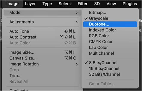
Begin by opening your image in Photoshop and converting it to Grayscale. Navigate to Image > Mode > Grayscale. When you select this option, a couple of notifications will appear. The first may inquire about discarding color information; confirm this action. The second notification might address how color changes could affect other layers. In this scenario, it's generally safe to proceed without flattening the image, unless you have a complex layer structure where preserving work is critical. Once your image mode is set to 8-bit grayscale, you can then proceed to Image > Mode > Duotone.
After selecting Duotone Mode, a new dialog box will appear, presenting the Duotone Options. Here, you'll see a preview of your image alongside various settings. To initiate the duotone effect, click on the color swatch next to the "Type" dropdown menu. This action opens the Color Picker window, where you can select your primary duotone color. Beyond that, the process can become slightly more involved. While you can technically adjust the curves for each color to fine-tune the tonal mapping, the image doesn't update in real-time, making it challenging to visualize the results and often leading to a lot of trial and error. It is suggested to play around with these settings to gain a feel for their impact.
Method 3: Using Photoshop Actions (The Expedited Route)
For users who prefer a streamlined workflow or wish to explore a variety of pre-designed duotone schemes quickly, Photoshop Actions provide an excellent solution.
To utilize this method, you'll first need to download a Photoshop action designed for duotone effects, such as the "Flywheel - Duotoner" action mentioned. Once downloaded, open the image you intend to transform in Photoshop and then open the Actions window (Window > Actions). Within the Actions panel, locate and click on the dropdown menu for the "Flywheel - Duotoner" folder. You will then see a collection of pre-made duotone layers, each offering a different color scheme. To apply a specific duotone, simply make the desired layer visible by clicking on its eye icon. It's important to note that if multiple duotone layers are visible simultaneously, their colors will blend, potentially obscuring image details.

Method 4: Solid Color Fill Layers with Blending Modes (The Flexible Technique)
This method offers a high degree of flexibility and control without altering the original image's mode. For this approach, you won't need to convert your image to Grayscale or Duotone mode.
Open your image in Photoshop. Create a new Solid Color Fill Layer by navigating to Layer > New Fill Layer > Solid Color. Click "OK," which will open the Color Picker. Choose your first color and click "OK." Now, set the blending mode of this new layer to "Screen." This will make the color interact with the underlying image.
Next, duplicate your original image layer. On this duplicated layer, create another Solid Color Fill Layer, this time choosing your second duotone color. Set the blending mode of this second layer to "Multiply." By adjusting the opacity of both color layers, you can precisely fine-tune the resulting duotone effect, achieving a balanced and visually appealing outcome.
FASTEST SPLIT TONING method EVER in PHOTOSHOP [using solid color fill layers?]
Advanced Considerations and Creative Exploration
Leveraging Channels for Precise Selections
Channels are an often-underestimated tool within Photoshop, capable of making ultra-detailed selections that are invaluable for advanced coloring techniques, including duotone effects. You can find the Channels tab next to the Layers tab in the Layers Panel. Clicking on the Channels tab reveals a list of all available color channels in your document. For an RGB document, this includes the composite RGB channel and individual Red, Green, and Blue channels. Viewing each channel individually presents a black and white representation of how much of that specific color is present in the image; lighter areas indicate a higher concentration of that color, while darker areas show less.
For instance, in an image of a blue sky over a wheat field, the Blue Channel would display the sky as nearly pure white and the ground as a deep dark gray. This information is crucial for accurately selecting highlights and shadows. By examining each channel, you can determine which one offers the most natural contrast and best displays the highlights and shadows for your intended duotone effect. Once you've identified the most suitable channel, you can convert it into a selection by holding down CTRL or CMD and clicking on the channel's thumbnail.
With an accurate selection of highlights or shadows, you can then use very basic tools, such as Solid Color Fill Layers, to add a beautiful duotone effect. When you create a Solid Color Fill Layer with an active selection, it will automatically load as a Layer Mask. This ensures the fill layer only affects the areas you've isolated. Create a Solid Color Fill Layer for your highlights, choosing a lighter color. Subsequently, create another Solid Color Fill Layer underneath for the shadows, opting for a darker hue. The advantage of using Adjustment Layers like Solid Color Fill Layers is the ease with which you can revisit and modify your colors or revert to your original image at any point.
Beyond Two Colors: Triotones and More
The duotone effect, as its name suggests, typically involves two colors. However, the principles can be extended to create triotones or even more complex color combinations. In the Gradient Editor, by adding additional color stops to the gradient bar, you can introduce more hues into the tonal spectrum. For example, adding a lighter blue in the middle of a gradient can lend more definition to a picture, creating a more nuanced and visually rich outcome. This demonstrates that duotone designs are not necessarily limited to bold and vivid tones; subtlety and complexity can also be achieved.
The Role of Precision Tools
While Photoshop offers powerful tools for achieving the duotone effect, mastering color grading and achieving nuanced results often requires precise control. Tools like TourBox are designed for precision control in digital creation, enabling users to master the subtleties of color grading far beyond what pre-set schemes can offer. Such tools can be invaluable for designers aiming to push the boundaries of color manipulation.
The duotone effect, with its roots in historical printing techniques and its modern application in digital design, offers a versatile and impactful way to enhance images. Whether employed for branding, artistic expression, or simply to create visually arresting graphics, understanding the various methods in Photoshop empowers designers to harness its full potential. The key lies in strategic image selection, thoughtful color choices, and an understanding of the tools available to achieve the desired aesthetic.