While Adobe InDesign is primarily a page layout and desktop publishing tool, rather than a dedicated image editing application like Photoshop or a vector graphics editor like Illustrator, it offers several methods to simulate the visual appeal of Gaussian blur and related effects. These techniques are crucial for achieving modern design trends such as glassmorphism, creating atmospheric elements, or simply softening the appearance of objects and text within your InDesign layouts. This guide will explore various approaches, from faking blur with opacity and blend modes to leveraging drop shadows and understanding the limitations within the vector domain.
Understanding the "Blur" in InDesign: Faking the Effect
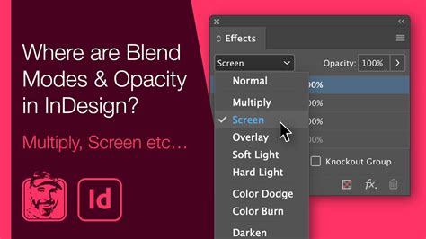
InDesign does not possess a direct "Gaussian Blur" filter that can be applied to vector objects or text in the same way that Photoshop or Illustrator do. This means that when you want to achieve a blurry look, you often need to employ workarounds that mimic the visual outcome. One of the most accessible methods involves manipulating opacity and blend modes.
The Opacity and Blend Mode Technique
This approach focuses on creating a layered effect where copies of an object are offset and given varying degrees of transparency. By adjusting the opacity and selecting appropriate layer blend modes, you can create a sense of depth and softness that approximates a blur.
To implement this, you would typically:
- Select the object or text you wish to blur.
- Copy the selected item.
- Use "Paste In Place" (Edit > Paste In Place) to paste an identical copy directly on top of the original.
- Nudge the newly pasted copy slightly. This subtle shift is key. A small movement, perhaps just one tap of the arrow keys on your keyboard, is a good starting point. You can increase this offset later if needed to achieve a more pronounced blur effect.
- With the top copy still selected, open the Effects panel (Window > Effects).
- Apply an opacity value. A value around 50% is often a good starting point, but this is highly subjective and depends on the desired intensity of the blur.
- Choose a layer blend mode. Modes like "Soft Light" or "Overlay" can effectively blend the semi-transparent copy with the layer beneath, contributing to the blurry appearance.
This process can be repeated to build up a more complex and convincing blur effect. By creating multiple offset copies with varying opacities and blend modes, you can achieve a richer, more nuanced softening. The degree of "blur" can be fine-tuned by adjusting both the opacity of each layer and the extent to which each copy is offset from the original. This method allows for a great deal of creative control, enabling you to simulate effects ranging from a gentle haze to a more pronounced, out-of-focus look.
Simulating Glassmorphism with InDesign
Glassmorphism is a contemporary user interface (UI) trend characterized by frosted glass-like elements that blend background blur with high transparency. While this effect is readily achievable in applications like Photoshop and Adobe XD, replicating it precisely in InDesign requires a thoughtful application of its available tools. The core challenge lies in applying a background blur directly to an object within InDesign's vector-based environment.
The "Acrylic" or "Frosted Glass" Look
The desired effect often involves a semi-transparent object that has a blurred background visible through it, giving it a glass-like appearance. In applications with robust blur capabilities, this is often achieved by applying a background blur to the layer behind the glass element and then adjusting the transparency of the glass element itself.
In InDesign, a common approach to simulate this "acrylic" or "frosted glass" look involves:
- Creating the "glass" object: This could be a rectangle or any other vector shape that will serve as your glass pane.
- Applying transparency: Adjust the opacity of this object. A lower opacity (e.g., 20-50%) is typically used to allow the background to show through.
- Simulating the blur: Since InDesign doesn't have a direct background blur for vector objects, you can achieve a similar effect by:
- Placing a blurred version of the background behind your "glass" object. This blurred element would ideally be a raster image (like a .jpg or .png) that has had a Gaussian blur applied in a dedicated image editor. You would then position this blurred image behind your transparent "glass" shape.
- Using a "Color Overlay" layer effect. With a low opacity, a color overlay can add a subtle hue or tint to your transparent object, giving it more plausibility as a piece of colored glass. This is particularly effective when combined with a slightly reduced layer opacity for the main "glass" object.
It's important to note that when working with vector elements in InDesign, operations like "cropping" can sometimes reduce the area where a blur is calculated. This means that if you were to try and "crop" a blurred vector shape, you might not get the full blur effect at the edges of your desired area. Therefore, using a pre-blurred raster image as the background element is often a more reliable method for achieving a convincing glassmorphism effect in InDesign.
The Smart Object Approach (Conceptual)
While not a native InDesign feature, the concept of a "Smart Object" from Photoshop offers a useful analogy for understanding how some effects can be managed. In Photoshop, you can place an image inside a Smart Object, apply a Gaussian blur to it, and then make that Smart Object semi-transparent. If you then place a solid color layer above the Smart Object within its own editable space, reducing that color layer's opacity, you can drag the rectangle layer around the image. The Smart Object will then reveal itself wherever you drag it, with the blur effect intact.
In InDesign, you can achieve a similar outcome by:
- Placing a raster image into your InDesign document.
- Applying a Gaussian blur to this raster image using an external editor (like Photoshop, Affinity Photo, or even an online tool) before placing it into InDesign.
- Placing this pre-blurred image into your layout.
- Overlaying a semi-transparent shape (e.g., a rectangle with reduced opacity) on top of the blurred image. This shape would act as your "glass" pane.
- Adding a "Color Overlay" layer effect to this semi-transparent shape, with low opacity, to further enhance the glass-like appearance.
This method ensures that the blur calculation is performed on a raster image, circumventing the limitations of applying blur directly to vector objects in InDesign.
Using Drop Shadows to Simulate Blur
An intriguing and often overlooked technique for simulating blur in InDesign involves the strategic use of drop shadows. Instead of directly blurring an object, you can make the object itself invisible and then use its drop shadow as a blurry stand-in. This is particularly effective for creating soft-edged elements like smoke, clouds, or even a "nearsighted" effect on text.
The "Invisible Object, Visible Shadow" Method
This method capitalizes on the fact that a drop shadow, by its nature, is a softened, offset version of the object casting it.
Here's how to implement it:
- Select the object or text you want to appear blurred.
- Change its fill color to "Paper" (or white, if you don't have a "Paper" swatch). This makes the object effectively invisible against a standard white background.
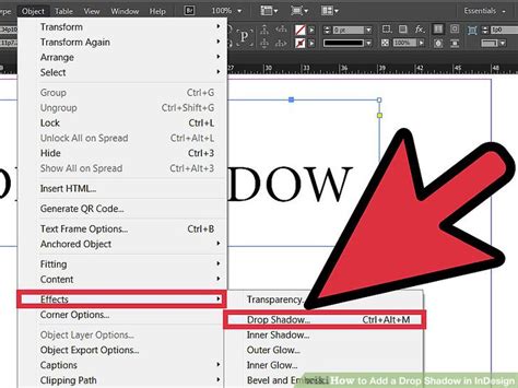
- Open the Effects panel (Window > Effects).
- Apply a Drop Shadow. Double-click at the object level within the Effects panel to open the Drop Shadow dialog box.
- Configure the Drop Shadow settings:
- Opacity: Adjust this to control the intensity of the shadow.
- X Offset and Y Offset: These determine how far the shadow is shifted from the original object's position. Small offsets will create a tighter blur, while larger offsets will spread it out.
- Blur: This is the crucial setting. Increase the blur value significantly to create a soft, diffused edge that mimics a Gaussian blur.
- Color: While typically black, you can experiment with other colors for different atmospheric effects.
Consider an example: applying this to an eye chart to simulate a nearsighted view. By making the text itself "Paper" colored and applying a heavily blurred drop shadow, the text will appear as a soft, indistinct blur, just as someone with poor vision might perceive it. This technique is versatile and can be used to create a variety of atmospheric effects where a distinct blur filter isn't available.
Exploring Blur Effects in Illustrator (and the Vector Domain Limitation)
While this guide focuses on InDesign, understanding how blur is handled in related Adobe applications like Illustrator can provide valuable context and highlight the differences. In Illustrator, you can apply a Gaussian Blur effect directly to vector objects. However, as mentioned earlier, the way vector paths and effects interact can lead to unexpected results, particularly at the edges.
The Reflective Lake Example from Illustrator
A common tutorial example in Illustrator involves creating a reflective lake. This process often includes drawing a shape for the lake using the Curvature Tool, applying a Gaussian Blur effect to it, and then creating a compound path for realism.
The steps typically involve:
- Drawing the lake shape: Using the Curvature Tool (or Pen Tool) to create a natural-looking curve for the lake's edge. Anchor points can be added and adjusted to refine the shape.
- Applying Gaussian Blur: Going to Effect > Blur > Gaussian Blur. A preview can be enabled to adjust the blur radius (e.g., to about 4-5 pixels). This directly blurs the vector shape.
- Creating a Compound Path: This is often done by drawing a rectangle around the lake and then making a compound path with the lake shape. This helps in masking or defining the area where the reflection appears.
- Masking and Refinement: Using clipping masks or other methods to control which elements appear through the lake or its reflection.
Apple’s Liquid Glass Effect in Illustrator - Super Fast!
The key takeaway here is that Illustrator does have a direct Gaussian Blur effect for vector objects. However, the user's experience in Affinity Designer, where "cropping also reduces the area where the blur is calculated," points to a fundamental challenge in vector blur implementations: the blur is often calculated based on the original vector data. When you then clip or crop this to a specific area, the blur might not extend naturally to the new edges, leading to a less convincing result at the boundaries. This is a common limitation that InDesign's lack of a direct vector blur feature sidesteps by forcing alternative, often raster-based or shadow-based, approaches.
Conclusion: Creative Workarounds for InDesign
While InDesign may not offer a one-click Gaussian blur solution for vector objects, its suite of effects and transparency controls provides a powerful toolkit for simulating such visual styles. By understanding the principles of layering, opacity, blend modes, and the clever use of drop shadows, designers can effectively achieve blurred aesthetics for a wide range of applications, from modern UI trends like glassmorphism to atmospheric scene creation. The key is to think creatively and leverage the tools available to approximate the desired outcome, often by working with raster images or by cleverly manipulating the appearance of existing objects.