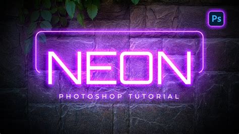
The allure of neon signs, with their vibrant glow against dark backdrops, has transcended their physical origins to become a sought-after digital aesthetic. Whether gracing the virtual windows of bars, lending an edgy vibe to a landing page, or adding a pop of color to a logo design, neon text effects in Photoshop offer a dynamic and eye-catching visual. This guide delves into the intricacies of creating these luminous designs, from foundational techniques to advanced applications, leveraging the power of Photoshop's layer styles and creative tools.
Establishing the Foundation: Backgrounds and Initial Text Setup
The journey to a convincing neon effect begins with a suitable canvas. A dark, often black, background is paramount for allowing the neon glow to truly shine. For this, a new document can be initiated in Photoshop (Ctrl + N), with dimensions tailored to the intended size of your text. A common starting point might be 400x150 pixels. If a white background is initially chosen, the Paint Bucket tool can effortlessly transform it into the desired black.
Following the background, the text itself is introduced. The Text tool is employed to write out the desired message. While any font can be utilized, fonts with rounded edges tend to yield the most authentic neon sign appearance. However, for demonstration purposes, even a standard font like Times New Roman, bold and italicized and scaled to its maximum, can effectively showcase the effect. The key is to make the text as large as possible within the document boundaries.
The Art of Layer Styles: Building the Neon Glow
The magic of Photoshop's neon effect lies in the judicious application of layer styles. These non-destructive effects allow for intricate control over the appearance of text and shapes, enabling the emulation of light and depth.
Drop Shadow: The Initial Illumination
The first layer style to be applied is the Drop Shadow. This serves as the primary light source for the neon effect. The color of the drop shadow should match the intended color of your neon glow. Opacity is typically reduced to around 50%, with a distance of approximately 6 pixels, a spread of 14 pixels, and a size of 8 pixels. This establishes a soft, diffused light emanating from the text.
Inner Shadow: Defining the Core Glow
Next, an Inner Shadow is introduced. This style helps to define the core luminescence of the neon tube. Set the blending mode to Normal and select a darker shade of the color used for the drop shadow. A reduced opacity, around 40%, is advisable. All values for distance, choke, and size are often set to 8 pixels, creating a concentrated glow within the text's boundaries.
Outer Glow: Expanding the Radiance
The Outer Glow is crucial for simulating the halo effect of a real neon tube. With opacity set to 100%, the glow color should mirror the darker shade used for the inner shadow. Increasing the element size to around 16 pixels allows this radiant aura to spread outwards, enhancing the perceived luminosity.
Inner Glow: Refining the Light Source
An Inner Glow, distinct from the Inner Shadow, further refines the light source. Set the blend mode to Normal and reduce the opacity to 25%. The glow color here should revert to the original neon color used for the drop shadow. Setting the technique to "Precise" and increasing the size to approximately 13 pixels helps to create a more defined, yet still soft, internal illumination.
Bevel and Emboss: Adding Dimension
To imbue the text with a sense of three-dimensionality, Bevel and Emboss is applied. The style is often set to "Stroke Emboss" with a small size, such as 2 pixels. The highlight opacity is increased to 100%, while the shadow color is set to match the inner glow and drop shadow colors, with an opacity of 25%. This technique adds subtle highlights and shadows, making the text appear to have a physical form.
Satin: Enhancing Surface Detail
The Satin layer style can add a subtle sheen to the neon tube. With the color matching the previous settings, an opacity of 50% is applied. Adjusting the distance to 11 pixels and the size to 14 pixels can create a gentle, reflective quality on the surface of the simulated neon.
Stroke: Defining the Neon Tube's Edge
Finally, a Stroke layer style is applied to define the outer edge of the neon tube. A size of 2 pixels and a position set to "Inside" are common settings. This creates a clean, defined outline for the neon characters.
Advanced Techniques: Texturing and Realism
Beyond basic layer styles, several advanced techniques can elevate the realism and visual appeal of your neon text.
Incorporating Textures for Depth
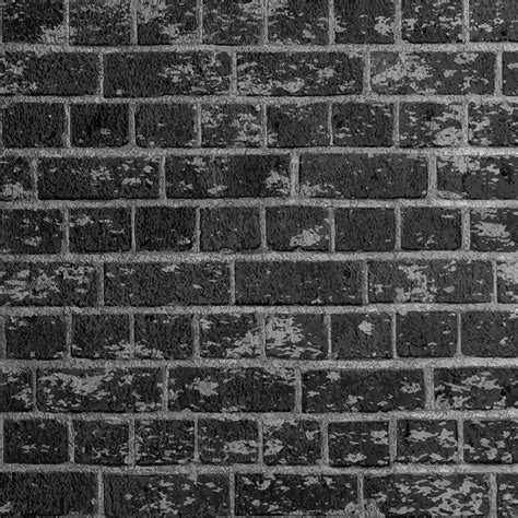
To add a layer of realism, textures can be incorporated. For instance, a grunge brick wall texture can be placed into the Photoshop document. This can be achieved by going to File > Place Embedded and selecting the desired texture image. This texture can then be manipulated in terms of blending modes and opacity to serve as a backdrop that complements the neon glow.
Defining Patterns for Customization
The ability to define custom patterns in Photoshop offers further creative control. Opening a texture file like "Texture_02" and navigating to Edit > Define Pattern allows this texture to be used within layer styles, such as the Stroke, for a more unique and customized neon tube appearance.
Separating Letter Components for Detailed Control
More intricate neon effects can be achieved by separating different parts of the letters. For example, vertical and diagonal segments can be distinct from horizontal ones. This allows for tailored application of effects like Bevel and Emboss, adjusting angles and altitudes to precisely match the orientation of each segment. This involves duplicating text layers, cutting and pasting special parts to new layers, and then applying specific layer style adjustments to each.
For instance, to adjust the Bevel and Emboss for vertical and diagonal parts, one might double-click the respective layer and change the Angle and Altitude values to 1 and 97. For horizontal components, different values like an Angle of 180 and Altitude of 72 might be applied. This granular control ensures that the light and shadow play realistically across each part of the letter.
Adding Cables and Connections
A truly convincing neon sign often includes the visible electrical cables that power it. Creating a new layer below the main text and naming it "Cable" is the first step. The Pen Tool is then used to draw the paths for these cables, clicking to create anchor points and dragging to form curves. Once the path is created, it can be stroked with a brush tool, often with a dark grey color and a specific spacing, to simulate the cable's appearance.
Learn The Pen Tool In Photoshop - All You Need To Know!
Creating Flickering Effects for Animation
To simulate the dynamic nature of a real neon sign, a flickering effect can be introduced. This often involves creating a non-glowing copy of the text layer. The Outer Glow style is hidden on this copy, and the Inner Shadow is adjusted to a darker color. The Lightness of this layer can then be reduced using Hue/Saturation (Ctrl + U). By duplicating the glowing text layer multiple times and masking out specific letters on each duplication, a sequence of frames can be created for animation. These frames, displayed in Photoshop's timeline, can then be exported as an animated GIF, with each frame showing a different combination of glowing and non-glowing letters to simulate a flicker.
Beyond Layer Styles: Alternative and Advanced Approaches
While layer styles are the cornerstone of many Photoshop neon text tutorials, other methods and considerations can enhance the process and outcome.
Utilizing Pre-made Assets and Plugins
For those seeking to save time or explore a wider range of effects, pre-made assets and plugins are invaluable. Numerous websites offer Photoshop text effects, including neon styles, that can be downloaded and applied with minimal effort. Similarly, specialized plugins can provide advanced neon generation capabilities, often with greater customization options than standard layer styles. Some resources even offer complete neon sign typefaces that can be used across various projects.
Vector-Based Neon Effects in Illustrator
For designs that require scalability without quality loss, vector-based neon effects can be created in Adobe Illustrator. Tools like the Pen Tool and various stroke and effect options in Illustrator can achieve similar neon aesthetics, which can then be imported into Photoshop for further manipulation or integration into larger designs. Some resources provide Illustrator effects that work with both shapes and text, offering a versatile solution.
Custom Font Creation for Unique Neon Designs
For ultimate control and originality, creating a custom neon font is an option. This process typically involves using the Pen Tool in Photoshop to draw individual characters, leaving intentional gaps to mimic neon tubing. These characters can then be refined and, if desired, turned into a usable font file using software like FontCreator. This allows for precise control over the kerning (the space between letters) and the overall cohesiveness of the typeface.
Color Palettes and Background Adjustments
The choice of color palette is critical for a striking neon effect. A vibrant neon color against a dark, desaturated background creates maximum contrast. Experimenting with different color combinations for the neon glow and its surrounding aura can lead to unique results. Backgrounds can also be further enhanced. After placing a texture, creating adjustment layers like Hue/Saturation or Solid Color, and manipulating their blend modes (e.g., Multiply, Vivid Light) and opacity, can dramatically alter the background's mood and further accentuate the neon text. A vignette, created by duplicating a background layer, masking the center, and adjusting brightness/contrast, can also draw more attention to the luminous text.
Smart Objects for Non-Destructive Editing
Converting text layers or shape layers to Smart Objects before applying effects like Outer Glow is a best practice. This ensures that all subsequent edits, including transformations and further layer style adjustments, remain non-destructive, preserving the original quality of the artwork. Masking can then be used with a black brush on the Smart Object's mask to hide specific parts of the neon shape, further refining its appearance.
The Enduring Appeal of Neon
The persistent popularity of neon text effects stems from their inherent visual impact. The contrast between saturated, luminous colors and dark, muted backgrounds creates a powerful aesthetic that is both modern and retro. This effect is highly versatile, suitable for a wide range of applications, from web design elements like landing page headers and logos to eye-catching graphic designs. Furthermore, the ability to easily animate these effects and export them as GIFs with small file sizes makes them ideal for digital platforms where visual engagement is key. The perceived simplicity of the neon sign, when expertly rendered in Photoshop, belies the sophisticated interplay of light, shadow, and dimension that Photoshop's tools allow artists to achieve.