Introduction to Gradient Fills in Photoshop
The gradient tool in Adobe Photoshop is a powerful feature that allows for the creation of smooth, blended transitions between multiple colors. This technique is invaluable for graphic designers, illustrators, and photographers looking to add depth, dimension, and stylistic flair to their work. Whether you're aiming for a subtle background wash, a vibrant abstract design, or a dramatic lighting effect, understanding how to effectively utilize Photoshop's gradient capabilities is essential. This tutorial will guide you through the process, demonstrating how to achieve professional-looking results, with a focus on practical application and creative exploration. We will delve into the nuances of the Gradient Fill adjustment and how it interacts with layer masks, offering a step-by-step approach to mastering this versatile tool.
Understanding the Gradient Fill Adjustment Layer
The Gradient Fill adjustment layer in Photoshop offers a non-destructive way to apply gradients to your images. This means you can experiment with different gradient settings, colors, and blend modes without permanently altering your original pixel data. This flexibility is crucial for iterative design processes and allows for easy revisions.
The Gradient Fill adjustment creates a layer mask above the target layer, effectively filling the selected area of the photo with the chosen color gradient. This interaction between the gradient fill and the layer mask is key to achieving nuanced effects. For instance, if you are working with a photograph, the gradient can be applied to a specific portion of the image, allowing the original photo to show through in other areas. This is particularly effective when working with high-contrast images, as the distinct tonal differences can accentuate the gradient's impact.
Practical Application: Applying a Gradient to a High-Contrast Photo
To illustrate the practical application of the gradient tool, let's consider a scenario involving a high-contrast photograph. Artist and designer Lidia Lukianova, known for her passion for illustration, often utilizes such images as a base for her creative work. For this tutorial, we can leverage a sample file featuring a black-and-white photo, which provides excellent contrast for gradient application.
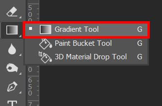
The initial step involves selecting the Gradient Fill adjustment. Once applied, Photoshop presents a dialog box where you can choose from a variety of pre-defined gradient presets. Lukianova reviewed the available gradient presets before choosing the one she liked. This selection process is subjective and depends heavily on the desired aesthetic. Some presets offer subtle shifts in color, while others provide dramatic, multi-hued transitions. Exploring these presets is a good starting point to get a feel for the tool's capabilities.
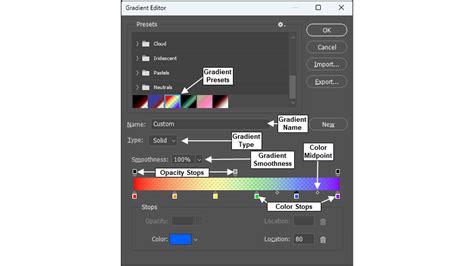
Customizing Your Gradient: Color Stops and Midpoints
While presets are a convenient starting point, the true power of the Gradient Fill lies in its customization options. You can create unique gradients by manipulating color stops and Color Midpoints.
Color stops are the individual points on the gradient slider that define a specific color. By default, a gradient usually has at least two color stops, representing the start and end colors. You can add more color stops to introduce additional colors into the gradient, creating more complex transitions. Clicking on a color stop allows you to change its color. This can be done by selecting from the color picker or by using the eyedropper tool to sample colors directly from your image.
The Color Midpoints, also known as color midpoint sliders or interpolation points, control how the colors blend between two adjacent color stops. Moving a midpoint closer to one color stop will make the transition to that color happen more quickly, resulting in a less even blend. Conversely, moving it away from a color stop will create a smoother, more gradual transition. Lukianova was able to create a smooth gradient by moving the color stops and Color Midpoints to get the look she wanted. This iterative adjustment of color stops and midpoints is crucial for fine-tuning the gradient's appearance to achieve the desired visual effect.
Refining Mask Edges for Seamless Integration
As mentioned earlier, the Gradient Fill adjustment creates a layer mask. This mask dictates which parts of the gradient are visible and which parts of the underlying layer are revealed. In our example with Lukianova's photo, the Gradient Fill created a layer mask above the model layer, filling the selected area of the photo with the color gradient.
Often, the initial mask generated by the gradient fill may require refinement to ensure a seamless integration with the underlying image. Lukianova wanted to refine the edges of the mask. To do this, she clicked the mask thumb of the Gradient Fill in the Layers (Window > Layers) panel. This action brings up the mask editing tools.
Then she chose the Brush (B) tool. For refining mask edges, a soft round brush is often ideal. Setting the brush to a soft round edge allows for smooth, feathered transitions between the masked and unmasked areas, preventing harsh lines. Lukianova painted with black to reveal the top part of the dress. Painting with black on a layer mask conceals parts of the layer, while painting with white reveals them. Gray tones create semi-transparency. By carefully painting with black, she was able to selectively reveal the original details of the dress while allowing the gradient to blend in the desired areas. This process of refining mask edges is fundamental for achieving professional-looking composite images and effects.
Photoshop Layer Masks Explained in 7 Minutes!
Exploring Different Gradient Styles and Blend Modes
Beyond basic linear gradients, Photoshop offers various gradient styles, including Radial, Angle, Reflected, and Diamond. Each style creates a different pattern of color transition, offering a wide range of creative possibilities.
- Linear: Colors transition in a straight line.
- Radial: Colors transition outwards from a central point in a circular pattern.
- Angle: Colors sweep around a starting point in a counter-clockwise direction.
- Reflected: Colors transition linearly on either side of a central point, mirroring each other.
- Diamond: Colors transition outwards from a central point in a diamond shape.
Experimenting with these different styles can dramatically alter the mood and focus of your image. For example, a radial gradient can draw attention to the center of an image, while a reflected gradient can create a sense of symmetry.
Furthermore, the blend mode of the Gradient Fill layer can be adjusted to control how the gradient interacts with the layers below it. Common blend modes like "Normal," "Multiply," "Screen," "Overlay," and "Soft Light" can produce vastly different outcomes. "Multiply" tends to darken the image, while "Screen" lightens it. "Overlay" and "Soft Light" blend the gradient with the underlying image in a way that preserves highlights and shadows, often resulting in more naturalistic effects.
Advanced Gradient Techniques and Applications
The gradient tool is not limited to simple color fills. It can be used in conjunction with other Photoshop features for more complex and artistic results.
Gradient Maps: A Gradient Map adjustment layer replaces the luminance values of an image with colors from a selected gradient. This is a powerful tool for color grading and stylistic transformations. For instance, you can use a black-to-white gradient map on a color image to create a monochromatic effect with subtle tonal variations, or a vibrant gradient map to give a surreal or painterly look to a photograph.
Gradient Overlays in Layer Styles: The Gradient Overlay layer style allows you to apply a gradient directly to the content of a layer, such as text or shapes. This is a quick way to add dimension and visual interest to graphic elements. You can control the gradient's angle, scale, and opacity, and it can be combined with other layer effects like drop shadows and strokes.
Using Gradients in Illustrations: For illustrators, gradients are fundamental for creating smooth shading, atmospheric effects, and vibrant backgrounds. They can be used to depict light sources, create depth in objects, or establish a mood. The ability to precisely control color transitions and blend modes makes gradients an indispensable tool in digital illustration.
Tips for Achieving Professional Gradient Results
- Start with High-Quality Images: For photographic applications, using images with good resolution and dynamic range will yield better results when applying gradients.
- Understand Color Theory: A basic understanding of color harmony and contrast will help you choose gradient colors that are visually appealing and complementary to your subject matter.
- Subtlety is Often Key: While bold gradients can be striking, subtle transitions can often add a more sophisticated and polished look, especially in photographic contexts.
- Non-Destructive Editing: Always utilize adjustment layers and smart objects to maintain flexibility throughout your workflow.
- Practice and Experiment: The best way to master the gradient tool is to practice regularly and experiment with different settings, styles, and blend modes. Try applying gradients to various types of content, from photos to vector shapes, to discover new creative avenues.
By thoroughly understanding and applying the techniques discussed, you can elevate your Photoshop skills and create visually compelling graphics and images with the powerful gradient tool.