In the realm of graphic design, the strategic application of texture can elevate a design from ordinary to exceptional, creating a tactile and visual experience that leaves a memorable impression. Textures are so potent that they can forge a brand's unique visual identity, setting it apart from competitors and ensuring instant recognition. Consider, for instance, how a weathered texture on product packaging, reminiscent of Jack Daniel's, can evoke a sense of rich history or artisanal craftsmanship. Conversely, a geometric pattern might convey innovation and technological advancement. Therefore, whether you are an experienced designer or just embarking on your creative journey, understanding and utilizing the right textures is an indispensable skill.
Among the myriad of textures that designers frequently employ is the halftone texture, also known as the halftone overlay. This adaptable design technique, which has become a cornerstone of graphic design, boasts a history spanning over a century. Its origins lie in the printing industry, where it served as a method to simulate shading through the use of dots or lines of varying sizes and spacing. The underlying principle is straightforward: the denser the concentration of dots or lines, the darker the shade appears, whereas sparser arrangements result in lighter shades. To generate a halftone texture, designers typically leverage software such as Adobe Photoshop or Illustrator, manipulating the size and spacing of dots or lines to achieve the desired aesthetic.
The Genesis of Halftone: From Printing Necessity to Design Staple
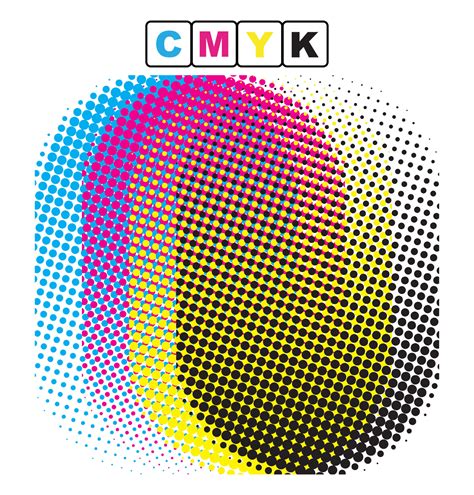
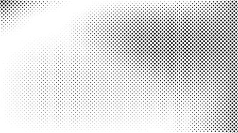
Halftone dots are a fundamental element of a 20th-century printing technique. At a time when printing processes were inherently limited, particularly concerning color reproduction, the halftone method was the prevailing solution to create the appearance of varied colors and shades. Early color presses were restricted to using only four primary inks: cyan, magenta, yellow, and black (CMYK). Printers ingeniously developed the halftone process as a means to simulate a broader spectrum of colors. This was achieved by creating fields of minuscule dots of these four colors, positioned in close proximity to one another. When viewed collectively, these closely packed dots appear to blend, thereby generating the illusion of other shades and tones. This technique was particularly crucial for achieving gradients and subtle tonal variations that would otherwise be impossible with solid ink coverage. The resolution of these dots, often measured in lines per inch (LPI), directly influenced the perceived smoothness and detail of the printed image. A higher LPI would result in finer dots and a more detailed image, while a lower LPI would produce larger, more visible dots, giving the image a coarser, more stylized appearance.
The impact of halftone dots extends far beyond their technical origins. Halftone images have become an enduring characteristic of pop art, screen printing, and graphic design, serving as a direct visual reference to the printing styles of a bygone era. This nostalgic quality, combined with their inherent graphic appeal, makes them a popular choice for designers looking to imbue their work with a retro, artistic sensibility. The deliberate visible structure of the dots can add a unique visual texture that enhances the overall composition.
Exploring the Diverse World of Halftone Textures
Designers can employ several types of halftone textures to achieve distinct visual outcomes. Each halftone texture is meticulously crafted by combining smaller elements, whether dots or lines, in varying sizes and spacing to create an overall progression of tone and form.
Dot Pattern Halftone: The Comic Book Aesthetic
Dot pattern halftones are generated using small dots of varying sizes and spacing to produce a textured effect. A prime example of this texture can be observed in the iconic comic book-style designs of artists like Roy Lichtenstein. His work famously utilized large, evenly spaced dots, often in primary colors, to mimic the look of mass-produced comic strips.
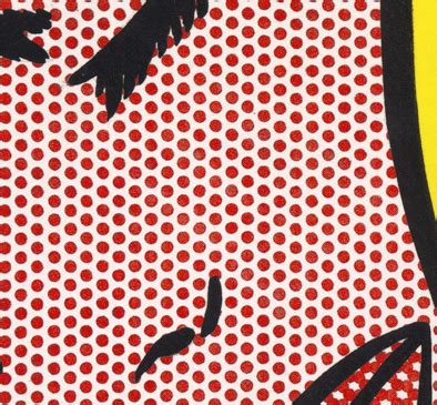
You can effectively use dot pattern halftones to introduce depth, dimension, and a vintage aura to your projects. Incorporating this texture into illustrations, posters, or digital graphics can evoke a retro aesthetic, infusing the design with a unique and appealing visual character. The controlled arrangement of dots provides a nuanced interplay of light and shadow, offering a creative avenue to enhance your work's overall impact and narrative. This texture is particularly effective for adding a tactile quality to digital designs, making them feel more tangible and less flat. The perceived "roughness" of the dots can also add an element of grit or authenticity, depending on the context.
Line Pattern Halftone: Embracing Organic Forms
A line pattern halftone texture is created using lines of varying thickness and spacing to achieve a textured effect. This type of halftone is ideal for producing a more organic, hand-drawn appearance, which can be found across various styles and mediums, from classic illustrations and comic book art to contemporary graphic design.
A notable exponent of this technique is the acclaimed comic book artist and writer Frank Miller, renowned for his influential work on titles such as "Sin City" and "The Dark Knight Returns." Miller's distinctive gritty, noir-influenced style frequently incorporates bold linework and a significant reliance on line pattern halftones. The stark contrast and the directional flow of the lines in his work contribute immensely to the mood and atmosphere of his narratives.
The use of line pattern halftones can lend a sense of raw energy and dynamism to a design. The directionality of the lines can guide the viewer's eye, create a sense of movement, or even mimic the texture of different materials, such as wood grain or brushed metal. This makes them versatile for a wide range of applications where a strong graphic statement is desired.
Gradient Halftone: Achieving Smooth Transitions
A gradient halftone texture is achieved by employing dots or lines of varying sizes and spacing to create a smooth transition from one tone or color to another. Gradient halftones are exceptionally effective for generating subtle and seamless shifts between colors, and they are frequently utilized in background designs and gradient elements.
Master Halftone Effects for DTF Printing | Photoshop Guide
Street artist and designer Shepard Fairey, widely recognized for his iconic "Obey" and "Hope" posters, skillfully integrates gradient halftones into his artistic practice. Fairey's designs are often characterized by bold colors and striking gradients, which are artfully rendered using halftone effects. The application of gradient halftones imbues his designs with depth and texture, ensuring they command attention and possess a distinctive visual presence. The ability to simulate smooth gradients with discrete dots or lines is a testament to the power and adaptability of the halftone technique. This method allows for a controlled progression of color that can be both visually appealing and technically sophisticated.
Crafting Halftone Textures in Adobe Photoshop: A Practical Guide
Creating your own halftone textures does not need to be an intricate process; it is relatively straightforward within Adobe Photoshop. You can begin by creating a new layer and utilizing the brush tool to paint dots or lines of varying thickness and spacing. Furthermore, you can experiment with different brush sizes and opacity levels to achieve your desired effect.
Moreover, Photoshop offers a suite of filters and adjustment layers that enable you to further customize your textures. With a bit of practice, you can develop unique and eye-catching halftone textures that significantly enhance the visual appeal of your designs. It is important to note that the specific process for creating halftone textures will largely depend on the type of texture you aim to produce.
How to Create a Dot Pattern Halftone Overlay
Follow these steps to achieve a dot pattern halftone overlay in Photoshop:
- Open your image: Launch Adobe Photoshop and open the image you wish to apply the halftone effect to.
- Duplicate the background layer: To preserve your original image, duplicate the background layer by pressing
Ctrl+J(Windows) orCmd+J(Mac). - Convert the duplicated layer to grayscale: With the duplicated layer selected, navigate to
Image > Adjustments > Desaturateor pressShift+Ctrl+U(Windows) /Shift+Cmd+U(Mac) to convert the layer to grayscale. This step is crucial as the Color Halftone filter works best on grayscale images. - Apply the Color Halftone filter: Go to the top navigation bar and select
Filter > Pixelate > Color Halftone. - Adjust settings: A dialog box will appear, presenting two primary variables:
RadiusandChannel.- The
Radiussetting controls the size of the halftone dots and the spacing between them. Adjusting this value directly impacts the gradient and blur of the color and image. Experiment with different values to find the sweet spot for your image. A smaller radius will create finer dots, while a larger radius will result in more prominent, larger dots. - The
Channelsetting dictates how the dots are placed and how they overlap. Each channel (Cyan, Magenta, Yellow, Black) is controlled by aScreen Anglesetting, which is listed in degrees. Modifying these values changes the angle at which the dots for each CMYK color are applied to the pattern. Different angle combinations can create moiré patterns or distinct visual textures. For a classic halftone look, try angles like 45 degrees for Black, 15 degrees for Cyan, 75 degrees for Magenta, and 0 degrees for Yellow, though experimentation is key.
- The
- Change the layer blend mode: Once you have applied the filter and are satisfied with the result, change the blend mode of the halftone layer.
OverlayorSoft Lightare often excellent choices for blending the halftone pattern seamlessly with your original image, allowing the underlying colors and details to show through while the halftone texture is visible. - Adjust opacity: Finally, fine-tune the opacity of the halftone layer to control the intensity of the effect. Lowering the opacity will make the halftone pattern more subtle, while keeping it at 100% will result in a more pronounced effect.
How to Create a Line Pattern Halftone Overlay
To create a line pattern halftone overlay in Photoshop:
- Open and duplicate your image: As before, open your image and duplicate the background layer.
- Convert to grayscale: Desaturate the duplicated layer using
Image > Adjustments > Desaturate. - Access the Filter Gallery: Navigate to
Filter > Filter Gallery. - Select Halftone Pattern: Within the Filter Gallery, go to
Sketch > Halftone Pattern. - Adjust settings: In the Halftone Pattern options, you'll typically find settings for
Size,Contrast, andPattern Type(though the latter might be less prominent in this specific filter). For most line pattern effects, a smallSizeand highContrasttend to work best, creating sharp, well-defined lines. Experiment with these values to achieve the desired line thickness and density. - Change the layer blend mode: Set the blend mode of this layer to
OverlayorSoft Lightto integrate the line pattern with your base image. - Adjust opacity: Modify the layer's opacity to control the strength of the line pattern effect.
How to Create a Gradient Halftone Overlay (Mezzotint)
For a more organic, gradient-like halftone effect, the Mezzotint filter is a useful tool:
- Open and duplicate your image: Begin by opening your image and duplicating the background layer.
- Convert to grayscale: Desaturate the duplicated layer.
- Apply the Mezzotint filter: Go to
Filter > Pixelate > Mezzotint. - Choose a Gradient type: From the
Methoddropdown menu, select aGradienttype. Options likeFine Dots,Medium Dots,Coarse Dots,Vertical Lines, orHorizontal Linesare available, each producing a different kind of dot or line pattern that can simulate gradients.FineorMediumgrain options often yield the most pleasing gradient-like results. - Adjust settings: Experiment with the
Grainsettings to control the density and distribution of the dots or lines. The goal is to create a pattern that smoothly transitions in density, mimicking a gradient. - Change the layer blend mode: Apply an
OverlayorSoft Lightblend mode to this layer to blend the mezzotint effect with your original image. - Adjust opacity: Adjust the opacity of the layer to fine-tune the intensity of the gradient halftone effect.
From dots to lines to grids, a variety of halftone patterns are available, making it straightforward to discover the perfect look and feel for your design projects.
Enhancing Your Design Workflow with Halftone Textures
The right textures can breathe life into your designs. However, to fully harness their potential, you need an appropriate selection of design tools. This includes not only choosing the right platform for creating your halftone textures but also having an efficient system for storing, managing, and presenting your texture-based designs.
A basic cloud storage platform, such as Google Drive, may not be sufficient for managing complex design assets and workflows. This is where solutions like Playbook come into play. Playbook distinguishes itself from other cloud storage systems by prioritizing design collaboration and management. With Playbook, you can effortlessly organize and present your work in a visually appealing and user-friendly manner, eliminating the need to sift through non-visual folders. This streamlined approach to asset management ensures that your halftone textures and the designs that incorporate them are easily accessible, shareable, and presentable, allowing you to focus more on creative execution and less on administrative overhead.

The ability to effectively integrate and manage design assets like halftone textures is crucial for maintaining a productive and professional workflow. By leveraging the right tools and techniques, designers can continue to push the boundaries of visual communication, creating work that is not only aesthetically pleasing but also deeply engaging and conceptually rich. The enduring appeal of halftone textures lies in their ability to connect contemporary design with the historical legacy of print, offering a timeless aesthetic that continues to resonate with audiences.