The creation of a memorable and effective logo is a cornerstone of brand identity. While professional graphic design software like Adobe Illustrator is often considered the industry standard for vector-based logo creation, Adobe Photoshop remains a powerful and accessible tool for many. This guide will delve into the intricacies of designing a logo within Photoshop, emphasizing best practices, essential techniques, and crucial considerations to ensure your logo is not only visually appealing but also functional across various applications.
The Foundation of a Great Logo: Pre-Design Strategy
Before even opening Photoshop, a critical phase of strategic thinking must take place. Jumping directly into the software without a clear vision is a surefire path to a mediocre outcome. The provided information stresses the importance of answering fundamental questions that shape the entire design process.
Defining Brand Personality and Visual Direction
Understanding the brand's essence is paramount. Is the personality modern and minimal, friendly and playful, or premium and classic? This core identity will dictate the aesthetic choices, from typography to color palettes. Equally important is exploring the shape direction you are investigating. A logo icon typically falls into one of several categories: an abstract geometric mark, a mascot/character, a monogram/lettermark, or a wordmark. Each of these forms has distinct strengths and applications.
Identifying Constraints and Target Audience
Every design project operates within constraints. Will the logo need to work at very small sizes, such as for app icons or favicons? Does it need to be effective in a single flat color? These considerations will influence the level of detail and complexity you can incorporate. Furthermore, understanding your target audience is crucial. The logo must resonate with the intended viewers, conveying the right message and evoking the desired emotions.
Setting Up Your Photoshop Workspace for Logo Design
A well-prepared workspace is essential for efficient and effective logo creation in Photoshop. The software offers various tools and features that, when utilized correctly, can significantly enhance the design process.
The Importance of Canvas Size and Resolution
For logo design, it is recommended to work on a large canvas, with a minimum size of 2048x2048 pixels. A larger canvas ensures that diagonal angles remain precise, provides ample room to work at full detail, and simplifies the process of scaling for exports to various sizes without significant loss of quality. This approach mitigates potential pixelation issues, especially when the logo needs to be rendered at smaller dimensions.
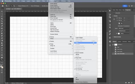
Leveraging Grids and Smart Guides for Precision
Consistent spacing and symmetry are the invisible scaffolding behind every logo that appears "professional." Logos designed without a grid often exhibit subtle imbalances that detract from their intended polished look. Therefore, enabling and utilizing a grid within Photoshop is a critical technical step. This provides a visual framework for aligning elements and maintaining proportional harmony. Similarly, smart guides offer dynamic alignment and spacing cues as you move and resize objects, ensuring that elements snap into place with precision. To enable these, navigate to View > Show and ensure Grid and Smart Guides are checked. You can also set your canvas to Snap to Grid via View > Snap to.
Core Design Techniques in Photoshop
With the workspace prepared, the focus shifts to the actual creation of the logo elements. Photoshop's strength lies in its layer-based approach and its diverse toolset.
Mastering Shape Layers for Scalability
When creating logo elements in Photoshop, it is imperative to use shape layers exclusively. This means avoiding raster brushes, painted fills, or pixel-mode shape tools for any logo component. Shape layers are vector-based within Photoshop, meaning they can be scaled infinitely without losing quality. This is crucial for a logo that needs to be used across a wide range of applications, from large-format printing to small digital icons. The shape tools (Rectangle, Ellipse, Polygon, Line, Custom Shape) are your primary instruments here.
For lettermarks and monograms, a highly effective technique involves typing your letters using a geometric sans-serif font. Once satisfied with the letterforms, right-click the type layer and select ‘Convert to Shape’. This transforms the text into editable vector shapes, allowing for precise manipulation and integration with other graphical elements.
A key principle to adhere to is to limit yourself to 2-3 basic shapes combined in an interesting way before adding complexity. The strongest logos in the world are often remarkably simple in their construction, such as the iconic bitten apple, overlapping circles, or a simple swoosh. This simplicity enhances memorability and versatility.
The Mirror Test and Working with Pure Black
To assess the fundamental form and balance of your logo icon, the mirror test is invaluable. Duplicate your icon layer, then flip it horizontally (Edit > Transform > Flip Horizontal) and place the two side-by-side. This reveals any asymmetries or imbalances that might not be apparent in the original. During the initial design phase, it is best to work with pure black on a transparent background. This allows you to focus solely on the form and structure without the distraction of color.
Incorporating Color and Brand Palettes
Once you are happy with the form of your logo, you can introduce color. It is advisable to add brand colors using Solid Color fill layers (Layer > New Fill Layer > Solid Color) rather than directly filling shape paths. This maintains the editability of both the shape and the color. For digital logo work, it is generally recommended to keep 1-2 colors maximum. Excessive color can reduce versatility and impact. If you are working with a defined brand palette, use hex codes to ensure color consistency. Copy and paste your brand’s hex code into the color picker for precise shade selection.
Refining and Testing Your Logo Design
A logo is more than just a static image; it's a dynamic element that must perform under various conditions. Rigorous testing and refinement are essential.
The Importance of Scalability Testing
To truly gauge a logo's effectiveness, you must test its legibility at different sizes. Open the Navigator panel (Window > Navigator) and zoom the thumbnail to 48px width. At this reduced size, ask yourself: "Can I still tell what the icon is?" If the logo becomes indistinct or unrecognizable at such small dimensions, it indicates a need for simplification or a redesign of certain elements.
The Flat Color Test
Another critical test is to turn off your color layers to see the mark in flat black. Does it still read? Many otherwise good logos fail this test because their visual integrity relies too heavily on color. A strong logo should be recognizable and impactful even in monochrome.
Optical Corrections for Visual Harmony
While mathematical precision is important, the human eye perceives things differently. Optical corrections often override mathematical ones. For instance, circles that are mathematically the same size as squares may appear slightly smaller due to how the human eye perceives area. Therefore, slightly increasing the size of circular elements - by 2-4% - can make them feel optically balanced within a composition.
Establishing Consistent Corner Radii
If your design incorporates rounded corners on any element, it is crucial to establish a base radius and scale all other radii from it. For example, if your base radius is 8px, secondary elements could use radii of 4px or 16px. This creates a sense of visual rhythm and cohesion.
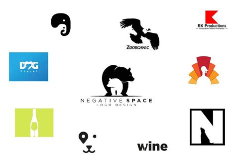
Understanding and Utilizing Negative Space
Negative space is not merely empty space; it is an active design element. The space around and inside your logo elements plays a crucial role in its overall perception and memorability. Iconic examples like the FedEx arrow or the hidden bear in Toblerone demonstrate how intelligent use of negative space can make a logo unforgettable.
Limiting Font Mixing
When a logo includes a wordmark or tagline, it is generally best to use one typeface family. Mixing two fonts in a logo often appears accidental and can detract from the professionalism of the design. If you need variations, stick to different weights or styles within the same font family.
Exporting Your Logo from Photoshop
The final stage of logo creation involves preparing the file for its intended use. Photoshop offers various export options, but understanding their limitations is key.
Photoshop's SVG Export Limitations
While Photoshop can export to SVG (Scalable Vector Graphics) format, its SVG export is often unreliable for anything beyond very simple single-path shapes. For production-ready SVG files, it is highly recommended to copy your shape paths into a vector editing program like Adobe Illustrator or Figma and export from there. This ensures true vector scalability and compatibility.
Best Practices for Raster Exports (PNG/JPEG)
For digital use where vector formats are not required, exporting as PNG is generally preferred, especially if a transparent background is needed. This format supports transparency and is ideal for web use and applications. JPEG is suitable for web images where transparency is not a requirement and file size is a significant concern, though it does not support transparency and uses lossy compression.
When exporting, always ensure you are exporting from your layered PSD master file. This PSD file is your source of truth and should be preserved for future edits and revisions. Every export should be generated from this master file.
Beyond Photoshop: Enhancing Your Logo Workflow
While Photoshop is a capable tool, integrating it into a broader design workflow can yield even better results.
Considering Vector-Based Alternatives
As mentioned, Illustrator is the industry standard for logo design because it's purpose-built for vectors. Figma is a strong alternative, offering collaborative features and robust vector capabilities. Photoshop is a viable option if you stick strictly to shape layers and understand its SVG export limitations.
Utilizing AI Tools for Concept Generation
For those needing ideas fast, tools like BrandForge AI can generate strong logo concepts. These concepts can then be refined in a dedicated Refinement Studio before being brought into Photoshop for final adjustments and export.
Protecting Your Artwork with Watermark Logos
In the digital age, protecting intellectual property is paramount. A logo can serve as a watermark to safeguard your work from misuse and infringement. As artists have evolved from simple signatures to sophisticated brands, the concept of a logo has modernized.
Creating a Signature-Style Logo in Photoshop
One effective method for creating a watermark logo is to leverage your own signature.
- Doodle signatures on paper with a good pen.
- Scan or take a sharp photograph of your preferred signature and upload it to Photoshop.
- Use the marquee tool to select the signature.
- Use the eraser tool to clean up any smudges.
- Select EDIT > DEFINE BRUSH PRESET.
- Name your signature brush.
- To use it, select the brush tool on a piece of work, ensure hardness is 100%, and click once where you want the logo to appear. This brands your work consistently and identifiably.
Creating Text-Based Logos from Scratch
Not everyone is comfortable with hand-drawn elements. Photoshop also allows for creating text-based logos from scratch.
- Use the Type tool to enter your business name, initials, or slogan.
- Choose a font that reflects your brand's personality. Bold fonts suggest masculinity, italicized typefaces can imply creativity (though often overused), and slim fonts can be modern and appealing. Limit font mixing to one typeface family.
- Style your text with color and effects.
- To add texture, you may need to rasterize the text (
Layer > Rasterize Type). Then, use the magic wand tool to select areas and fill them with a texture or image file. Be aware that rasterizing is a destructive process, so ensure you are happy with the text before proceeding.
Design Like a Pro 🔥 Easy Photoshop Logo Tutorial for Beginners
Additional Tips for Logo Excellence
- Choose shapes wisely: Circles often signal unity, triangles convey action, and squares suggest stability.
- Keep it simple but relevant: A logo should be instantly recognizable and memorable.
- Find inspiration without copying: Look at competitors but aim to stand out.
- Think about size and scalability: Ensure your logo looks sharp across all mediums.
By following these guidelines and leveraging Photoshop's robust features, you can create a professional, impactful, and versatile logo that effectively represents your brand. Remember, the most effective logos are often a result of a thoughtful strategy, meticulous execution, and rigorous testing.