By default, content on a layer in Procreate is opaque, meaning it completely covers up whatever is on the layers underneath it. However, the power of digital art often lies in the subtle and not-so-subtle ways that objects and colors on different layers can interact and blend. Procreate offers a robust set of Blend Modes, a feature that allows artists to control precisely how layers interact, opening up a universe of creative possibilities. This guide will delve into the intricacies of Procreate's Blend Modes, from their fundamental purpose to the nuanced effects of each individual mode, empowering you to elevate your digital artwork.
Understanding the Foundation: Layers and Opacity
Before diving into Blend Modes, it's crucial to grasp the concept of layers and opacity. Each layer in Procreate is a distinct canvas upon which you can place elements. Opacity refers to the transparency of a layer. By default, a layer is at 100% opacity, making it solid and completely obscuring anything beneath it. Adjusting the opacity slider, found within the layer's properties, allows you to make a layer more transparent, revealing the layers below. A handy shortcut for adjusting layer opacity involves two-finger-tapping a layer, which brings up a narrow blue bar at the top of the canvas. Sliding your finger left on the canvas then decreases the layer's opacity. This adjustment affects the entire layer, irrespective of any selections made.
What Exactly Are Blend Modes?
Blend Modes are a collection of settings within Procreate's Layers panel that dictate how the colors and pixels of one layer interact with the colors and pixels of the layers beneath it. When you have two layers, the bottom layer is typically referred to as the "base layer," and the top layer is the "blend layer" or "color layer." When you apply a Blend Mode, you're essentially choosing a specific rule for how the blend layer's content will modify the base layer's content. This interaction can affect brightness, contrast, color, and saturation in a myriad of ways, depending on the mode selected. It’s akin to mixing paints on a physical palette, but with a level of precision and reversibility that digital art affords.
Accessing and Applying Blend Modes in Procreate
Locating and applying Blend Modes in Procreate is a straightforward process.
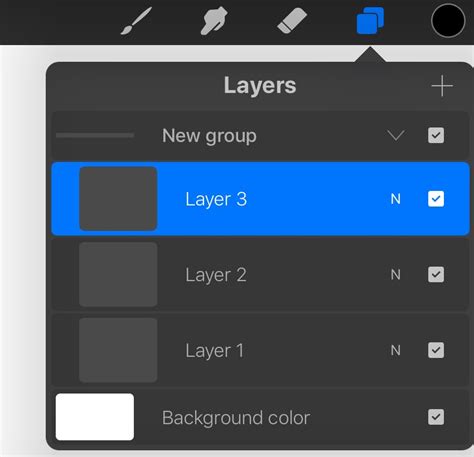
- Open the Layers Panel: Tap the stacked squares icon in the top right corner of your screen to access the Layers panel.
- Select a Layer: Tap on the layer you wish to apply a Blend Mode to.
- Access Blend Modes: On the right-hand side of each layer in the panel, you'll see a letter. This letter indicates the current Blend Mode. By default, it's 'N' for Normal. Tap this letter.
- Choose a Blend Mode: A dropdown menu will appear, displaying a scrolling list of all available Blend Modes. The currently selected mode will be highlighted in blue.
- Preview and Apply: As you scroll through the list, you'll see a live preview of the effect on your canvas. Once you've found the desired Blend Mode, tap anywhere outside the list or on the layer itself to apply it. The letter on the layer will update to reflect the chosen Blend Mode.
Within this same menu, you'll also find the Opacity slider for that specific layer, allowing you to fine-tune the intensity of the Blend Mode's effect.
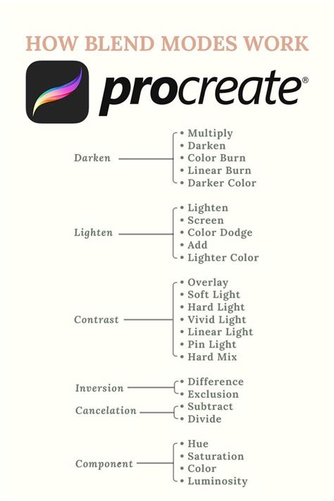
Exploring the Blend Mode Categories
Procreate's Blend Modes can be broadly categorized by the type of effect they produce, helping to understand their general purpose. While each mode's outcome is dependent on the specific colors and luminances of the layers involved, these categories offer a useful starting point.
Darkening Blend Modes
These modes generally make the resulting image darker than the original base layer. They are excellent for adding shadows, depth, and atmospheric effects.
- Normal: This is the default mode. The top layer simply covers the layer below it with its set opacity. If opacity is less than 100%, the layer becomes transparent, allowing the layer below to show through.
- Multiply: This mode multiplies the luminosity of the base color by the blend color. The result is an overall darker and more intense effect. Multiply produces different levels of darkening depending on the luminosity of the blend layer. It's perfect for creating shadows or darkening images while retaining some of the underlying detail.
- Darken: This mode does not blend pixels in the traditional sense. Instead, it compares the base and blend colors and keeps the darker of the two for each pixel. Darken makes no change when the colors on both layers are identical. Since Procreate 5.4, older projects using 'Darken' have been switched to the introduced 'Shade' mode, which functions similarly but with subtle differences.
- Color Burn: Designed to mimic the burn tool used in traditional photography, Color Burn increases the contrast between the base and blend colors. This results in higher mid-tone saturation and reduced highlights, leading to darker and more saturated results than Multiply.
- Linear Burn: This mode decreases the brightness of the base color based on the value of the blend color. This gives a result that is darker than Multiply but less saturated than Color Burn.
- Darker Color: This mode functions somewhat like Darken but compares the composite RGB channels of the base and blend colors, keeping the darker of the two. It considers all channels together, ensuring the darkest tones make their mark across the spectrum.
Lightening Blend Modes
Conversely, these modes tend to make the resulting image brighter. They are useful for adding highlights, glows, and general brightening effects.
- Lighten: This mode is the opposite of Darken. It compares the base and blend colors and keeps the brightest of the two for each pixel. If the blend and base colors are the same, there are no changes. Lighten is like having a digital flashlight that highlights the best and brightest of your base and blend layers.
- Screen: Screen produces different levels of brightening depending on the luminosity values of the blend layer. It's ideal for brightening images, creating soft glows, or adding highlights without losing too much detail. Screen divides the color above by the one below.
- Color Dodge: Based on the dodge tool from traditional photography, Color Dodge creates a brighter effect than Screen by decreasing the contrast between the base and blend colors. It lifts your art by enhancing the contrast, making mid-tones pop and highlights sing.
- Add: Similar to Screen and Color Dodge, Add produces even stronger brightening results. It reflects the blend color by increasing the brightness, making it the go-to mode for intensifying brightness, especially for scenes with strong light sources like streetlights or glowing eyes.
- Lighter Color: This mode functions like Lighten but compares the composite RGB channels of the base and blend colors, keeping the brightest of the two. It illuminates the brightest colors in your artwork.
Contrasting Blend Modes
These modes combine elements of both darkening and lightening, often affecting mid-tones to increase contrast and vibrancy.
- Overlay: This mode works like a combination of Multiply and Screen. It both lightens and darkens images by shifting the mid-tones. Dark blend colors shift the mid-tones to darker colors, while light blend colors shift them to lighter colors. It's fantastic for adding both depth and contrast, making colors pop and enhancing textures.
- Soft Light: This is a gentler version of Overlay. It applies subtle darkening or lightening effects based on luminance values, kissing your artwork with a whisper of shadow or light.
- Hard Light: This mode is a combination of Multiply and Screen, similar to Overlay, but it uses the brightness values of the blend layer to make its calculations. Results with Hard Light tend to be more intense and dynamic.
- Vivid Light: This is an extreme version of Overlay and Soft Light. Anything darker than 50% gray is darkened, and anything lighter than 50% gray is lightened, creating very strong results.
- Linear Light: This mode produces very strong results by combining Dodge effects on lighter pixels with Burn effects on darker pixels. It's for thrill-seekers, mixing Dodge and Burn for vivid outcomes.
- Pin Light: An extreme Blend Mode, Pin Light performs Darken and Lighten simultaneously. It uses the brightness values of the blend layer to either darken or lighten the base layer. This mode removes all traces of mid-tones, resulting in a unique, high-contrast, and sometimes patchy look.
- Hard Mix: This is an extreme Blend Mode that flattens detail, creating a super-flat, super-saturated result that almost looks posterized. Hard Mix provides a result using only white, black, and any of the six primary colors - red, green, blue, cyan, magenta, or yellow. It offers an almost cartoon-like simplicity with vibrant colors and stark contrasts.
Color Theory Basics for Digital Painters
Color & Component Blend Modes
These modes focus on manipulating the hue, saturation, or luminosity of the colors, offering precise control for recoloring and tonal adjustments.
- Difference: As the name suggests, Difference uses the difference of the base and blend colors to create the resulting blend. White pixels invert the colors of the base layer, while black pixels produce no change. This mode creates a psychedelic, invert-like effect, often leading to creative and unexpected color combinations, valuable for surreal or otherworldly artwork.
- Exclusion: This mode works the same as Difference on black and whites but is gentler on grays, creating subtle contrasts without going to extremes. It's considered the peacemaker among contrast modes.
- Subtract: This mode darkens colors in a drastic manner by subtracting brightness. Already dark areas make little change, acting as the drama queen of blend modes by pulling brightness down.
- Divide: This mode is the opposite of Subtract. It brightens darker colors and lets lighter areas have little change, acting as Subtract's optimistic sibling.
- Hue: This mode preserves the luminosity and saturation of the base layer while adopting the hue of the blend layer. This makes it ideal for coloring monochromatic images or changing the color of an object without altering its shading. It's the chameleon, changing colors without losing the essence of your artwork’s saturation or tones.
- Saturation: This mode preserves the luminosity and hue of the base layer while adopting the saturation of the blend layer. It takes the lowest saturation value for each component. Saturation acts as a mediator, balancing the vibrancy of your artwork.
- Color: This mode preserves the luminosity of the base layer while adopting the hue and saturation of the blend layer. This is perfect for coloring monochrome images or applying a new color palette to an existing artwork while retaining the original lighting and shadows. It's your coloring book hero.
- Luminosity: This mode preserves the hue and saturation of the base layer while adopting the luminosity (brightness and darkness) of the blend layer. It holds onto the hues and saturation of your base layer while embracing the light and dark from your blend layer. It is the illuminator.
Advanced Techniques and Common Pitfalls
While mastering each Blend Mode through experimentation is key, incorporating advanced techniques can elevate your work further.
- Layer Masks: Combining Blend Modes with Layer Masks allows for precise control over which areas of a layer are affected. You can apply a Blend Mode selectively, for instance, to just the hair or skin in a portrait, enabling greater subtlety and refinement.
- Alpha Lock: When Alpha Lock is applied to a layer, it locks the transparent parts, allowing you to paint only on the existing pixels. Using Blend Modes on layers with Alpha Lock can help fine-tune colors and effects on a very detailed level, particularly useful for adding specific textures or lighting.
- Layer Order: The order in which your layers are stacked significantly impacts how Blend Modes interact. Reordering layers can lead to entirely different visual outcomes.
- Color Theory: Understanding basic color theory is crucial, as Blend Modes are heavily influenced by the colors involved. Misjudging color interactions can lead to undesired results.
Beginners often fall into common traps, such as over-relying on a few favorite modes (like Multiply or Overlay), ignoring the importance of base colors, forgetting to adjust opacity, neglecting layer order, and not saving different versions of their work. Procreate's non-destructive workflow means you can always go back, but saving incremental versions, especially when experimenting heavily with Blend Modes, is a wise practice.
By understanding and actively experimenting with Procreate's diverse range of Blend Modes, you unlock a powerful toolkit to add depth, texture, mood, and unique visual effects to your digital art. Don't be afraid to dive in, play with the options, and discover the transformative power of blending.