Procreate, the powerful digital art application for iPad, offers a dynamic environment for artists to create stunning visuals. While its digital brushes are incredibly versatile, achieving a realistic paper texture can elevate your artwork from digital to tactile. This guide will walk you through various methods to imbue your Procreate creations with the authentic feel of paper, catering to both beginners and seasoned digital painters. We will explore how to leverage existing tools, import custom textures, and even simulate the subtle imperfections that make real paper so appealing.
Understanding the Essence of Paper Texture
Before diving into Procreate's tools, it's crucial to understand what constitutes a "paper texture." Real paper isn't a perfectly smooth, uniform surface. It possesses subtle variations in its fibers, tooth, and even microscopic imperfections that catch light and affect how ink or paint interacts with it. These characteristics include:
- Tooth: The surface roughness of paper, which provides "grip" for drawing media. Different papers have varying degrees of tooth, from smooth (hot-pressed) to rough (cold-pressed or rough).
- Fibers: The visible or subtly discernible strands of cellulose that form the paper's structure.
- Grain: The direction in which paper fibers are aligned during the manufacturing process, which can influence how paint or ink behaves.
- Imperfections: Small variations, specks, or subtle mottling that are inherent to the papermaking process.
- Color Casts: Many papers have a slight off-white or creamy hue rather than a pure, stark white.
By understanding these elements, you can more effectively replicate them in your digital work.
Leveraging Procreate's Built-in Brush Library
Procreate comes equipped with a vast array of brushes, and many of them can be surprisingly effective at simulating paper textures with a few adjustments.
Utilizing Textured Brushes
Within Procreate's brush library, you'll find brushes categorized by their intended use, such as "Texture" or "Artistic." Many of these brushes, when used with a subtle touch and appropriate color, can lay down a grainy or fibrous pattern.
- Experiment with Grain Brushes: Look for brushes that have a built-in texture. Brushes like "Gouache," "Oil Paint," or even some of the "Texture" brushes can be excellent starting points. Adjust the brush size, opacity, and flow to control the intensity of the texture.
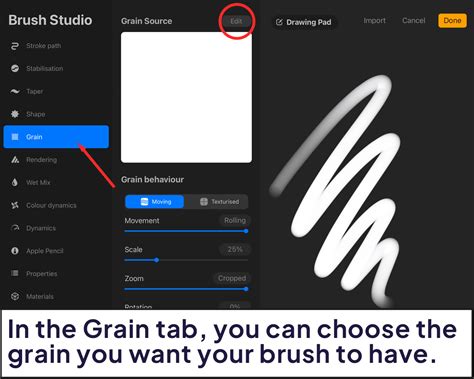
- Adjusting Brush Settings: Even standard brushes can be modified to create texture. Tap on a brush to open the Brush Studio. Here, you can explore settings like "Grain," "Texture," and "Stroke Path."
- Grain: This setting allows you to add a texture pattern to the brush stroke itself. You can import your own images here or use Procreate's built-in textures.
- Texture: This tab is specifically for applying a secondary texture to your brush. You can adjust the scale, depth, and blend mode of the texture.
- Stroke Path: Modifying the "Spacing" in this section can create a more broken, textured line, mimicking the way dry media might appear on rough paper.
Simulating Paper with Color and Blending Modes
Even a simple round brush can be made to look like it's interacting with paper.
- Subtle Color Variations: Instead of using a flat color, introduce subtle variations in hue and value. This can be achieved by adjusting your color picker slightly as you paint, or by using a textured brush that inherently creates these variations.
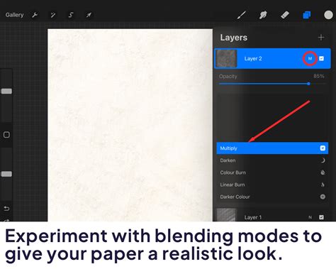
- Blending Modes: Experiment with blending modes for your texture layers. "Overlay," "Soft Light," and "Multiply" can be effective for integrating a paper texture seamlessly with your artwork.
Importing and Applying Custom Paper Textures
For the most realistic and versatile results, importing custom paper textures is the most effective method. This involves finding high-resolution images of real paper and applying them to your canvas.
Sourcing High-Quality Paper Textures
You can find excellent paper texture images from various sources:
- Stock Photo Websites: Many websites offer free or premium stock photos, including scans of different types of paper. Search for terms like "paper texture," "watercolor paper texture," "canvas texture," or "parchment paper."
- Scanning Your Own Paper: If you have physical art supplies, you can scan sheets of your favorite papers at a high resolution. Ensure your scanner is clean and the paper is flat for the best results.
- Dedicated Texture Packs: Numerous artists and websites sell curated packs of digital textures, often specifically designed for art applications like Procreate.
When selecting textures, consider:
- Resolution: Higher resolution images will produce sharper, more detailed textures.
- Seamlessness: For certain applications, you might want textures that tile seamlessly to cover larger areas without visible breaks.
- Variety: Collect textures from different paper types (e.g., watercolor cold-press, Bristol board, newsprint, handmade paper) to offer a range of effects.
Applying Textures in Procreate
Once you have your texture image, there are several ways to apply it to your Procreate artwork.
Method 1: Using the "Insert a File" or "Insert a Photo" Feature
This is the most straightforward method for applying a texture as a new layer.
- Open your Procreate artwork.
- Tap the wrench icon (Actions menu) in the top-left corner.
- Go to the "Add" tab.
- Select "Insert a File" or "Insert a Photo." Choose your desired paper texture image from your iPad's files or photo library.
- Position and Scale: The texture will appear as a new layer. Use the transform tool (arrow icon) to resize and position the texture to cover your entire canvas. Ensure it's scaled appropriately to avoid pixelation.
- Adjust Blending Mode and Opacity: This is where the magic happens.
- Blending Mode: Select the texture layer and tap "N" to open the Blending Modes. Experiment with modes like:
- Overlay: This mode blends the texture with the layers below, enhancing contrast and color while retaining the texture's pattern. It's excellent for subtle paper grain.
- Soft Light: Similar to Overlay, but often gentler.
- Multiply: This mode darkens the artwork based on the texture's colors, useful for darker, more pronounced textures or simulating ink absorption.
- Linear Burn/Color Burn: Can create dramatic effects, but use with caution.
- Screen/Linear Dodge: Useful for adding subtle highlights or sheen if your texture has bright elements.
- Opacity: Adjust the opacity of the texture layer to control how strong the paper effect is. Start with a lower opacity (e.g., 20-50%) and increase it until you achieve the desired look.
- Blending Mode: Select the texture layer and tap "N" to open the Blending Modes. Experiment with modes like:
Method 2: Using the "Canvas" Function for a Global Texture
This method applies a texture to the entire canvas at once, essentially creating a paper-like background.
- Open your Procreate artwork.
- Tap the wrench icon (Actions menu).
- Go to the "Canvas" tab.
- Tap "Image Assist."
- Tap "Import."
- Select your paper texture image.
- Adjust Settings: Procreate will attempt to apply the texture. You can then adjust its scale and position. This method can be less flexible for fine-tuning compared to using separate layers, but it's quick for a base texture.
Creating Custom Paper Brushes
For even more control and efficiency, you can create your own brushes that incorporate paper texture. This allows you to "paint" with the texture directly.
Steps to Create a Textured Brush:
Prepare Your Texture Source:
- Find or create a seamless grayscale image of your desired paper texture. This image will be used as the "grain" or "texture" for your brush. The darker the areas in your source image, the more pronounced the texture will be in your brush stroke.
- Ensure the image is square and preferably at a resolution suitable for Procreate (e.g., 1000x1000 pixels or larger).
Open the Brush Studio:
- Tap the brush icon to open the Brush Library.
- Tap the "+" icon in the top-right corner to create a new brush.
Configure the "Shape" Source:
- In the Brush Studio, navigate to the "Shape" tab.
- Tap "Edit."
- Tap "Import."
- Choose "Import a file" or "Import a photo" and select your prepared paper texture image.
- Tap "Done" to exit the shape editor.
- Ensure "Invert" is off unless your texture source is designed to be inverted.
- Adjust "Movement" to "Texturized" if you want the texture to follow the stroke's path.
Configure the "Grain" Source (Optional but Recommended):
- Navigate to the "Grain" tab.
- Tap "Edit."
- Tap "Import."
- Select your paper texture image again.
- Adjust "Scale" to control how large the texture appears within the brush stroke.
- Adjust "Depth" to control the intensity of the texture.
- Set "Movement" to "Texturized" or "Stroked" depending on the desired effect. "Texturized" often works well for paper.
Adjust "Stroke Path" and "Rendering":
- Stroke Path: Adjust "Spacing" to create a more broken or continuous line. Lower spacing creates a smoother stroke, while higher spacing can give a more dry or textured feel.
- Rendering: Experiment with "Rendering" options. "Uniformity" can affect how evenly the texture is applied. "Blend Mode" for the brush itself can also be adjusted.
Fine-tune Other Settings:
- Tapering: Adjust "Shape > Taper" to control the brush's tip shape.
- Opacity and Flow: Control these in the "Properties" tab.
- Wet Mix: If you're aiming for a watercolor or paint-on-paper effect, explore the "Wet Mix" settings to simulate paint behavior.
Name and Save Your Brush:
- Go to the "About this brush" tab to give your brush a name and add your signature.
- Tap "Done" to save your new custom brush.
You can now use this brush to paint directly onto your canvas, and the paper texture will be integrated into every stroke.
Paper Texture in PROCREATE with 2 Layers
Advanced Techniques for Realism
Beyond basic texture application, several advanced techniques can further enhance the realism of paper in your Procreate art.
Simulating Paper Types
Different papers have distinct visual characteristics.
- Watercolor Paper (Cold-Press): Known for its pronounced "tooth" and slight irregularities. Use textured brushes with high spacing or import textures with visible fiber patterns. Apply textures with blending modes like "Overlay" or "Soft Light" at moderate opacity.
- Bristol Board: Typically very smooth with minimal tooth. Use flatter brushes and focus on subtle color variations and perhaps a very fine, almost imperceptible texture.
- Newsprint: Characterized by its low quality, often with a yellowish tint and visible fibers. Use rougher textures and consider adding a slight yellow or sepia color overlay.
- Textured Drawing Paper: Can vary widely, but often has a consistent, fine grain. Experiment with different texture images and brush settings.
Adding Imperfections and Variations
Real paper is rarely perfect. Adding subtle imperfections can significantly boost realism.
- Speckles and Flecks: Use a fine-point brush with low opacity and a slightly speckled texture to add small dots and flecks, mimicking paper fibers or imperfections. Apply these on a separate layer with a "Screen" or "Add" blending mode.
- Mottling and Unevenness: For a painterly effect, use a soft brush with low opacity and varying colors to gently scumble over areas, simulating how paint might pool or dry unevenly on textured paper.
- Edge Effects: Real paper often has slightly softened or irregular edges, especially if it's been torn or deckled. You can achieve this by lightly smudging or using a textured eraser along the canvas edges.
Lighting and Shading Considerations
How light interacts with paper texture is key to its realism.
- Subtle Highlights: Use a very fine brush with a light color and low opacity, set to a "Screen" or "Add" blending mode, to paint subtle highlights that catch the "tops" of the paper's texture.
- Shadows within Texture: Conversely, a dark color with low opacity on a "Multiply" or "Linear Burn" layer can create subtle shadows within the "valleys" of the texture, adding depth.
- Consider the Light Source: Think about where your light is coming from and how it would realistically interact with a textured surface.
Integrating Textures with Your Art Style
The goal is not just to add texture, but to make it feel like an integral part of your artwork.
- Subtlety is Key: Often, less is more. A very subtle paper texture can be more effective than an overpowering one.
- Consistency: Ensure the texture you choose complements your overall art style and the subject matter. A rough, handmade paper texture might not suit a clean, minimalist illustration.
- Experimentation: The best way to find what works for you is to experiment. Try different textures, blending modes, opacities, and brush settings. Don't be afraid to layer multiple textures or effects.
By mastering these techniques, you can transform your digital creations in Procreate, giving them a tangible, authentic feel that resonates with the tactile beauty of real paper. The ability to simulate these physical qualities opens up new avenues for artistic expression and allows for a deeper connection with the viewer.