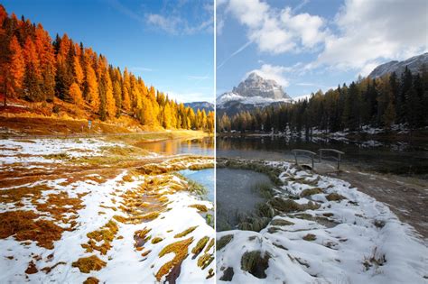
When editing images in Photoshop, the initial capture often doesn't quite translate the vibrant hues and rich textures that were present in reality. The striking reds and deep blues that captivated attention during a fashion photoshoot can appear flat and uninspiring on screen. This is precisely where the powerful capabilities of color correction and color grading in Photoshop become indispensable. While color correction focuses on rectifying color imbalances and restoring the true, natural appearance of hues, color grading introduces a creative dimension to enhance the overall mood and aesthetic of an image. Photoshop offers a comprehensive suite of tools, from adjusting white balance and exposure to meticulously refining specific color ranges, empowering users to elevate their photographs to their absolute best.
The Foundation: Understanding Color Correction in Photoshop
Color correction in Photoshop is a fundamental photo editing technique aimed at adjusting the colors within an image to more accurately reflect what was perceived by the human eye. The reality of digital photography is that colors don't always render perfectly straight out of the camera. This can be due to various factors, such as the camera's white balance not being accurately set, leading to an unwanted blue or orange cast, or issues with overall exposure that affect color perception. Sometimes, a subtle, pervasive color tint can cast a shadow over the entire image.
Mastering color correction and grading tools in Photoshop unlocks a world of creative possibilities, extending beyond mere color adjustments to tasks like enhancing fabric textures and skillfully removing wrinkles for a polished final look. Color correction serves as the crucial first step in resolving these color discrepancies. Its primary goal is to neutralize colors, rendering them "true to life." This provides an accurate and neutral starting point, which is essential for any subsequent creative modifications or enhancements to the photograph.
Basic Photoshop Color Correction Techniques
Photoshop offers several intuitive tools for basic color correction, allowing users to quickly address common color imbalances.
Levels Adjustment: Sculpting Tones with Sliders
The Levels tool is an exceptionally powerful instrument for fine-tuning the shadows, highlights, and intermediate tones within an image. To access and utilize this tool:
- Navigate to
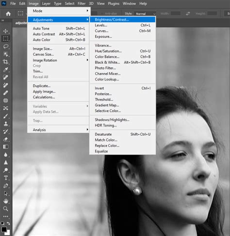
Image > Adjustments > Levels. - Upon opening, you will encounter sliders representing the black points, white points, and gray points of your image's tonal range.
- By manipulating these sliders, you can deepen the shadows for more contrast, brighten the highlights to reveal detail, and precisely adjust the midtones to achieve your desired look.
- Furthermore, the Levels tool provides eyedropper tools that allow you to manually set the black, gray, and white points, offering greater control over color balance.
Curves Adjustment: Precise Control Over Tonal Range
The Curves tool extends the tonal adjustment capabilities of Levels, offering even more granular control over shadows, midtones, and highlights. Here's how to leverage its power:
- Access the Curves tool by going to
Image > Adjustments > Curves. - The Curves interface displays a graph where the horizontal axis represents the input tones (from black on the left to white on the right) and the vertical axis represents the output tones.
- You can click directly on the diagonal line to add anchor points, which can then be dragged to directly influence specific tonal areas - deepening shadows, brightening highlights, or adjusting any point in between.
- Crucially, the Curves tool allows for individual adjustment of the Red, Green, and Blue (RGB) color channels. This is invaluable when you need to tweak a particular color, such as subtly reducing the intensity of blues to correct a cool cast.

Auto Color Correction: A Quick Fix
For those moments when a quick and basic color fix is needed without delving into manual adjustments, Photoshop's auto color correction feature can be a lifesaver.
- Simply navigate to the
Imagemenu and locateAuto Color. - Upon selection, Photoshop analyzes the photograph and automatically makes adjustments to elements like white balance, exposure, and removes any perceived unwanted color tones.
- While this feature often yields decent results with a single click, it's important to note that its automatic fixes can sometimes be overly aggressive. If the resulting colors appear unnatural, reducing the opacity of the applied layer can help to achieve a more balanced and natural look.
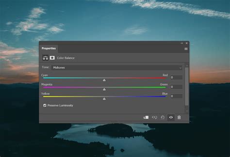
Color Balance Tool: Targeted Color Adjustments
The Color Balance tool offers precise control over which colors are adjusted within the shadows, midtones, and highlights of an image. Its usage is straightforward:
- Access the tool via
Image > Adjustments > Color Balance. - You will find sliders dedicated to adding or subtracting colors such as cyan, magenta, yellow, red, green, and blue. These sliders can be applied independently to the shadows, midtones, and highlights.
- For instance, if you wish to introduce a bluer tone to the shadows, simply move the blue slider to the left within the shadows section. Conversely, to impart a warmer tone to the highlights, shift the red slider to the right in the highlights section.
Advanced Color Correction and Grading Techniques
Beyond the basic tools, Photoshop offers more sophisticated methods for achieving professional-level color adjustments and creative grading.
Camera Raw Filter: RAW Power for All Files
Even if your images are in JPEG format rather than RAW, you can still harness the extensive color editing controls offered by the Camera Raw filter.
- Apply the filter by navigating to
Filter > Camera Raw Filter. - This action opens a comprehensive panel brimming with sliders for meticulous image fine-tuning.
- Within the "Basic" tab, you'll discover familiar options like exposure, contrast, highlights, and, most importantly, dedicated white balance sliders.
- The "HSL" (Hue, Saturation, Luminance) section provides the ability to individually adjust the hue, saturation, and lightness of every single color present in the photo, offering unparalleled control.
The Secret Way to Get Pro Level Color Grading with Camera Raw Masking
Hue/Saturation Adjustment: Fine-Tuning Specific Colors
The Hue/Saturation tool is designed for precisely targeting and modifying specific colors within an image.
- Access this tool through
Image > Adjustments > Hue/Saturation. - The interface presents sliders for adjusting hue (the color itself), saturation (the intensity of the color), and lightness. You can select the specific color or color range you wish to modify from the dropdown menu located above the sliders.
- Once a color range is selected, such as reds or a combination of oranges and yellows, you can then manipulate the sliders to achieve your desired effect.
Selective Color Adjustment: Isolating and Tweaking
The Selective Color tool is ideal for situations where you need to isolate a single color and make very specific adjustments to it.
- Navigate to
Image > Adjustments > Selective Color. - This tool allows you to select a specific color from a dropdown menu.
- The sliders that appear control the cyan, magenta, yellow, and black ink components for the chosen color. This enables you to precisely add or subtract amounts of these inks.
- For example, to subtly darken reds, you can pull down the magenta slider. To enhance the vibrancy of greens, you might boost the yellow component.
Match Color Feature: Harmonizing Image Palettes
The Match Color feature is incredibly useful when you aim to achieve a consistent look and feel across multiple photographs.
- Begin by opening both the image you want to adjust and the source image (whose color scheme you wish to emulate) in Photoshop.
- Select the image you intend to modify.
- Go to
Image > Adjustments > Match Color. - In the dialog box, you will be prompted to select the "source" image from a dropdown menu.
- Photoshop then analyzes the color data of the source image and applies the necessary corrections to the selected image, aiming to match the tones and overall mood.
The Art of Color Grading in Photoshop
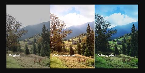
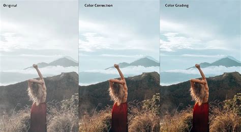
While color correction is about accuracy and restoring natural hues, color grading is an inherently artistic process that uses color to establish a specific mood, atmosphere, or emotional tone. Where correction strips colors back to a neutral baseline, grading is about injecting style, personality, and a distinct visual narrative. You can warm up an image to evoke coziness, cool it down to create a sense of mystery, or amplify saturation for a high-energy, vibrant look. Color grading is less about realism and more about leveraging color to evoke emotions. For instance, cooler blues might suggest a melancholic mood, while vibrant oranges and yellows can convey a sense of fun and cheerfulness.
Gradient Map Adjustment: Artistic Recalibration
Gradient Maps offer a playful yet powerful way to completely re-color an image in artistic and imaginative ways.
- Create a new Adjustment Layer by going to
Layer > New Adjustment Layer > Gradient Map. - You'll be presented with a variety of preset color scheme options, such as "Sunset" or "Rainbow." However, you also have the ability to craft your own custom gradients for unique artistic expression.
- Experiment with blending modes and opacity settings to fine-tune the effect and achieve your desired artistic outcome.
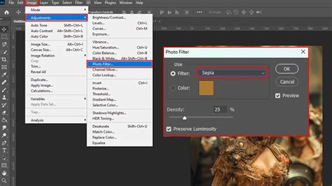
Photo Filter Adjustment: Emulating Classic Filters
The Photo Filter adjustment layer is designed to mimic the effect of physical camera filters, adding a distinct color cast to your image.
- Access this feature by navigating to
Layer > New Adjustment Layer > Photo Filter. - You can choose from a range of imitation filter options, including warming, cooling, blue/orange, and more. Custom colors can also be applied.
- Once a filter is selected, the "Density" slider controls the intensity of the effect. A higher density results in a stronger application of the chosen color.
Split Toning: Dual-Tone Emphasis
Split toning is a fantastic technique for imbuing the shadows and highlights of an image with distinct color characteristics, adding depth and stylistic flair.
- Navigate to
Image > Adjustments > Color Balance. - Within this panel, you'll find dedicated sections for "Shadows" and "Highlights," allowing you to select specific colors and tones for each.
- The "Balance" slider then controls the transition between these two color treatments, dictating where the split effect is most pronounced.
Creating and Using LUTs: Reusable Color Recipes
Look-Up Tables (LUTs) are invaluable for saving and reusing customized color treatments across multiple photos, ensuring consistency in your workflow.
- Begin by editing an image to your satisfaction, achieving the desired color look.
- To save these adjustments as an LUT file, go to
File > Export > Color Lookup Tables. - Assign a memorable name to your "recipe" for easy identification later.
- To apply a saved LUT to another image, create a new Adjustment Layer and select "Color Lookup" from the list.
- Your saved LUT will appear in the dropdown menu. Selecting it will instantly apply the saved color grading to your new photo.
A Step-by-Step Color Grading Workflow
Streamlining your color grading process can lead to more efficient and effective results. Consider this systematic approach:
- Define the Mood: Take a moment to contemplate the overall vibe or mood you wish to convey. Referencing other images for inspiration can be beneficial at this stage.
- Establish the Foundation: Begin with broad adjustments. The Curves panel is excellent for setting the base exposure and contrast. Subsequently, utilize individual color sliders to balance the overall tones.
- Target Specific Hues: Once the foundational tonal structure is in place, employ specialized tools for refining exact hues. You might start with Hue/Saturation adjustment layers to modify specific color ranges.
- Fine-Tune with Precision: Experiment with the Selective Color tool for ultra-fine adjustments to individual color mixtures. The Color Balance panel is also crucial for adding character to shadows and highlights independently.
- Review and Refine: Periodically step back to assess the overall flow and coherence of the image. Making subtle adjustments across multiple layers is often more effective than drastic changes to a single element.
- Blend and Integrate: Layer modes and opacity settings are your best allies for subtly blending adjustments and achieving a harmonious look. Layer masks can also be employed to confine adjustments to specific areas of the image.
Essential Tips for Effective Color Correction and Grading
To further enhance your color correction and grading skills, consider these timeless recommendations:
- Embrace Adjustment Layers: Always opt for adjustment layers. This non-destructive approach allows you to easily tweak or remove changes without compromising the original image data.
- Master Layer Masks: Layer masks are indispensable for restricting adjustments to specific parts of an image. They are crucial for ensuring colors appear natural and consistent across varying light and dark areas.
- Calibrate Your Monitor: Ensure your monitor is properly calibrated and profiled. This is vital for accurate color representation, guaranteeing that what you see on your screen closely matches how your images will appear on other displays or in print.
- Maintain Consistency in Series: When working on a series of photographs, strive for a consistent color grade across all images. Saved presets and LUTs are incredibly helpful in achieving this uniformity.
Conclusion: The Synergy of Technical Skill and Artistic Vision
Perfecting color correction and grading in Photoshop requires a blend of technical proficiency and artistic intuition. The more you familiarize yourself with the diverse array of tools and methodologies available, the more precisely you can transform your images. Don't hesitate to experiment; discovering your unique style is an inevitable outcome of consistent practice and exploration. Both adjustment layers and editing within Adobe Camera Raw offer robust workflows for altering image tone and color, providing extensive control and flexibility without permanently altering the original image information. This preserves the integrity of your source files. Adjustment layers apply edits on separate layers, leaving the original background layer untouched. The Adjustments panel provides easy access to these tools, and multiple adjustment layers can be stacked for complex edits. Layer masks further enhance control by limiting adjustments to specific image areas. Adobe Camera Raw, a Photoshop plug-in, offers comprehensive color and tonal adjustments, even for JPEGs and TIFFs, in a dedicated editing window with a large preview. For most professional work, prioritizing adjustment layers or Camera Raw over direct Image > Adjustments commands is recommended unless a specific adjustment isn't available through these non-destructive methods. Smart Objects also offer a powerful way to edit layers nondestructively.
There isn't a single "best" way to alter color in Photoshop; each method has its merits. The Color Replacement Tool, found within the Brush tool group, allows for direct color application. When using this tool, setting the "Mode" to "Color" is crucial. Its "Continuous Sampling" or "Single Sample" modes determine how it samples colors, while "Tolerance" controls the accuracy of the color replacement. For destructive edits, duplicating the layer or creating a "Stamp Layer" is essential.
The "Replace Color" command under Image > Adjustments provides another avenue, utilizing eyedropper tools and a "Fuzziness" slider to define the color range to be replaced. This method also allows for refinement using layer masks. For the most control and natural-looking results, especially in professional contexts, the Hue/Saturation adjustment layer, often combined with a Color Range selection, is frequently the preferred approach. This method allows precise targeting of specific colors while preserving intricate details, contrast, and textures.
The fundamental elements of color in Photoshop - Hue, Saturation, and Lightness - are key to understanding these adjustments. Hue defines the color itself (e.g., blue, green), Saturation dictates its intensity, and Lightness controls its brightness. Tools like the Hue/Saturation adjustment layer, Color Fill layers with specific blending modes (like "Color"), and the Gradient Map tool offer diverse ways to manipulate these elements. For global changes, Image > Adjustments > Replace Color is an option, while the Color Replacement Tool offers a more direct, brush-based approach. For complex, color-based selections across an entire image, the Select > Color Range command is highly effective. The Contextual Task Bar in Photoshop also provides on-canvas sliders for immediate hue, saturation, and lightness modifications, automatically creating adjustment layers for non-destructive editing. These adjustments can be further refined in the Properties panel, which also offers comparative color swatches.
For more specialized tasks, the Sponge tool can selectively increase or decrease saturation on specific objects. The Color Replacement Tool, while simple, is destructive and requires layer duplication. Its sampling modes (Continuous, Single) and tolerance settings influence its behavior. The "Replace Color" dialog allows for sampling and adjustment of colors, with "Fuzziness" controlling selection accuracy. The Hue/Saturation adjustment layer, particularly when combined with a Color Range selection and a layer mask, is often considered the most robust method for achieving natural-looking color changes while preserving detail and texture.
When working with color, it's also important to consider the color mode. While most tonal and color corrections are best performed in RGB mode due to its fewer channels and wider color gamut, CMYK mode is essential for fine-tuning final output for print. Photoshop provides tools like Gamut Warning to identify colors that fall outside the printable CMYK range, allowing for manual correction or conversion before final output. Ultimately, the choice of tool and technique depends on the specific image, the desired outcome, and the user's comfort level with Photoshop's extensive capabilities.