Changing colors in Photoshop is a fundamental skill that can dramatically transform your images. While the sheer number of tools and options might seem daunting at first, understanding the core principles and workflows allows for precise and creative color manipulation. This guide will walk you through various methods to adjust color in Photoshop, from subtle corrections to dramatic transformations, ensuring you can achieve the desired aesthetic for any image.
The Importance of a Solid Foundation: File Preparation and Non-Destructive Editing
Before diving into specific color adjustment techniques, it's crucial to establish a strong foundation for your editing workflow. For optimal results, especially when undertaking significant color changes, working with a 16-bit RAW file is highly recommended. RAW files contain a far greater amount of image data compared to 8-bit JPEGs, offering more flexibility and preserving detail during adjustments. While not strictly necessary for all edits, using a 16-bit image significantly minimizes data loss when making tonal and color adjustments, which is particularly critical for preserving the integrity of highlights and shadows.
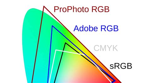
When you open an image in Photoshop, it's generally advisable to avoid working directly in the sRGB color space if possible, as it has a relatively small gamut. Instead, consider using a wider gamut color space like Adobe RGB (1998) for your initial edits, especially if your final output is intended for print. sRGB is generally suitable for web use due to its standardization with monitors.
The principle of non-destructive editing is paramount in professional image manipulation. This means making changes in a way that allows you to revisit and modify them later without permanently altering the original image data. The most effective way to achieve this in Photoshop is by utilizing adjustment layers.
Adjustment layers are special layers that apply color and tonal adjustments to the layers below them without directly modifying the pixels of the original image. This offers immense flexibility, allowing you to tweak, refine, or even remove adjustments at any point in your workflow. Each adjustment layer creates a separate entity in the Layers panel, which can be individually selected, modified, masked, or deleted.
To access these powerful tools, ensure your Adjustments panel is open (Window > Adjustments). Clicking on any of the icons within this panel will automatically create a corresponding adjustment layer above your currently selected layer.
Duplicating Your Layer and Converting to a Smart Object
A common and highly recommended practice before applying complex filters or adjustments is to duplicate your image layer. This provides an immediate backup of your original image data. Furthermore, converting this duplicated layer into a Smart Object is a key step for enabling non-destructive filtering, particularly when using the Camera Raw Filter.
To convert a layer to a Smart Object:
- Duplicate your image layer (Ctrl+J or Cmd+J).
- Right-click on the duplicated layer in the Layers panel.
- Select "Convert to Smart Object."
Smart Objects allow you to apply filters, including the Camera Raw Filter, in a non-destructive manner. This means you can re-edit the filter settings at any time by simply double-clicking on the Smart Filter entry in the Layers panel.
Smart Objects in Photoshop: Learn The Basics
Fine-Tuning White Balance and Color Temperature
One of the first and most critical color adjustments is correcting the white balance. An incorrect white balance can cast an unwanted color tint across your entire image, making colors appear unnatural. The goal of white balance correction is to ensure that white objects in your image appear truly white, and consequently, all other colors are rendered accurately.
The Camera Raw Filter (accessible via Filter > Camera Raw Filter) is an excellent tool for initial white balance adjustments. Within the Camera Raw Filter, you'll find a White Balance Adjustor tool (often represented by an eyedropper). By selecting this tool and clicking on a neutral gray or white area in your image, you can instruct Photoshop to neutralize any color cast and set a correct white balance. If your image contains a true black area, like the top of Cara's head in the example provided, clicking on it can also be a straightforward way to achieve a proper white balance.
Within the Camera Raw Filter, the Color Mixer tab also offers granular control over individual color channels. By selecting the "Hue" view, you can shift the hue of specific colors, moving them towards adjacent colors on the color wheel. This can be useful for subtle color shifts or for correcting specific color casts that might not be fully resolved by the white balance alone.
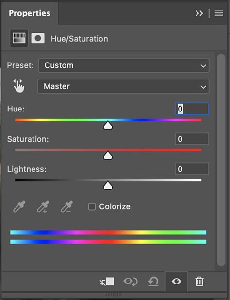
The Power of Hue/Saturation: Precise Color Manipulation
The Hue/Saturation adjustment layer is one of the most versatile tools for altering colors in Photoshop. It allows you to modify the hue (the actual color itself), saturation (the intensity of the color), and lightness (the brightness of the color) of specific color ranges within your image.
The Targeted Approach with the Hand Tool
A particularly powerful feature of the Hue/Saturation adjustment layer is the Hand Tool icon, located to the right of the color drop-down menu in the Properties panel. When this icon is active, you can directly interact with your image to select and adjust colors.
Here's how to use it effectively:
- Select the Hue/Saturation adjustment layer.
- Click the Hand Tool icon.
- Click and drag on the specific color you wish to modify in your image. As you drag, Photoshop will automatically target that color range and display the corresponding sliders (Hue, Saturation, Lightness) in the Properties panel.
- Adjust the Saturation slider: Pushing the saturation to +100 temporarily intensifies the selected color. This helps you clearly see the range of pixels being affected.
- Refine the Color Range: The rainbow-like slider below the color drop-down shows the current color ranges being targeted. You can drag the endpoints of these ranges to include or exclude specific colors. The goal is to isolate the color you want to change while leaving other colors unaffected.
- Modify Hue: Use the Hue slider to shift the selected color to your desired hue.
- Fine-tune Saturation and Lightness: Adjust these sliders to achieve the perfect intensity and brightness for your target color.
Addressing Residual Colors
It's common to encounter "residual" colors - colors that are subtly affected even after you've made your primary adjustments. To manage these:
- Go back to the master dropdown menu in the Hue/Saturation Properties panel.
- Select the color range that was originally changed (e.g., if you changed greens, select "Greens" from the master dropdown).
- You will see the adjustment sliders reset to their state when that color range was selected.
- Make further adjustments to fine-tune the primary color and address any residual color shifts. You might need to create additional Hue/Saturation adjustment layers to target specific residual colors independently.
Exploring Other Color Adjustment Tools
Photoshop offers a rich array of tools for color correction and creative color manipulation, each with its unique strengths.
Levels and Curves: Tonal Range and Color Balance
Levels and Curves are fundamental tools for adjusting the tonal range and color balance of an image. They allow you to control the distribution of pixels across the entire tonal spectrum, from shadows to highlights.
- Levels: This adjustment provides three sliders (black point, midtone, and white point) for each color channel (Red, Green, Blue, or composite RGB). By adjusting these sliders, you can deepen shadows, brighten highlights, and correct overall exposure and contrast.
- Curves: Curves offer more precise control than Levels. You can create custom curves by adding up to 14 control points to individually adjust highlights, midtones, and shadows for each color channel. This allows for sophisticated tonal sculpting and color grading.
Both Levels and Curves can be used to correct unwanted color casts by adjusting the individual Red, Green, and Blue channels. For instance, if an image has a blue cast, you would decrease the blue channel's curve in the midtones or highlights.
Color Balance: Shifting the Overall Mood
The Color Balance adjustment layer is ideal for correcting color imperfections or for creating dramatic color effects.
- To correct color casts: Move the Cyan/Red, Magenta/Green, or Yellow/Blue sliders towards the color that needs to be added to the image, or away from the color that needs to be subtracted. The values displayed above the sliders indicate changes in the Red, Green, and Blue channels, ranging from -100 to +100.
- For creative effects: You can push the sliders significantly to create distinct moods. For example, shifting towards blues and cyans can evoke a cool, serene feeling, while moving towards reds and yellows can create warmth and energy.
You can also access this adjustment via Image > Adjustments > Color Balance, but using an adjustment layer is always preferred for non-destructive editing.
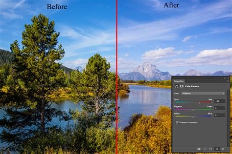
Photo Filter: Simulating Lens Filters
The Photo Filter adjustment layer simulates the effect of placing a colored filter in front of your camera lens.
- Preset Filters: Photoshop offers a range of preset filters (e.g., Warming Filter, Cooling Filter, Sepia).
- Custom Color: You can select a custom color and adjust its density to apply a specific hue to your image.
- Preserve Luminosity: An important option here is "Preserve Luminosity." When enabled, it helps to prevent drastic changes to the overall brightness of your image while applying the color shift.
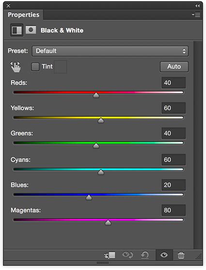
Selective Color: Targeting Specific Color Components
Selective Color is a powerful tool for fine-tuning the CMYK components of specific color ranges in your image. While it might seem counterintuitive to use CMYK for RGB images, this tool offers a unique way to isolate and adjust colors.
- By selecting a color range (e.g., Reds, Yellows, Greens, Cyans, Blues, Magentas, Whites, Neutrals, Blacks), you can then adjust the amounts of Cyan, Magenta, Yellow, and Black within that specific color range.
- For example, to make reds richer, you might increase the Magenta and Yellow sliders within the "Reds" color range. To desaturate blues, you could increase the Yellow slider within the "Blues" range.
Match Color: Transferring Color Schemes
The Match Color command (Image > Adjustments > Match Color) is designed to transfer the color characteristics from one image or selection to another. This is incredibly useful for ensuring color consistency across multiple images or for applying a specific color look to a subject.
- You can match colors from a source image to your target image.
- You can also match colors from a selection in one image to a selection in another.
- This command also adjusts luminance and neutralizes color casts, making it a comprehensive tool for color harmonization.
Replace Color: Swapping Specific Hues
The Replace Color command (Image > Adjustments > Replace Color) allows you to select a specific color range and replace it with a new color.
- Select the color range you want to change using the eyedropper tools.
- Adjust the Hue, Saturation, and Lightness sliders to define the new color you want to introduce.
- The "Fuzziness" slider controls the tolerance of the color selection.
This tool is excellent for quickly changing the color of a specific object, like a shirt or a car, without affecting the rest of the image.
Advanced Considerations and Best Practices
Monitor Calibration and Profiling
For any critical image editing, especially when color accuracy is paramount, calibrating and profiling your monitor is essential. A calibrated monitor displays colors accurately according to industry standards. Without it, what you see on your screen may not be what others see on their screens or what will be printed.
Working Spaces and Color Management Policies
Understanding Photoshop's color settings is crucial for consistent results.
- Working Spaces: These define the color space within which you are working (e.g., sRGB, Adobe RGB). For web use, sRGB is standard. For print, Adobe RGB often provides a wider gamut.
- Color Management Policies: These dictate how Photoshop handles color data when opening or importing files, especially when profiles mismatch or are missing. The "Preserve Embedded Profiles" policy is generally recommended for most workflows to maintain consistent color management.
- Gamut Warnings: Use the "Gamut Warning" command (Edit > Transparency & Gamut) to highlight colors in your image that are outside the printable CMYK gamut. This helps you identify and adjust colors that may not reproduce accurately when printed.
Understanding Color Models: RGB vs. CMYK
- RGB (Red, Green, Blue): This is an additive color model used for digital displays like monitors and web graphics. It has fewer channels and is generally easier to edit in.
- CMYK (Cyan, Magenta, Yellow, Black): This is a subtractive color model used for printing. It's device-dependent and based on ink and paper combinations. While you can make most tonal and color corrections in RGB, it's often best to use CMYK mode for fine-tuning before final output for print. You can view CMYK values while working in RGB by opening a second window (Window > Arrange > New Window For) and setting it to display CMYK.
Saving Presets for Reusability
Once you've achieved a specific color adjustment you like, you can save it as a preset for future use. This is particularly useful for maintaining a consistent look across a series of images.
- In many adjustment dialog boxes (Levels, Curves, Hue/Saturation, etc.), you'll find a "Presets" menu in the Properties panel.
- Click the panel menu (the small icon with lines in the top right of the panel) and choose "Save Preset."
- You can then access this saved preset from the menu in the Properties panel or load it into other adjustment dialogs.
By mastering these techniques and understanding the underlying principles of color management, you can unlock the full potential of Photoshop to achieve stunning and precise color adjustments in your images. Whether you're aiming for subtle corrections or bold creative transformations, Photoshop provides the tools to bring your vision to life.