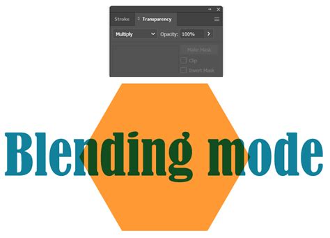
Digital art offers a unique advantage: the ability to work with layers and manipulate how colors interact. At the heart of this manipulation lies the concept of Blending Modes in ibisPaint X. These modes, also referred to as Combination Modes or Drawing Modes, dictate how the colors of an upper layer combine with those of a lower layer. Understanding and effectively utilizing these modes is crucial for artists aiming to express light, shadow, and a myriad of other visual effects with precision and flair. While the concept might seem straightforward, mastering Blending Modes requires practice and a nuanced understanding of how digital colors, represented numerically, behave under different combinations.
Accessing and Understanding Blending Modes
To begin exploring the world of Blending Modes in ibisPaint X, you first need to access the Layer Window. This is achieved by pressing the ①[ Layer Button ]. Within this window, you will find the ②[ Blending Mode list ], where you can select from a diverse array of options. It's important to visualize how these modes function. Imagine placing a semi-transparent sheet of colored cellophane over another. The way the colors interact is akin to this visual, with the upper layer's color influencing the appearance of the layer beneath it.
The core principle behind many Blending Modes involves comparing the numerical values of the RGB color channels in both the upper and lower layers. Digital colors are managed and displayed numerically, and Blending Modes leverage these values to create specific visual outcomes.
Darkening Effects: Multiply, Color Burn, and Linear Burn
Several Blending Modes are designed to darken the image, offering distinct ways to achieve this effect.
Multiply
The [ Multiply ] Blending Mode is perhaps one of the most fundamental and widely used for darkening. As the name suggests, it multiplies the color of the lower layer with the color of the upper layer. This results in darker colors, making it exceptionally effective for painting areas that should be in shadow, such as the subtle shadows on skin or the depths of hair.
The mathematical principle behind [ Multiply ] is straightforward: it literally multiplies the RGB values of the lower and upper layers for each color channel. In ibisPaint, color brightness is represented by values ranging from 0.0 to 1.0. If you paint with a brightness of 0.5 on the upper layer, it will be blended with the lower layer, resulting in a brightness that is precisely half of the lower layer's original brightness (effectively, it's multiplied by 0.5). Similarly, using a brightness of 0.33 on the upper layer will yield a brightness that is one-third of the lower layer's.
This property of [ Multiply ] can be harnessed for advanced techniques. For instance, to isolate and extract only the Red channel of an RGB image, you can place a layer filled with pure red (R=255, G=0, B=0) above the target layer and set its Blending Mode to [ Multiply ].
Furthermore, [ Multiply ] can be used to enhance the mood and depth of an image. By duplicating your photo or illustration, changing the Blending Mode of the duplicate to [ Multiply ], and overlaying it, you can darken the entire image while simultaneously strengthening its overall impression.
Color Burn
[ Color Burn ] also darkens the image, but it does so by increasing the contrast between the base and blend colors. It "burns" the color of the upper layer into the lower layer, resulting in a darker, more saturated appearance. This can be particularly useful for achieving rich, deep tones.
Linear Burn
[ Linear Burn ] offers a different approach to darkening. Unlike [ Color Burn ], which can sometimes lead to localized darkening, [ Linear Burn ] darkens the entire image more evenly, affecting both light and dark areas. However, this even darkening can sometimes obscure details in the darker regions, potentially causing them to merge into pure black. It achieves this by comparing the total RGB values of the lower and upper layers and displaying the color with the lower (darker) value.
Brightening Effects: Screen, Color Dodge, and Linear Dodge
Conversely, several Blending Modes are designed to brighten images, offering ways to introduce light and vibrancy.
Screen
The [ Screen ] Blending Mode is the inverse of [ Multiply ]. Instead of darkening, it brightens the image while preserving the original ratio of light and dark areas. It compares the values of each RGB color channel and displays the color with the higher (lighter) value. This makes it excellent for creating soft glows or lightening areas subtly.
Color Dodge
[ Color Dodge ] brightens the bright areas of an image, making it ideal for situations where you want to enhance luminosity and increase contrast without "blowing out" the highlights into pure white. It achieves this by brightening the image while simultaneously increasing contrast. To achieve a similar effect to strengthening an image's impression with [ Multiply ], you can duplicate your artwork, set its Blending Mode to [ Color Dodge ], and overlay it. This will not only brighten the image but also make it more vivid by increasing the contrast.
Linear Dodge
As [ Linear Burn ] is the even counterpart to [ Color Burn ], [ Linear Dodge ] serves as the even counterpart to [ Color Dodge ]. It brightens the entire image uniformly across both light and dark areas. While effective for overall brightening, this can sometimes lead to bright areas becoming pure white, obscuring details. This mode compares the total RGB values of the lower and upper layers and displays the color with the higher (lighter) value.
A practical application of [ Linear Dodge ] involves color channel separation. If you've used [ Multiply ] to separate RGB channels, combining them using [ Linear Dodge ] will effectively restore the original image.
Add
The [ Add ] Blending Mode is designed to produce the brightest possible colors, making it the go-to mode for expressing intense highlights or light sources. At 100% opacity, [ Add ] behaves similarly to [ Linear Dodge ]. However, when the opacity is reduced, [ Add ] becomes significantly brighter, making it particularly effective for rendering glowing effects or light that emanates intensely. Similar to other additive modes, painting with a desired color in this mode will strongly brighten specific colors.
Contrast and Tone Manipulation: Overlay, Soft Light, Hard Light, Vivid Light, Linear Light, Pin Light, and Hard Mix
A significant group of Blending Modes focuses on manipulating contrast and tone, offering nuanced ways to blend colors.
Overlay
[ Overlay ] is a versatile mode that darkens dark areas and brightens light areas simultaneously. It's a powerful tool for enhancing vibrancy and contrast. Interestingly, pure black or pure white areas on the lower layer remain unaffected by any color overlaid on top in this mode. Overlaying an image onto itself with the [ Overlay ] mode will result in increased vibrancy. Furthermore, even if the lower layer is already colored, overlaying another layer can alter its hue.
Consider the example of transforming a daytime sky to a nighttime scene or changing a character's hair color. [ Overlay ] is frequently used for such color tone transformations. For instance, placing a layer filled with orange between a background and a character, and setting its Blending Mode to [ Overlay ], can effectively shift the overall color temperature.
Soft Light
[ Soft Light ] offers a gentler version of the [ Overlay ] effect. It slightly darkens dark areas and slightly brightens light areas. Use this mode when the impact of [ Overlay ] feels too strong or overpowering for your desired aesthetic.
Hard Light
[ Hard Light ] intensifies the effect of [ Overlay ]. It makes dark areas very dark and light areas very light, while also boosting saturation. The result is a more dramatic and pronounced contrast. This mode creates an effect as if the color of the upper layer is directly shining onto the lower layer, providing a more direct and impactful illumination.
Vivid Light
[ Vivid Light ] pushes the contrast even further. It makes dark areas darker, light areas lighter, and significantly increases the overall contrast of the image.
Linear Light
Similar to [ Vivid Light ], [ Linear Light ] also intensifies contrast by making dark areas even darker and light areas even lighter. It offers a very strong and direct manipulation of tonal values.
Pin Light
[ Pin Light ] operates by comparing the brightness of the lower and upper layers. If the color of the upper layer is bright, it results in the lighter of the two colors. Conversely, if the upper layer color is dark, it results in the darker of the two colors.
Hard Mix
[ Hard Mix ] is the most extreme Blending Mode. It forces each RGB channel to either 0 or 255, resulting in only eight possible colors: black, red, green, yellow, blue, magenta, cyan, and white. The logic is that if the sum of the RGB values of the upper and lower layers is less than 255, it's set to 0; if it's 255 or more, it's set to 255. This mode is useful for creating highly stylized, posterized effects.
Color Manipulation: Hue, Saturation, Color, and Luminosity
Beyond simple darkening or brightening, several Blending Modes allow for precise control over color attributes.
Hue
The [ Hue ] Blending Mode changes the hue of the lower layer to match the hue of the upper layer, while preserving the saturation and luminosity of the lower layer. This is useful for changing the base color of an object without altering its brightness or intensity.
Saturation
[ Saturation ] adjusts the saturation of the lower layer according to the saturation of the upper layer. This mode can be used to desaturate an image, effectively turning it into black and white. To achieve this, create a layer filled with pure white (or pure black) and set its Blending Mode to [ Saturation ].
Using Lighten as Blending Mode | Ibispaint Tutorials
Color
The [ Color ] Blending Mode changes both the hue and saturation of the lower layer to match those of the upper layer, while maintaining the luminosity of the lower layer. This is a powerful mode for recoloring objects or elements within an artwork.
Luminosity
[ Luminosity ] refers to the lightness of a color when converted to grayscale. This mode changes the lightness of the lower layer according to the lightness of the upper layer, while preserving the hue and saturation of the lower layer. This is useful for adjusting the brightness of an image without affecting its colors.
Inversion and Exclusion
Two unique Blending Modes, [ Invert ] and [ Exclusion ], offer distinct ways to manipulate colors.
Invert
[ Invert ] inverts the color of the painted area. It subtracts each RGB value of the lower layer color from 255. This creates an effect similar to a photographic negative. For each RGB channel, the smaller value is subtracted from the larger one, resulting in darker colors. If the upper layer color is black (R=0, G=0, B=0), there will be no change to the lower layer. [ Invert ] can also be a helpful tool for comparing two images or for cleaning up line art.
Exclusion
[ Exclusion ] creates a similar effect to [ Difference ] but with lower contrast. Areas where the lower and upper layers have the same color become darker, while areas with greater color differences become brighter. It achieves this by subtracting the value of the upper layer from the value of the lower layer for each RGB channel. This subtraction process also leads to darker colors.
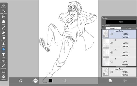
Advanced Techniques: Layering for Line Art and Color Separation
The power of Blending Modes truly shines when applied to more complex workflows. One such workflow involves preparing line art for coloring.
- Layer 1 (Normal): This is your primary working layer, where you will apply colors.
- Layer 2 (Multiply): Import your line art onto this layer. By setting its Blending Mode to [ Multiply ], the black lines will remain visible while the white background becomes transparent, allowing your colors on Layer 1 to show through.
- Layer 3 (Division): To ensure perfect transparency or to isolate specific colors, you can use the [ Division ] mode. Use the Eyedropper tool to pick up the color of your "paper" or background on this layer and fill the entire layer with that color. This layer, when combined with the line art on Layer 2 using [ Division ], can help in isolating or cleaning up the line art.
Commonly Used Blending Modes
While ibisPaint X offers a vast array of Blending Modes, a few stand out for their frequent use and versatility:
- [ Normal ]: The default mode, where the upper layer simply covers the lower layer.
- [ Multiply ]: Essential for adding shadows and darkening areas.
- [ Add ]: Perfect for creating light sources, highlights, and glowing effects.
- [ Overlay ]: Ideal for adjusting color tones, enhancing vibrancy, and color transformations.
- [ Screen ]: Useful for subtle brightening and creating soft glows.
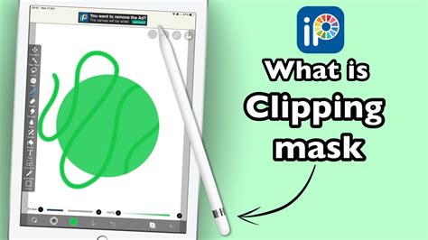
Clipping Masks for Targeted Blending
To apply a Blending Mode to a specific layer without affecting other layers, use a clipping mask. By creating a new layer above the layer you want to affect and enabling the clipping mask option (often represented by an arrow pointing down), any strokes made on the clipping layer will only be visible and will only affect the layer directly beneath it. This allows for precise application of blending effects.
By understanding and experimenting with these Blending Modes, artists can unlock a new level of control and creativity in their digital illustrations, transforming flat colors into dynamic and expressive artworks. The journey to mastering them is one of continuous exploration and practice, but the rewards in terms of visual storytelling and artistic expression are immense.