In the realm of digital art, particularly within the robust capabilities of Clip Studio Paint, understanding and effectively utilizing blending modes is a cornerstone for achieving professional-looking results. Blending modes are not merely decorative filters; they are powerful tools that alter how colors interact between layers, allowing artists to create depth, enhance light, simulate atmospheric effects, and refine their artwork in myriad ways. This article will delve into the fundamental and advanced applications of blending modes, with a specific focus on how they can be employed to "brighten" and enhance various elements within your illustrations.
The Foundation: What Are Blending Modes?
At its core, a blending mode is an effect applied to a layer that dictates how the colors within that layer interact with the colors of the layers situated beneath it. By default, all layers are set to "Normal" blending mode. In this mode, if an area of the layer is drawn with 100% opacity, it will appear completely opaque, obscuring anything on the layers below. However, by changing the blending mode, you unlock a dynamic interplay of colors, transforming the visual outcome of your artwork.
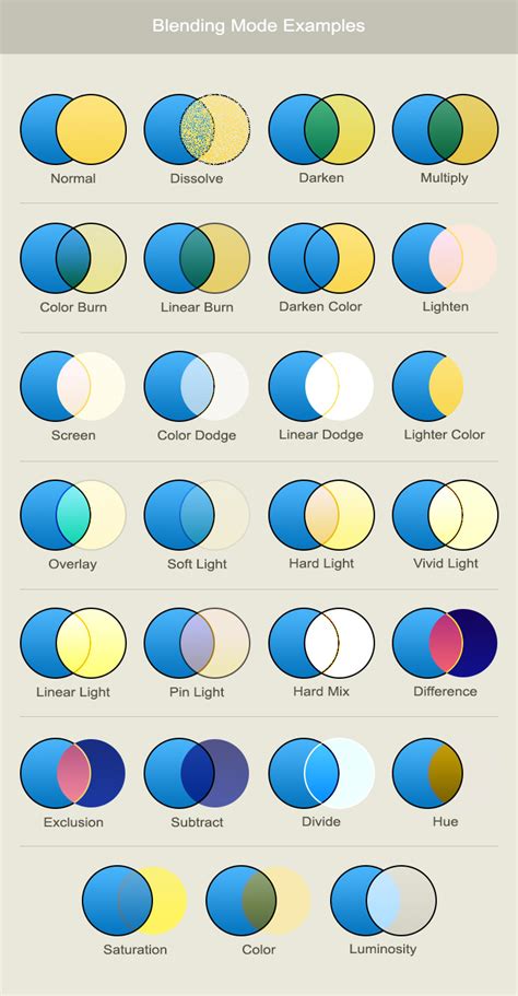
Clip Studio Paint offers a comprehensive suite of blending modes, each with its unique characteristics. These modes can be broadly categorized, and understanding these categories can provide a more intuitive grasp of their functions.
Darkening and Deepening: The Multiply Family
The "darkening" group of blending modes, often characterized by the Multiply mode, are designed to make the resulting image darker. They achieve this by analyzing the color information of both the blending layer and the base layers.
Multiply
The Multiply mode is perhaps the most well-known in this category. It functions by multiplying the color values of the blending layer with the color values of the base layer. The result is always a darker color, effectively creating shadows or deepening existing tones. This mode is incredibly useful for rendering shadows, adding atmospheric effects like fog, or for the initial stages of coloring where you want to build up darker tones gradually. You can think of it as stacking translucent colored filters on top of each other; the more you stack, the darker the result.
Color Burn
Named after a traditional photography technique where areas of a print are intentionally overexposed to darken them, Color Burn also results in a darker image. It works by increasing the contrast and decreasing the brightness of the underlying layers, adding the color from the blending layer. This can create rich, saturated darks and is often used to add depth and intensity to shadows, or to create dramatic lighting effects. While similar to Multiply, Color Burn tends to produce more intense and sometimes more posterized darks.
Multiply Layer for Beginners | Easiest Way to Shade Drawings
Lightening and Enhancing: The Screen and Dodge Family
Conversely, the "lightening" group of blending modes achieves the opposite effect: they make the resulting image brighter. These modes are crucial for adding highlights, glows, and general luminosity to your artwork.
Screen
The Screen mode is the inverse of Multiply. Instead of multiplying colors, it inverts the base colors and then multiplies them with the colors of the blending layer. This process results in a brighter image. Screen is exceptionally effective for rendering light sources, creating soft glows, and adding a general sense of brightness or atmospheric haze. If you want to simulate sunlight filtering through leaves or the soft glow of a distant star, Screen is an excellent choice.
Color Dodge
Color Dodge is the counterpart to Color Burn. It lightens the colors of the base layers by increasing the brightness and decreasing the contrast. The color from the blending layer is applied, resulting in a lighter, often more vibrant effect. This mode is fantastic for creating bright highlights, energetic light effects, and for adding a luminous quality to objects that are directly illuminated. It can also be used to simulate lens flares or the intensity of a light source.
Add
The Add mode is a more intense version of Screen and Color Dodge. It directly adds the color information from the blending layer to the base layers. This results in very bright, often blown-out highlights, and is perfect for extreme light sources, magical effects, or anything that needs to appear intensely luminous and energetic. The effect can be quite dramatic, so it's often used sparingly or with lower opacity.

Contrast and Luminosity: The Overlay and Lighten Family
This group of blending modes focuses on how the blending layer interacts with the luminosity of the layers below, often creating effects that enhance contrast and vibrance.
Overlay
Overlay is a highly versatile mode that combines the effects of Screen and Multiply. In bright areas of the base layer, it behaves like Screen, making them brighter. In darker areas, it behaves like Multiply, making them darker. This results in an overall increase in contrast, making the image more dynamic. Overlay is excellent for adding subtle lighting effects, enhancing textures, and generally giving an illustration a more polished and vibrant feel. It’s also a key mode for techniques like "Center of Light" and "Sub Surface Scattering."
Soft Light
Soft Light is a gentler version of Overlay. Its effect depends on the density and color of the superimposed color. Using bright colors on the blending layer will create a brighter, dodge-like effect, while dark colors will create a darker, burn-like effect. It’s ideal for subtle lighting adjustments, adding a soft glow, or enhancing the mood of an illustration without being overly harsh.
Hard Light
Hard Light is a more intense version of Soft Light. Like Overlay, it combines Screen and Multiply but with a harsher, more direct application of light. The effect depends on the density of the superimposed color. If the blending layer color is lighter than 50% gray, the image is lightened; if it's darker than 50% gray, the image is darkened. This mode is great for creating strong, defined highlights and shadows, and can add a punchy, graphic quality to your art.
Linear Light
Linear Light works similarly to Vivid Light, but it is less prone to blending and contrasting issues when the layer below has luminosity. It essentially brightens or darkens the base layer based on the color of the blending layer. Brighter colors on the blending layer will lighten the base, while darker colors will darken it. This mode can be very dramatic and is often used for strong lighting effects.
Lighten
The Lighten mode is straightforward: it compares the color information of the blending layer and the base layer and only keeps the lightest color. This means any part of the blending layer that is darker than the corresponding part of the base layer will not be visible. This mode is particularly useful for compositing elements, such as adding stars to a night sky or combining textures, where you only want the brighter parts of an element to show. The visibility of any image once turned into any LIGHTEN Blending will depend on how originally vibrant and saturated it was.
Hard Mix
Hard Mix is a highly specialized and often extreme blending mode. It forces the colors to their maximum or minimum values, resulting in only pure White, pure Black, or the primary RGB and CMY colors. While it might seem destructive, it can be used creatively for very specific graphic effects, posterization, or as a base for further manipulation. It's a mode that often requires experimentation to find its unique applications.
Advanced Techniques: Center of Light and Sub Surface Scattering
Beyond the basic modes, certain techniques leverage specific blending modes to achieve sophisticated lighting effects.
Center of Light
The "Center of Light" effect is used to add a sense of luminescence or to break up flat lighting, giving the impression that light is emanating from a specific point. To achieve this:
- Create a New Layer: Press
CTRL + Shift + Nto create a new layer. - Set Blending Mode: Change the blending mode of this new layer to
Overlay. - Choose Brush and Color: Select an Airbrush tool and pick a light, vibrant color.
- Paint the Light: Paint in the areas where you want the light to appear to be hitting or emanating from.
- Blend: Use a Blending Tool (like the one mapped to 'J') to spread out the colors, creating a soft gradient.
- Refine:
Overlayis ideal for this as it enhances vibrancy. You can also experiment withSoft Lightfor a more subtle effect.
This technique adds a "This isn't flat" quality to your artwork, making it feel more dynamic and three-dimensional.
Sub Surface Scattering (SSS)
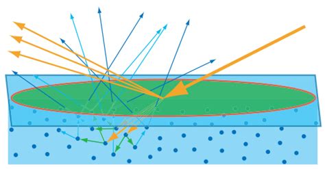
Sub Surface Scattering is an optional lighting effect that simulates how light penetrates and scatters beneath the surface of an object, giving it a softer, more volumetric appearance. This is a technique often seen in 3D rendering and 2D realism, and it can add significant volume and detail to anime-style art.
While SSS is described as a "harsh version of Center of Light," they both utilize the Overlay blending mode. The key difference lies in the application of light:
- Center of Light: Applied and blended like a gradient, focusing on a central glow.
- Sub Surface Scattering: The application of light is more nuanced, often involving painting lighter colors in specific areas to mimic light scattering within the form. It aims to give objects a more tangible, less flat appearance, as if light is interacting with their internal structure.
Lighting Effects and Enhancements
Highlights
A common application of contrast and lighten blending modes is in rendering highlights.
- Normal: This is the default mode, used here for reference.
- Linear Light: As mentioned, it works like
Vivid Lightbut is less prone to issues with underlying luminosity. - Lighten: This mode specifically preserves the lightest color between the blending layer and the base layer. If your highlight color is GOLD,
Lightenwill ensure only the gold (or lighter) parts are visible. - Hard Mix: As discussed, this mode can produce extreme results, potentially useful for very stylized highlights.
Outline Glow
An "Outline glow" is essentially a variation of the "Center of Light" effect applied to outlines. It can be created by duplicating your line art layer, setting the duplicate to a glow-inducing blending mode (like Add or Screen), and then applying a blur or further manipulation to create the radiating light effect.
Light Rays
Light rays, or god rays, are streaks of light emanating from a specific source, such as the sun or a light bulb. These can be created by painting lines of light on a new layer set to a blending mode like Screen or Add, then using blur effects and potentially masking to shape them.
Multiply Layer for Beginners | Easiest Way to Shade Drawings
Compositing Stock Images
When incorporating stock images, especially those with dark backgrounds like lens flares, blending modes are invaluable.
- Lens Flare Example: A lens flare created in Photoshop with a dark background can be imported into Clip Studio Paint.
- Positioning: Place the stock image on a new layer and position it as desired.
- Softening: If the flares are too sharp, apply
Gaussian Blur. - Color Adjustment: Use
Hue/Saturationto alter the color if you don't like the original. - Blending: Crucially, change the blending mode of the stock image layer to a lightening mode such as
ScreenorAdd. This will effectively make the black background transparent, allowing only the light elements of the flare to show through.
Tonal Correction Tools in Clip Studio Paint
Beyond blending modes, Clip Studio Paint offers a robust set of tonal correction tools that work in conjunction with layers to refine your artwork. These can be accessed through the Edit menu > Tonal Correction or via Layer menu > New Correction Layer.
Brightness/Contrast
This fundamental tool allows you to adjust the overall brightness of an image and the difference between its lightest and darkest areas.
- Brightness: Controls the overall lightness or darkness.
- Contrast: Adjusts the range between light and dark tones.
Hue/Saturation/Luminosity
This set of adjustments allows for fine-tuning of colors:
- Vividness (Saturation): Controls the intensity of colors. Higher values make colors more vibrant.
- Brightness (Luminosity): Adjusts the lightness of the colors themselves, independent of overall image brightness.
- Posterization: Simplifies an image into a limited number of color levels, creating a graphic, stylized effect. The number of levels can be set.
- Reverse Gradient: Inverts the colors of the image.
Level Correction
Level Correction provides more granular control over tonal ranges.
- Input Levels: Controls the darkest parts (shadows), midtones, and lightest parts (highlights) of the image. You can directly manipulate sliders or a graph to adjust these ranges.
- Output Levels: Adjusts the brightness of the image by modifying the input values.
- Tone Curve: A powerful tool that allows you to adjust the tone curve by manipulating a graph. The horizontal axis represents input brightness, and the vertical axis represents output brightness. A histogram in the background shows the distribution of dark and bright areas, aiding in precise adjustments.
Color Balance
This tool allows you to adjust the color balance across shadows, midtones, and highlights independently. You can shift the color balance towards Cyan/Red, Magenta/Green, or Yellow/Blue using sliders. The effects can differ significantly depending on which tonal range (Shadow, Half tone, Highlight) you are adjusting.
Binarization
Binarization sets a threshold between pure black and pure white, converting the image into a two-tone representation.
Gradient Map
A Gradient Map replaces the shades in an image with colors from a selected gradient. This is a powerful tool for recoloring, creating stylized effects, or establishing a specific mood. You can define the gradient colors and how they are applied based on the existing colors of the image. When created as a new adjustment layer, it can be edited later.
Color Match
Color Match allows you to apply the color scheme of a selected image or gradient to your current layer. This is useful for achieving a consistent color palette across different elements or for quickly adopting a specific mood. You can select a source image or a gradient, and then adjust the intensity of the applied colors.
Conclusion: Experimentation is Key
Mastering blending modes in Clip Studio Paint is an ongoing journey. While this article provides a comprehensive overview of their functions and applications, the true understanding comes from hands-on experimentation. Don't be afraid to try different modes, combine them, and explore their effects on your artwork. By understanding these foundational tools, you can elevate your illustrations, adding depth, dimension, and a professional polish that truly makes your art shine.