Procreate, a powerhouse digital art application, offers a sophisticated yet intuitive suite of tools for color management. Whether you are a seasoned professional or a beginner exploring digital illustration, understanding how to effectively change colors in Procreate can significantly elevate your artwork. This guide delves into the various color interfaces, application methods, and advanced manipulation techniques available, providing a thorough exploration from basic selection to complex adjustments.
Navigating Procreate's Color Interfaces
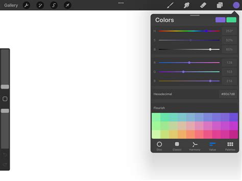
Procreate presents multiple color interfaces, each designed to cater to different working styles and preferences. At the core of color selection is the Color Panel, which can be invoked by tapping the color swatch in the top right of the Procreate interface. This panel can be repositioned anywhere on the canvas by dragging the small grey handle at its top, allowing it to detach from the menu bar and transform into a more compact Color Companion.
The Color Disc
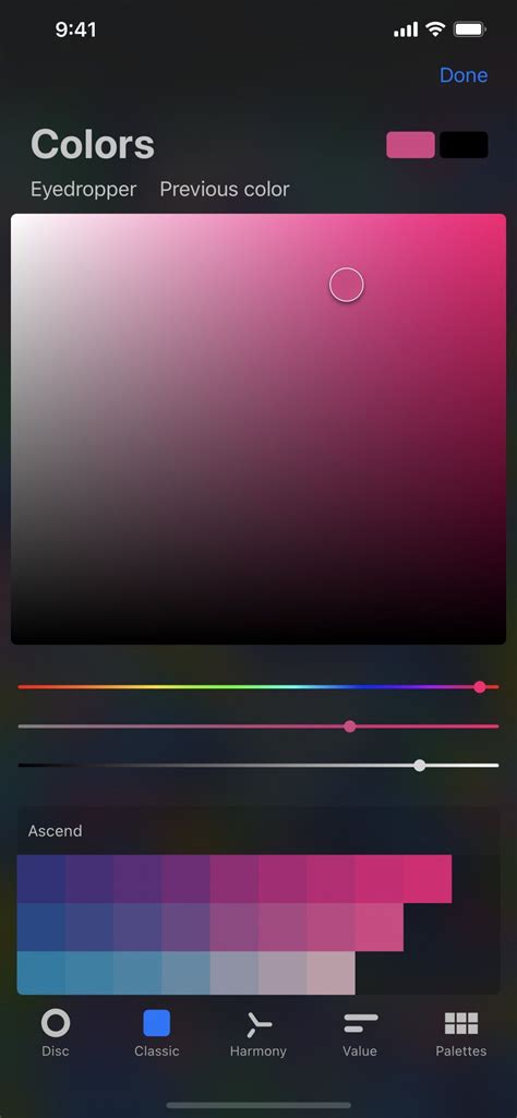
When you first open the Color Panel, the Color Disc is the default view. This interface features a vibrant outer Hue ring surrounding an inner, zoomable Saturation disc. A reticle, a clear circle, allows you to drag and select your desired color. As you move a smaller, secondary reticle within the disc, it displays two colors in a split circle: the color the reticle currently hovers over on the right, and your most recently used color in the History section on the left. The History section, initially empty in a new artwork, populates with up to ten selected colors as you work, providing a quick reference to your recent choices. Double-tapping around the saturation disc offers a way to snap to the 'perfect' value closest to your current selection, ensuring a precise hue.
The Classic Interface
For those who prefer a more traditional approach, the Classic interface offers a familiar color selection experience. This view presents a straightforward square or rectangle where you can pick colors, reminiscent of older digital art software.
The Harmony Interface
The Harmony interface is a powerful tool for creating visually pleasing color combinations. From this tab, you can select a color harmony algorithm from the top left corner, such as complementary, analogous, or triadic. Dragging the primary color reticle around the color wheel will then display harmonious color options, making it easier to build cohesive palettes.
The Value Interface
The Value interface provides a high degree of precision. It features sliders for Hue, Saturation, and Brightness, alongside numerical and hexadecimal (HEX) values. This is ideal for users who need exact color specifications, allowing for direct input of HEX codes or fine-tuning of color properties. You can also tap the alphanumeric field to copy or paste HEX values, streamlining the process of using specific brand colors or referencing colors from other sources.
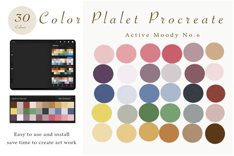
Palettes: Curating Your Color Collections
The Palettes tab is where you manage your color swatches. Procreate comes with several standard palettes, but you can also import custom palettes or create your own. Active palettes are indicated by a tick mark. To set a different palette as active, tap the ellipsis on the far right and select 'Set as active'. You can also drag a palette out to the drawing area in any color picker mode to utilize SwatchDrop, which functions similarly to ColorDrop but uses swatches from your selected palette.
Applying Color: From Simple Fills to Advanced Techniques
Once you have selected your colors, Procreate offers dynamic ways to apply them to your artwork.
Active Color and ColorDrop
The Active Color swatch, displayed in the top right of the interface, shows your currently selected color. Pressing and holding this swatch allows you to quickly switch between your current and previous color. More significantly, you can drag the Active Color onto the canvas to invoke ColorDrop. A colored dot will detach from the swatch and hover over the canvas, indicating the precise location for the fill. Tapping the canvas then applies the color.
ColorDrop Threshold
ColorDrop's effectiveness can be finely tuned using the Threshold setting. To activate it, drag the Active Color over the area you want to fill, but do not release your finger. After a moment, ColorDrop Threshold will activate, indicated by a thin bar above the artwork. Dragging your finger left or right along this bar adjusts the fill threshold: dragging left fills less area, while dragging right fills more. This feature is crucial for controlling how far a color will spread, especially in artworks with varying line weights or open areas. At lower thresholds, the color will confine itself to smaller, more defined areas. ColorDrop remembers your chosen Threshold setting until you change it again.
SwatchDrop
Similar to ColorDrop, SwatchDrop allows you to drag a swatch color from a Color Palette onto any area of your canvas. To activate the Threshold for SwatchDrop, touch and hold the swatch, then drag it over the area you wish to fill. Keep holding down until a blue line appears on the top of your screen, then swipe your finger left or right to adjust the fill threshold. SwatchDrop also remembers the last Threshold setting used.
ColorDrop with Hover
For users with compatible devices (iPadOS 16.1 or newer on iPad Pro 12.9-in. (6th generation) or iPad Pro 11-in.), ColorDrop with hover provides an even more visual application. The colored dot that detaches from the Active Color hovers precisely over the canvas, offering a clear preview before you commit to the fill.
Continue Filling
After using ColorDrop, a 'Continue Filling' option may appear at the top of the interface. Tapping this enters Continue Filling mode, allowing you to further adjust the threshold of subsequent fills with additional taps and holds.
100 PROCREATE TIPS in 15 MIN
Advanced Color Manipulation and Recolor Tool
Beyond basic application, Procreate offers powerful tools for transforming existing colors within your artwork.
The Recolor Tool
The Recolor tool is a potent feature for changing colors within your illustration, especially useful for applying new color palettes or correcting existing ones. To access it, you first need to assign it as a QuickMenu button. Once assigned, select Recolor from the QuickMenu. A small crosshair will appear in the middle of the screen.
The simplest way to use Recolor is on a flat layer with a single color. After invoking QuickMenu and selecting Recolor, the tool activates. It's essential to check and make sure you're on the correct layer before proceeding. The Recolor tool works with your currently selected color. As you move the crosshairs, the color will gradually fill with the replacement color. The tool displays your chosen new color on the top half of a loupe, with the current color on the bottom half.
If you have textured layers, moving the crosshairs will change the color dynamically depending on the area of the object you are hovering over. At the bottom of the screen, a Flood slider allows you to control the extent of the recoloring. Sliding this slider gradually fills the selected area with the replacement color. If you get an undesirable result, such as the background changing color, you can drag the crosshairs around at any time to see the effects of the flood fill elsewhere in your layer.
Adjustments Menu: Hue, Saturation, Brightness, and Color Balance
Procreate provides industry-standard color adjustment tools to refine your artwork. These are found within the Adjustments menu (the magic wand icon).
Hue, Saturation, Brightness (HSB): This is a fundamental tool for altering the overall color characteristics of a layer or selection.
- Hue: Determines the overall color tone. Adjusting the Hue scrubber is a swift way to cycle through the entire spectrum of colors.
- Saturation: Controls the intensity or purity of a color. Higher saturation means more vivid colors, while lower saturation leads to more muted or grayscale tones.
- Brightness: Adjusts the lightness or darkness of the colors.
Color Balance: This tool allows for precise color correction by manipulating the Red, Green, and Blue channels. You can adjust the color balance for Highlights, Midtones, and Shadows independently. Sliding a channel's slider to the right shifts the tone towards that color (e.g., sliding Red right adds more red). Adjusting the Midtones is often the most effective way to achieve even color correction across the image.
Curves and Histograms
For more advanced tonal and color control, the Curves tool is invaluable. This tool represents the tonal values of your layer as a straight line on a graph. The colored part of this graph is called a histogram, which maps where each color appears in your image and its quantity.
- Adjusting Lightness/Darkness: You can drag nodes on the curve graph up to affect the lightness of your layer or down to affect its darkness. You can add up to 11 nodes for intricate control.
- Color Channels: The histogram also provides a graphical representation of the balance of Red, Green, and Blue color in your image. By tapping 'Red', 'Green', or 'Blue', you can adjust a specific color channel in isolation. Colors other than R, G, and B in the histogram indicate overlapping channels; for example, purple signifies the presence of both blue and red.
- Gamma Setting: When using Curves, the Gamma setting offers a nuanced way to adjust brightness. Dragging the far-right and far-left areas of the spectrum inward and then manipulating the center of the curve up or down provides more control over brightness adjustments without washing out or darkening the entire image.
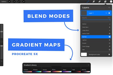
Gradient Map
The Gradient Map tool is a creative way to re-color your artwork by mapping image tones to a chosen gradient. Procreate includes several preset Gradient Palettes like Mystic, Breeze, Instant, Venice, Blaze, Neon, Noir, and Mocha.
- Applying Gradients: Tapping a preset Gradient Palette assigns it to your image. You can Touch and Hold a preset to Delete or Duplicate it, and drag to reorder them in your Gradient Library.
- Creating and Editing Gradients: To create or edit a gradient, you enter the Gradient Map interface, which shows a gradient with at least two color points. The left side of the gradient affects the shadows and darker tones, while the right side influences the highlights. You can add new Color Points by tapping along the gradient where no swatch exists. A gradient must have at least two different color points at either end. You can also name or rename your gradient maps by tapping their title.
Color Profiles and Workflow Considerations
Understanding color profiles is crucial for ensuring your artwork appears as intended, whether for screen display or print.
Choosing Color Profiles
When creating a new canvas in Procreate, you can select a Color Profile.
- RGB: Best for artwork intended for screens (web, social media, digital displays). Procreate offers native sRGB, P3 Wide Color, and other RGB profiles. RGB manages color the same way screens do, using a mixture of red, green, and blue light.
- CMYK: The ideal choice for artwork destined for print. CMYK breaks down colors into a mix of Cyan, Magenta, Yellow, and Black inks.
It's important to note that once a Color Profile is set for a piece of art, it cannot be changed. Changing the Color Profile can also have a dramatic effect on your Time-lapse recording. Custom color profiles are a complex topic beyond the scope of this guide.
Duplicating for Exploration
A fundamental strategy for exploring new color palettes without compromising original work is to duplicate your illustration. In the Procreate Gallery, tap 'Select', choose your illustration, and then tap 'Duplicate'. This creates an identical copy, allowing you to experiment freely with color adjustments on the duplicate while preserving your original artwork.
Manual vs. Layer-Based Color Adjustment
There are two primary approaches to recoloring duplicated artwork:
Manual Color Adjustment: This method offers the most control. After selecting a desired color palette, you can manually drop colors into different parts of your illustration. When dragging a color, don't lift your Apple Pencil from the screen; this allows you to scrub left and right to change the intensity and coverage of the color. Continue this process until you achieve the desired look.
Layer-Based Color Adjustment: This technique is often faster and can lead to unexpected and vibrant results. Select the layer you wish to recolor, go to the Adjustments menu, and choose 'Hue, Saturation, Brightness'. Applying the 'Layer' option here allows you to adjust the entire layer's color properties. You can then further refine these adjustments using tools like 'Curves' for precise brightness control or 'Gradient Map' for creative re-coloring. This method encourages exploration and can help you discover unique color variations you might not have considered otherwise.
By mastering these diverse color tools and techniques within Procreate, artists can unlock a new level of creative expression, ensuring their digital creations are visually compelling and technically sound across various media.