Gradients, those mesmerizing blends of colors or shades, have become a powerful tool in modern design, adding dimension and depth to layouts. Powerhouse brands like Instagram and Apple have notably popularized their use, and this trend shows no signs of slowing down. Whether you're crafting print materials or web designs, gradients offer a way to create stunning color transitions. This guide will walk you through the essential steps of creating, modifying, and applying gradient effects within Adobe InDesign, transforming your designs from lackluster to striking.
Understanding the Fundamentals of Gradients in InDesign
At its core, a gradient is a gradual blend of two or more colors or shades of the same color. The transition point between these colors is known as a "stop." Most gradients feature a smooth blend with a midpoint, the point where the start and end colors are equally blended, typically located at the swatch's center. InDesign simplifies the management of these effects through its dedicated Gradient Tool and Gradient panel.
What is a Gradient?
A gradient is a blend of two or more colors or shades. There are no restrictions on the colors that can make up a gradient. A transition point between colors is called a stop. Most gradients have a gradual blend and a midpoint between colors/shades at the swatch’s center.
Accessing Gradient Tools in InDesign
Creating a gradient in Adobe InDesign typically begins with accessing the Gradient panel, usually found under Window > Color > Gradient. Alongside this, the Gradient Tool (keyboard shortcut G), generally located in the left toolbar, is essential for applying gradients to your objects. The Gradient panel is where you select the type of gradient and define its colors, while the Gradient Tool allows you to apply and manipulate these effects on your chosen elements.
Creating and Applying Basic Gradients
When you first open the Gradient panel, black and white are often the default colors selected. To apply such a gradient, you first need to create an object, such as a rectangle, on your InDesign page.
Step-by-Step Gradient Creation
- Create a Shape: Use a tool like the Rectangle Tool (M) or Ellipse Tool (L) to draw the shape you want to fill with a gradient. For instance, you might create a background shape for a poster or a frame for text.
- Open the Gradient Panel: Navigate to Window > Color > Gradient to open the Gradient panel.
- Choose Gradient Type: At the top of the Gradient panel, you'll find a type menu. You can choose between Linear or Radial gradients, or other specialized types depending on your InDesign version and needs. For many applications, a Linear gradient is a common starting point.
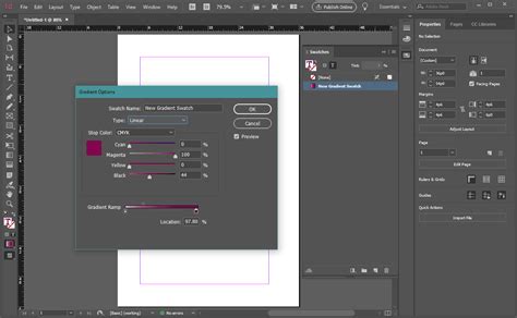
- Define Color Stops: The Gradient Ramp displays a graphical representation of your gradient, with "stops" indicating the points where colors are applied. By default, you'll see a black stop on the right and a white stop on the left.
- Select Colors for Stops: To change these default colors, click on a color stop. This action typically highlights the selected stop. You can then change its color by interacting with the Swatches panel (Window > Color > Swatches). Drag any color swatch from the Swatches panel directly onto the desired color stop in the Gradient panel. Alternatively, you can double-click a color stop to access a color picker or define specific CMYK or RGB values.
- Adding New Colors: To introduce more complexity, you can add additional color stops by clicking directly on the gradient bar below the existing stops. You can then assign a new color to this new stop.
- Removing Colors: To remove a color stop, simply click and drag it downwards, away from the gradient bar.
- Apply the Gradient: Once you've defined your colors, you can apply the gradient to your selected object. If the object is already selected, the gradient will appear automatically. If not, use the Gradient Tool (G) to draw across your object, defining the direction and extent of the gradient.
Saving Your Gradients
To efficiently reuse your custom gradients, it's best practice to save them. After creating a gradient you're happy with, select the object that has the gradient applied. Then, open the Swatches panel (Window > Color > Swatches), and click the "New Swatch" button. This will save your gradient as a "New Gradient Swatch." You can then double-click this swatch to rename it for easier identification. Saving gradients to your Swatches panel makes them readily available for future projects or different elements within the same document.
Modifying and Fine-Tuning Gradients
InDesign offers robust controls for adjusting gradients once they've been applied. This allows for precise customization and the creation of nuanced visual effects.
Editing Gradient Stops and Colors
- Adjusting Color Positions: You can click and drag on any color stop to reposition it along the gradient ramp. This changes the spread and transition of the colors.
- Modifying Midpoints: The diamond-shaped icon above the gradient ramp represents the midpoint, where the start and end colors blend equally. Dragging this midpoint alters the balance of the color blend, creating a faster or slower transition.
- Changing Color Values: Double-clicking a color stop provides access to precise color editing tools, allowing you to adjust the CMYK, RGB, or other color values for that specific stop.
Adjusting Gradient Direction and Angle
The direction and angle of a gradient significantly impact its appearance.
- Using the Gradient Swatch Tool: The Gradient Swatch Tool (G) is instrumental here. After applying a gradient, you can use this tool to redraw the gradient's path over your object. Clicking and dragging defines the start and end points of the gradient, effectively controlling its direction.
- Using the Gradient Panel: Within the Gradient panel, you can directly adjust the Angle of the gradient. Changing this value rotates the gradient, offering a different visual flow. For linear gradients, altering the angle can create a wide range of effects from subtle shifts to dramatic diagonal transitions.
Learn How to Use the Gradient Feather Tool in Adobe InDesign | Dansky
Creating Transparency in Gradients
To achieve transparency within a gradient, you can utilize the "Paper" swatch. Apply the Paper swatch to a color stop, and that portion of the gradient will become transparent, allowing any underlying elements to show through. This is particularly useful for creating subtle fades or integrating gradients with other design components.
Advanced Gradient Techniques and Creative Applications
Beyond basic linear and radial blends, InDesign supports more complex gradient manipulations and creative uses.
Creating Multi-Color Gradients
The ability to add multiple color stops to a gradient ramp opens up a world of possibilities. By carefully placing and coloring several stops, you can create intricate, multi-hued transitions. This is fundamental to achieving effects like those seen in popular neon or pastel trends.
Gradient Fills for Text
Applying gradients directly to text can be achieved by converting text to outlines, but this prevents further text editing. A more flexible approach is to apply a gradient fill to the text frame itself or to shapes that contain text. For more advanced text gradient effects, users often turn to external tools like Adobe Illustrator, creating the gradient there and then importing it into InDesign.
High-Impact Gradient Effects
Gradients are excellent for creating visually striking effects suitable for various design projects, including posters, flyers, stationery, and magazine layouts.
- Eclipse Effect: A radial gradient can be used to create an "eclipse" or spotlight effect, often best achieved with a circular design. Placing text or images within the inner circle can enhance its impact.
- Themed Gradients: Gradients can be tailored to specific themes, such as using the colors of the Pride flag for LGBTQ+ Pride Month designs.
- Trendy Gradients: Popular trends like neon and pastel gradients are relatively simple to create. By experimenting with different color palettes-for example, a combination of lavender, pale pink, and bright pink-you can generate an almost endless range of stylish results. A retro feel can be achieved by drawing inspiration from 1960s and 70s graphic design color palettes.

Adding Texture to Gradients
For added depth and visual interest, gradients can be combined with textures. For instance, a grunge vector texture, often sourced from Adobe Illustrator, can be overlaid onto a gradient background to create a more complex and tactile appearance.
Troubleshooting and Best Practices
When working with gradients, especially in professional print workflows, certain considerations are crucial.
Color Modes and Print Considerations
- CMYK vs. RGB: While RGB is common for web design, for print projects, it's often best to specify gradients using CMYK colors. This helps prevent unexpected color shifts when the design is printed. Gradients specified in RGB may shift when converted to CMYK.
- Spot Colors and Mixed Inks: InDesign allows for gradients using CMYK process colors, spot colors, or a mix of inks. Understanding the color mode of your document is essential for predictable results.
Global Editing
Creating a new gradient swatch and saving it makes it easier to use across multiple pages or elements. Crucially, when you edit a saved gradient swatch in the Swatches panel, the changes are applied globally throughout your document in real-time, ensuring consistency and efficiency.
Advanced Manipulations
For highly specialized or complex gradient effects, or to add sophisticated backgrounds to images, seeking out advanced tutorials or consulting with design professionals can be beneficial. Resources often cover topics like creating custom gradient swatches, applying gradient feathers, or combining gradients with Adobe InDesign’s Text Wrap features for sophisticated editorial layouts.
Further Learning and Resources
The world of gradients in InDesign is vast, with continuous opportunities for learning and experimentation.
- Online Tutorials: Numerous tutorials are available online, covering everything from basic gradient creation to advanced techniques like gradient feathers and texture overlays. Platforms like Envato Tuts+ offer a wealth of resources, including written guides and video tutorials.
- Video Content: For those who prefer visual learning, video tutorials on platforms like the Envato Tuts+ YouTube channel provide step-by-step demonstrations of creating various gradient effects.
- Creative Assets: To further enhance gradient designs, consider adding unique typography. Resources like Envato Elements offer a wide selection of fonts suitable for projects incorporating gradient backgrounds, such as posters, flyers, or stationery.
By mastering the tools and techniques for gradient color manipulation in InDesign, you can significantly elevate the visual appeal and professionalism of your design projects. Experiment with different color combinations, angles, and applications to discover the full potential of this dynamic design element.