Procreate offers a robust suite of tools for digital artists to explore and manipulate color, taking your artwork from flat to dynamic with a few strategic adjustments. Whether you're a beginner looking to understand the basics of digital coloring or an experienced artist seeking to refine your workflow, Procreate's color features provide the flexibility and power to achieve professional-level results. This guide will delve into the various methods and tools available within Procreate for coloring, from simple fill techniques to advanced color adjustments, ensuring you can confidently bring your creative visions to life.
Understanding the Fundamentals of Color in Procreate
At its core, digital color in Procreate, like most digital art software, is based on the RGB (Red, Green, Blue) color model. Colors formed on-screen consist of a mixture of these three primary colors. Procreate provides intuitive ways to interact with these primaries and their interactions.
Hue, Saturation, and Brightness: The Building Blocks of Color
To truly master coloring in Procreate, it's essential to grasp the concepts of Hue, Saturation, and Brightness.
- Hue determines the overall color tone used in the image. Think of it as the pure color itself - red, blue, green, etc. Adjusting hue shifts the fundamental color.
- Saturation determines color strength. A highly saturated color is vibrant and intense, while a desaturated color appears more muted or closer to gray.
- Brightness controls how light or dark a color is. This ranges from pure black to pure white, with varying shades in between.
Procreate's Hue, Saturation, Brightness adjustment tool allows you to expertly tweak these fundamental aspects of your colors. This is a powerful way to make broad changes to the overall mood and vibrancy of your artwork.
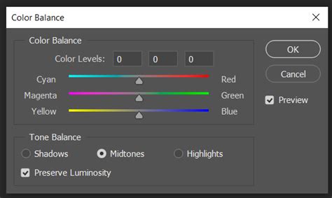
The Color Balance Tool: Fine-Tuning Tonal Ranges
For more nuanced control, the Color Balance tool is invaluable. This feature allows you to expertly tweak your Color Balance, giving you the power to make quick color corrections on your image.
Color Balance splits Red, Green, and Blue into their own sliders. Crucially, it also splits the image into three tonal sections: Highlights, Midtones, and Shadows. This means you can adjust the color cast specifically within the brightest, middle, or darkest parts of your artwork.
- Sliding to the right on a color slider (e.g., Red) will move the tone of your selected layer towards that color.
- Tapping Shadows, Midtones, or Highlights allows you to choose which part of your image will be affected by your color changes.
- Adjusting the Midtones is often the best way to achieve even color adjustment across the entire image, as it impacts the largest range of tones.
Understanding how to use Color Balance effectively can transform a flat image into one with depth and atmosphere, allowing you to push colors towards warmer or cooler tones as needed.
Histograms and Curves: Visualizing and Manipulating Tonal Values
The histogram is a graphical representation of the balance of red, green, and blue color in your image, along with its tonal distribution. It’s a map of where each color appears in your image, and how much of it there is. This tool represents the tonal values of your layer as a straight line on a graph. The colored part of this graph is called a histogram. Colors other than red, green, and blue indicate these channels are overlapping. For example, purple means that blue and red are both present in that part of the image.
You can directly interact with the histogram using the Curves adjustment.
- Drag a node up to affect the lightness of your layer in that specific tonal range.
- Drag a node down to affect the darkness.
- You can add up to 11 nodes for highly precise control over your image's tonal and color distribution.
- Tap Red, Green, or Blue to start adjusting a color channel in isolation, allowing for precise color grading.
Gradient Mapping: Advanced Color Transformations
For more artistic and transformative color effects, Gradient Mapping is a powerful tool. This feature analyzes the highlights, midtones, and shadows of an image and applies a gradient to them.
- Procreate offers eight preset Gradient Palettes: Mystic, Breeze, Instant, Venice, Blaze, Neon, Noir, and Mocha.
- You can tap a Gradient Palette to assign it to your image.
- Touch and Hold a preset Gradient Palette to Delete or Duplicate it, allowing for customization.
- Touch, Hold, and Drag a preset Gradient Palette to reorder it in your Gradient Library.
- To restore your Gradient Library’s default gradients, Touch and Hold the + symbol at the top of your Gradient Library panel.
When creating or editing a Gradient Map, the interface changes to the Gradient Map interface. Here, you'll see a gradient with at least two points of color.
- The left-hand side of the Gradient Map affects the shadows and darker tones of your image.
- To add a Color Point to your Gradient Map, tap anywhere along the gradient where there isn’t an existing swatch.
- A Gradient Map must have at least two different Color Points at either end of the gradient.
- You can tap a Gradient Map's Title to name or rename it.
Gradient mapping can be used to create dramatic stylistic shifts, from turning a realistic photo into a surreal landscape or giving a black and white sketch a vibrant, stylized look.
Essential Coloring Techniques in Procreate
Beyond the advanced adjustment tools, Procreate offers several core techniques that form the backbone of digital coloring workflows. These methods cater to different artistic styles and levels of precision.
The Recolor Tool: Effortless Color Swapping
One of the most misunderstood yet incredibly useful tools in Procreate is the Recolor tool. It's designed to help you swap colors within your artwork efficiently, saving significant time and effort.
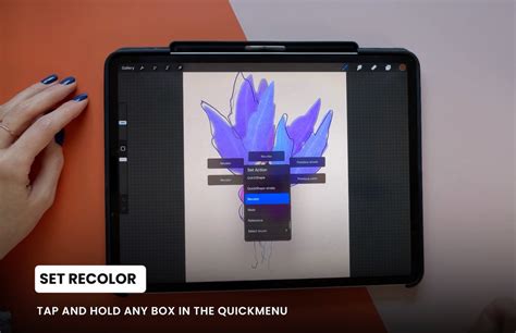
- Accessing the Recolor Tool: To access the Recolor tool, open your Quick Menu (which can be customized to include Recolor).
- Simple Recolor on Flat Layers: The simplest way to use Recolor is when you have a flat layer of a single color. Once Recolor is invoked from the Quick Menu, a small crosshair icon will appear in the middle of the screen. Recolor works with the color you currently have selected.
- Recoloring Textured Layers: If you have a layer with texture, as you move the crosshairs over different areas, the color will start changing depending on the object you're moving it to. This allows for nuanced recoloring even on complex surfaces.
- Potential Issues and Solutions: Sometimes, you might end up with an undesirable result, like the entire background changing color. If the color doesn't "spill" and the element you wanted to recolor has changed, it's a success. If not, ensure you are on the correct layer before activating Recolor.
Coloring Like a Pro: Layers and Alpha Lock
For many beginners, adding color without destroying linework can be a significant hurdle. Procreate's layer system, particularly Alpha Lock and Clipping Masks, provides elegant solutions.
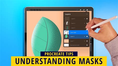
- Alpha Lock: This feature locks transparent pixels on a layer. When Alpha Lock is active, you can only paint within the existing pixels on that layer. This is incredibly useful for coloring within the lines of a sketch without accidentally painting outside them. To use it, open the Layers panel, tap the layer you want to lock, swipe left, and select Alpha Lock. A small checkered pattern will appear on the layer thumbnail.
- Clipping Masks: Clipping masks allow you to apply color to a base layer without affecting the entire canvas. A new layer is "clipped" to the layer below it, meaning it will only show up within the boundaries of the layer beneath. This is perfect for adding shading, highlights, or textures without altering the original base color layer. To use it, create a new layer above your base color layer, tap the new layer, and select Clipping Mask.
Painting Directly on a New Layer (Multiply Mode)
This method feels natural for expressive artwork and is akin to traditional marker or watercolor techniques.
- Lock your Line Art: To prevent accidental edits, lock your line art layer.
- Create a New Multiply Layer: Add a new layer above your line art. Change its Blend Mode to Multiply. This blend mode allows colors to show through the linework while maintaining its integrity.
- Choose Your Brush and Color: Select a brush from Procreate's extensive library and pick your desired color from the Color Panel.
- Paint: Paint directly onto the Multiply layer. The colors will appear beneath your linework, creating a natural, layered effect.
Pros: Painterly, natural, expressive look; great for shading and blending; feels close to traditional illustration.Cons: Takes more time; requires a steadier hand; harder to make quick colorway changes later.
Color Drop (Fill Tool) for Flat Colors
Color Drop is Procreate's drag-and-drop fill tool, ideal for clean, flat coloring, especially for fashion flats or graphic designs where precision is key.
Option A - Closed Shapes with Reference Layer:
- Ensure your line art has completely closed shapes.
- Create a new layer above your line art.
- Drag your active color from the Color Panel and drop it into the area you want to fill. Procreate will fill the enclosed space.
- You can also drag swatches directly from the Palettes menu.
Option B - Open Shapes with Filled Outline Layer: This method is often preferred when line art has intentional gaps or a textured quality.
- Create a new layer below your line art layer.
- Pick a color and draw an outline shape on this new layer that perfectly encloses the area you want to fill.
- Use Color Drop on this outline layer to fill the shape. This effectively creates a "bucket" for your color.
Pros: Very fast and precise; keeps linework separate and editable; great for filling multiple colorways.Cons: Needs perfectly closed outlines for Option A; less natural than painting for fabric rendering.
Common Mistakes to Avoid with Color Drop:
- Spilling Across the Canvas: This happens if outlines aren't closed. Always zoom in and patch gaps with a brush before using Color Drop.
- Residual Color Halos: If you fill on the same layer as your line art, previous colors might linger. Always use a separate layer for fills.
Using Procreate Like a Coloring Book
Procreate can be used like a digital coloring book, offering a fun and accessible way to practice coloring techniques.
- Download Coloring Pages: Procreate offers free coloring pages designed for digital use. Download these as .Procreate files to your iPad.
- Import into Procreate: Tap the downloaded file in your Files app to import it directly into Procreate.
- Coloring Layer: Open the Layers panel. You'll see a layer designated for coloring, typically labeled "Color Here," situated below the black line art layer.
- Coloring Methods: You can use Color Drop to fill in different spaces with color or simply color them in by hand with your chosen brushes.
How to turn AI photos into Line Drawings & Coloring Book pages with Procreate | Easy Step by Step
Advanced Color Management and Workflow
Beyond basic filling and adjustments, Procreate provides tools to manage your color palettes and integrate them seamlessly into your workflow.
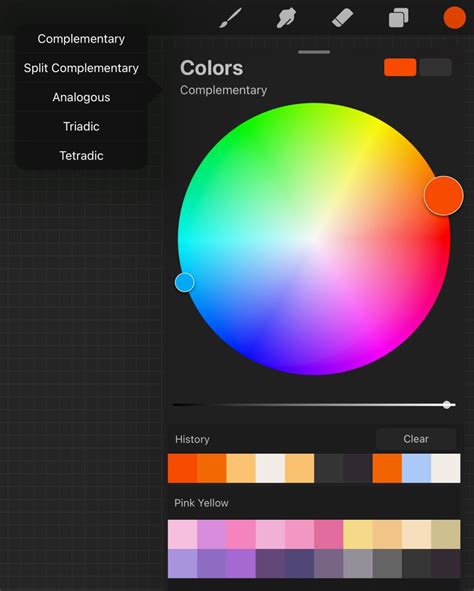
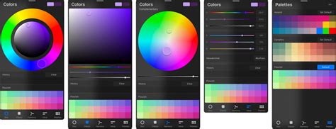
The Color Panel: A Universe of Color Options
The Color Panel in Procreate is your central hub for all things color. It offers multiple interfaces tailored to different preferences and needs.
- Color Disc: The default view, featuring an outer Hue ring around an inner zoomable Saturation disc. Double-tapping around the saturation disc snaps to the 'perfect' value closest to your current selection.
- Classic: Provides a more traditional color picker experience.
- Harmony: This powerful tab helps you pick colors that are harmonious with your active color. You can choose from various color harmony algorithms (e.g., Complementary, Analogous) and drag the primary color reticle around the color wheel to select your active color.
- Value: Allows you to select and modify your color with precise sliders for Hue, Saturation, and Brightness. It also offers sliders for Red, Green, and Blue values, and you can input a hexadecimal value directly.
- Palettes: This tab is where you create, organize, and manage your color swatches. You can create custom palettes for specific projects or import .swatches files.
Color Palettes: Organizing Your Hues
The Palettes tab is crucial for maintaining consistency and efficiency in your projects.
- Creating Palettes: Tap the + icon at the top of the Palettes tab to create a new palette. You can then tap empty squares to add swatches from your current selection or import them.
- Importing Palettes: You can import custom palettes via New from File, Photos, or Camera. This is incredibly useful for working with brand guidelines or replicating specific color schemes.
- Using Swatches: You can drag a palette out to the drawing area to use SwatchDrop, which functions like ColorDrop but with your saved swatches. Continue holding down and drag left or right to adjust the threshold.
Color History and the Color Companion
Procreate keeps track of your recently used colors in the Color History. This is often displayed at the bottom of the Color Panel.
- Color Companion: You can detach the Color Panel from the top menu bar by dragging its small grey handle. This turns it into the "Color Companion," a floating window that can be positioned anywhere on your canvas, keeping your color tools readily accessible without obscuring your artwork.
Active Color and ColorDrop Hover
The Active Color display at the top right of the Procreate interface shows your currently selected color.
- Quick Swap: Press and hold the Active Color to switch between your current and previous color.
- Invoking ColorDrop: You can drag the Active Color onto the canvas to invoke ColorDrop. A colored dot will detach and hover over the canvas, helping you precisely target where you want to fill. This feature, ColorDrop with hover, requires iPadOS 16.1 or newer on compatible devices.
Threshold for ColorDrop
The Threshold setting for ColorDrop is vital for controlling how far the color will spread.
- When using ColorDrop (either by dragging the Active Color or a Swatch), you can activate the Threshold by dragging the color over the area you want to fill but not releasing it. A thin bar above the artwork represents the threshold amount.
- Drag your finger to the left to fill less area (lower threshold).
- Drag your finger to the right to fill more area (higher threshold).
- ColorDrop and SwatchDrop will remember your chosen Threshold setting until you change it again.
Bringing Your Artwork to Life: Shading, Highlights, and Recolor Workflows
Once your base colors are laid down, Procreate offers several ways to add depth and refine your artwork.
Adding Shadows and Highlights with Clipping Masks
A simple yet effective method for adding depth without disturbing your base colors involves using Clipping Masks.
- New Layer: Create a new layer above your base color layer.
- Clipping Mask: Tap the new layer and select "Clipping Mask." This ensures that anything you paint on this layer will only appear within the boundaries of the layer below.
- Blend Mode: Change the Blend Mode of the clipping mask layer. For shadows, Multiply is often used; for highlights, Overlay or Screen can be effective.
- Paint: Use darker tones on a Multiply layer for shadows or lighter tones on Overlay/Screen layers for highlights to add dimension.
- Tip: Create separate layers for shadows and highlights to allow for independent adjustments and different blend modes.
Recoloring Sketches and Multiple Colorways
Fashion designers and illustrators often need to explore multiple color options for the same piece. Procreate makes this process streamlined.
- Replace with ColorDrop: If you have a flat color layer, you can simply use Color Drop with a new color to overwrite the existing fill.
- Clipping Mask for Color Testing: A highly flexible method is to set your original fill layer to white. Then, create a new layer above it and apply a Clipping Mask. On this new layer, drag a color into the sketch. The color will "clip" to the white fill layer below, acting like a stencil. You can repeat this for each new color variation on separate clipping mask layers.
Conclusion: Unleash Your Creative Potential with Procreate's Color Tools
Procreate's comprehensive array of color tools, from fundamental adjustments like Hue, Saturation, and Brightness to advanced features like Gradient Mapping and precise fill tools like Color Drop, empowers artists of all levels. By understanding and utilizing these features, you can transform your digital art, experiment with dynamic color palettes, and refine your workflow to achieve professional-quality results. Whether you're coloring a simple illustration, designing intricate patterns, or exploring complex tonal adjustments, Procreate provides the tools to bring your most vibrant ideas to life.