Typography is the backbone of effective visual communication, and within this intricate art form lies the crucial element of kerning. Far from being a mere adjustment of space, kerning is a sophisticated technique that profoundly impacts the readability, aesthetic appeal, and overall professionalism of text. This article delves into the definition of kerning, its significance, and practical applications, with a specific focus on how to master this skill within Adobe Photoshop.
Understanding the Fundamentals: Spacing, Leading, Kerning, and Tracking
Before dissecting kerning, it's essential to understand its related typographic concepts: spacing, leading, and tracking. These are the tools that font developers and designers employ to fine-tune the distances between characters, altering the rhythm and influencing readability.
Spacing refers to the horizontal distance between all characters in the text, encompassing all additional configurations like kerning and tracking. This spacing is typically set around each glyph during the font's development. The predefined distance between all glyphs in a font is referred to as "aprosh."
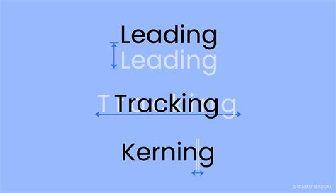
Leading, often called line height, is the vertical distance between lines of text. More precisely, it's the measurement between their baselines. In simpler terms, it's the familiar line spacing found in word processing programs. The default leading in Adobe software is often 120% of the font size, but this can be adjusted to suit specific design needs. Correctly configured leading is vital; too little makes text dense and tiring to read, while too much forces the eye to jump awkwardly between lines. The optimal leading is generally considered to be around 120% of the font size, though this can vary.
Tracking, also known as letter spacing, is the adjustment of space between all symbols in a font. It allows designers to evenly increase or decrease the intervals between letters, maintaining a balanced look thanks to kerning.
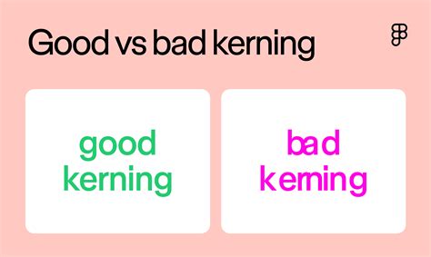
Kerning is the selective adjustment of spacing between two specific characters based on their shapes, aiming to create visually uniform typesetting. Every font symbol is unique, and applying equal spacing between them can lead to inconsistent visual rhythm. Kerning compensates for this visual irregularity. While subtle changes might go unnoticed by the casual observer, kerning significantly influences the visual perception of text and directly impacts readability.
The Definition and Significance of Kerning
Kerning refers to the configuration of the distance between two adjacent symbols, whether they are punctuation marks, numbers, or letters. Its primary purpose is to balance the rhythm of the text and ensure it is evenly formatted. Because each character possesses a unique shape, uniform spacing can result in awkward gaps or overlaps, creating an inconsistent visual flow. Kerning addresses these visual irregularities.
The significance of kerning cannot be overstated. While small adjustments might seem minor to an ordinary user, they profoundly impact the visual perception of the text. A text block set with proper kerning will appear significantly better and more professional than one without it. Kerning directly influences readability by ensuring that the negative space between characters is aesthetically pleasing and does not hinder the eye's natural flow.
In essence, kerning is about creating visual harmony between individual letterforms. It's the art of making characters, particularly those with challenging shapes, appear as if they were organically designed to fit together. This meticulous attention to detail is what separates amateur typography from professional design.
How Kerning is Applied and Adjusted
Unlike leading and tracking, which can often be adjusted by the user independently across larger blocks of text, kerning is fundamentally about the relationship between pairs of characters.
Font Development and Kerning
Traditionally, kerning is configured by font developers at the stage of designing the font, using specialized software like Fontlab or Glyphs. These developers create "kerning pairs" - predefined adjustments for specific letter combinations that commonly cause spacing issues. These pairs are embedded within the font file itself.
User Adjustments in Design Software
While font developers embed kerning, users can often fine-tune it further within design programs. This is particularly important for large-format text, headlines, logos, and branding, where the visual impact of letter spacing is amplified.
In Adobe Photoshop, adjusting kerning can be achieved in several ways:
Using the Character Panel:
- Select the Type Tool (T).
- Click and drag to create a text box or click on existing text to edit it.
- Highlight the specific pair of characters you want to adjust.
- Open the Character panel (Window > Character).
- Locate the Kerning option, often represented by a "V/A" icon.
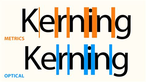
- You can choose from predefined options like "Metrics" (which uses the font's built-in kerning pairs), "Optical" (which automatically adjusts spacing based on character shapes), or "0" (to disable kerning).
- Alternatively, you can manually input a numeric value. Positive values increase the space between characters, while negative values decrease it.
Using Keyboard Shortcuts:
- Select the Type Tool.
- Place the text cursor between the two characters you wish to kern.
- Hold down the Alt key (on Windows) or the Option key (on Mac).
- Use the Left Arrow key to decrease the space (move characters closer) or the Right Arrow key to increase the space (move characters further apart). This method allows for rapid, iterative adjustments.
Kerning vs. Tracking in Photoshop
It's crucial to distinguish kerning from tracking. Kerning is about the specific spacing between individual pairs of letters, while tracking is about the uniform spacing across an entire word, sentence, or paragraph.
- Kerning: Addresses problematic letter combinations (e.g., "AV," "To," "We") to ensure visual harmony. It's often applied in titles, logos, and large display text.
- Tracking: Adjusts the overall density of text. It can be used to open up dense text for better readability or to fill space evenly.
While kerning focuses on local adjustments, tracking provides global control over letter spacing. Both are essential tools for achieving optimal typography.
How to Adjust Kerning Tracking and Leading in Adobe Photoshop 2022 - Photoshop Quickie
Common Kerning Challenges and Solutions
Certain letter combinations inherently pose spacing challenges due to their shapes. Recognizing these "troublemaker" pairs is key to effective kerning.
- Diagonal Arms: Letters with diagonal strokes, such as "A," "V," "W," and "Y," often require tighter kerning when paired with other letters, especially rounded ones. For instance, the space between "A" and "V" typically needs to be reduced.
- Round and Straight Combinations: Pairs like "To" or "We" can also be problematic. The curve of "o" or "e" might feel too far from the straight stem of "T" or "W."
- Uppercase and Lowercase: Combinations of uppercase and lowercase letters, like "Wa," can also benefit from specific kerning adjustments.
- Top-Heavy Letters: Letters like "P" or "T" can sometimes create awkward spacing when paired with lowercase letters.
Solutions and Best Practices:
- Trust Your Eye: While software offers tools, the ultimate arbiter of good kerning is visual balance. Step back from your design frequently to assess the overall look.
- Subtlety is Key: Kerning adjustments should be subtle. Over-kerning can be just as detrimental as under-kerning.
- Consistency: Ensure that similar character pairs are kerned consistently throughout your text.
- Consider the Font: Different fonts have different kerning needs. A highly decorative font might require more attention than a simple sans-serif.
- Print It Out: Sometimes, viewing your design on a printed page can reveal spacing issues that are not apparent on a screen.
- Learn Common Pairs: Familiarize yourself with common kerning pairs that often require adjustment.
Kerning in Different Design Contexts
The application of kerning varies depending on the design context:
- Logos and Branding: Kerning is paramount in logo design. The name of a brand must look cohesive and professional. Improper kerning can undermine brand credibility. For example, the spacing in the Nike logo is meticulously adjusted.
- Headlines and Titles: Large font sizes used in headlines, posters, and magazine covers make letter spacing more apparent. Kerning ensures these prominent texts are visually appealing and easy to read, preventing awkward gaps or overcrowding.
- Body Text: While font developers embed extensive kerning pairs for body text, designers may still need to make minor adjustments, especially if using fonts with less robust kerning tables or when dealing with specific phrases that stand out.
- Web and UI Design: Readability on screens is critical. Proper kerning contributes to a seamless user experience, ensuring text is comfortable to read on various devices.
Advanced Kerning Techniques and Considerations
- Manual Kerning: This involves directly adjusting the space between individual letter pairs using the methods described above. It offers the most control but requires a keen eye and practice.
- Optical Kerning: This automated feature in design software analyzes the shapes of characters and adjusts the spacing accordingly. It can be a great starting point, especially for less common fonts, but often requires manual fine-tuning.
- Metrics Kerning: This method relies on the kerning pairs predefined by the font designer. It's generally effective for well-designed fonts but may not address all spacing issues in unique or free fonts.
- Resetting Kerning: If you've made extensive adjustments and want to revert, setting the kerning value to "0" or choosing "Metrics" in the Character panel will usually reset it to the font's default.
The Importance of Kerning in Professional Design
Mastering kerning is a hallmark of a skilled designer. It demonstrates an understanding of typographic detail that elevates a design from merely functional to truly polished and professional. In a competitive design landscape, paying attention to these subtle yet significant details can be the difference between a design that simply communicates and one that truly resonates. By understanding and applying kerning principles effectively, designers can ensure their typography is not only legible but also aesthetically harmonious and impactful.
tags: #kerning #photoshop #definition