Adobe's InDesign, while perhaps not as universally recognized as its siblings Illustrator or Photoshop, is an indispensable tool for graphic designers, brimming with potent functionalities for executing intricate design tasks. This tutorial aims to demystify the process of creating a magazine within InDesign, focusing on foundational techniques for beginners while offering insights for more experienced users. We will explore the creation of a magazine spread, drawing inspiration from real-world examples and best practices in layout design.
Setting Up Your Document: The Blueprint for Your Magazine
The initial step in creating any publication within InDesign involves meticulously setting up your document. This foundational stage dictates the overall structure and flow of your magazine. When embarking on your own document creation, it's important to note that you might encounter a pre-established grid for the publication. It is highly recommended to experiment with different combinations of rows, columns, and gutters to discover what best suits your aesthetic and content requirements.
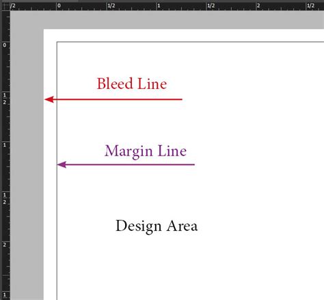
For a standard document of normal A4 size, consider setting your page dimensions accordingly. Margins are crucial for ensuring readability and providing visual breathing room. A common practice is to set an outside margin of 20 mm and an inside margin of 13 mm. These margins serve as essential guides for positioning your content effectively.
InDesign offers robust tools for establishing these structural elements. You can access margin and column settings by navigating to Layout > Margins And Columns. In the dialog box that appears, ensure that the link option is set in the Margins section. This allows you to adjust all margin guides to your preferred distance from the page edges simultaneously. To adjust the outside margins independently, deselect the link option in the Margins section. A useful tip for quickly establishing proportions is to multiply an existing margin value by a factor; for instance, to double the outside margin, insert your cursor after the outside margin value and type *2.
Beyond simple margins, InDesign's grid system is paramount for organizing complex layouts. To visually divide your layout into thirds or quarters, or to add a guide to the center of the layout vertically, utilize the Create Guides command. This feature allows for precise placement of guides, which are invaluable for aligning elements and maintaining visual consistency across your pages. In the dialog box for creating guides, you can specify the number of rows and columns you wish to implement. To create single guides, setting the gutter value to 0 is effective.
Experimentation with different combinations of rows, columns, and gutters is key to finding a grid that complements your content and design vision. A well-defined grid not only enhances visual appeal but also contributes significantly to the overall readability and professional feel of your magazine.
Mastering Image Placement and Manipulation
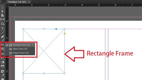
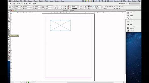
InDesign's approach to handling images differs from that of other Adobe programs like Photoshop. Here, the image and its containing frame can be edited independently, offering a flexible workflow. The process begins with defining the frame for where you envision your image on the page. When you import an image into InDesign, you will notice a light blue line surrounding the picture; this represents the image frame.
You can resize this frame while preserving the original image's aspect ratio by dragging the frame while holding down the Shift key. Alternatively, you can drag the frame to precisely fit a desired space, and it will not distort the appearance of the original image. Once the frame is established, you can then adjust the size of your image to fill this frame. For instance, in the creation of a magazine spread, an image might be set to encompass the entire left page.
The balance between images and text is a critical aspect of magazine design. Effective use of white space, or negative space, is not merely about leaving areas blank; it's a deliberate design choice that enhances readability, directs the reader's eye, and contributes to the overall aesthetic. When positioning images, consider their relationship to the text that surrounds them. Avoid overcrowding the page; allow elements to breathe.
For a beginner's tutorial, using an article published on 99designs as source material to create the first spread of an article titled "Massive impact design: the world’s subway maps" serves as an excellent practical example. This approach allows for a hands-on understanding of how to integrate visual and textual content harmoniously. The goal is to achieve a visually engaging and detail-driven design solution that effectively communicates the article's message.
Typography: Shaping the Voice of Your Magazine
Typography plays a pivotal role in conveying tone, hierarchy, and readability within a magazine. InDesign provides a comprehensive suite of tools for typographic control, allowing designers to fine-tune every aspect of text presentation.
When setting the title of an article, for instance, consider the visual impact you want to achieve. For the title "Massive Impact Design," a bold, sans-serif font like Helvetica Neue can command attention. The size of the font is crucial for establishing hierarchy. For "Massive," a size of 100 points might be used, while "Impact Design" could be set at 56 points. A subtitle, in the same font for simplicity, can then be introduced in an even smaller size, such as 30 points, and presented in all lowercase letters to maintain a clear hierarchy with the main title.
The choice of font for body text is equally important. To create a pleasing contrast and enhance readability, pairing a sans-serif title with a serifed font for the body text is a common and effective strategy. This combination offers a visual distinction that guides the reader's eye through the different levels of information.
InDesign offers dedicated tools for character and paragraph formatting. To access these, look to the right of the toolbar for the "A" icon for character formatting and the "P" icon for paragraph formatting. Clicking "P" reveals the paragraph formatting tools. Within this panel, you'll find options for creating automated columns in your text box. For body text, dividing it into two columns with margins set at 1p0 (a typographic unit representing 12 points) can significantly improve readability, especially in longer articles.
To further refine the text, InDesign's hyphenation settings often require minor adjustments from their default configurations. Optimizing word spacing is essential for achieving justified text that appears even and professional. Setting the word spacing to a maximum of 100% and a minimum of 85% can prevent excessive gaps between words. Access these settings within the Indents & Spacing section. Furthermore, tracking adjustments, which involve uniformly increasing or decreasing the space between characters, can benefit headlines immensely by creating a more polished and balanced appearance.
For the body text, consider using the Left Justify alignment option within the Indents & Spacing settings. This alignment, combined with careful hyphenation and word spacing, ensures that the text block maintains a clean, vertical edge on the left while allowing for a more natural flow of words.
Enhancing Visual Appeal with Design Elements
Beyond images and typography, InDesign provides tools to incorporate graphic elements that enhance the visual narrative of your magazine. These elements can echo themes within your content, add color, and create a more dynamic layout.
For instance, to visually connect with the concept of subway lines in an article about subway maps, you could use the rectangle tool. Found in the toolbar, this tool allows you to create shapes. By drawing a horizontal green box around the subtitle, you can effectively mirror the visual effect of subway lines, establishing a thematic link between the design and the content.
The strategic use of color is another powerful design tool. A well-chosen color palette can evoke specific moods, reinforce branding, and draw attention to key elements. When incorporating color, consider its impact on readability and its relationship to the overall theme of the magazine.
Automating and Exporting Your Design
While manual control offers granular precision, InDesign also provides features to automate repetitive tasks, saving time and ensuring consistency. For example, page numbering can be automated. However, for a basic layout, manually creating a text box with the magazine's name and the page number is a straightforward approach.
The final stage of the creation process involves exporting your design. The appropriate format for export will depend on the intended use of your publication. Common formats include .INDD (InDesign document) for further editing and .PDF for printing or digital distribution. To export your design, navigate to File > Export (keyboard shortcut: Ctrl/Cmd + E).
When exporting a print design, it's crucial to ensure high quality. Opt for exporting the image as a high-quality PDF. Furthermore, it's often desirable to export your design as a spread rather than individual pages. This is achieved by ensuring the "Spreads" button under the "Pages" heading is selected during the export process. This ensures that facing pages are exported together, maintaining the intended layout for print.
Export a Print-Ready PDF from InDesign (2025 Tutorial)
By mastering these fundamental tools and techniques in InDesign, you can create professional, engaging, and visually compelling magazine layouts. The journey from initial concept to final export involves a thoughtful integration of document setup, image handling, typographic refinement, and strategic design elements.
The creation process itself is iterative. As you build your magazine, you will continuously refine the balance between images and text, adjust typography, and ensure that your design elements work harmoniously. The ability to thread text frames together, allowing text to flow seamlessly from one frame to another, is a crucial technique for managing longer articles and maintaining a consistent flow. To thread frames, select the first frame, then click its out-port (located in the lower-right corner) and release. This action prepares it to connect to the next frame, which you would then click.
If you are working with a client or a publication that has specific branding guidelines, adhering to those requirements is paramount. For a cost-effective option, making the most of the suggestions outlined above can lead to professional, high-quality designs. The ultimate goal is to deliver engaging and detail-driven design solutions that resonate with your target audience.
The journey of creating a magazine in InDesign is a rewarding one, offering a platform for creativity and precision. By understanding and applying the principles of layout, typography, and image management, you can bring your publication vision to life. The flexibility of InDesign allows for both simple, elegant designs and complex, multi-layered spreads, catering to a wide range of editorial needs. The tools available empower designers to control every aspect of the page, from the subtle kerning of letters to the grand arrangement of full-page imagery. Remember that practice and experimentation are your greatest allies in mastering this powerful software.