Drop caps, those oversized initial characters that grace the beginning of chapters or sections, are a powerful typographic tool for adding visual interest and hierarchy to a document. Adobe InDesign offers robust features for creating them, but achieving specific design goals, especially when dealing with initial quotes or multi-character drop elements, can present unique challenges. This article delves into the intricacies of setting up drop caps in InDesign, exploring various techniques and workarounds to achieve professional and aesthetically pleasing results, catering to a wide range of user expertise.
The Fundamentals of InDesign Drop Caps
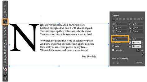
At its core, creating a drop cap in InDesign is a straightforward process managed within the Paragraph Style options. When you define a paragraph style, you can specify a "Drop Cap" setting. This allows you to determine the number of lines the initial character will span and the number of characters that will be included in the drop cap effect.
To access these settings, you navigate to the Paragraph Style Options, then to the "Drop Caps and Nested Styles" section. Here, you can set the "Lines to Drop" and "Characters to Drop." For a standard single-letter drop cap, you would typically set "Lines to Drop" to a value greater than one (e.g., 2, 3, or more, depending on your design) and "Characters to Drop" to 1.
However, the simplicity of this basic function can quickly become a limitation when more complex scenarios arise, such as the common design requirement of having an initial quote precede the main text of a chapter.
The Challenge of Initial Quotes with Drop Caps
A frequent design dilemma arises when a chapter begins with a quote. For instance, a client might request a drop cap at the start of a chapter, but the actual beginning of the text is an opening quotation mark. InDesign's standard "Drop Cap" feature, by default, applies to the specified number of characters starting from the very first character of the paragraph. This means if your paragraph begins with "The journey...", and you set a drop cap for 2 characters, both the quotation mark and the "T" will be affected, which is often not the desired aesthetic.
The Chicago Manual of Style, a widely respected authority on style and usage, suggests that in many design contexts, the open quote is often dropped when a drop cap is employed. This approach typically leads to a more visually appealing and less cluttered opening. The idea is to have the drop cap be the first letter of the actual content, not the punctuation preceding it.
Workarounds for Initial Quotes: Hiding or Including the Quote
Several strategies can be employed to handle this situation effectively:
Hiding the Initial Quote: One common approach is to hide the initial quotation mark from the print version while still having the first letter of the sentence function as the drop cap. This can be achieved using InDesign's powerful GREP Styles and Conditional Text features.
- GREP Styles for Initial Quotes: Within your paragraph style, you can use GREP Styles to target the initial quotation mark and apply a character style that makes it invisible (e.g., by setting its color to [None] or its size to 0). You would set up a GREP style that finds the opening quote at the beginning of a paragraph and applies a specific character style.
- Conditional Text: For more advanced control, especially when working with content that might be managed in InCopy, Conditional Text can be invaluable. You can create a condition for the opening quote that can be toggled on or off for print. However, a significant limitation noted by users is that Conditional Text cannot be directly manipulated or worked with within InCopy, and linking Character Styles to Conditional Text can be problematic.
Including the Initial Quote in the Drop Cap: Another design choice, and one that has been observed to work well in practice, is to include the opening quotation mark as part of the drop cap itself. This means the "Characters to Drop" setting in the Paragraph Style would need to be set to 2 (or more, if the quote is followed by other characters intended to be part of the initial typographic flourish).
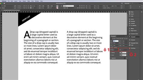
This approach requires careful consideration of the font and its spacing. As one user noted, a 2-character drop cap setting, combined with "Optical Margins" and a sufficiently large point size, can create an attractive effect. However, achieving balanced spacing can be challenging. For instance, when dealing with numerical sequences like room numbers that need to stand out, setting a linked Character Style to a very high Kerning value can space out the drop-cap characters but also make the character spacing unacceptably wide for the intended numbers.
The Limitations of the Standard Drop Cap Feature
It's important to understand the inherent limitations of InDesign's built-in "Drop Cap" feature within Paragraph Styles. While it allows you to apply the drop cap effect to "Lines" and "Characters," it does not offer the granularity to apply it specifically "Through 1 Letter" when you need to exclude preceding characters like quotes. This is where nested styles and GREP styles become essential for more precise typographic control.
Nested Styles allow you to apply character styles through a specified number of characters or lines, and importantly, can be set to apply through a single letter. If you wish to format the drop cap itself with a specific character style (e.g., a different font, weight, or color), you would typically define this within the Paragraph Style's "Nested Styles" section, setting it to apply "through 1 Letter."
Advanced Techniques and Workarounds
When the standard drop cap functionality isn't sufficient, InDesign's more advanced features come into play.
Leveraging GREP Styles for Precision
GREP Styles are indispensable for automating complex text formatting. They allow you to define patterns (using regular expressions) and apply character or paragraph styles to text that matches those patterns.
For instance, to ensure that an initial quote is always handled correctly, you might create a GREP style within your paragraph style:
- Find:
^(\u)- This GREP finds the first uppercase letter at the beginning of a paragraph. - Apply Style: A character style designed for your drop cap.
However, this still doesn't directly address the quote issue. A more nuanced approach involves using GREP to identify and potentially style or hide the quote, and then using nested styles for the actual letter.
A common workaround for the initial quote problem involves a two-step process:
Paragraph Style Setup:
- In the Paragraph Style Options, go to "Drop Caps and Nested Styles."
- Set "Lines to Drop" to your desired number (e.g., 3).
- Set "Characters to Drop" to 1.
- In the "Nested Styles" section, create a new nested style. For the "Apply Style," choose a character style you've created for your drop cap (e.g., "Drop Cap Character Style"). Set this style to apply "Through 1 Letter." This ensures only the first letter of the actual content receives the special formatting.
GREP Style for Hiding the Quote (Optional but Recommended):
- Still within the Paragraph Style Options, go to "GREP Styles."
- Click "New GREP Style."
- For "Find what," enter a GREP expression to find the opening quote at the beginning of a paragraph, such as
^("|\u201C). This finds either a straight double quote or a curly opening double quote. - For "Apply Style," select a character style that makes the quote invisible. This could be a style that sets the text color to [None] or has zero size.
This combination ensures that the first letter of the content is formatted as a drop cap, while the preceding quote is either hidden or can be styled separately if desired.
The Anchored Object Approach
A robust, albeit more manual, method for achieving highly customized drop caps involves converting the drop cap character(s) into anchored objects. This technique offers the most flexibility because anchored objects can be positioned precisely and can interact with text using InDesign's powerful Text Wrap features.
The process generally involves:
- Typing the initial character(s) as normal text.
- Applying any desired character styling.
- Cutting the character(s).
- Pasting them as an anchored object into the text flow.
- Using Text Wrap settings on the anchored object to control its position relative to the surrounding text.
While this provides immense control, it can be a time-consuming process, especially for documents with many drop caps. The desire for InDesign to automate this by treating the drop cap character as an anchored object with associated paragraph and character styles is a sentiment shared by many designers.
Case Study: Spacing Numerical Drop Caps
A specific challenge arose when trying to create drop caps for three-digit room numbers. The initial attempt to make the numbers stand out using the same font as the title proved unreadable. Switching to a different font helped, but the primary issue was achieving adequate spacing between the three digits without making the overall character spacing unacceptably wide.
The standard solution of setting a linked Character Style to higher Kerning led to the undesirable outcome of excessively spaced characters. A clever workaround was found using a combination of Find/Change with GREP and Kerning adjustments:
- Initial Setup: Ensure the three-digit numbers are formatted with a paragraph style that includes a character style for the drop cap effect.
- GREP Find/Change for Spacing:
- Use the Find/Change dialog box.
- In the "Find what" field, enter
^(\d{3}). This finds any three consecutive digits at the beginning of a paragraph. - In the "Change to" field, enter
$0_(where$0represents the found string, and_represents a space). This inserts a space after the three-digit number. - Crucially, in the "Change Format" section, apply a specific character style that has a significantly increased Kerning value (e.g., 200). This applies the desired spacing only to these specific three-digit numbers.
- Apply GREP Style: Then, go back to GREP Styles within the Paragraph Style Options. Ensure you have a GREP style that finds the same three digits (
^(\d{3})) and applies the character style with the adjusted kerning. This ensures the formatting is consistently applied.
This method effectively isolates the spacing adjustment to the target numbers, preventing the wider spacing from affecting other text.
Tips & Tricks to Create Drop Caps in InDesign
Considerations for Different Audiences and Workflows
The methods discussed for creating drop caps in InDesign range from simple paragraph style adjustments to complex GREP and anchored object techniques.
- For beginners: Understanding the basic "Drop Caps and Nested Styles" panel is the first step. Applying a simple drop cap to a few lines is achievable with minimal effort.
- For intermediate users: Exploring Nested Styles for applying specific character formatting to the drop cap letter, and using GREP styles to handle initial quotes by hiding them, will offer more control.
- For advanced users and complex projects: The anchored object method, while manual, provides the ultimate control. For collaborative workflows, especially those involving InCopy, understanding the limitations and potential workarounds with Conditional Text is vital. The ability to label Conditional Text as a subset of a Paragraph Style, or to link Character Styles to Conditional Text, remains an area where users often seek more seamless integration.
The "Optical Margins" feature in InDesign is also worth noting. When enabled in the Story Editor or via the Text Frame options, it can help to optically align text at the margins, which can subtly improve the overall appearance of text blocks, including those with drop caps, by adjusting the spacing of punctuation and characters near the edge.
Ultimately, mastering drop caps in InDesign involves a combination of understanding the tool's capabilities, recognizing its limitations, and employing creative workarounds using the software's advanced features. Whether dealing with simple single-letter drops or complex initial quotes and multi-character elements, the goal is to achieve a design that is both visually striking and perfectly aligned with the client's vision.