Adobe InDesign offers powerful tools for creating and manipulating gradients, enabling designers to add depth, dimension, and visual interest to their layouts. Whether you're aiming for subtle color transitions or bold, eye-catching effects, understanding how to edit and apply gradients is a fundamental skill. This tutorial will guide you through the process, from basic color adjustments to more advanced techniques, ensuring you can achieve professional results.
Understanding the Gradient Panel
The Gradient panel in InDesign is your central hub for all gradient-related operations. When you select an object with a gradient fill, this panel becomes active, displaying a graphical representation of the gradient stops. These stops are essentially color anchor points that define the various segments of your gradient.
Within the Gradient panel, you'll see a gradient bar that visually depicts the blend of colors. Below this bar, color stops are identified by color squares. Each color stop represents a specific color within the gradient. You can interact with these stops directly to modify the gradient.
Manipulating Color Stops
The core of gradient editing lies in manipulating these color stops. You can click and drag on any of these gradient stops to adjust their position along the gradient bar, thereby altering the distribution and flow of colors. This allows for fine-tuning the appearance of the transition between different hues.
To change the color of an existing stop, you can select it and then choose a new color. A convenient way to do this is by dragging any color swatch from the Swatches panel directly onto the desired color stop in the Gradient panel. This instantly updates the stop's color, and the gradient will reflect the change.
If you wish to remove a color stop, simply click and drag it downwards, away from the gradient bar. It's akin to pulling the color off the gradient, effectively deleting it from the sequence. For instance, if you have a gradient transitioning from light blue to dark blue and want to change it to light blue to light purple, you would remove the dark blue stop and replace it with a light purple stop.
Adding and Adjusting Colors in Gradients
InDesign makes it remarkably simple to introduce new colors into your gradients. As mentioned, you can drag a color swatch from the Swatches panel and drop it onto an existing color stop to replace its color. Alternatively, you can drag a color swatch to an empty area below the gradient bar to create a new color stop.
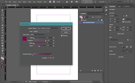
The "location" value for each color stop is crucial. This numerical value, displayed near the color stop, sets its precise position along the gradient bar. By adjusting this value, you can meticulously control where each color begins and ends its transition. The gradient bar shows a series of color stops, each with an associated color and a "Location" value to set the position of that color.
Setting Color Values
For optimal results and predictable output, especially when preparing files for print, it is highly recommended to specify gradients using CMYK process colors. While InDesign supports various color modes, CMYK ensures accurate reproduction of mixed ink colors using any color mode. You can select a color swatch from the Swatches panel and then apply it to a color stop.
To achieve transparency within a gradient, you can apply the "Paper" swatch. This effectively makes that portion of the gradient transparent, allowing underlying elements to show through.
Gradient Types and Application
InDesign offers two primary types of gradients: Linear and Radial.
- Linear Gradients: These create a smooth transition of colors along a straight line. You define the angle and direction of the gradient, and the colors blend evenly from one end to the other.
- Radial Gradients: These produce a circular or elliptical transition of colors, radiating outwards from a central point. You can control the center point, radius, and angle of the ellipse.
To apply a gradient, you first select the object you want to modify. Then, you can access the Gradient tool from the Toolbox. With the Gradient tool selected, you can click and drag across the object to define the direction and extent of the gradient. This action allows you to "repaint" the fill by dragging along an imaginary line, establishing the starting and ending points of the gradient. The bounding box of the gradient's path or text frame indicates where the gradient is to be applied.
Adjusting Gradient Appearance
Once a gradient is applied, you can further refine its appearance by adjusting color stops and midpoints. The midpoint is the point exactly halfway between two adjacent color stops. Adjusting the midpoint changes the rate at which the colors blend. A midpoint closer to one color stop will cause the transition to favor that color, while a midpoint closer to the other will create a faster shift towards that hue.
The "Reverse" button in the Gradient panel is a handy feature that inverts the order of the colors in the gradient. This can be useful for quickly experimenting with different color combinations or achieving a mirrored effect.
How to Create 5 Awesome Gradient Effects in Adobe InDesign
Gradients with Text
Applying gradients to text can add a dynamic and sophisticated touch to your designs. There are several methods for achieving this:
Applying Gradients to Outlines
One common technique involves converting text to outlines. You can select your text, go to Type > Create Outlines. This transforms the text characters into vector shapes. Once converted, you can apply a gradient fill to these outlines just as you would to any other object. However, be aware that once text is converted to outlines, it can no longer be edited as live text. This means the text will not hyphenate, and you won't be able to make spelling corrections directly.
Underlying Gradient Fill
InDesign also allows you to apply a gradient fill that underlies the text. This means the text itself remains editable, but the gradient appears beneath it. This method preserves the text's editability and ensures proper hyphenation. The "Underlying gradient fill" option can be found within the object's or text frame's properties.
Unique Gradients for Text Ranges
For more advanced control, you can apply a unique gradient to each range of text. This is particularly useful for creating visually interesting effects, such as a gradient that flows across multiple words or even individual characters. You can achieve this by selecting specific text ranges and then applying different gradients to them. It's important to keep track of the specific gradient applied when you applied each gradient.
Advanced Gradient Techniques
Mixed Ink Colors
When working with CMYK process colors, InDesign allows for the mixing of ink colors to create a wider spectrum of hues. This is particularly relevant for professional printing where specific ink formulations are used. The ability to mix ink colors using any color mode ensures that your gradients translate accurately to the final printed output.
Tints
In addition to full colors, gradients can also incorporate tints. A tint is a lighter version of a color, created by mixing it with white. By using tints within your gradients, you can achieve more subtle and nuanced color transitions. You can select a color swatch and then adjust its tint value in the Color panel or by applying a tint directly when creating a swatch.
Using Adobe Illustrator for Complex Gradients
For highly complex or specialized gradient effects that might be challenging to achieve directly within InDesign, you can leverage the power of Adobe Illustrator. You can create your intricate gradient in Illustrator, copy it, and then paste it into your InDesign document using the "Paste" command, ensuring it's in the Clipboard format. This allows you to combine the strengths of both applications.
Best Practices for Gradient Design
- Specify Gradients Using CMYK: For print projects, always specify gradients using CMYK colors. This ensures accurate color reproduction and avoids unexpected shifts in hue when the document is sent to print.
- Understand Color Stops and Midpoints: Master the manipulation of color stops and midpoints to achieve precise control over color transitions.
- Consider Readability: While gradients can be visually striking, ensure they don't compromise the readability of your text or the clarity of your design elements.
- Test Your Gradients: Before finalizing your design, always preview your gradients in their intended context and, if possible, print a proof to check for color accuracy.
- Use Live Preview: The Gradient panel provides a live preview of your gradient. As you make adjustments, you can see the changes reflected in real-time, allowing for immediate feedback and iterative refinement.
By thoroughly understanding and utilizing the gradient tools in Adobe InDesign, you can elevate your designs from ordinary to extraordinary, creating visually compelling and professional layouts. Experiment with different color combinations, transition types, and application methods to discover the full potential of gradients in your creative workflow.