Photoshop, a powerhouse for image manipulation and graphic design, offers a versatile toolkit for typography. While the ability to bold text is a common requirement for emphasis, understanding how to apply an italic effect is equally crucial for conveying tone and adding stylistic flair. This guide will delve into the various methods for italicizing text within Photoshop, moving from the simplest, most accessible techniques to more nuanced approaches that offer greater control and creative possibilities.
The Direct Approach: Utilizing Font Styles
The most straightforward method for applying an italic effect to your text in Photoshop mirrors the process of bolding. This involves selecting the desired text and then choosing an italic style directly from the font's available options.
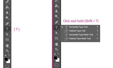
When the Type Tool (T) is active and you have highlighted the specific text you wish to italicize, observe the Upper Settings Bar. Positioned between the font family and font size menus, you will find a dropdown menu. For standard fonts, this menu typically displays "Regular" by default. Clicking on this dropdown will reveal a list of available font styles. If your chosen font includes an "Italic" or "Oblique" variant, selecting it will instantly apply the italic formatting to your highlighted text.
This method is quick, efficient, and ideal for fonts that natively support italic styles. However, it's important to be aware that not all fonts come with pre-defined italic variants. In such cases, you will need to explore alternative techniques to achieve the desired effect.
The Character Panel: Enhanced Typographic Control
For a more comprehensive approach to text refinement, the Character panel in Photoshop offers a wealth of options, including the ability to apply italic formatting. While it replicates the direct method found in the Upper Settings Bar, it also provides access to advanced typographic controls such as kerning, leading (line spacing), and ligatures.
To access the Character panel, navigate to the top menu bar and select Window > Character. Once the panel is open, you will find a row of icons representing various text attributes. Similar to the Upper Settings Bar, you can select your text and then choose the "Italic" style from the font style dropdown within the Character panel.
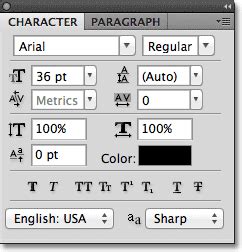
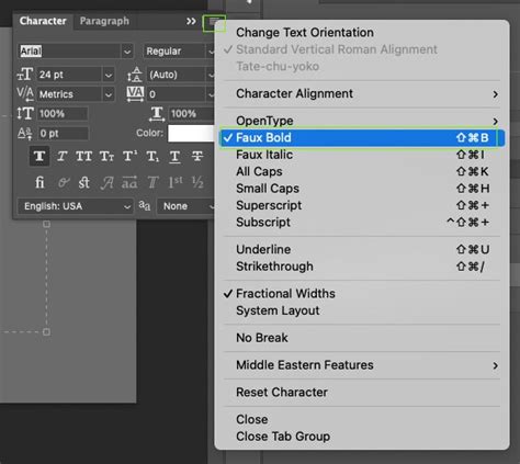
The Character panel's true power lies in its ability to offer more granular control. For instance, if your font does not have a native italic style, the Character panel provides an option to simulate it. This is achieved through a feature often referred to as "Faux Italic" or "Faux Bold."
Simulating Italics: The Faux Italic Option
When a font lacks a dedicated italic style, Photoshop can artificially skew the characters to create an italic appearance. This "Faux Italic" is accessible through the Character panel. Within the row of T icons, you'll typically find an option that, when activated, applies a simulated italic effect.
It is crucial to understand that Faux Italic is an artificial manipulation. While it can provide a visual approximation of italics, it may not always produce the aesthetically pleasing results of a true italic font. The spacing and weight of the characters can sometimes appear distorted.
A key characteristic of the Faux Italic setting is that it remains active until manually disabled. This persistence means you can apply it to text and it will carry over even if you start a new project or select different text layers. This can be useful, but it also necessitates vigilance to ensure you're not unintentionally applying the effect where it's not desired. Furthermore, the Faux Italic setting can be used in conjunction with the normal bold setting, offering a way to achieve a more pronounced emphasis when needed. However, for professional design work, it is generally recommended to use fonts with native italic styles whenever possible for superior visual quality.
Advanced Emphasis: Using Stroke for a Bold Effect
While the primary focus of this article is on italics, it's worth noting that the user's provided information also touched upon an advanced technique for creating a bolder text effect using layer styles, which can be adapted conceptually for enhancing emphasis in general. This method involves applying a stroke to the text layer.
When you add text using the Type Tool (T), Photoshop automatically creates a separate text layer in the Layers Panel. To apply a stroke, you would typically go to the bottom of the Layers panel, click Effects, and then select Stroke. In the Layer Style window that appears, you would configure the stroke's properties. For a bold effect, you would choose the same color as your text, set the Opacity to 100%, and position the stroke to Outside. This technique allows for the creation of a wider stroke around the letters than traditional bolding methods might offer, leading to a more dramatic visual impact. As you adjust the stroke size, you can preview the changes on the canvas to ensure the text remains legible. The applied layer style will then appear non-destructively under your text layer in the Layers Panel.
While this technique is primarily for bolding, understanding how layer styles can manipulate text appearance opens up possibilities for creative emphasis. For instance, one could theoretically use subtle outlines or color overlays to subtly alter the visual weight of italicized text, though this would be a more experimental approach.
Understanding Tone and Emphasis: Why Italics Matter
Creating bold text is undeniably effective for emphasizing a particular word or phrase. However, when the goal is to convey a specific tone, add nuance, or suggest an internal thought or a foreign word, using italics is often far more effective. Italics can lend a sense of sophistication, highlight a title, or differentiate spoken words from narration.
Photoshop offers at least two primary options for making your text italic, as detailed earlier: the direct font style selection and the Character panel. The choice between them often depends on the font's capabilities and the desired level of control.
When you have finished applying italics to your text, it is important to remember to switch off the italic setting if you used a method that stays on by default, such as the Faux Italic. This ensures that subsequent text you type reverts to the standard font style, preventing unintended formatting.
Expanding Your Photoshop Text Skills
Mastering text formatting in Photoshop is an ongoing journey. While learning how to apply italics and bold is fundamental, there are many more layers to explore. For those looking to deepen their understanding of text manipulation, exploring guides on creating text effects, working with type on a path, or utilizing advanced layer styles can further enhance your design capabilities.
For instance, understanding how to create text in Photoshop involves not just formatting but also the creation of text layers, the use of different text tools, and the integration of text with other graphic elements. A comprehensive guide on this topic would likely cover the fundamental principles of typography within the software, including leading, kerning, tracking, and alignment, all of which contribute to the overall readability and aesthetic appeal of your designs.
A Beginner Guide to EDITING Text in Photoshop!
The ability to expertly apply italics, alongside other formatting options, is a cornerstone of effective visual communication in graphic design. By understanding and utilizing the various tools Photoshop provides, designers can ensure their text not only stands out but also communicates the intended message with clarity and style. The interplay between font styles, the Character panel, and layer styles offers a rich palette of options for any typographic challenge.