Italics are a fundamental typographic tool, used to emphasize words or phrases, denote titles, and add stylistic flair to documents. Adobe InDesign, a powerful page layout program, offers multiple ways to apply italics, from simple keyboard shortcuts to advanced OpenType features. Understanding these methods, and the nuances behind them, is crucial for professional typesetting and achieving the desired visual impact. This article delves into the various approaches to italicizing text in InDesign, addressing common challenges and exploring best practices.
The Core Functionality: Applying Italics
At its most basic, italicizing text in InDesign involves selecting the desired text and applying an italic style. The most common method is using keyboard shortcuts. The default shortcut for applying italics to selected text is Shift+Control+I (Windows) or Command+Shift+I (macOS). This shortcut leverages the font's designed italic variant, if one is available.
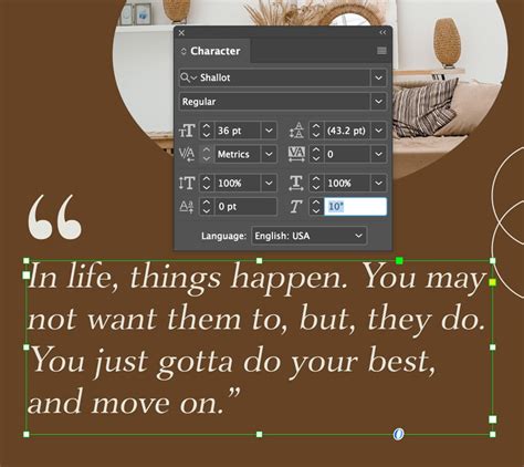
For instance, if you are using the "Shallot" font and have installed its italic face, selecting text and pressing Command-Shift-I will apply it. This is the preferred method as it utilizes the typeface's intended italic form, which is a separately drawn character from the regular or Roman version. This distinction is important for typographic integrity. For example, with Minion Pro, the shape of the "A" in the regular version differs from the "A" in the italic version, highlighting that an italic font is a distinct design.
Another common approach is to use the Character panel or the Control panel. Within these panels, you can access a Weight dropdown menu and select "Italic" for the chosen font. This achieves the same result as the keyboard shortcut when an italic face is available.
Troubleshooting Italic Application Issues
Despite the straightforward nature of applying italics, users sometimes encounter frustrating problems. One common scenario is a shortcut inexplicably ceasing to function. For example, a user might have customized the "apply italics" shortcut to F2. While this shortcut works perfectly on some documents, it inexplicably stops working on others, even after reverting to the default Shift+Control+I. This can occur even when using the same fonts, styles, and applying the shortcut to a new text box with basic paragraph settings and no character styles.
When this issue arises, it's important to note that the program might still recognize the italic formatting. If italics are manually applied to text and then F2 is pressed, InDesign can sometimes correctly remove the italics, indicating that the underlying formatting is present but the shortcut is not triggering it.
Several factors can contribute to this behavior:
- Font Availability and Integrity: While you might be using the same font, the specific font file might have issues, or the italic face might not be correctly recognized by InDesign in that particular document. Ensure the font and its italic variant are properly installed and not corrupted.
- Document Corruption: Occasionally, InDesign documents can become corrupted, leading to unexpected behavior with features like keyboard shortcuts.
- Conflicting Preferences or Plugins: Although less common, third-party plugins or specific InDesign preferences could potentially interfere with shortcut functionality.
- OpenType Features vs. True Italics: It's crucial to understand the difference between a true italic font and a "faux" or "oblique" italic, which is often generated by software. True italics are designed by the font creator and offer a distinct, often more elegant, appearance.
If the shortcut fails, creating a new text box and changing the font can sometimes resolve the issue, suggesting a document-specific or font-instance-specific problem rather than a global shortcut failure.
Beyond True Italics: Oblique and Skew
When a font does not have a dedicated italic version, or for specific stylistic effects, InDesign offers alternatives that create a slanted appearance, often referred to as "faux italics" or "oblique type."
One such method is using the Skew feature. This is also known as false italics and can be accessed through various panels. Skewing artificially slants the existing characters, rather than using a separately designed italic form. While it can create a visual resemblance to italics, it often results in less aesthetically pleasing typography, with characters appearing distorted.
Another related feature is Baseline Shift. This allows you to move a selected character up or down relative to the baseline of the surrounding text. In the Character panel or Control panel, you can type a numeric value for Baseline Shift. To increase or decrease the value, select the Baseline Shift box and then use the Up Arrow or Down Arrow keys. While not directly for creating italics, Baseline Shift, along with other character-specific adjustments like Superscript or Subscript (which are applied as percentages of the current font size and leading), are part of the granular control InDesign offers over text appearance.
Advanced Typographic Controls in InDesign
InDesign provides a rich set of tools for fine-tuning text appearance, extending beyond basic formatting to encompass sophisticated typographic features.
Underlining and Strikethrough
You can turn on underline or strikethrough for the current text. These features offer options to control the thickness of the underline or strikethrough line and its offset from the baseline. Choosing a color and tint for these lines is also possible. These options are vital for clarity and can help avoid errors that can occur with printing misregistration, ensuring that lines and text align as intended.
Case Manipulation and Small Caps
The Change Case command offers powerful control over text capitalization. It can change the case setting of selected text, which is an important distinction when searching or spell-checking text. Options include:
- Uppercase: Changes all characters to uppercase.
- Lowercase: Changes all characters to lowercase.
- Sentence case: Capitalizes the first letter of each sentence.
- Title Case: Capitalizes the first letter of each word.
- Small Caps: Converts selected text to uppercase letters that are smaller than the surrounding text. This is designed as part of the font, if available, and creates more elegant type than simply shrinking uppercase letters.
- OpenType All Small Caps: A more advanced version of small caps available with OpenType fonts.
When using the Change Case command, especially for applying all caps, it's often recommended to use this command rather than the "All Caps" button directly, as it offers more flexibility and can lead to better results, particularly when combined with OpenType features.
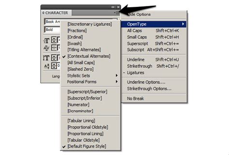
Ligatures and OpenType Features
Ligatures are characters that are joined together, often to create a more aesthetically pleasing and readable text. InDesign automatically produces standard ligatures defined in the font when you choose Ligatures from the Character panel menu, Control panel menu, or in-context menu, provided the font supports them. This feature is particularly useful for common letter combinations like "fi," "fl," or "ffl."
Language Settings and Spell Checking
InDesign uses a spelling and hyphenation dictionary based on the language setting of the text. To ensure accurate spell-checking and hyphenation, you can select text and then choose the desired language from the Language menu in the Character panel. If no documents are open, setting the language will apply it as the default for new documents. InDesign supports dictionaries for both spelling and hyphenation, which work with standard syllable breaks. These language settings do not affect existing text frames or documents until explicitly applied. For example, the word "Glockenspiel" would be recognized and hyphenated differently in English versus Traditional German.
Font Management
When selecting a font in the Font Family menu, you can click Find More to discover and sync Adobe Fonts to your computer. To view only your activated Adobe fonts, you can filter the font list by clicking Show Activated Fonts.
Character vs. Paragraph Styles
In the Properties panel, InDesign distinguishes between two primary types of text formatting: character formatting and paragraph formatting.
- Character formatting, such as font, font size, and weight, applies to selected text or all of the text within a selected text frame.
- Paragraph formatting applies to entire paragraphs, affecting elements like alignment, indentation, and spacing.
Text formatting can be saved as text styles within a document to ensure speed and consistency in application. There are two types of text styles:
- Paragraph Styles: These save both character and paragraph formatting and are applied to entire paragraphs.
- Character Styles: These save specific character formatting attributes and can be applied to selected portions of text within a paragraph.
To create a new style, you can click within the text with the Type tool or select the text, and then click the Create Style button in the Properties panel.
Local formatting, which is formatting applied directly to text without a defined style, may be overridden or removed. To manage and update styles, you can open the Paragraph Styles panel. If local formatting has been applied to text that uses a defined style, you can update the style to match the selected text by clicking the Redefine Style icon, which appears to the right of the style name in the styles menu.
How To Use Paragraph Styles (and save time) in Adobe INDESIGN // Beginner Tutorial
Typographic Considerations for Italics
Italics, while useful for emphasis, are generally considered harder to read than regular or Roman text. Therefore, it is best to use italics sparingly and primarily for emphasis. This includes highlighting titles of books, movies, or other works, quoting foreign words or phrases, or drawing attention to specific terms.
The Challenge of Combined Styles
A particular challenge arises when attempting to combine bold and italic formatting, especially with certain font families. For instance, a user might want to stylize "ITC Garamond Bold" to be both italic and bold. Adobe intentionally does not allow this combination directly in InDesign for certain font families, a design choice that some typographers support as it prevents "stylized" fonts, which they view as poor typography.
Historically, in applications like Pagemaker, combining bold and italic might have been more straightforward. However, InDesign enforces stricter typographic principles. When a font family has distinct bold and italic variants (e.g., "ITC Garamond Bold Italic"), that is the proper way to achieve the effect. If such a combined variant doesn't exist, InDesign will not artificially create it by overlaying bold and italic attributes.
This can lead to user frustration, especially when dealing with legacy workflows or specific design requirements. One workaround suggested is to find and replace the desired text, change its color to a temporary color, then find and replace again to apply the italic font, and finally, change the color back. However, this is a cumbersome process.
Font Families and Variants
Understanding how font families are structured is key. For example, under "ITC Garamond," you might find various condensed and non-condensed variants, each with its own italic counterpart:
- Light Condensed
- Light Condensed Italic
- Book Condensed
- Book Condensed Italic
- Bold Condensed
- Bold Condensed Italic
- Ultra Condensed
- Ultra Condensed Light
- Light
- Light Italic
- Book
- Book Italic
- Bold Italic
- Ultra
- Ultra Italic
When pasting text from sources like Microsoft Word, especially with fonts like "TT Garamond," it's possible for italics to be pasted using different font variants than intended. For example, text using "TT Garamond with italics" might paste as "ITC Garamond Light" and "Garamond Italic" when "ITC Garamond Book" and "ITC Garamond Book Italic" were expected. This occurs because InDesign is attempting to match the available font families and their specific weights and styles. The solution often involves manually selecting the correct font variants from the available list or ensuring the source document uses consistently named font files.
The ability to "split" ITC Garamond into smaller, more manageable families is not a direct function of InDesign but rather a characteristic of how font families are designed and packaged. Each variant is a distinct font file.
In conclusion, mastering italics in Adobe InDesign involves understanding the basic application methods, troubleshooting common issues, and leveraging the program's advanced typographic controls. By respecting the integrity of font designs and utilizing styles effectively, designers can create polished and professional documents.
If you have a question to ask or an idea to share, come and participate in the Adobe InDesign Community.