Adding metallic elements to your digital artwork is a powerful technique to make your creations truly stand out, especially in the vibrant online art community. Metallics can imbue your work with a sense of luxury, depth, and eye-catching dynamism. This tutorial will guide you through various methods and tools available in Procreate to achieve stunning metallic effects, from subtle shimmers to bold, reflective surfaces. We will explore how to leverage specialized brushes and textures to create a range of metallic finishes, suitable for diverse artistic styles.
Unlocking the Power of Metallic Textures and Brushes
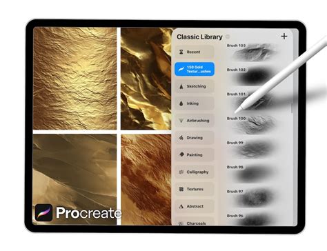
The journey into creating metallic effects in Procreate often begins with dedicated brush sets and texture packs. These resources are specifically designed to mimic the complex interplay of light and reflection found in real metallic surfaces. A comprehensive set, for instance, might include a variety of glitter, shimmer, and gold foil textures, alongside specialized brushstrokes, sprays, and splatters. Such a set, comprising around 50 distinct textures and 17 different brush types, provides an extensive toolkit for artists. These brushes can be used to generate metallic brushstrokes, splatters, and speckles, adding impactful elements that make artwork pop.
The provided set typically includes:
- 50 Glitter, Shimmer, and Gold Foil Textures: These are the building blocks for your metallic effects, offering a range of subtle to dramatic metallic sheens.
- 6 Brush Strokes for Revealing Gold Texture: These brushes are designed to "carve out" or reveal the underlying gold texture, creating defined metallic lines and shapes.
- 7 Splatter Brushes: Perfect for adding dynamic, energetic metallic splashes and drips.
- Gold Dust, Sparkle, and Glitter Brushes: These brushes add fine details, enhancing the realism and sparkle of your metallic elements.
By mastering the use of these tools, you can create eye-catching elements that elevate your artwork, making it truly pop off the page.
Technique 1: Creating Metallic Cutouts with Textures
One of the most effective ways to introduce metallic elements is by using a shape as a "cutout" to reveal a metallic texture underneath. This technique is particularly useful for adding polished accents to illustrations or creating striking graphic designs.
The process begins with creating a base shape. This shape will act as a mask, allowing a metallic texture - be it glitter, gold foil, or a metallic paint effect - to show through. The beauty of this method lies in its versatility. You can easily adjust the color and shine of your metallics to perfectly match your personal artistic style and the overall mood of your composition. This allows for a high degree of customization, ensuring that the metallic elements feel integrated rather than simply applied.
To achieve this, you would typically:
- Create your base shape: This can be anything from a simple geometric form to an intricate illustration.
- Place a metallic texture layer beneath the shape layer: Ensure the texture layer is large enough to cover the area you want to reveal.
- Use the shape layer as a clipping mask or alpha lock: This will confine the metallic texture to the boundaries of your shape.
- Adjust the metallic texture: Experiment with the color, brightness, and contrast of the texture to achieve the desired metallic look. Tools like Procreate’s Hue/Saturation/Brightness or Curves can be invaluable here.
Technique 2: Abstract Acrylics and Gold Fusion
For artists who enjoy a more expressive and energetic approach, combining abstract acrylic painting with metallic elements offers a fantastic creative outlet. This technique allows for a dynamic contrast between the fluid, organic nature of acrylics and the sharp, reflective quality of metallics.
In this approach, you can go "all out" with abstract acrylic paint and gold. Utilizing brushstrokes, splatters, scrapes, and sprays, you can create a rich visual dialogue with bright, bold colored acrylic paint. This method is not only a great way to get acquainted with the process of adding metallics but also serves as a fun and liberating exercise to loosen up your creative muscles before diving into more detailed work. The interplay of textures and colors can result in visually stunning and unique pieces.
The steps often involve:
- Building up layers of abstract acrylic paint: Use various brushes to create texture, movement, and color blends.
- Introducing metallic elements: Apply metallic brushstrokes, splatters, or textures over or within the acrylic layers.
- Creating contrast: Ensure there's a balance between the opaque, matte qualities of the acrylics and the reflective, luminous nature of the metallics.
This technique is excellent for exploring spontaneous art and discovering unexpected visual harmonies.
Alcohol Ink & Gold Metallic Geometric Elements in Procreate | Digital Abstract Art Tutorial
Technique 3: Harmonizing Watercolor and Metallics
The juxtaposition of watercolor and metallics creates a beautifully contrasted image due to their fundamentally different natures. Watercolor is known for its transparency, fluidity, and soft edges, while metallics offer opacity, shine, and sharp reflections. Combining these seemingly opposite mediums can yield breathtaking results.
To achieve this, specialized smooth liquid watercolor brushes can be employed. These brushes are designed to mimic the natural blending and layering properties of real watercolor paints. By skillfully blending and layering these watercolor elements, you can create a beautiful abstract watercolor painting that is then enhanced with metallic accents. The metallic elements can be integrated as fine lines, shimmering washes, or bold highlights, adding a touch of modern elegance to the organic flow of watercolor.
Key aspects of this technique include:
- Creating a watercolor base: Use watercolor brushes to build up translucent layers of color, allowing for natural blending and diffusion.
- Adding metallic details: Carefully apply metallic brushes or textures to complement the watercolor. This could involve adding fine linework, scattered sparkles, or metallic highlights on edges.
- Balancing transparency and opacity: Ensure the metallic elements don't overpower the delicate nature of the watercolor, but rather enhance it.
This fusion appeals to artists who appreciate both the subtle beauty of traditional mediums and the bold impact of digital enhancements.
Technique 4: Crafting Detailed Geometric Tiles with Metallic Accents
For those who appreciate precision and intricate design, creating detailed geometric tiles that incorporate metallic paint as an accent offers a rewarding challenge. These tiles can appear incredibly complex and time-consuming to create, but with the right tools and techniques, they become surprisingly simple to execute.
A key to this method is the use of a tile guide, a pre-designed template that helps in structuring the geometric patterns. By following this guide, artists can systematically build up their designs, ensuring symmetry and accuracy. Metallic paint can then be applied to specific elements within the tile - perhaps as outlines, decorative motifs, or as fill for geometric shapes - to add a luxurious and sophisticated finish. The contrast between the crisp geometric lines and the gleaming metallic accents can produce stunning visual effects.
To master this technique:
- Utilize a tile guide: This can be a custom-made grid or a downloaded template that provides a framework for your design.
- Build geometric patterns: Use line and shape tools, along with precise brushes, to construct the underlying pattern.
- Incorporate metallic accents: Apply metallic brushes or textures to selected areas of the tile, paying attention to how they interact with the surrounding geometry.
This approach is ideal for creating decorative elements, patterns for fabrics, or intricate digital artworks.
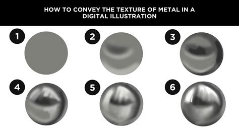
The Science of Shine: Making Objects Look Metallic
Beyond specialized brushes, understanding the fundamental principles of how light interacts with metallic surfaces is crucial for creating convincing metallic effects. To make an object look metallic, the core principle is to accurately represent its reflectivity and the way it interacts with light.
Every drawing or painting that aims for a metallic appearance begins as a flat color. The first step in achieving realism is to establish the light source. By determining where the light is coming from - for example, the upper right - you can begin to apply shading. Adding basic shading gives the shape a three-dimensional quality, but it doesn't yet convey the characteristic shine or reflectivity of metal.
To truly make something look metallic, you must significantly increase the contrast. This involves introducing more pronounced light and dark transitions, forming a discernible pattern. A common pattern to observe is a "light, middle, dark, middle, light" sequence. The transitions between these tonal values can vary: some are gradual, like the shading on the left side of a curved surface, while others are more abrupt, such as the transition at the edge of the darkest shadow on the right side.
For an even higher degree of shininess, you can make these transitions even less gradual and more abrupt. Increasing the number of these abrupt transitions further enhances the perception of a highly polished surface. Crucially, you can also add specular highlights. These are the super-bright, crisp white highlights that indicate a direct, intense reflection of the light source, much like a mirror. These sharp points of light are essential for conveying a sense of extreme polish and reflectivity.
Enhancing Shine and Reflectivity
To fine-tune how shiny an object appears, consider these adjustments:
- Increase Contrast: Sharpen the difference between the lightest highlights and the darkest shadows.
- Abrupt Transitions: Make the shifts from light to dark more sudden rather than gradual.
- More Transitions: Add more instances of these light-to-dark shifts across the surface.
- Specular Highlights: Introduce sharp, bright white points of light that mimic direct reflections.
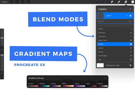
Harnessing Gradient Maps for Colored Metals
A remarkably efficient and versatile technique for rendering metallic surfaces in various colors is by using Procreate's Gradient Maps. This method involves drawing your object or surface in grayscale first. Once the grayscale rendering is complete, applying a Gradient Map allows you to instantly transform it into a metallic color, such as gold, silver, platinum, brass, copper, or virtually any other metallic hue imaginable.
The power of Gradient Maps lies in their flexibility. You can apply a Gradient Map to individual layers, allowing you to change the metallic color of specific parts of your illustration independently. Alternatively, for a unified effect, you can merge all relevant layers onto a single layer and then apply the Gradient Map to that merged layer, transforming the entire artwork at once.
To effectively use Gradient Maps for metallic colors:
- Create a grayscale drawing: Render your object or surface with accurate shading and highlights in grayscale.
- Prepare your Gradient Map colors: Select a palette of colors that represent the metallic tones you wish to achieve. For instance, a gold Gradient Map might use shades of yellow, orange, and brown.
- Apply the Gradient Map: In Procreate, go to the Adjustments menu and select Gradient Map. Choose your prepared color set or create a custom gradient.
- Adjust nodes: Gradient Maps use nodes to define color transitions. You can add or move these nodes to precisely control how your grayscale values are mapped to your chosen metallic colors. Typically, 5 nodes are sufficient for a good range of metallic tones.
- Assign colors to nodes: Use the Palette tab of the color picker to assign specific colors from your "Metal Colors" palette to each node. For example, the darkest part of your grayscale might map to a dark brown, while the brightest highlight maps to a bright yellow or white.
"Metal Colors" Palette for Gradient Maps
For those who wish to replicate the exact metallic colors demonstrated in tutorials, a "Metal Colors" color palette for Procreate is often provided. This palette typically contains meticulously chosen color sets for various metals, with each metal represented by a group of 5 distinct colors. These color groups are designed to be used as the nodes for your Gradient Maps, ensuring accurate and visually appealing metallic finishes.
When creating a new Gradient Map, you would aim to add a total of 5 nodes. You then use the Palette tab within Procreate's color picker to assign one of the 5 colors from your "Metal Colors" palette to each of these 5 nodes. This systematic approach ensures that your grayscale values are translated into realistic and vibrant metallic hues.
Essential Tools and Setup
To embark on this creative journey with Procreate metallic brushes, the essential tools are straightforward. All that is required is your iPad and a stylus. While an Apple Pencil is often used for its precision and pressure sensitivity, any stylus will work, and you can even use your finger if that is your preferred input method.
For specific projects, the canvas size can significantly impact the detail and resolution of your artwork. A canvas size of 2800x3800 pixels, for instance, offers ample space for detailed work and ensures high-quality output.
When experimenting with different techniques, a variety of brushes can be employed. While specialized metallic brush sets are invaluable, brushes from established packs, such as "Artist’s Pastels" by Bardot Brush, can also be adapted or used in conjunction with metallic textures to achieve unique effects.
For those looking to delve deeper into the technical aspects of rendering, resources like an article titled "Why do Mirrors Appear to be Silver in Color?" can provide fascinating insights into the physics of reflection and how it translates to visual representation. This knowledge can further inform and enhance your digital art.
The ability to combine traditional artistic principles with the powerful digital tools available in Procreate opens up a world of creative possibilities, allowing artists to achieve breathtaking metallic effects with relative ease.