Hand-lettering in Procreate is a popular and rewarding skill, offering a blend of artistic expression and digital precision. Whether you're a complete beginner or looking to refine your technique, this tutorial will guide you through the best practices for creating beautiful hand-lettered pieces using Procreate brushes. Hand-lettered quotes, inspirational messages, and words of wisdom are highly sought after in the commercial art world. In fact, a brush-lettered Shakespeare quote was instrumental in establishing a brand's presence in the market, remaining a best-seller years later. Many believe that good handwriting is a prerequisite for creating hand-lettered illustrations, but this is a common misconception. Anyone can cultivate the ability to produce exquisite hand-lettered artwork. This tutorial aims to equip you with the knowledge to create a compelling hand-lettered piece, even if you are entirely new to the craft. When first embarking on hand-lettering, it can be beneficial to conceptualize words and letters as visual illustrations rather than mere written text on a page.
Essential Tools for Procreate Hand Lettering
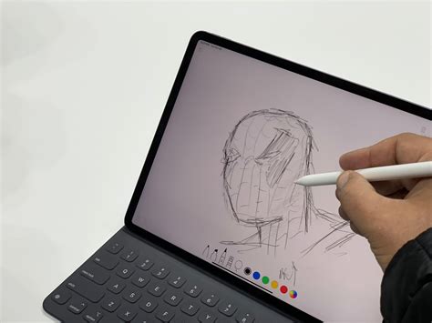
To begin your hand-lettering journey in Procreate, you will need the Procreate app, an iPad, and a stylus. For those entirely new to Procreate, you can even start by drawing with your finger. The process of pairing your Apple Pencil with your iPad is straightforward. For many iPad models, simply turn on your Bluetooth and connect the Apple Pencil to the bottom charging port. If your Bluetooth is not already active, a prompt should appear, asking if you wish to pair your device with your iPad. Once confirmed, you will be ready to begin lettering. It's important to note that some newer iPad models utilize a different Apple Pencil, so the pairing process might vary.
Setting Up Your Digital Canvas
The choice of canvas size in Procreate is contingent upon the intended use of your artwork. For pieces destined for print, it is crucial to maintain a high DPI (dots per inch), typically between 300 and 600 DPI. To simplify the process for print projects, you can set your canvas dimensions in inches. For instance, if you plan to create a piece for an 8x10 inch frame, you can adjust your canvas dimensions accordingly in inches. Conversely, if your creations are solely for digital distribution, you can define your canvas size using pixel dimensions tailored to your specific needs. For demonstration purposes within a video tutorial, setting the canvas to "screen size" often enhances visibility.
Navigating the Procreate Interface
The toolbar at the top of the Procreate interface is where much of your hand-lettering work will take place. On the right side of the toolbar, you will find essential tools such as Brushes, Airbrush, Eraser, Layers, and Color Options. The left side of the toolbar includes the Gallery, Wrench Tool (for actions and settings), Enhancements, Lasso Tool, and the Arrow (Transform tool). These tools, when utilized effectively, streamline the creative process.
Understanding Brush Types: Monoline vs. Pressure-Sensitive
Procreate offers a variety of brush types, and understanding their characteristics is key to achieving desired lettering styles. The monoline "brush" (referring to a Procreate brush, not a physical brush pen) maintains a consistent thickness regardless of stylus pressure, offering a clean, modern, and classic aesthetic. This style is a favorite for many.
However, a significant advantage of using the Apple Pencil with Procreate is its pressure sensitivity. This feature allows for varying brush stroke widths based on the applied pressure, enabling the creation of dynamic, brush-style lettering. In a demonstration with a brush pen example, you can observe how applying more pressure results in a thicker line, while lighter pressure produces a thinner stroke. This is the core mechanism behind achieving the characteristic thick and thin lines in brush lettering. While Procreate comes with numerous built-in brushes, there is also a vast marketplace for purchasing and importing custom lettering brushes, though the default options provide ample opportunity for practice and exploration.
Procreate Brush Settings to Change! | brush studio EXPLAINED ++ tips to make procreate brushes
Crafting Your Hand-Lettered Composition: From Sketch to Illustration
Thumbnail Sketching and Composition
Like any illustration, the most effective way to commence a hand-lettered quote is with a thumbnail sketch. This initial, loose sketch serves to transfer your ideas from thought to paper, or in this case, the screen. When sketching in Procreate, the built-in "Peppermint" brush in a vibrant red color is an excellent choice, as it clearly delineates the sketch lines.
Begin by writing out the quote you intend to hand-letter. For an example, the quote "Do what you love" can be used, or you can select a personally meaningful phrase. Once your quote is chosen, write it out to understand the form of the letterforms and how they might be arranged. It's important to recognize that most hand-lettered illustrations are not presented in a single line; rather, they are composed to be visually engaging and appealing. Remember, this is an illustration, not merely text. Experiment with different lettering styles. Consider how mixing cursive and block fonts might work together. In the example quote, "Love" rendered in cursive offered a particularly appealing aesthetic, allowing the preceding three words to be artfully contained within its curves and form. This compositional approach will vary based on your chosen quote, but it's essential to use this sketching phase for experimentation. There is no "wrong" way to sketch.
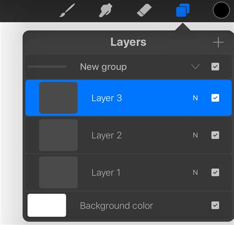
Once you have settled on a configuration that feels right, you can isolate this composition and place it on its own layer using the Selection tool. After selecting the composition, perform a three-finger swipe down on your screen. Navigate to your layers panel, swipe left on the original sketch layer, and delete it. This action will leave only your finalized compositional sketch, which was copied onto its own layer. If you prefer sketching on a diagonal, you may need to adjust your sketch's size and position on the canvas using the Transform tool, located at the top left of your canvas.
Refining Your Sketch for Precision
After positioning your composition on the canvas, it's time to refine the illustration. For this stage, activating a drawing grid can be immensely helpful, serving as a guide to ensure perfect alignment as you create your illustration.
Since thumbnail sketches are often loose and can be somewhat imprecise, the next step involves refining them. A thicker brush, one that more closely resembles the final illustration's appearance, is ideal for refining hand-lettering sketches. This refinement process also allows for greater precision by adhering to your drawing guide.
Subsequently, reduce the opacity of your thumbnail sketch within the layers panel. This is achieved by tapping "N" next to the layer and adjusting the opacity slider. Ensure you are working on a new layer for your refined sketch and select a larger brush. While this refined sketch doesn't need to be perfect, it should serve as a clear guide for the subsequent illustration stage.
Creating Your Hand-Lettering Illustration
Now, the enjoyable part begins: the actual illustration. Using a textured brush can impart an organic, hand-drawn quality to your work. After selecting your preferred brush, create a new layer for your illustration and begin drawing over your refined sketch. This is where your personal style truly shines. Explore diverse color palettes and brushes to align your illustration with your unique aesthetic. It is advisable to create a separate layer for each element of your illustration, facilitating easier manipulation later on. In the example, "Do what you" and "Love" were illustrated on distinct layers. Once completed, your illustration might resemble the example, intentionally retaining a slightly imperfect quality to enhance the hand-drawn vibe.
Elevating Your Hand-Lettering with Effects
Applying a Drop Shadow
A popular technique to add depth and a faux-3D effect to hand-lettering is by applying a drop shadow. To create this, select the layer you wish to enhance. In the layers panel, swipe left on that layer and choose "duplicate." This action generates an identical copy of the layer. To differentiate the drop shadow from the original lettering, navigate to your color palette and select your desired shadow color. Then, drag the color circle from the top left of your screen onto the hand-lettering you are applying the shadow to. Keep your stylus on the screen and drag it to the right until all letters are recolored. Finally, position this duplicated and recolored layer beneath the original lettering layer. You might observe that some edges of the shadow do not seamlessly connect. The objective is to ensure these letters appear as a cohesive unit.
A swift and effective method for positioning the drop shadow layer precisely involves tapping the bottom right corner of your iPad screen. Each tap (using only one finger) will subtly shift the letters, creating a beautifully rendered drop shadow. For more detailed guidance on drop shadows, refer to timestamp 1:01 of the accompanying video tutorial.
Procreate Gestures: Enhancing Workflow Efficiency
Mastering Procreate gestures, also known as shortcuts, can significantly expedite your workflow and boost efficiency when creating art. Be mindful, however, as you might find yourself instinctively tapping your physical drawing surface to undo mistakes out of habit.
Here are some of Procreate's most useful gestures:
- Two-Finger Tap: This is the quickest way to undo your last action. Instead of navigating to the eraser tool, a simple two-finger tap will revert your most recent move. For those who letter frequently, a habit of tapping with the pinky and ring fingers can minimize hand posture changes. To undo multiple actions, simply continue tapping.
- Three-Finger Tap: This gesture performs the opposite function of the two-finger tap, effectively redoing your erased strokes. This is invaluable if you accidentally erase something you intended to keep.
- Important Note on Undo/Redo: To the best of current knowledge, the undo history resets once you navigate away from a canvas. Therefore, while you can undo and redo within a canvas, these actions are lost upon exiting and re-entering. It is advisable to create a new layer and uncheck the visibility of a layer if you are uncertain about a particular element, allowing you to hide it until you decide whether to keep it.
- Three-Finger Swipe: A three-finger swipe across the canvas will clear your entire current canvas.
- Holding Down Two or Three Fingers: Similar to tapping, holding down two or three fingers allows for rapid undoing or redoing. For instance, if you've drawn numerous small dots and wish to erase them quickly, holding down two fingers will perform the erasure much faster than repeated tapping.
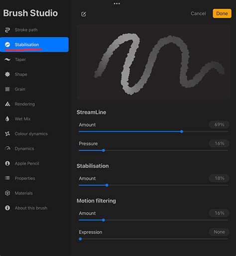
The Significance of Streamline in Procreate
The streamline feature in Procreate, which assists in smoothing out lines, was not always present. In the early days of iPad Pro lettering, jittery lines were a common challenge, particularly with finer lettering styles. The Apple Pencil's sensitivity meant that even the slightest hand movement was translated into the artwork. This led to intense pressure being applied by some artists in an attempt to achieve smooth strokes, sometimes resulting in physical strain. The introduction of the streamline feature was met with excitement, despite some initial reservations about it feeling like "cheating." Lettering with streamline is still a skillful endeavor, presenting its own unique challenges.
While the video example demonstrates lettering with and without streamline, experimenting with different percentages is recommended to discover what feels most natural. A high streamline setting can create a pronounced "magnet-like" effect that can significantly alter the appearance of your lettering. A streamline setting between 70-80% often feels more organic, aiming to enhance, rather than completely transform, your personal style.
Creating Custom Brushes for Unique Lettering Styles
Procreate's flexibility extends to creating custom brushes, allowing artists to tailor their tools precisely to their needs. To create a custom calligraphy brush, begin by tapping the plus sign in the upper right corner of the screen to initiate a new canvas. The canvas size is flexible at this stage. Next, tap the brush icon, and under the "Calligraphy" category, press the plus sign in the upper right corner of the Brush Library to begin creating a new brush.
Defining Brush Shape and Stroke Properties
The initial step in brush creation is defining its shape. For a calligraphy brush, selecting a pre-made shape is often a good starting point. Within "Stroke Properties," set the "Spacing" to "None." The "StreamLine" setting is crucial for smoothing out your lines. For this tutorial, the "Stroke Taper" section is left unmodified.
Adjusting Apple Pencil Pressure and Brush Behavior
A key setting for calligraphy brushes is "Apple Pencil Pressure," which dictates how the brush responds to the pressure applied by the stylus. Under "Apple Pencil Pressure," increase the "Size" setting. In the "Brush Behavior" settings, ensure "Orient to Screen" is enabled. Adjust the "Max" setting to approximately 80%, and set the "Min" slightly higher. Once these settings are configured, select your desired color (black is a common choice for testing) and test your new brush to see how it performs.
Exploring Brush Sets and Their Applications
As artists hone their lettering skills, they often gravitate towards specific brushes that best suit their style and needs. When Procreate became available, the ability to create bespoke lettering brushes became a reality, allowing artists to bring their envisioned lettering styles to life. These meticulously programmed brushes represent a collection designed to facilitate the realization of diverse lettering aesthetics.
Recommended Brush Sets and Individual Brushes
- Ink Lovers Brush Set: This set includes brushes that emulate the texture of sumi ink applied with a waterbrush, offering custom inky brush stroke textures. Another brush within this set is described as an "ode to Jane Austen," suggesting a refined or classic aesthetic.
- Font Lovers Brush Set: This set features brushes that influence the way an artist writes, and includes a monoweight brush with a grainy texture and rough edges, appealing to those who prefer a more textured or imperfect look.
- Beautiful Lettering Brush Set: This highly utilized set contains several notable brushes:
- A brush with a subtle edge texture, perfect for both lettering and doodling, adding character without being overpowering.
- A favorite lettering pencil brush, designed to mimic the feel and appearance of a traditional pencil.
- The "blunt crayon pro," recommended for creating fun, more childlike lettering styles.
- A brush that evokes a rougher edge aesthetic with low contrast stroke variation, akin to the title art style of the movie "Drive."
Choosing brushes is fundamentally about enjoyment and experimentation. Practicing control over stylus pressure is essential for achieving visually striking, contrasted lines that bring lettering to life.
Common Pitfalls and Strategies for Success
Despite the perceived simplicity of digital lettering, beginners often encounter common pitfalls. It's important to remember that hand lettering is a form of self-expression, allowing for the infusion of unique personality into each stroke. The key is to find brushes and techniques that resonate with your individual artistic vision.
For those who have explored style studies and seek further advancement, comprehensive courses are available. These often include step-by-step videos, free practice sheets, custom brushes, and guidance on flourishing techniques. A popular style, "Bounce Lettering," was first introduced in 2016 and has since gained significant traction. Updated processes and tips for achieving natural, beautifully bounced, and dynamic letterforms are often included in advanced courses.
Monetizing Your Hand-Lettering Skills
Hand-lettering is a skill that can be effectively monetized, setting artists apart and opening up new income streams. Your hand-lettered artwork can be transformed into sellable fonts, creating a source of passive income. Additionally, offering hand-lettering as an add-on service for freelance clients, such as logo design, can be highly lucrative.
With consistent practice, dedication, and the right tools, you will be well on your way to creating beautiful hand-lettering compositions that showcase your unique style and captivate your audience. Receiving exclusive offers on courses and products, a monthly design file, and instant access to a resource library can further support your artistic journey.
iPad vs. iPad Pro for Lettering
The notion that only the iPad Pro is suitable for digital lettering is a misconception. Many iPads are compatible with the Apple Pencil and can produce excellent lettering results. While an iPad Pro offers advanced features, a standard iPad can be a more affordable yet highly capable option for lettering enthusiasts. It is advisable to check which current iPad models support lettering with the Apple Pencil.
The Art of Calligraphy vs. Hand Lettering
Before delving into specific brush settings, it's important to distinguish between different lettering styles. Hand lettering, or simply lettering, is essentially the artistic illustration of letters, words, and phrases. It generally involves fewer rigid "rules" than calligraphy, and the range of tools that can be employed is virtually limitless. Calligraphy, on the other hand, traditionally refers to the art of beautiful handwriting, often with specific tools like dip pens or brush pens, and adheres to more defined forms and strokes.
Conclusion
This comprehensive guide has explored the multifaceted world of Procreate brushes for hand lettering. From understanding the fundamental tools and interface elements to mastering advanced techniques like drop shadows and custom brush creation, the journey of digital lettering is both accessible and deeply rewarding. By embracing experimentation, practicing diligently, and leveraging the powerful features of Procreate, artists of all levels can create stunning hand-lettered pieces that express their unique vision and captivating style.