In the realm of graphic design, creating depth and visual interest is paramount. Adobe InDesign offers a powerful tool for achieving this: the Drop Shadow effect. While seemingly straightforward, mastering its nuances can elevate your designs from flat to dynamic. This tutorial delves into the intricacies of InDesign's Drop Shadow, providing practical techniques and insights for both novice and experienced users, ensuring your shadows are not just present, but graphically correct and aesthetically pleasing.
Understanding the Drop Shadow Effect in InDesign
The Drop Shadow effect in InDesign is designed to simulate the shadow cast by an object, thereby adding a sense of three-dimensionality to your design. It allows for granular control over various parameters, including color, distance, size, and opacity, enabling you to mimic lighting conditions of varying intensity and angles. This capability is crucial for adding visual pop and guiding the viewer's eye through your layout.
As Rufus Deuchler, a graphic designer, trainer, and consultant based in Florence, Italy, points out, "InDesign’s Drop Shadow just does not yield the expected, or graphically correct, results" in some scenarios. This highlights the importance of understanding the underlying principles and available settings to achieve desired outcomes. The effect essentially creates a shadow in the shape of the object it's applied to, providing a sophisticated way to enhance the visual hierarchy and realism of your compositions.
Applying a Basic Drop Shadow
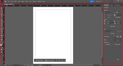
Let's begin with a fundamental application. Imagine you have a document with a placed picture and some accompanying text, and you wish to apply a drop shadow to these elements. The process is initiated by selecting the object(s) you want to affect. InDesign offers several convenient ways to access the Drop Shadow settings.
A prominent feature is the dedicated Drop Shadow button located on the Control panel. This button is unique as it's the only effect with its own dedicated icon. Clicking it once will apply a default drop shadow, and clicking it again will remove it. For more immediate control, holding down the Option (Mac) or Alt (Windows) key while clicking this button will directly open the Effects dialog box to the Drop Shadow settings.
Alternatively, you can access the effect by clicking the Fx button in the Control panel, Properties panel, or the Fx panel, and then selecting "Drop Shadow" from the subsequent menu. For keyboard enthusiasts, InDesign provides a built-in shortcut: Command+Option+M (Mac) or Control+Alt+M (Windows).
To visualize the effects of your adjustments in real-time, it's highly recommended to open a second window. Navigate to Window > Arrange > New Window for DropShadow. This allows you to keep one window in preview mode while manipulating settings in the other, providing immediate visual feedback.
Fine-Tuning Drop Shadow Settings for Realism
The default settings for a drop shadow can often appear overly dark and heavy. For a more subtle and realistic effect, adjustments are necessary. Rufus Deuchler's example of creating shadows for a catalogue of rings underscores the need for subtlety.
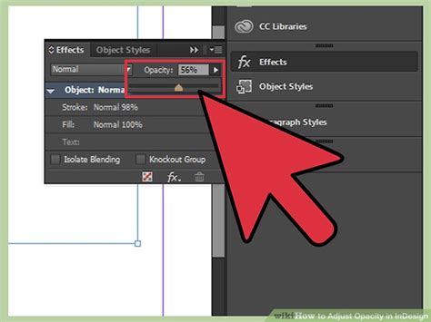
The Opacity setting is a primary control. Reducing it from the default 75% to a more subdued value, such as 40%, can significantly improve the natural appearance of the shadow. The Distance parameter controls how far the shadow is offset from the original object. For instance, setting it to 4 pixels can create a subtle separation.
The Size of the shadow influences its blurriness. Increasing or decreasing this value affects the spread of the shadow's edge. A setting of 5 pixels, for example, can provide a slightly softer diffusion.
Spread determines the extent to which the shadow retains its full color and opacity. At 0% spread, the entire shadow is affected by the opacity setting. However, increasing the spread to 100% means that the entire shadow is rendered at full opacity (e.g., 40% in our example) and color (typically black, with a Multiply blend mode). Adjusting this value allows you to control the gradient of the shadow's intensity. A spread of 10% often strikes a good balance.
Adding a touch of Noise can also enhance realism. A small percentage, like 1% or 2%, introduces subtle randomness, breaking up any artificial smoothness and making the shadow appear more organic, akin to real-world shadows.
Controlling Shadow Placement: Distance and Angle
The Distance and Angle settings are fundamental to positioning the drop shadow accurately in relation to the object. These parameters dictate the direction from which the light source appears to be emanating.
The Angle setting allows you to specify the direction of the shadow. When working with multiple objects or effects, enabling Use Global Light is highly beneficial. This ensures that all applied effects maintain a consistent angle, simplifying the management of lighting across your design. You'll typically want to leave this option checked to maintain uniformity.
Another important setting is Object Knocks Out Shadow. By default, this is usually enabled, meaning the original object will obscure any part of the shadow that falls behind it, which is the natural behavior of light. However, there are specific creative scenarios where disabling this option can yield interesting visual results, allowing the shadow to appear 'underneath' the object more distinctly.
Furthermore, InDesign allows the drop shadow to honor other transparency effects applied to the same object. This ensures that interactions between shadows and other transparencies are rendered correctly, maintaining the integrity of your overall transparency settings.
Crafting Realistic Shadows for Specific Objects: The Catalogue Example
Rufus Deuchler’s example of creating shadows for a catalogue of rings provides a practical illustration of how to achieve more sophisticated and graphically correct results when the default drop shadow might fall short.
In such cases, a manual approach involving cloning and gradients can be more effective. The process begins by selecting the frame containing the image of the ring. This frame is then 'cloned' by performing a Copy followed by a Paste in Place (Edit > Paste in Place). This creates an identical, layered object directly on top of the original.
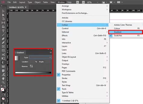
On this duplicated frame, the Gradient Tool is used to draw a gradient from Black to White. This gradient will form the basis of the shadow. To soften the edges and mimic the diffusion of a real shadow, the Feather effect is applied. With the duplicated frame still selected, navigate to Object > Feather. Adjusting the feathering settings will blur the edges, making them less sharp and more natural.
The next step involves manipulating the perspective of this feathered gradient. Using the Free Transform Tool, you can select a specific transformation point. As Sandee pointed out in the original context, clicking the top middle point of the frame and then holding down Cmd/Ctrl will change the cursor to a horizontal double-headed pointer. Dragging this pointer will skew the frame, creating a sense of depth and perspective for the shadow, making it appear to cast from the ring onto the surface.
For the gradient itself, it's crucial to use a "rich black." Rufus Deuchler notes that "most blacks in placed images contain other colors too." Therefore, instead of a pure black, a black with subtle undertones (often achieved through CMYK values like C:60 M:50 Y:50 K:100) can appear more natural and less flat, especially when dealing with photography.
Beyond the Basics: Color and Blending Modes
While the default drop shadow often uses black, InDesign offers complete control over the shadow's color. You can select the fill color in the Properties panel and choose from the Swatches option or the Color option to mix custom colors. For precise color control, you can switch to CMYK sliders within the Color panel.
The Blending settings for the drop shadow are equally important. The default Multiply mode is excellent for simulating how shadows interact with underlying colors, darkening them realistically. However, exploring other blend modes like Screen, Overlay, or even Normal (with adjusted opacity) can lead to unique artistic effects, though they deviate from a strictly realistic shadow simulation.
Integrating Graphics and Text with Drop Shadows
The process of applying drop shadows extends to both placed graphics and text frames.
If your document lacks a graphic, you can import one using File > Place in the Control panel. After navigating to your desired image file and double-clicking it, your cursor will transform into a loaded icon. Click within your document to place the graphic. You can then adjust its size proportionally by selecting it with the Select tool, dragging a handle, and holding down Control and Shift keys simultaneously.
Similarly, for text, you can create a text frame using the Text tool from the Tools palette. With the Text tool still active, click within the frame to begin typing. If you have existing text in a word processing document, use File > Place to import it.
How can i add shadows behind images in indesign
Advanced Considerations and Best Practices
When applying drop shadows, remember that less is often more. Overuse or overly aggressive settings can make a design look amateurish and cluttered. Strive for subtlety, aiming to enhance rather than overpower the primary elements.
Consider the overall lighting and mood of your design. A harsh, direct light will create a sharp, distinct shadow, while diffused light will result in a softer, more spread-out shadow. Your drop shadow settings should align with this visual narrative.
The Eyedropper tool, accessible by clicking and holding the Color Theme tool in the toolbox, can be invaluable for sampling colors from existing elements in your design or from placed images. This allows for a harmonious color palette, even when defining custom shadow colors.
When creating custom color swatches for your shadows, you can double-click the new color swatch in the list, rename it, and set specific options in the Swatch Options dialog box. This organizational approach is particularly useful for maintaining consistency across larger projects.
Ultimately, InDesign's Drop Shadow effect is a versatile tool that, when understood and applied thoughtfully, can significantly enhance the visual appeal and perceived depth of your graphic designs. By experimenting with its various settings and employing manual techniques when necessary, you can achieve professional-quality results that truly make your designs stand out.