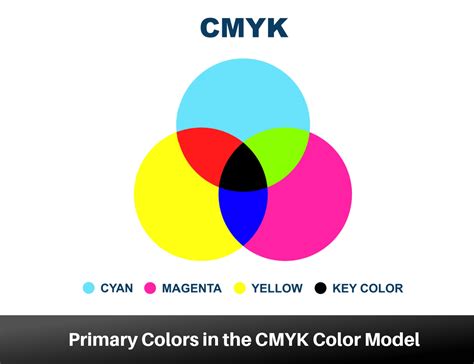
In the realm of visual communication, the colors we see on our screens often differ from those that grace the printed page. This discrepancy is largely due to the fundamental differences between the RGB (Red, Green, Blue) color model, used for digital displays, and the CMYK (Cyan, Magenta, Yellow, Key) color model, the standard for professional printing. Understanding CMYK is not just a technical detail; it's crucial for designers aiming for accurate color reproduction, consistent branding, and high-quality printed materials. The CMYK acronym stands for Cyan, Magenta, Yellow, and Key: those are the colours used in the printing process. These four ink colors, when combined in varying percentages from 0% to 100%, can create over 16,000 colors, forming the foundation for virtually any hue imaginable on paper.
The Subtractive Nature of CMYK
The CMYK color model is a subtractive color model, a concept that sets it apart from the additive nature of RGB. In subtractive models, colors are created by reducing or "subtracting" the amount of light reflected from a background. When we talk about CMYK printing, the "white" is typically the natural color of the paper or substrate itself. The inks then act as filters, absorbing certain wavelengths of light and reflecting others. Cyan ink, for instance, absorbs red light, while magenta absorbs green, and yellow absorbs blue. When these inks are combined, they subtract more light, leading to darker colors. Theoretically, a perfect combination of cyan, magenta, and yellow inks in equal, large amounts would produce black. However, due to impurities in ink formulations, achieving a true, deep black solely through this combination is challenging.
This is where the "K" in CMYK becomes indispensable.
Decoding the "K": Black's Crucial Role
The "K" in CMYK has been a subject of much discussion and debate. While it might seem logical for it to stand for "Black," the reasoning is more nuanced and deeply rooted in the history of printing. One theory suggests that "K" was chosen to avoid confusion with "B" for Blue, as "B" could be ambiguous in color contexts. However, this explanation is often considered less likely by printing professionals.
The prevailing and most widely accepted explanation is that "K" stands for "Key." In traditional offset printing, the "key plate" was the printing plate that carried the most detail and was used to align and register the other color plates (cyan, magenta, and yellow). This key plate was most commonly used for the black ink, as black provides the essential detail, contrast, and depth to an image, making it the "key" component for defining the final printed output. Therefore, the term "key" became synonymous with the black ink in the CMYK process.
What Is The History Behind CMYK's Dominance In Print? - Graphic Design Nerd
Why Black Ink is Essential in CMYK
While the combination of cyan, magenta, and yellow can create dark colors, they often result in a deep brown or a muddy gray rather than a true black. Relying solely on the CMY mix for dark tones presents several practical challenges in commercial printing.
Firstly, using a high percentage of all three CMY inks can lead to an excessive ink coverage on the paper. This can cause the paper to become oversaturated, potentially leading to smudging, slow drying times, and ink transfer onto adjacent sheets. This not only affects print quality but also increases production time and costs.
Secondly, achieving fine details and sharp text using only CMY inks can be difficult. The process of layering multiple inks for dark tones can cause slight misalignments, known as "dot gain" or "trapping issues," which can soften the crispness of fine lines and text.
Black ink, as a standalone color, offers a solution to these problems. It provides a true, deep black that is sharp and well-defined. When printing text, for example, using only black ink ensures maximum sharpness and legibility without the need for precise registration with other colors. This makes black ink the "key" for achieving high-quality text and intricate details in printed designs.
CMYK vs. RGB: A Fundamental Difference
The distinction between CMYK and RGB is critical for anyone involved in design and printing. Your computer monitor or smartphone screen operates using the RGB color model. RGB is an additive color model, meaning it starts with black (the absence of light) and adds different wavelengths of red, green, and blue light to create colors. As more light is added, the colors become lighter, culminating in white when all three primary colors are combined at full intensity. This model is optimized for emitting light and producing vibrant colors on digital displays.
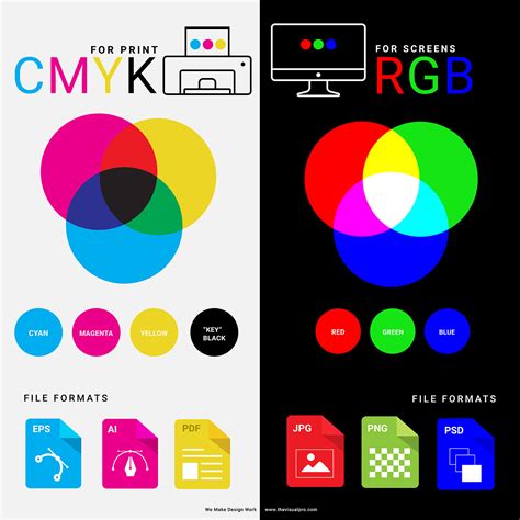
CMYK, on the other hand, is a subtractive model designed for reflecting light off a surface. It begins with a white background and subtracts light through the application of inks. The colors produced by CMYK are generally less vibrant and have a smaller gamut (range of colors) compared to RGB, especially in the brighter, more luminous tones. This is why colors viewed on a screen may appear significantly different when printed. A design created in RGB might contain colors that simply cannot be accurately reproduced using CMYK inks.
Color Reproduction Challenges in CMYK
While CMYK offers a vast spectrum of reproducible colors, some hues are inherently more challenging to achieve accurately than others. Designers often encounter difficulties with specific colors, and understanding these limitations can help in selecting appropriate color palettes for print projects.
- Red: Red can be particularly tricky. When printed, it can sometimes appear as orange or a rusty hue. This often indicates an imbalance in the magenta and yellow ink levels. If the red appears too pinkish, it suggests that too much magenta has been used.
- Green: Green is created by mixing cyan and yellow. To achieve vibrant greens, it's recommended to use equal parts of cyan and yellow and ensure the ink density is sufficient.
- Yellow: While vibrant yellow can be achieved, darkening it requires careful management. If overdone, dark yellow can easily shift towards a more muted sage or mustard color.
- Blue: Blue is consistently cited as one of the most challenging colors to reproduce accurately in CMYK. Achieving a true, rich blue often requires precise, balanced mixtures of cyan and magenta, with careful control over ink levels. Suggested starting points, like 100-50-0-0 (Cyan-Magenta-Yellow-Key), aim for balanced mixtures, but fine-tuning is usually necessary.
- Purple: Fortunately, regal purple tones are generally CMYK-friendly. These colors can be achieved with good accuracy by balancing magenta and cyan.
- Pink: Pinks in CMYK printing are heavily dependent on the magenta ink. For stand-out pinks, high magenta levels with low amounts of yellow, cyan, and black are typically used.
- Metallic Colors (Gold and Silver): It's important to note that CMYK printing cannot produce true metallic finishes for gold or silver. While it's possible to create flat representations or simulate metallic effects (often referred to as Non-Metallic Metal or NMM), the reflective shimmer of actual metallic inks cannot be replicated.
Practical Applications and Design Considerations
When designing for print, it is imperative to set up your files in the CMYK color mode from the outset. Using design software that allows you to specify CMYK values ensures that you are working within the printable color space. If you design in RGB, you risk encountering unexpected color shifts when your files are converted for printing. Many professional printing services, like instantprint, offer automatic RGB to CMYK conversion, but it's always best practice to manage this yourself to maintain creative control and ensure accurate results.
File types that are well-suited for CMYK include Portable Document Formats (PDFs), Adobe Illustrator (AI) files, and Encapsulated PostScript (EPS) files, as these formats support CMYK color modes and are widely compatible with printing workflows.
The CMYK model is fundamental for a wide array of printed materials, including:
- Business cards
- Posters
- Billboards
- Stationery
- Promotional items (t-shirts, mugs, pens)
- Flyers and brochures
- Product packaging
- Menus
- Banners
For brands that operate in both digital and print spaces, ensuring color consistency across all platforms is paramount. Tools and workflows that facilitate smooth transitions between RGB and CMYK, such as design platforms with specialized plugins, are invaluable for maintaining brand integrity.
Achieving Rich Black and Standard Black
The distinction between "Standard Black" and "Rich Black" is another important consideration in CMYK printing. Standard black is achieved by using only black ink (K=100%). This provides a clean, sharp black suitable for text and fine details.
Rich black, on the other hand, is created by blending all four CMYK colors. This results in a deeper, more saturated, and visually richer black tone. A common recipe for rich black is C=60%, M=60%, Y=60%, K=100%. This is particularly useful for large areas of solid black, where a more intense and visually impactful black is desired. However, it's important to use rich black judiciously, as excessive use of multiple inks can still lead to oversaturation and drying issues.
The ability to precisely control these ink values, often monitored using specialized equipment like GMG scanners and related software, allows printing presses to be calibrated. This calibration process ensures that each machine produces a standard color output, regardless of its individual characteristics, leading to consistent results throughout a print run.
In essence, understanding the intricacies of the CMYK color modelâfrom the foundational meaning of "K" to the practical challenges of color reproduction and the differences between RGB and CMYKâempowers designers to create visually stunning and accurate printed materials that effectively communicate their message.