Adobe InDesign's Liquid Layout feature, introduced in CS6, revolutionized how designers approach multi-format publishing. Once a daunting task involving extensive manual adjustments, adapting content for different page sizes, orientations, and output devices can now be streamlined, saving significant time and resources. This powerful tool, coupled with InDesign's Alternate Layouts, offers a dynamic solution for creating responsive designs that adapt seamlessly across print and digital platforms.
The Evolution of Layout Adaptation: From Manual Drudgery to Automated Efficiency
Historically, creating multiple versions of a design for different outputs was a labor-intensive process. For print, producing hardcover and trade paperback editions often meant building two entirely separate layouts from scratch. For digital, adapting a design for various tablet sizes and orientations - like the difference between an iPad portrait (768×1024 px) and landscape (1024×768 px) - required meticulous manual repositioning and resizing of every element on every page. Even with features like Layout Adjustment, which offered some automation for reflowing and repositioning anchored objects, significant manual cleanup was invariably necessary. This manual approach could stretch a project that might take hours into days, or even weeks.
The introduction of Liquid Layouts marked a paradigm shift. It’s not a single tool or command, but rather a set of behaviors that dictate how page items scale and reposition when the page dimensions or orientation change. This capability is particularly transformative when creating Alternate Layouts within the same InDesign document. If Liquid Layout rules are applied before creating an Alternate Layout, the adaptation process becomes largely automated. Without these rules, designers would face the tedious task of manually adjusting every single item on each new layout.
Understanding Liquid Layout Rules: Directives for Dynamic Adaptation
Liquid Layout rules act as instructions, guiding InDesign on how to handle page elements in response to alterations in page size or orientation. By default, no Liquid Layout rules are applied to master or document pages. However, once applied, these rules govern the behavior of content. It's crucial to note that Liquid Layout and the older Layout Adjustment feature are incompatible; you must choose one or the other.
Controlled by Master: Inheriting Layout Behavior
The most fundamental Liquid Layout rule is "Controlled by Master." This rule dictates that document pages will automatically adopt the Liquid Layout rules applied to their respective master pages. If the desired behavior is simply to have document pages adapt based on master page settings, this rule provides a straightforward improvement over previous methods.
The Scale Rule: Proportional Resizing for Uniformity
The "Scale" rule functions much like manually resizing a group of objects. When applied, it resizes all elements on the page - including text frames and images - proportionally in response to changes in page size. If you enlarge the page, all content scales up; if you shrink the page, all content scales down. This is akin to grouping multiple objects, holding down Cmd+Shift/Ctrl+Shift, and dragging a corner of the bounding box.
When using the Scale rule, the entire page content is resized until it reaches the edges of the new page dimensions. Any remaining space on the page is then centered. If this space appears at the top and bottom, it's referred to as "letter-boxing"; space on the sides is "pillar-boxing." Notably, the Scale rule is the only Liquid Layout rule that alters the actual size of type and images by default, unless the AutoFit option is used.
To apply this rule to a specific document page rather than its master, you would select the Page tool, access the Control panel, and set the Liquid Page Rule to "Scale." You can then adjust the page's width and height fields to the desired new dimensions.
The Re-Center Rule: Maintaining Central Alignment
The "Re-center" Liquid Layout rule offers a different approach: it does not resize any objects. Instead, it ensures that all content remains perfectly centered, both horizontally and vertically, within the page edges. This rule is most effective when increasing page size, as it ensures content stays in the middle of the larger canvas.
When a page is resized smaller than its content using the Re-center rule, the content is forced outside the page trim area, leading to cropping upon export. This rule is particularly beneficial for web content, where layouts often adapt to fill browser windows. Web designers commonly use fixed or max-width layouts, and the Re-center rule ensures that the entire page content remains centered within the browser, with any empty space on the sides filled by a background image or color.
A peculiar aspect of InDesign CS6 is how page resizing is previewed. With the Page tool active, dragging a page's control corner merely previews the change rather than committing it. This design choice by Adobe is intended for scenarios where the output format inherently supports liquid layouts, such as HTML or SWF, allowing the viewing device to manage the adaptation. To commit a resize, you typically need to use modifiers like Alt (Windows) or Option (Mac OS) while dragging, or adjust dimensions directly in the Control panel or Pages panel.
Guide-Based Rules: Intelligent Object Adaptation
Moving beyond simple scaling and centering, Guide-Based Liquid Layout rules introduce a more sophisticated level of control. This behavior is inspired by concepts like 3- and 9-slice scaling found in other Adobe applications. The core idea is to use special "liquid guides" placed strategically to touch one or more objects. When the page dimensions change, these objects will then expand or contract in specific ways, adapting to the new page size.
To implement this, you first create a standard ruler guide. Then, with the Page tool active, you hover near the guide until an icon appears. Clicking this icon transforms the guide from solid to dashed, indicating it's now a liquid guide, and the icon changes to reflect this. By positioning these liquid guides to touch specific objects, you can influence how those objects resize.
For instance, if you have a two-column text frame and you want to ensure the columns don't become excessively wide when the page is enlarged, you can use liquid guides. You might apply a "Flexible Width" rule to the text frame, setting a maximum column width. When the page is widened, the text frame will adapt, but each column will not exceed the specified maximum width, maintaining a more aesthetically pleasing layout. This approach allows for more granular control over how elements behave, preventing undesirable distortions.
Object-Based Rules: Pinning, Constraining, and Auto-Fitting
The "Object-based" rule offers the most granular control, allowing designers to define specific behaviors for individual objects on the page. This is where the true "liquidity" of the layout can be achieved, enabling objects to adapt independently to page changes.
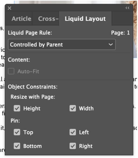
With the Page tool selected, you can click on an object (like a graphic frame) and choose "Object-based" from the Liquid Page Rule dropdown in the Control panel. This reveals a host of new symbols and options. Lines emanating from the object can connect to page edges, indicating how the object should behave relative to those edges. Inside the object's bounding box, dashed lines might represent its dimensions, accompanied by icons like a padlock (indicating a fixed dimension) or a spring (indicating a dimension that can grow or shrink).
For example, you could configure a frame to maintain its width regardless of page width changes (using the padlock on the horizontal dimension) but allow its height to adjust with page height changes (using the spring on the vertical dimension).
Furthermore, the "Auto-Fit" option within the Liquid Layout panel (often used in conjunction with object-based rules) allows the content inside a frame to resize along with the frame itself. This preserves chosen fitting methods, such as "Fit Content to Frame" or "Fill Frame Proportionately," ensuring images and other media scale appropriately within their containers.
The power of object-based rules lies in their ability to automate the adaptation of complex layouts for numerous outputs. Imagine designing a large poster, a small flyer, and a digital magazine for a multitude of devices (iPad, Samsung Galaxy, Amazon Fire, etc.) in both portrait and landscape orientations. By meticulously preparing each object and applying the appropriate Auto-Fit and flexible width options, the process of adapting a single designed layout to all these variations can become almost entirely automated, saving immense amounts of time and effort.
How to Create Responsive Layouts - Pt. 2 Creating a Smartphone Layout that Scales Automatically
Alternate Layouts: The Foundation for Multi-Format Design
InDesign's Alternate Layout feature is intrinsically linked to the effectiveness of Liquid Layouts. An alternate layout is essentially a different version of a page or set of pages created within the same InDesign document. This allows designers to manage multiple versions of a publication - whether for different print sizes or various digital devices - in a single, organized file.
The Traditional Approach to Alternate Layouts
Before Alternate Layouts and Liquid Layouts, creating different versions of a document was achieved by duplicating the main file and then manually adjusting each copy. For instance, converting an A4 document to A5 would necessitate resizing fonts, adjusting text flow, and repositioning graphics. While manageable for short documents, this became an overwhelming task for extensive publications like magazines or books. A significant drawback was that any content change required individual edits across all duplicated files.
InDesign's Integrated Alternate Layouts
Adobe InDesign's Alternate Layout feature streamlines this process by allowing multiple layouts to exist within a single document. Each alternate layout is a "child" of the original "parent" layout and can be radically different. Crucially, text frames in child layouts can be linked to their parent counterparts. This means that edits made to the parent text frame can be automatically updated in the child layouts, managed through the Links panel. This integration is vital in today's landscape where documents are designed for a multitude of platforms and devices.
Liquid Layouts: The Engine for Seamless Alternate Layouts
Liquid Layouts are the key to making Alternate Layouts truly efficient, especially for digital publishing. They provide the rules and behaviors that enable content and objects to adapt automatically or semi-automatically from one size or scale to another. When you create an Alternate Layout, you can choose to apply Liquid Page rules to help content adapt to different aspect ratios and sizes. Without these rules, designers would indeed need to manually create a unique layout for every possible size and orientation.

When creating an alternate layout, you can specify target device dimensions and orientation. You can then optionally add Adobe Liquid Layout page rules. If you choose to preserve existing liquid page rules from the source pages, the adaptation process is further simplified. The option to "Enable this option to place objects and to link them to the original objects on the source layout" is also invaluable for maintaining consistency and ease of updates.
Implementing Liquid Layouts within Alternate Layouts
To apply a liquid page rule, you select the Page tool and click on a page. The desired rule is then chosen from the Control bar. To preview the effect of an applied rule, you can use the Page tool to drag the page handles. Remember that resizing the page directly by dragging its handles might result in slightly off-intended sizes; using the Alt (Windows) or Option (Mac) key while dragging, or directly inputting dimensions, ensures precision.
With Liquid Layouts, the design strategy for multiple formats can range from fully manual ("hand-crafted") to semi-automated or fully automated. As you rely more on automated workflows, the degree of direct design control naturally decreases, but the efficiency gains are substantial. The flexibility to apply different rules to different pages within a document, depending on the specific layout and goals, makes Liquid Layouts an indispensable feature for modern design workflows.
The ability to adapt layouts when changing existing page sizes, whether for print variations like different advertisement sizes or for the diverse requirements of digital publishing, is made significantly easier. By understanding and leveraging the various Liquid Layout rules - Scale, Re-Center, Guide-Based, and Object-Based - designers can transform the challenging task of multi-format design into a manageable and even efficient process, allowing them to focus more on creativity and less on repetitive adjustments.