Adobe InDesign offers powerful tools for manipulating paths and integrating text with them, allowing for dynamic and visually engaging layouts. Two fundamental techniques that unlock a wealth of creative possibilities are the Offset Path command and the Type on a Path tool. Understanding how to use these features effectively can dramatically enhance your design workflow, enabling you to create intricate graphics, wrap text around complex shapes, and even distort characters to fit the contours of a path. This tutorial will delve into the intricacies of these tools, providing a comprehensive guide for both novice and experienced InDesign users.
The Versatility of the Offset Path Tool
The Offset Path command is a cornerstone for creating parallel paths, expanding or contracting existing shapes, and generating outlines. This tool is particularly useful for icon design, where creating clean, consistent lines and shapes is paramount.
When you need to create an offset and set its corners to Round, you can easily do that. The third and last option is Miter Limit, which controls the sharpness of corners in an offset path. A lower Miter Limit will result in more rounded corners, while a higher value will maintain sharper angles. This setting is crucial when dealing with complex shapes or when aiming for a specific aesthetic, such as a bevel join.
The process for creating offset paths is straightforward. You can use the Path tool to create your initial path or shape. For line icons, it's often beneficial to create the document’s outline directly using strokes rather than fill shapes. This is because Illustrator (and by extension, InDesign's underlying path handling) indicates the size of the actual path, and not the object. This means that elements extending beyond the path indicator line are accurately represented.
There are two primary methods for creating line icons. The first involves using strokes directly. You can create your desired path and then swap the fill with the stroke by pressing Shift-X. This is especially useful when you don’t have colors assigned to both the fill and stroke, simplifying the process of dealing with line icons. The second method is to create shapes and then use the Offset Path command to generate outlines or parallel paths. This is particularly effective when you need identical shapes or when you want to create a thicker stroke effect that is still editable as a path.
When designing icons, the choice between these methods often depends on the type of icon you’re creating. For a simple line icon, directly using strokes might be more efficient and simpler to understand for somebody who is new to the game. However, if you need a more complex shape with consistent line weights or outlines, the Offset Path command offers greater control.
Consider the base size for your icon as a starting point. As designs become more intricate, you'll have to start thinking about the weight of our lines. The Offset Path tool allows you to maintain consistent line weights even as you expand or contract your shapes, which is crucial for visual harmony. For instance, you might choose to create an offset path that is slightly narrower than the original, or expand it to create a bolder appearance.
The Offset Path command is also instrumental when you want to create a shape that is identical in size, color, and shape as its original counterpart, but with a slight variation in position or thickness. This can be achieved by applying an offset to the original path. The resulting offset path can then be used as a cutout or as a distinct element within your design.
Integrating Text with Paths: The Type on a Path Tool
The Type on a Path tool in Adobe InDesign is a powerful feature that allows you to flow text along any open or closed path. This opens up a world of design possibilities, from creating circular text for badges to distorting characters to follow the curves of a complex illustration.
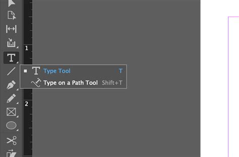
To begin typing on a path, select the Type on a Path tool, often represented by an icon that looks like a letter 'T' with a curved line underneath it. Then, click on the desired path. An insertion point will appear at the start of the path by default. If you wish to confine the text to a specific portion of the path, click on the path where you would like the text to start, and drag along the path to where you want the text to end, then release the mouse. Once the insertion point is in place, you can begin typing your text. The path remains visible after you add type to it, serving as a guide for your text placement.
When you are typing on a path, certain standard text formatting options have no effect on the type. For instance, options related to paragraph alignment might not behave as expected because the text is inherently bound to the path’s geometry.
The Type on a Path tool offers several options to control how characters align and orient themselves along the path:
- Rainbow: This option keeps the center of each character’s baseline parallel to the path’s tangent. This creates a visually appealing effect where the text seems to "hug" the curve of the path smoothly.
- Skew: This option keeps characters’ vertical edges perfectly vertical regardless of the path shape, while letting characters’ horizontal edges follow the path. This can create a more dynamic, distorted look, especially on highly curved paths.
- Gravity: This option keeps the center of each character’s baseline on the path while keeping each vertical edge in line with the path’s center point. This offers a balanced approach, ensuring characters remain upright while still conforming to the path's curvature.
To access these options, you can often double-click the Type on a Path tool icon or select the text frame and access the "Type on a Path Options" from the Type menu. This will open a dialog box where you can select the desired effect (Rainbow, Skew, or Gravity), as well as specify other settings like spacing and alignment.
For spacing, you can type a value in points to control the distance between characters. The angle of the text relative to the path can also be adjusted. When working with paths, you'll often encounter start and end brackets. These brackets are at the ends of the path and indicate the beginning and end of where text can be placed. You can drag these brackets to define the exact area of the path that your text will occupy.
It's also possible to thread text to and from a path. This means that if the text on the path exceeds the available space, it can flow to another text frame. Conversely, text from another frame can be threaded onto the path. If you delete the threaded text frame or type-on-a-path object, the threaded text is deleted.
Advanced Text Wrapping Techniques in InDesign
Beyond basic text-on-a-path, InDesign provides sophisticated text wrapping capabilities that allow text to flow around objects in complex ways. This is essential for creating visually appealing layouts where text interacts dynamically with images and graphics. There are several options when it comes to applying text wraps to projects in Adobe InDesign.
Method 1: Using Select Subject
This method leverages built-in Artificial Intelligence to detect the subject in an image, making it incredibly efficient for complex shapes.
- Select the Image: Click the image once with the Selection Tool.
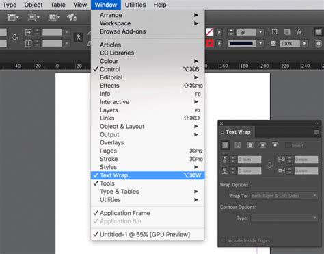
- Open Text Wrap Window: Navigate to the Text Wrap window (Window > Text Wrap).
- Choose Wrap Around Object Shape: Select the third icon option in the top menu of the Text Wrap panel.
- Set Wrap To: In the "Wrap To" dropdown, set the option to "Both Right and Left Sides" for a balanced wrap.
- Select Subject Contour: Under "Contour Options," set the dropdown to "Select Subject."
- Apply Offset: Apply a desired offset (e.g., 20px) to create space between the text and the image.
To edit the text wrap, simply click on the image frame again to adjust the settings in the Text Wrap panel.
Method 2: Using Photoshop Paths
This technique is ideal when you have precise control over the text wrap boundary, often created in image editing software like Photoshop.
- Prepare in Photoshop: In Photoshop, save your selection as a path using the Paths window. Name the path clearly (e.g., "Text Wrap Path").
- Place PSD in InDesign: Place the Photoshop document (.psd) with the background removed into your InDesign layout.
- Select the Image: Click on the PSD image frame in InDesign.
- Open Text Wrap Window: Ensure the Text Wrap panel is open.
- Choose Wrap Around Object Shape: Click the "Wrap Around Object Shape" icon again.
- Set Wrap To: Set the "Wrap To" dropdown to "Both Right and Left Sides."
- Select Photoshop Path Contour: In the "Contour Options," set the dropdown to "Photoshop Path."
- Apply Offset: Apply a suitable offset (e.g., 10px).
This method allows text to conform precisely to the edges of your masked object.
Method 3: Using the Bounding Box
The most commonly used method, the Bounding Box text wrap, is perfect for simple rectangular wraps or when you want to wrap text around an entire object or group, including pull quotes or infographics.
- Select the Object/Group: Click the image and text frame group you want to wrap text around.
- Open Text Wrap Window: Access the Text Wrap panel.
- Choose Wrap Around Bounding Box: Click the "Wrap Around Bounding Box" icon (the second icon in the Text Wrap panel menu).
- Set Wrap To: Set the "Wrap To" dropdown to "Both Right and Left Sides."
- Adjust Offsets: You can unlink the offset link to adjust specific sides independently. For example, to adjust the bottom offset only, unlink the chain icon and then modify the bottom value.
This method provides a straightforward way to create space around any object.
Considerations for Icon Design and Path Manipulation
When creating icons, understanding the nuances of path manipulation is crucial. The "naked lines" approach, where you create outlines directly using strokes, is effective because InDesign indicates the size of the actual path, not just the visible stroke. This ensures that your icon dimensions are accurate.
The choice between using Offset Path or direct stroke creation often depends on the desired outcome. If you need a simple, clean line icon, direct stroking is often sufficient. However, if you require parallel lines, outlines, or the ability to easily modify the thickness of all lines simultaneously, the Offset Path command becomes indispensable.
For example, if you want to create an icon with rounded corners, you can easily achieve this by setting the corner radius within the Offset Path options. This level of control is essential for creating polished and professional-looking icons.
Furthermore, the concept of "sending to back" is often used in conjunction with path manipulation. For instance, when creating a compound shape or a cutout effect, you might create an offset path and then send it behind the original shape to create a layered appearance or a subtle shadow effect.
The designer has to decide on many factors, usually that of choosing the base size for the icon. This initial size sets the stage for all subsequent manipulations. It's important to consider how the icon will be used - will it be displayed at very small sizes where intricate details might be lost, or at larger sizes where finer lines can be appreciated?
The weight of our lines is another critical consideration. The Offset Path tool helps maintain consistent line weights across an icon, even as shapes are scaled or modified. This is particularly important for maintaining visual balance and readability.
Ultimately, mastering the Offset Path and Type on a Path tools in Adobe InDesign empowers designers to move beyond static text and create dynamic, visually rich compositions. Whether you're crafting intricate icons, wrapping text around complex shapes, or exploring experimental typography, these tools provide the foundation for innovative design solutions.