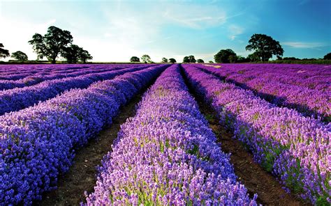
Lavender, a hue that whispers of serene fields and delicate floral scents, is more than just a pretty color. Named after the iconic lavender flower, this light shade of purple, positioned between violet and red on the color wheel, offers a unique blend of calming tranquility and understated elegance. Its ability to evoke feelings of relaxation, the freshness of spring, and the gentle charm of femininity makes it a compelling choice for a wide array of design projects. Understanding its precise color values is crucial for ensuring consistency and impact across various mediums, from digital interfaces to printed materials.
Decoding Lavender: Precise Color Values for Design Consistency
To effectively utilize lavender in design, it's essential to grasp its specific color codes. These values act as a universal language, ensuring that the intended shade of lavender is accurately represented across different platforms and devices.
Digital Representation: HEX and RGB
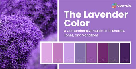
For digital design, the HEX code provides a concise hexadecimal representation of the color. The most commonly recognized HEX code for lavender is #E6E6FA. This translates into RGB (Red, Green, Blue) values of R: 230, G: 230, B: 250. In a percentage-based RGB color space, this equates to approximately 90.2% red, 90.2% green, and 98% blue. This high proportion of blue, combined with a significant amount of red and green, creates the characteristic pale, cool-toned purple of lavender.
Another common interpretation of lavender, often referred to as "Lavender Purple," has the HEX code #967BB6. This variation presents different RGB values: R: 150, G: 123, B: 182, which translates to approximately 58.8% red, 48.2% green, and 71.4% blue. This hue has a hue angle of 267.5 degrees, a saturation of 28.8%, and a lightness of 59.8%, indicating a more muted and slightly darker tone compared to the brighter #E6E6FA.
Print Production: CMYK
When working with print projects, the CMYK (Cyan, Magenta, Yellow, Key/Black) color model is paramount. For the primary lavender HEX code #E6E6FA, the CMYK values are C: 8%, M: 8%, Y: 0%, K: 2%. This minimal use of cyan and magenta, with virtually no yellow or black, signifies a very light and desaturated color, typical of lavender.
For the "Lavender Purple" variation (#967BB6), the CMYK values are C: 17.6%, M: 32.4%, Y: 0%, K: 28.6%. This indicates a more significant presence of cyan and magenta, along with a notable amount of black, contributing to its deeper, more subdued character.
Exploring the Spectrum: Variations and Relatives of Lavender
Lavender exists not in isolation but as part of a broader color family. Understanding its neighbors and variations can unlock a richer palette of design possibilities.
Close Relatives and Similar Hues
Several colors share lavender's soft, ethereal quality, offering subtle shifts in hue, saturation, or lightness.
- Periwinkle (#CCCCFF): This color shares the same hue as lavender but is slightly darker, offering a more pronounced cool tone.
- Lilac (#A47DAB): With a similar floral essence, lilac leans more towards the red undertones, giving it a warmer, richer feel than standard lavender.
- Mauve (#E0AFFF): Mauve is a more saturated purple color, often possessing a dusty or muted quality that distinguishes it from the brighter lavender.
- Misty Blue (#B5C7EB): This shade offers a soft, cool-toned appearance with a stronger blue presence, evoking a sense of gentle mist.
Shades, Tints, and Tones
Understanding how to manipulate a base hue is fundamental to color theory and design.
- Shades are created by adding black to a pure hue. A shade of lavender would result in a deeper, more intense purple, moving towards a richer violet or even indigo depending on the amount of black added.
- Tints are achieved by mixing white with a pure color. Tinting lavender would create lighter, more pastel versions, moving towards paler lavenders or even off-whites with a hint of purple.
- Tones are produced by adding gray to a pure hue. Toning lavender would result in a more muted, desaturated version, giving it a softer, more subdued appearance, often described as a "dusty" or "heather" tone.
Harmonizing with Lavender: Complementary and Analogous Palettes
The true power of lavender in design lies in its ability to harmonize with other colors, creating distinct moods and visual experiences.
Inspiring Color Pairings
- Pastel Yellow (#FFEE8C): This combination creates a cheerful and springtime feel, with the warmth of yellow gently contrasting the coolness of lavender.
- Mint Green (#ADEBB3): Pairing lavender with mint green adds a touch of freshness and reinforces the natural, calming aesthetic.
- Ivory (#FFFFE3): As a neutral color, ivory combines seamlessly with lavender to create a soft, airy, and sophisticated atmosphere.
- Light Blue (#90D5FF): Sharing the same coolness, light blue with lavender cultivates a deeply calming and serene environment.
- Yellow: Beyond pastel yellow, a brighter yellow can be used to create a dynamic feel, offering a vibrant contrast to lavender’s softness.
- Peach: This warm hue can add a touch of energy and warmth when paired with lavender, creating a balanced and inviting palette.
Color Harmonies
Exploring established color harmonies can provide a structured approach to designing with lavender.
- Complementary Colors: The direct complement to lavender (a mix of red and blue) would lie in the yellow-green spectrum. A pairing with a soft, muted yellow-green could create a balanced yet engaging contrast.
- Split Complementary Colors: This involves pairing lavender with the two colors adjacent to its direct complement. This offers a more nuanced contrast than a direct complementary scheme.
- Triadic Colors: A triadic scheme would involve lavender and two other colors that are equally spaced on the color wheel. This could lead to a vibrant and playful palette.
- Analogous Colors: Colors adjacent to lavender on the color wheel, such as soft blues and pale pinks or violets, create harmonious and tranquil palettes.
- Monochromatic Palettes: Using various tints, shades, and tones of lavender itself can create a sophisticated and cohesive design, emphasizing subtlety and depth.
Basic Color Theory & Color Harmonies
Strategic Application: Using Lavender in Design
The psychological and historical associations of lavender lend themselves to specific design applications, particularly those aiming to evoke certain emotions or brand identities.
Setting a Relaxing Mood
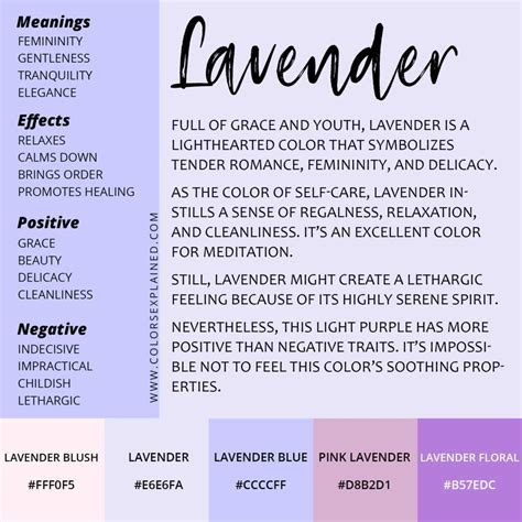
Lavender is an ideal primary background color for interfaces focused on relaxation or well-being. This includes applications like meditation apps, spa booking services, or sleep trackers, where a calming visual experience is paramount. The color's inherent soothing properties can significantly enhance user engagement and satisfaction in such contexts.
Creating Dynamic and Engaging Designs
While inherently calming, lavender doesn't have to be static. Combining it with pops of contrasting colors can inject energy and dynamism into a design.
- Liveliness: Pops of yellow or vibrant green can create a more energetic feel, suitable for designs that need to be engaging without being overwhelming.
- Calmness: A pairing with light blue amplifies the serene qualities, perfect for environments that prioritize peace and tranquility.
Ensuring Readability and Accessibility
A critical consideration in any design is ensuring that text is legible and that the overall experience is accessible to all users.
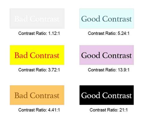
- Contrast is Key: Lavender, being a relatively light color, requires careful attention to text and background contrast for easy reading, especially in designs with extensive text.
- High-Contrast Pairings: To ensure optimal readability, pair lavender with high-contrast colors such as black, dark gray, or white. This creates clear visual hierarchy and prevents text from blending into the background. Figma's accessibility plugins can be invaluable tools for checking and ensuring compliance with Web Content Accessibility Guidelines (WCAG).
Historical and Cultural Significance of Lavender
The color lavender carries a rich history, interwoven with symbolism and cultural associations that continue to inform its use in contemporary design.
Origins and Etymology
The color lavender derives its name directly from the fragrant lavender flower, renowned for its delicate purple blooms. The term "lavender" was first used in English to describe the color around 1705, previously referring solely to the plant itself. This linguistic evolution highlights how natural elements have historically influenced our color vocabulary.
Historical Symbolism: Royalty, Purity, and Refinement
Historically, purple, and by extension its lighter derivative lavender, has been associated with royalty and luxury. The rare and expensive dyes used to create purple in ancient times meant that only nobility could afford it, establishing a long-standing connection to wealth and status. Lavender, while less ostentatious than deep purple, still retains an echo of this refined elegance.
Furthermore, lavender symbolizes purity and calmness, stemming from its association with the lavender flower's soothing and floral scent. This connection to tranquility and well-being has been a consistent thread throughout its cultural interpretation.
The color has appeared across various historical contexts, from textiles and pottery to paintings and fashion, particularly during periods like Romanticism and revival styles, where its gentle aesthetic aligned with the prevailing artistic sensibilities.
Evolving Meanings in Modern Design
Over time, the historical meaning of lavender has evolved to encompass broader associations with relaxation, calmness, and spirituality. This modern interpretation makes it a popular choice in contemporary design trends, where it is often used to create soothing, harmonious, and aesthetically pleasing color palettes. Its ability to evoke feelings of peace and well-being translates directly into its application for brands aiming to project an image of serenity or elegance.
Lavender's Psychological Impact: Evoking Peace and Well-being
In color psychology, lavender is understood to evoke feelings of peace and relaxation, mirroring the tranquil and calming effect of the actual lavender fragrance. Experiencing the color can be akin to breathing in fresh air in a serene lavender field, promoting a profound sense of well-being and mental clarity. Unlike bolder, more assertive colors, lavender offers a gentle and unobtrusive sensory experience, making it exceptionally easy on the eyes. This makes it a powerful tool for brands that wish to convey a sense of peace, tranquility, or sophisticated elegance.
Potential Clashes and Considerations for Color Combinations
While versatile, lavender can sometimes clash with certain colors, leading to visually jarring or unbalanced combinations. Awareness of these potential pitfalls is crucial for effective design.
Colors That May Clash with Lavender
- Fuchsia (#FE3894): This vibrant, intense pink can overpower the softness of lavender, creating a visually harsh contrast that may feel aggressive rather than harmonious.
- Lime Green (#89F336): The sharp, acidic tone of lime green clashes with lavender’s cool undertones, potentially resulting in an unbalanced and jarring aesthetic.
- Navy Blue (#000080): While a deep color, navy blue can dominate lavender, especially in larger proportions, making the lavender appear dull or washed out.
- Dark Orange (#C76E00): The dark red undertones of dark orange can create an unpleasant color combination with the cool, blueish tones of lavender, leading to a muddy or unappealing visual effect.
Designing with Lavender: A Practical Guide
When incorporating lavender into your designs, consider the overall message and intended user experience.
Tools for Color Exploration
Platforms like PicMonkey offer user-friendly tools and templates that can help designers explore color palettes and create stunning visuals. Their intuitive interface allows for immediate creative output, regardless of skill level. Features such as professionally designed templates and powerful custom design tools cater to a wide range of needs, from quick social media graphics to intricate web designs.
Understanding Color Contrast for Accessibility
As mentioned earlier, accessibility is paramount. Tools like contrast checkers can help ensure that text placed on a lavender background has sufficient contrast to be easily readable. For instance, a contrast ratio of 1.45 for large text and 14.53 for normal text on a lavender background (#D3D3FF) with a white background (#FFFFFF) indicates a significant contrast failure, highlighting the need for careful color pairings.
Custom Palettes and Creative Exploration
Beyond established harmonies, creating custom palettes allows for unique expressions. Experimenting with different color harmonies - complementary, split complementary, triadic, tetradic, analogous, and monochromatic - can lead to innovative and memorable designs. Embracing tools that allow for easy color code retrieval and palette generation, such as those found in design software or online resources, can streamline the creative process.
Ultimately, lavender is a color that offers a rich tapestry of meaning, history, and design potential. By understanding its precise values, its relationships with other colors, and its psychological impact, designers can harness its serene beauty to create compelling and effective visual experiences.