In today's interconnected world, logos are no longer static symbols confined to a single application. They must be adaptable, maintaining their integrity whether magnified to the size of a billboard or shrunk to fit within a URL bar. This ubiquity demands a strategic approach to logo design, with dimensions, versatility, and scalability at the forefront. While Photoshop is a powerful tool for graphic design, understanding its role in the logo creation process, particularly concerning dimensions and file formats, is crucial for ensuring a brand's consistent and professional representation across all platforms.
The Importance of Logo Dimensions and Versatility
Logos these days have to exist in more spaces than ever before. You might need to blow your logo up to the size of a billboard or shrink it down so that it fits within a URL bar. And in each of these scenarios, your logo must stay consistent and recognizable. When we talk about logo sizes and dimensions, we are referring not only to the physical size but the shape and orientation of your logo. These can shift around along with your logo’s content (the icon, slogan and company name) depending on the context. A logo should adapt seamlessly in any context. Great logos will retain their integrity over any background and adapt to any size without losing clarity. Versatility, scalability, balance and proportion are some of the basic principles of logo design that apply directly to logo size. When shaping and orienting your design for different logo variations and sizing contexts, these will be your guiding lights.
The significance of logo dimensions cannot be overstated. A logo is more than just an image-it’s a symbol that embodies your brand’s values, mission, and identity. Logo dimensions play a critical role in visibility, versatility, and brand recognition. A logo that is too small may become illegible, whereas a logo that is too large might not fit well on certain platforms. Consistent and proper sizing ensures your logo looks great whether it’s on a business card or a billboard.
Understanding File Types: The Foundation of Scalability
When shaping and orienting your design for different logo variations and sizing contexts, understanding file types is paramount. Brush up on file types: Vector files such as PDF or EPS are designed for effective scalability. These files use mathematical paths to describe shapes, lines, and curves, allowing them to be scaled infinitely without losing quality. This is vital as logos need to be versatile across various mediums and platforms. Ensuring that your design can be expanded or shrunk without losing quality is a hallmark of good logo design.
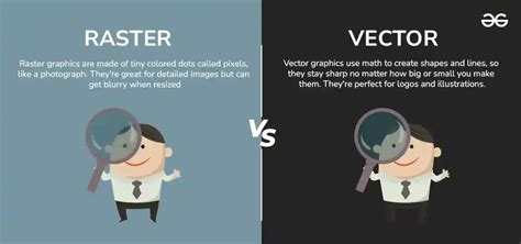
Raster files, on the other hand, are made up of pixels. While they can be useful for certain applications, pixel-based images can lose quality when scaled. The problem with pixels is that they don’t scale; 100 pixels on your cell phone is going to look a lot different than 100 pixels on your laptop. This issue leads to a "pixelated" effect when raster graphics are enlarged beyond their original resolution.
Vector vs. Raster: A Deeper Dive
- Vector Files (SVG, EPS, AI): Use mathematical paths to form shapes. These are infinitely scalable and are the preferred format for logos, especially for print and large-scale applications. They maintain crisp lines and clarity at any size.
- Raster Files (PNG, JPG): Are made up of pixels. They are resolution-dependent, meaning their quality degrades when scaled up. While useful for web images where file size is a concern, they are not ideal for primary logo files.
Photoshop's Role: Design and Optimization, Not Primary Creation
While the user might be under the impression that they would need to create a logo to factor in each of the various dimensions within Photoshop, it's important to clarify Photoshop's role. Photoshop is a powerful tool for graphic design, offering flexibility and precision for creating and optimizing logos. However, it's not the ideal starting point for logo design, especially if the goal is true scalability.
"Photoshop is a bad place to start," states one perspective. "It's not a matter of 'people thinking' it's better to use Illustrator, it's really the only way to ensure you create a proper file for a logo. If you fail to use Illustrator, it is inevitable that at some point you will have to recreate any logo as a vector file.. i.e. Illustrator, Inkscape or some other vector based application, never Photoshop. If you use things like the filters in Photoshop, you may find it impossible to recreate those appearances in a vector-based application. Designing a logo isn't the time to 'learn about Photoshop'. You should focus on the logo, not on 'tricks' or learning tools/features within an inappropriate application. If you want to play around and learn Photoshop, then that's fine.. play around. It's not the right time to design a logo though. Start with a pencil and a piece of paper for the design. When you're ready to move to a digital image, start in Illustrator and ignore Photoshop with its raster format entirely."
This viewpoint emphasizes that for true logo design, a vector-based program like Adobe Illustrator is essential. Photoshop's raster-based nature means that designs created within it are inherently limited by pixel dimensions. While Photoshop can be used for refining raster versions of a logo or preparing them for specific digital applications, the master logo file should always be in a vector format.
Illustrator Tutorial: Create a Vector Logo from a Rough Sketch
Proportions vs. Dimensions: A Matter of Design Philosophy
The question of whether to focus on proportions over dimensions is a valid one, reflecting different approaches to design.
"Proportion or dimension should mean nothing when designing things such as logos," argues one perspective. "The focus should be on the message and how you can convey that in small iconography or a pleasing image. You should be free to draw what seems 'right' to you. Later you can worry about various dimensions. By limiting yourself so greatly - What software, what size, what proportions - all you are doing is ensuring you won't create a logo you feel really good about. To be more creative you need to remove these restrictions and brainstorm to get as many ideas as you can out.. then you start refining with things like proportion in mind. Experimentation --- For a logo neither proportion or dimension matter during design. Once you've settled on a design, or feel you've got a solid footing then you may want to experiment with variations based upon different proportions.. how does the logo look if I try and stack it… what about if I make it horizontal… that sort of thing. It's all exploratory to find the best possible image. Then, much like Google variations, you can start to experiment with ideas based upon proportion… such as…. The gist is that proportion is the last thing to consider. It's a means to display in a specific instance, it shouldn't be the driving factor for logo design."
This approach champions creative freedom during the initial design phase, prioritizing the conceptualization of a strong visual identity over strict adherence to specific measurements. Proportions and dimensions are seen as considerations that come into play after the core design has been established, allowing for variations and adaptations for different use cases.
Conversely, another viewpoint acknowledges the importance of planning for various dimensions from the outset, especially when considering the final output. "I am under the impression that I would need to create a logo to factor in each of the above dimensions. Over time, I will end up having a lot of files for various purposes."
The reconciliation lies in understanding that while the initial sketch and conceptualization should be free from rigid constraints, the digital execution requires careful consideration of dimensions. For instance, when opening a new file in Photoshop for a logo that is intended for web use, starting with a square canvas, such as 1000x1000 pixels at 72 PPI, can be a good starting point. This size allows for sufficient detail and can be easily scaled down. However, it's crucial to remember that this is a raster representation, and the true master file should be vector.
Logo Variations: Adapting to Every Context
Since various platforms have different requirements, preparing several versions of your logo design allows for adaptability. Having a logo lockup will help with consistency by maintaining a formal version of your logo elements, which can then be modified accordingly.
Color Variations
- Black and white
- Grayscale
- Monochromatic
- Transparent background
- Colored backgrounds
Logo Type Variations
Different types of logos can be adapted for diverse uses. For example, your master logo design may have a wordmark version with just your company name or a version with your slogan, and one without. A company can have variations of one logo that is suitable for vertical or horizontal orientation. Some people will specify that they will want you to use their horizontal logo as the primary logo and use the vertical logo when appropriate. A vertical logo is sometimes referred to as a stacked logo.
Navigating Digital Spaces: Social Media and Favicons
Social media presents an incredible opportunity to use your logo both strategically and effectively, since every platform uses some kind of profile picture. Optimizing your logo size for each social media channel will ensure your logo looks its best at all times. Whenever you use your logo on social media, be sure to pay attention to the formatting of each. In some cases, specific types of logos may need to be adjusted accordingly.
Social Media Profile Pictures
Most social media platforms display profile photos as circles, even if you upload a square image. To avoid this, make sure your logo has ample white space (padding) around its main elements. For instance, Instagram profile pictures require a minimum resolution of 250 x 250 px. Etsy recommends 400 x 400 px for profile pictures. A square aspect ratio (1:1) is generally recommended for social media profile pictures.
Favicons
A favicon should be a simple, minimalized, flat version of the logo. These small icons appear in the browser tab, bookmarks, or mobile browser shortcuts. They are too small to read any text, so they typically feature just the icon that represents your brand. Standard favicon sizes for browsers include:
- 16 x 16 pixels
- 32 x 32 pixels
- 48 x 48 pixels
Print Media: Precision and Quality
In the realm of print media, your logo may end up on everything from signage, T-shirts, pins, mugs, packaging, and more. While digital spaces tend to favor smaller dimensions, sizing varies greatly across print media.
Print File Formats and Color Modes
When printing your logo, you’ll want to use a vector file (SVG or EPS). As mentioned above, this file type is infinitely scalable and won’t decrease in quality-regardless of how much you expand or decrease it. This is particularly important because if you print something for a magazine compared to a billboard, they should always have the same quality. In most cases, professional printers will work with you to resize or make necessary adjustments, which is why having high-quality vector files is even more important.
It's also important to pay attention to your logo colors in print, which use CMYK (cyan, magenta, yellow and black) color mode, compared to RGB (red, green, blue) in digital formats. In general, it is recommended to always design your logo in CMYK, which is easier to transition into RGB. You can select colors using the Pantone Matching System to avoid printing inconsistencies. For all print materials, a resolution of 300 DPI (dots per inch) is recommended.
Standard Print Sizes and Considerations
- Business Cards: Standard dimensions are 3.5 x 2 inches (89 x 51 mm). A logo on a business card is typically sized between 1 to 1.5 inches (25-38 mm) wide, depending on the card design. It should be clear and not overcrowd the card.
- T-shirts: The maximum size for the print area is typically 14 x 15 inches. You can also consider printing a logo on a chest pocket, which should measure around 4 ⅜ x 5 ⅝ inches.
- Mugs: On an 11 oz. mug, the standard print size area is 8.5 x 3 inches.
- Hats: The logo size on an average hat is around 3 - 3 ½ inches wide.
- Packaging: Your logo on packaging should be prominent enough to be noticed, but not overpower the product or other design elements. Consider curved surfaces, embossing, and printing techniques.
- Signage and Billboards: For large-scale prints like banners, billboards, or store signage, file resolution and format become critical. Always use vector files for banners and signage. A logo on a billboard typically ranges from 3 to 6 feet (0.9 to 1.8 meters) in height, depending on the billboard size.
File Formats for Digital Use: PNG, JPG, and SVG
Once your logo is ready, exporting it in the right format is crucial. Common formats include PNG, JPEG, and SVG. Each serves a different purpose:
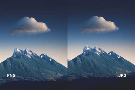
- PNG: The preferred file format for logos online. PNGs are lossless, meaning they retain full image quality even after multiple edits or saves. They also support transparency, making them highly adaptable for various digital backgrounds. For web-based logos, keep the file size as small as possible, with a maximum size of 200KB to ensure fast loading times.
- JPG (JPEG): While lightweight and widely supported, JPGs don't support transparency and use lossy compression, which slightly reduces image quality each time you save the file. This can cause visible blurring or artifacts over time, making them less ideal for logos.
- SVG (Scalable Vector Graphics): If there’s one format that every brand should use online, it’s the SVG format. SVGs are vector files, made up of mathematical paths that browsers can render smoothly at any resolution. They are also incredibly lightweight, making them ideal for web performance.
Resolution and File Size: Optimizing for Performance
Resolution Concepts
- PPI (Pixels Per Inch): Refers to how many pixels will appear in a single inch of any digital screen. PPI, also known as pixel density, is used to measure the clarity of images.
- DPI (Dots Per Inch): Another way to measure clarity, but on paper. For print, 300 DPI is a standard for high resolution.
- Resolution (Pixel Dimensions): The total number of pixels that will appear on the screen, measured in both width and height (e.g., 500 x 500 px).
- Bytes: Refer to the actual file size and can be measured in kilobytes (KB), megabytes (MB), and gigabytes (GB). For online purposes, keeping logo file sizes under 200 KB is a good practice.
Size Down Strategy
Keep in mind that it’s much easier to start with a large size and go smaller, rather than trying to expand one that is too small. The original design should be created at a high resolution and in vector format to allow for maximum flexibility in scaling down for various applications.
Consistency and Brand Guidelines
Keeping your logo consistent is crucial since your logo will appear in different locations in a range of sizes. It’s important to clearly outline your brand style guide, which includes all of your branding assets. Following these guidelines will ensure brand consistency and help develop brand awareness, regardless of your logo size. A brand guidelines document outlines where and how a logo can be displayed and at what file dimensions. This allows your brand to remain consistent across all communications.
Conclusion: Embracing Adaptability
Ultimately, the core principle of logo design in relation to dimensions and sizing is adaptability. While Photoshop can be a valuable tool for refining and preparing logo assets, the foundation of a truly versatile logo lies in vector graphics created in programs like Adobe Illustrator. By understanding the nuances of file types, color modes, resolutions, and the specific requirements of different platforms, designers can ensure their logos remain impactful and recognizable across an ever-expanding digital and physical landscape. The goal is to create a logo that is not confined by its dimensions but is empowered by its ability to adapt and endure.
tags: #logo #photoshop #dimensions