A gritty and dramatic photo can powerfully capture attention, standing out amidst a sea of ordinary images. When aiming to stylize your photographs and achieve a distinctive aesthetic, employing a preset is an excellent starting point. This tutorial delves into the creation and application of "Dark & Moody" Lightroom presets, a popular style characterized by deep tones, enhanced contrast, and a captivating atmosphere. We will explore the technical adjustments within Lightroom that contribute to this look, providing a thorough understanding of how to achieve it manually and how presets streamline the process.
The Essence of Dark & Moody Photography
Dark and moody tones have experienced a significant surge in popularity, particularly on visual platforms like Instagram, over the past few years. This editing style is fundamentally characterized by its use of dark, mysterious, and earthy tones, often featuring lifted shadows and muted greens. It tends to work exceptionally well on photographs captured during overcast days, especially those rich in green tones, such as forest scenes, fields, or similar natural environments. When executed effectively, this style can evoke a truly ominous, stormy vibe, drawing the viewer into the image and creating a compelling narrative.
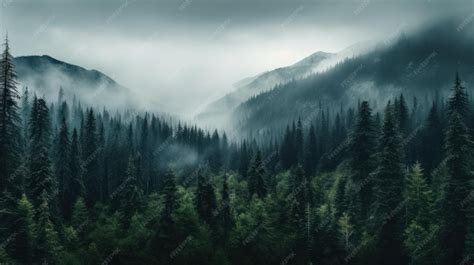
The core of the dark and moody aesthetic lies in the strategic manipulation of contrast. By increasing contrast, you achieve deeper blacks and lighter highlights, creating a visual dynamism that makes subjects pop. This approach goes beyond simply adjusting a single contrast slider. It involves a nuanced understanding of how different tonal ranges interact. While a bright afternoon might be what was captured, it might not be the desired final look. The goal is to transform the image into one that exudes depth, drama, and a sense of introspection.
Deconstructing the Dark & Moody Preset: Key Adjustments
Creating a compelling dark and moody look involves several key adjustments within Lightroom. While presets offer a one-click solution, understanding the underlying techniques provides greater control and allows for customization.
Manipulating Light and Tone
The foundation of the dark and moody style is built upon careful manipulation of light and shadow. A common starting point involves significantly reducing the highlights and whites.
- Load Your Image: Begin by loading a photograph of your choice into Lightroom. It's beneficial to select an image with a discernible subject, especially if you plan to refine skin tones, as this tutorial will address.
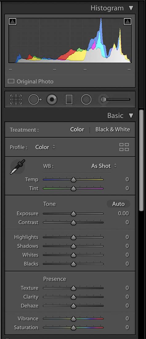
- The Light Panel: Navigate to the "Edit" panel and locate the "Light" section.
- Compressing Highlights: Set the "Highlights" and "Whites" sliders to -100. This action dramatically darkens the brightest areas of your image.
- Restoring Contrast: With the highlights severely reduced, the image will appear very dim. To reintroduce balance and visual interest, you need to bring the contrast back up. This is achieved through more sophisticated tonal adjustments.
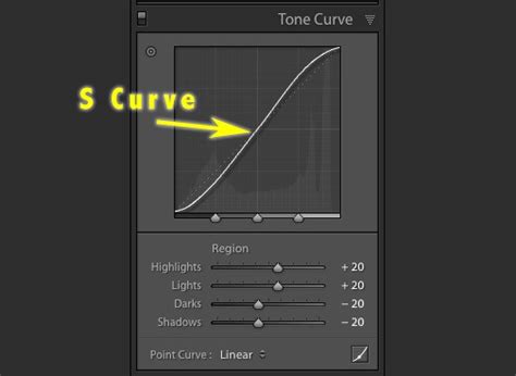
The Power of the Tone Curve
The Tone Curve is an indispensable tool for achieving precise control over the tonal range of an image, and it's central to the dark and moody effect. It allows for more nuanced adjustments than the basic contrast slider.
- Accessing the Tone Curve: In the "Light" section, click on the "Tone Curve" button.
- Point Curve Mode: Click on the gray circle at the bottom left of the curve graph. This action switches the curve from the default parametric mode to "Point Curve" mode, giving you direct control over individual points on the curve.
- Adding Midtone Contrast: To introduce midtone contrast, click directly on the middle of the diagonal line on the curve. This adds a new control point. You can then subtly adjust this point to fine-tune the midtones.
- Creating an S-Curve: A classic technique for increasing contrast is to create a subtle "S" shape on the tone curve. This involves slightly lifting the shadow point (the bottom-left point) and slightly lowering the highlight point (the top-right point). This action simultaneously deepens the blacks and brightens the whites, resulting in a more dynamic image. For a dark and moody look, you might create a more pronounced S-curve, ensuring the shadows are significantly darkened while the highlights retain some detail.
- Softening the Look: If the initial result is too harsh or the shadows are being "crushed" (losing all detail), you can soften the effect. One method is to increase the "Shadows" slider in the basic panel slightly. Alternatively, using the Tone Curve, you can lift the shadow point just enough to retain some detail without losing the deep, dark feel. Reducing "Contrast" in the basic panel is another way to achieve a softer moody look.
Preserving and Enhancing Skin Tones
A common challenge when applying dark and moody edits is maintaining natural-looking skin tones. The deep tones and muted colors can sometimes make skin appear dull or underexposed.
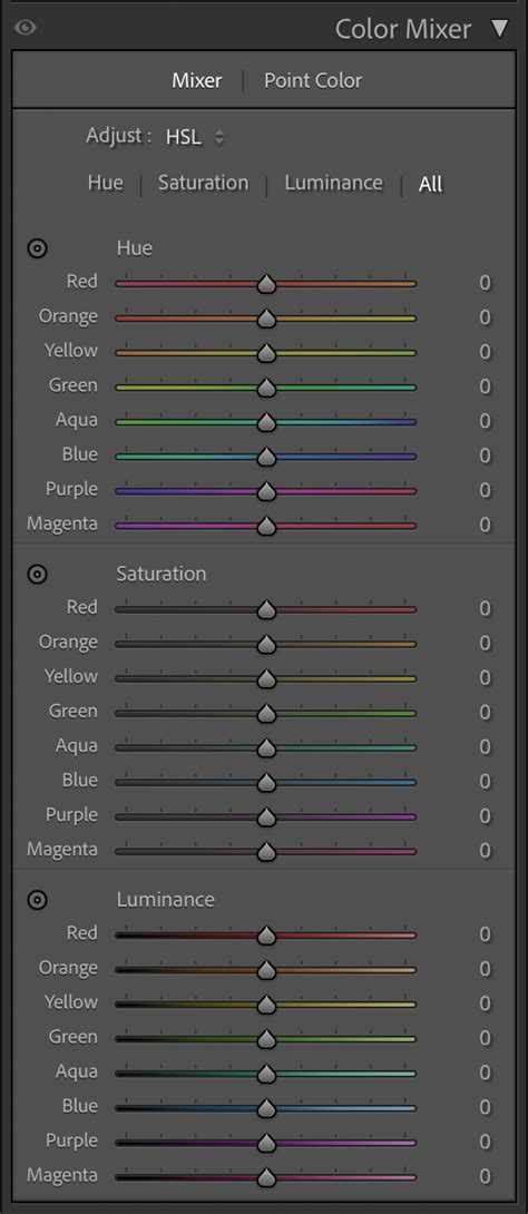
- The Color Mixer (HSL Panel): To address this, navigate to the "Color" section and select the "Color Mixer" tab (sometimes referred to as HSL - Hue, Saturation, Luminance).
- Targeting Oranges and Reds: Skin tones are primarily influenced by the orange and red color channels.
- Saturation: Select the "Orange" channel and increase its "Saturation" to around +10. This adds a bit more vibrancy back into the skin.
- Luminance: In the same "Orange" channel, adjust the "Luminance" slider. Increasing luminance will brighten the skin tones. A range of +30 to +50 is often effective, depending on how bright you want the skin to appear relative to the overall image.
- Muting Unwanted Colors: To further enhance the moody aesthetic and prevent distracting colors from clashing, you can desaturate specific color ranges.
- Saturation Adjustment: Under the "Adjust" dropdown menu, select "Saturation."
- Green to Magenta: Set the saturation for the range from green to magenta to -100. This will significantly mute greens, cyans, blues, and magentas, contributing to the darker, more subdued palette. This is particularly useful for muting background greens that might otherwise appear too vibrant.
Adding a Warm Tint and Split Toning
While dark and moody often implies a cooler temperature, a subtle warm tint can add depth and richness, especially to portraits. Split toning is a powerful technique for achieving this.
- Warm Tint with Tone Curve (Blue Channel):
- Go back to "Light" > "Tone Curve."
- Switch to the "Blue Channel."
- Drag the top-right point (representing the highlights) downwards. This adds a subtle yellow/warm tone to the highlights.
- Cooling Highlights (Optional - Green Channel):
- Switch to the "Green Channel."
- Drag the top-right point downwards slightly. This can add a magenta tint to the highlights, which, when combined with the yellowing from the blue channel, can create complex and interesting color shifts. This step is more about fine-tuning the highlight color.
- Split Toning for Depth: Split toning allows you to add distinct color casts to the highlights and shadows independently.
- Navigate to the "Color" section and find the "Split Toning" tab.
- Highlights: For the highlights, consider adding a subtle warm color, such as a light yellow or orange.
- Shadows: For the shadows, a cooler color like a muted blue or purple can enhance the moody and dramatic feel.
- Balance and Saturation: Adjust the "Balance" slider to control whether the split tone leans more towards the highlights or shadows, and adjust the "Saturation" to control the intensity of the color cast. A very light split tone is often more effective than an overly saturated one. Some users find adding a touch of green to highlights and purples/blues to shadows works well.
Create PERFECT COLORS with Lightrooms SPLIT TONING Tool!
Advanced Techniques and Refinements
Beyond the core adjustments, several other techniques can elevate your dark and moody edits.
Desaturation and Color Revival
Desaturating the image is a crucial step to eliminate any unwanted or distracting colors. This allows you to then selectively bring back the important ones.
- Overall Desaturation: You might start by slightly reducing the overall "Saturation" in the "Basic" panel or the "Vibrance" slider.
- Targeted Desaturation (HSL): As mentioned earlier, using the HSL panel to desaturate specific color ranges (like browns in the background or intense greens) can be very effective.
- Reintroducing Key Colors: After desaturating, use the "HSL" panel again, this time focusing on the colors you want to emphasize. For instance, if you want yellow flowers to stand out, increase the "Saturation" and "Luminance" of the "Yellow" channel. You can also subtly shift the "Hue" of these colors to create warmer or cooler tones that complement the overall mood.
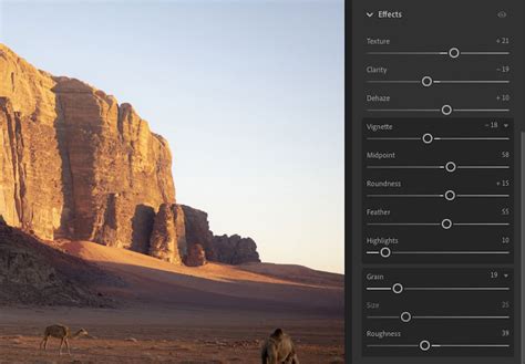
The Subtle Art of Vignetting
A vignette is a gradual darkening of the image's edges, drawing the viewer's eye towards the center and the main subject.
- Effects Panel: In Lightroom's "Effects" panel, you'll find the "Vignette" controls.
- Amount and Midpoint: Adjust the "Amount" slider to control the intensity of the darkening effect. The "Midpoint" slider determines how far the vignette extends into the image.
- Feathering: Ensure the "Feather" slider is set high to create a smooth, seamless transition between the darkened edges and the center of the image. A subtle vignette can significantly enhance the mood and subject focus without being overtly noticeable.
Local Adjustments with the Brush Tool
For fine-tuning specific areas and adding the final polish, the brush tool is invaluable.
- Targeted Enhancements: Use the brush tool to selectively brighten or darken specific areas, enhance local contrast, or add subtle color shifts.
- Feathered Brush: Always use a feathered brush for natural-looking transitions.
- Subtle Adjustments: Apply small, targeted adjustments. For example, you might slightly brighten the main subject's eyes, enhance the texture of a garment, or add a touch more warmth to a specific highlight.
- Highlight and Shadow Control: You can use the brush to subtly lift highlights in key areas or deepen shadows to further enhance the contrast and draw attention. Be cautious not to overexpose or crush details.
Understanding Preset Behavior and Customization
Our "Dark & Moody Lightroom Presets" are designed to intelligently increase contrast, richen warmer shades, and mute colors while diligently preserving skin tones. They can be applied to an entire series of images, ensuring a cohesive and unified style across your collection.
- Intelligent Contrast: The presets are engineered to preserve highlights, lower midtones, and darken shadows without crushing them, a more sophisticated approach than simply moving a single slider.
- One-Click Application: These presets offer a quick way to achieve a dark and moody look in just one click, providing dramatic effects, saturated dark moods, and muted tones.
- Brightness and Warmth: The presets carefully increase brightness in specific areas, add warm tones, and impart a moody feel to images while protecting skin tones.
- Customization is Key: While presets provide a strong starting point, remember that every image is unique. You should always be prepared to make minor adjustments after applying a preset. If the preset results in too much contrast, you can easily reduce the "Contrast" slider in the basic panel. If you desire a softer moody look, you can increase the "Shadows" levels using the Curve Tool.
Free Preset Offerings
For those looking to experiment, free Lightroom presets are available, including Dark & Moody, Airy Landscape, and many more. These presets are designed to bring the exposure down, resulting in the characteristic dark tones seen in before-and-after imagery. Sometimes, the presets might yield a high-contrast moody look, but as noted, this can be easily adjusted.
Conclusion: The Art of Contrast and Atmosphere
The creation of dark and moody photos is a process that hinges on the artful manipulation of contrast and the careful selection of color. By understanding the fundamental tools within Lightroom â particularly the Tone Curve, HSL panel, and Split Toning â you can move beyond one-click presets and develop a personalized approach to this popular editing style. The goal is to make your prominent subject or colors stand out, while the surrounding elements complement and enhance that focus, creating a captivating and atmospheric image. Trust the process, experiment with these techniques, and you'll be well on your way to mastering the dark and moody aesthetic.
For those seeking a deeper dive, further tutorials on editing dark and moody portraits or general Lightroom editing techniques are available. Expert Photography also offers comprehensive guides and courses for a more all-inclusive approach to photo editing.