Creating a movie poster is a critical step in the filmmaking process, serving as the visual handshake with potential audiences. It's the first impression, a silent storyteller that must intrigue, inform, and ultimately entice viewers to experience the film. Beyond artistic vision, the technical aspects of poster design, particularly dimensions and resolution, play a crucial role in ensuring a poster looks its best, whether displayed digitally or in print. Understanding these parameters, alongside fundamental design principles, empowers filmmakers to produce impactful promotional material.
The Foundation: Choosing the Right Poster Dimensions
The intended display environment is the primary driver for selecting appropriate poster dimensions. Different projects and locations call for different poster sizes. For instance, if you are designing a poster for a shop window or a small event board, a smaller format like A3 or A2 often works well. These sizes are manageable for placement in tight spaces and are easily visible at close to medium distances.
Standardized Sizing Systems
Understanding common dimensions helps you choose the right poster size for your poster and find the right balance between visibility, content layout, and printing costs. Many regions adhere to established paper sizing standards.
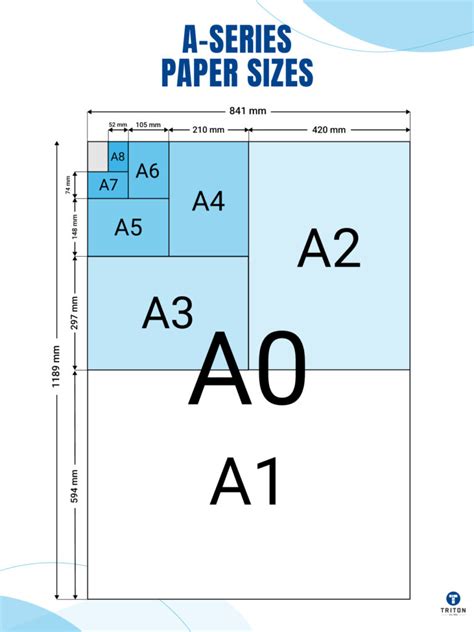
- ISO 216 A-Series: Standard UK poster sizes often follow the ISO 216 A-series system. This series begins with A4 (210 × 297 mm), a common document size, and progresses through larger formats: A3, A2, A1, and finally A0 (841 × 1189 mm), which is the largest standard size in this series. Each subsequent size is half the area of the previous one, maintaining a consistent aspect ratio.
- US Sizing Standards: In the United States, different sizing standards are prevalent. A common example is the tabloid size, measuring 11 × 17 inches.
Tailoring Size to Purpose and Audience
Choosing the best poster size depends on where your poster will be displayed, how much information it contains, and how far away viewers will be. A good rule of thumb is the larger the distance between the viewer and the poster, the larger the poster should be. For indoor environments like offices, smaller posters such as A3 or A2 are often ideal.
Furthermore, consider the content density. Posters with minimal text and bold visuals can still make a strong impact at smaller sizes. If your poster needs to include detailed information, charts, or fine print, a larger format will help keep everything readable. The message you want your poster to relay is also crucial; whether it needs to inform, educate, empower, or advertise will influence the optimal size and layout. Explore conference poster design templates and awareness poster templates for more ideas on how content can be adapted to different sizes.
Digital Versus Print: Navigating Resolution and File Formats
When designing a poster, it is important to plan for where and how it will be seen. Digital posters and printed posters require slightly different sizing and resolution considerations to achieve optimal results.
Resolution: The Key to Sharpness
Resolution, measured in dots per inch (DPI) for print or pixels for digital displays, dictates the level of detail and sharpness in an image.
- For Print Posters: It is crucial to use a resolution of 300 DPI (dots per inch) to ensure sharp quality. This higher density of dots allows for fine detail to be reproduced accurately when printed, especially for large formats where viewers might get close.
- For Digital Posters: For digital display, 72 DPI is usually enough. Digital screens have a fixed number of pixels, and increasing the DPI beyond what the screen can display does not improve perceived quality.
A common question arises regarding resolution for movie posters. While 300 DPI is the industry standard for high-quality prints, some designers might suggest that 150 DPI can suffice for a "nice looking" poster, particularly if the artwork itself is already high-resolution or if the poster will be viewed from a significant distance. However, for professional movie posters where viewers might want to look closely at details or where the poster will be printed at large scales, sticking to 300 DPI is a safer and more reliable approach to guarantee crispness and avoid pixelation. If you are designing as a vector project, resolution becomes less of a concern as vector graphics are infinitely scalable without loss of quality. However, if the project is entirely in Photoshop using bitmap elements, the DPI setting is paramount.
File Formats and Color Modes
The intended output also dictates the best file format and color mode to use.
- Print Posters: For print, it is best to save your file as a high-quality PDF or TIFF. These formats support high-resolution images and are widely accepted by professional printers. Print posters must also match standard sizes like A3, A2, A1, or A0 to avoid expensive custom printing.
- Digital Posters: For digital use, JPEG or PNG formats are usually preferred for quick loading and sharing. JPEG is good for photographic images, while PNG is ideal for graphics with transparency.
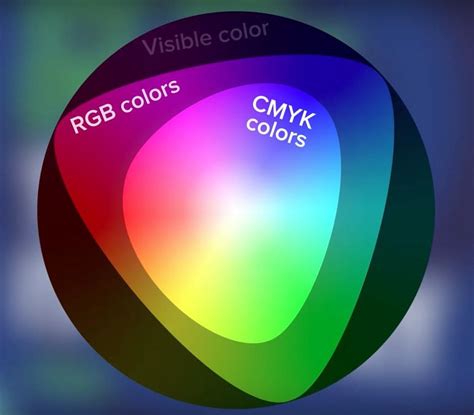
- Color Settings: Use CMYK colour settings for print posters and RGB for digital posters to get the best colour accuracy. CMYK (Cyan, Magenta, Yellow, Black) is the subtractive color model used in printing, while RGB (Red, Green, Blue) is the additive color model used for digital displays.
Designing for the Big Screen: Movie Poster Specifics
Movie posters often adhere to specific dimensions and conventions to maximize their impact and meet industry standards. The standardized size for a movie poster is typically 27″ X 41″, and it's crucial to ensure the units are set to inches when creating the canvas in software like Adobe Photoshop.
Resolution for Movie Posters
As mentioned, maintaining a high resolution is key. For a 27″ X 41″ movie poster, setting the resolution to 300 DPI in Photoshop when creating the new canvas will ensure that the final print is sharp and detailed, even when viewed up close. While some might argue for lower resolutions, especially if the artwork is vector-based or the viewing distance is significant, 300 DPI is the professional standard that guarantees quality.
Layout and Composition
The layout and composition of a movie poster are paramount to its success. Like a trailer, a movie poster can capture your audience’s attention and spark their interest in your film. A good movie poster should be clear and intriguing. The number of objects and overall composition on the canvas should be focused to instantaneously give the audience an idea of the movie. Prevent yourself from having too many focal points in the poster, which will just make your poster look clustered and frustrating.
- Focus and Simplicity: Do: Keep it simple. A great movie poster doesn’t always need to have fancy Photoshop editing. Sometimes, all you need is a hook - an image that suggests the promise of the plot, or just mainly a shot of what you think is the best moment of the film to lure them into the theatre.
- Visual Storytelling: Movie posters tend to show conflicts to capture the audience’s curiosity. This is often achieved through character placement, lighting, and the overall mood.
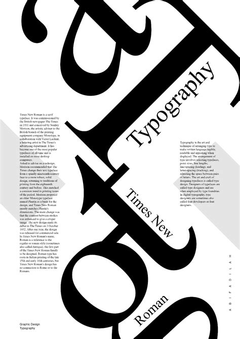
- Typography: The text itself is critically important. It must be bold, readable, and something that draws the eye to it. The font used for the credits section, often referred to as "credit block," is a standardized, condensed font that allows a lot of information to be displayed compactly at the bottom of the poster.
Color Grading and Visual Enhancement
Achieving a specific mood or tone is often done through careful color grading. Creating a gritty post-apocalyptic color grade using adjustment layers in Photoshop is a common technique. Enhancing an image to make it look more official, even if it was taken with a phone camera, can be done through vibrancy and contrast adjustments. This helps when you want to go back and edit the filters to your image in the future.
Custom Sizes and Software Flexibility
While standard sizes are common, sometimes a poster needs to fit a unique frame size, a small event board, or a large installation. Printing custom-sized posters is achievable with a few key steps and the right software.
Working with Design Software
- Adobe Photoshop: When creating a new canvas in Photoshop, you can enter custom dimensions. Whether you are designing a standard movie poster size or a completely unique one, you can tailor the canvas exactly to your project requirements. Always work in high resolution (at least 300 DPI) to keep the quality sharp, no matter the size. When grabbing images from the internet, use browser tools to help find higher resolution images. Filter out all the low-res images by using available features on the web browser you are using. For example, with Google Image Search, you may select the “Tools” option which will bring up a menu above the search results.
- Adobe Express: Tools like Adobe Express offer flexibility for creating posters of all different sizes. You can quickly resize your designs or start from templates that match your project, giving you the flexibility to create posters that fit any space and purpose. Adobe Express lets you download your posters in various formats, suitable for both digital sharing and print.
- Microsoft PowerPoint: For research posters or presentations, Microsoft PowerPoint is also a viable tool. Posters can be designed on a single slide that is set to a dimension of your choosing up to 56” x 56”. If resizing is needed, the "Design" tab allows for easy adjustment of "Slide Size" to custom dimensions. Selecting "Ensure Fit" when resizing helps preserve the integrity of all objects on the poster.
Preparing for Print
If you are printing at home, you’ll need to check that your bleed margins are set up correctly to ensure nothing important gets trimmed off during printing. Bleed is the area of your design that extends beyond the trim edge of the page. It ensures that ink reaches the very edge of the finished product without any unprinted borders.
Trim Size, Bleed, and Safe Zones
When resizing an image within design software, it is recommended to keep the option for constraining the aspect ratio of the image turned on. This will scale the image without stretching it disproportionately, preventing distortions. If the canvas size is reduced, objects that fall outside the canvas edge will be hidden, so careful planning is necessary.
Design Best Practices for Impact
Beyond technical specifications, effective poster design relies on clear communication and aesthetic appeal.
Readability and Visual Hierarchy
Keep your layout clean, and make sure important details are easy to read from a distance. This involves establishing a clear visual hierarchy, guiding the viewer's eye through the most important information first. Use high-contrast colors for your text and backgrounds. Avoid using bright text colors, such as yellow, on bright white backgrounds, as this can reduce legibility.
Content and Theme
Think about the message you want your poster to relay. Is it meant to inform, educate, empower, or advertise? The content should align with the film's genre and tone. For example, a comedy might use bright colors and playful fonts, while a thriller might opt for darker tones and more dramatic imagery.
Layered Files and Editing
When working in Photoshop, especially with templates, organizing your layers is crucial. Editable PSD or AI files with well-organized layers allow for easy customization of objects, colors, and text. Using Smart Objects for inserting photos and text can also streamline the editing process, ensuring that images are scaled and positioned correctly within the design.
Ultimately, a successful movie poster is a harmonious blend of artistic creativity and technical precision. By understanding the nuances of dimensions, resolution, file formats, and employing sound design principles, filmmakers can create posters that not only look great but also effectively communicate their film's essence and draw audiences in.