This tutorial serves as an excellent introduction to the world of newspaper layout design using Adobe InDesign, offering a solid foundation for beginners venturing into the realm of print design. The art of creating newspaper layouts, a cornerstone of traditional graphic design and typographic arrangement, has maintained its relevance due to the inherent visual power of its columnar structure. This guide will walk you through the essential steps to construct your very own newspaper template, empowering you to organize information with clarity and visual appeal. To embark on this creative journey, you will require access to the InDesign application, along with a selection of fonts and images to populate your newspaper design.
Laying the Foundation: Document Setup and Bleed
Before diving into the intricate details of layout, it's crucial to establish the correct document settings for print. Since we are creating this newspaper template for print, the inclusion of a bleed is paramount. A bleed ensures that your design extends beyond the trim edge of the page, preventing any unsightly white borders after the document is cut.
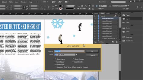
Within InDesign, the document grid emerges as an invaluable tool for newspaper design. It assists in aligning text baselines with precision as you progress through the design process, fostering a sense of order and visual consistency across the page. To manage different design elements effectively, it's advisable to create separate layers. Choose "New Layer" from the panel's drop-down menu and thoughtfully rename it "Images." This organizational strategy will help keep your design elements distinct and manageable.
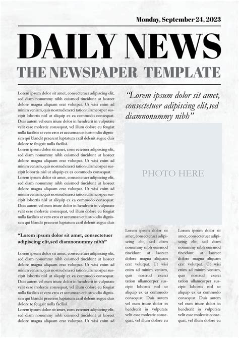
Structuring the Page: Columns, Rows, and the Masthead
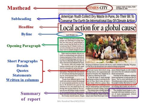
The effective division of a newspaper layout into columns and rows is fundamental to organizing the design. Allocating specific space for a masthead, the newspaper's title and identifying mark, is equally important. This structured approach ensures that the typically text-heavy content feels ordered, balanced, and easily digestible for the reader.
To begin constructing the foundational elements, you will need to utilize lines. Navigate to "Edit > Copy" and then "Edit > Paste" to duplicate a line. Position this duplicated line over the top margin line of your document. Subsequently, paste another line, carefully adjusting its Y position to 4.125 inches. This line will serve as a key visual separator.
With the structural lines in place, the Type Tool (T) becomes your instrument for creating text frames within the designated spaces flanking the masthead. These areas are ideally suited for essential publication details such as the price, location, date, and issue number. Following this, create a small text frame on the left side of the previously placed line. Within this frame, you can input a subheading for the section that a particular article will belong to, for instance, "Environment." To efficiently replicate this structure, select both the subheading and the line adjacent to it. Then, use "Edit > Copy" and "Edit > Paste" to duplicate these elements. Position this new set below the initial ones, approximately at a Y position of 12.9 inches. Paste this grouping once more, and move this latest copy to the top of the right-hand bottom section of your layout.
A highly effective tip for maintaining focus during your design process is to temporarily switch off the visibility of the "Background" layer. This can be achieved by clicking the small eye icon next to the layer's name in the Layers panel. This allows you to concentrate on the specific elements you are currently working with without visual distraction.
Incorporating Visuals: Mapping Image Placement
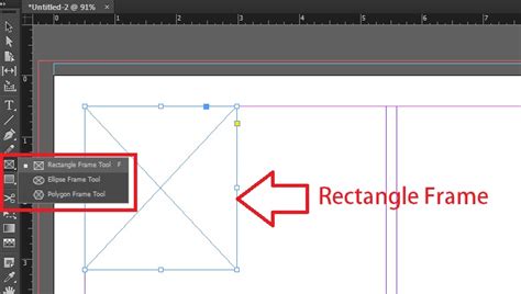
The visual element is critical in breaking up text and engaging readers. The Rectangle Frame Tool (F) is your primary instrument for "mapping out" where images will be positioned on your page. Begin by creating three image frames, ensuring they possess equal dimensions, directly below the masthead. These frames should span the entire width of each designated column, providing a consistent visual rhythm.
When placing an image into one of these colored image frames, you can preserve the background color of the frame by directly selecting the image inside the frame. Then, navigate to "Object > Effects > Gradient Feather." This technique allows for subtle integration of the image with the frame's color, creating a more cohesive visual.
Populating with Content: Text Frames and Typography
Before you can effectively insert article text into your newly created template, it's essential to further subdivide the design into more refined columns. This finer division allows for better control over text flow and readability. Working within the "Type" layer, employ the Type Tool (T) to create a text frame specifically for an article title. This frame should be sized to fit the newspaper headline template spaces you previously established, ideally positioned at the top of the first smaller article section.
Next, create a text frame for the main body of the article. This frame should be positioned directly below the title and confined within the width delineated by your guides. For optimal readability in a newspaper context, set the Font to "Anko Regular" and the Size to "8.5 pt."
Once you have meticulously formatted the typesetting for a single article, this unit can effectively serve as a template for all subsequent articles. Simply copy and paste the text frames you have created. Then, move these duplicated frames onto the other sections, both below and to the right of the initial article. As needed, adjust the height of the body text frames to accommodate varying lengths of content. The colored spaces situated below the masthead are particularly well-suited for featuring article and interview teasers, enticing readers to delve deeper into the publication.
Working with Primary Text Frames in InDesign
Finalizing for Output: Print and Online Export
The final stage of creating your newspaper template involves exporting the document in formats suitable for both print and online distribution.
For print: Navigate to "File > Export." In the "Format" menu, select "Adobe PDF (Print)." Provide a descriptive name for your file and click "Save." In the subsequent window, click on "Marks and Bleeds" in the left-hand menu. Here, you can specify crop marks and bleed settings to ensure accurate printing.
For online: Again, go to "File > Export." This time, choose "Adobe PDF (Interactive)" from the "Format" menu. Name your file and click "Save." This format is optimized for digital viewing, preserving interactive elements if any were incorporated.
Congratulations! Your newspaper template is now complete. You have successfully expanded your skillset by learning how to make a newspaper template in InDesign. You can save this document as an InDesign file (.indd) to easily return to it for future projects. The principles learned here can be readily applied to create a variety of other template types, including newspaper ad templates, newspaper article templates, and more. Along the way, you've acquired valuable skills applicable to creating a wide range of print documents and specialized tabloid newspaper templates within Adobe InDesign.
Exploring Further Template Options
For those seeking inspiration or pre-designed solutions, a wealth of resources is available. You might explore simple and elegant newspaper templates that can be readily adapted for use as company newsletters or business magazines. These are particularly effective for presenting corporate, financial, or general business news and articles.
If your requirements lean towards a comprehensive and professional newspaper template, several options cater to this need. Look for templates that offer standard tabloid dimensions and a variety of color themes. These can help introduce color subtly into your design, enhancing visual appeal without overwhelming the content. The advantage of using such templates is that you can bypass the need to learn how to make a newspaper from scratch, saving valuable time and effort.
Some newspaper templates boast a refined and elegant style, making them ideal for publications focused on lifestyle, beauty, and fashion news. The use of sans-serif typography in these designs often imparts a modern and clean aesthetic to the titling. For a distinctive look inspired by renowned publications, consider templates that adopt a rosy hue, blending traditional newspaper styling with contemporary minimalism. Such designs often incorporate generous amounts of white space, contributing to a particularly elegant and uncluttered feel.
To simplify your workflow even further, starter templates have been created to make your life easier. These can often be downloaded, providing a ready-made framework to build upon. Students, in particular, can benefit from these resources to easily create school newspapers. Many platforms offer free InDesign newspaper templates for download, often accompanied by larger preview images to showcase the page layout in detail. For those interested in booklet formats, specific booklet size templates are also available.
Printing Services and Options
For businesses and individuals requiring physical copies of their publications, understanding printing services is crucial. While some printing services may no longer offer traditional tabloid newspaper printing, they often provide alternative dimensions such as 14 x 20 inches. Furthermore, services for newsletters, magazines, books, and sports programs are typically still available. It is always advisable to contact printing providers directly to explore your specific printing options and requirements.