In the realm of digital design, achieving a tangible, authentic feel can elevate a project from ordinary to extraordinary. One of the most effective ways to impart a sense of history, warmth, and character is through the use of old paper texture overlays. These digital assets mimic the physical imperfections and inherent beauty of aged paper, offering designers a powerful tool to imbue their creations with a lived-in aesthetic. Whether the goal is to evoke nostalgia, add a touch of vintage sophistication, or simply provide a unique visual backdrop, old paper textures serve as a versatile and impactful design element.
Understanding the Appeal of Aged Paper
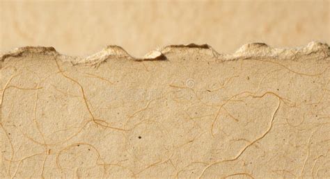
The allure of old paper lies in its inherent storytelling capabilities. Unlike pristine, new materials, aged paper bears the marks of time and use. These imperfections - the subtle yellowing, the gentle creases, the occasional stain or fraying edge - are not flaws but rather badges of experience. They speak of a history, of documents read, letters written, and moments preserved. For designers, these characteristics translate into a rich visual language that can evoke a wide range of emotions and associations. The "real-deal vintage paper feel" is precisely what these textures aim to capture, offering a shortcut to that sought-after worn-in, aged aesthetic straight to your artwork.
The Craftsmanship Behind Authentic Textures
Creating genuinely convincing old paper textures involves more than simply applying a filter. The Indieground Team, for instance, emphasizes their meticulous process: "The Indieground Team dug deep, sourcing, selecting, and fine-tuning real vintage paper to create these 3000x4500px, 300dpi textures-capturing those naturally yellowed tones and aged imperfections that make old paper, well… actually old." This dedication to authenticity means that the resulting textures are not artificial imitations but rather high-resolution scans or photographs of actual aged materials. This approach ensures that the subtle nuances, the unique grain patterns, and the organic variations in color and tone are preserved, offering a level of realism that is difficult to replicate through purely digital means. The commitment to using "no fake filters, no shortcuts-just the real thing" is paramount in delivering textures that feel genuinely aged.
Practical Applications in Digital Design
The utility of old paper texture overlays extends across a broad spectrum of design disciplines. For graphic designers, they can serve as the foundation for posters, flyers, and social media graphics, instantly lending a vintage or artistic flair. In web design, these textures can be used for backgrounds, banners, or even as subtle overlays on specific content blocks to create a more engaging and memorable user experience. Photographers and digital artists often employ them to add depth and character to their images, transforming a modern photograph into something that feels like a rediscovered artifact. The versatility lies in their ability to be layered up to create a background or to give designs "that extra dose of authenticity."
Technical Specifications and Accessibility
When selecting old paper texture overlays, certain technical specifications are crucial for ensuring their usability and quality. The provided free pack, for instance, offers "5 JPEG Textures," with "All textures are 6000×4000px at 300dpi." These high-resolution dimensions and dpi (dots per inch) ensure that the textures can be scaled up or down without significant loss of detail, making them suitable for both print and digital applications. The file dimension of "63 MB" for the pack indicates a substantial amount of data, reflecting the high quality of the scans. Crucially, these textures are "Compatible with all image editing software," meaning they can be easily integrated into workflows using programs like Adobe Photoshop, Affinity Photo, GIMP, and others. The JPEG format is universally supported, further enhancing their accessibility.
The "Freebie" Advantage and Beyond
The availability of free resources like the described pack democratizes access to high-quality design assets. For individuals and small businesses, freebies can be invaluable for creating professional-looking designs without a significant budget. The sentiment expressed, "Grab the free pack now and start making something that looks like it’s lived a little," encourages immediate engagement and experimentation. However, the mention of "bestselling premium resources" and "Build Your Bundle: Choose 4+ Products And Get 30% Off Instantly" suggests that while free options are excellent, a wider array of more specialized or extensive texture packs are also available for those seeking more advanced or specific effects. This tiered offering allows users to start with accessible options and explore more comprehensive solutions as their needs evolve.
Considerations for Effective Implementation
While old paper textures are powerful tools, their effective implementation requires a thoughtful approach. Overuse or misapplication can lead to designs that appear cluttered or inauthentic. The key is to use them judiciously, allowing the texture to enhance the design rather than overpower it. The "perfect mix of grit and nostalgia" is achieved when the texture complements the subject matter and overall aesthetic. For example, a delicate watercolor painting might benefit from a subtle, light paper texture, while a bold, graphic design might handle a more pronounced, distressed paper overlay. Experimentation with blending modes and opacity levels in image editing software is essential for achieving the desired effect.
How to Create Paper Texture Effect in Adobe Photoshop | Tutorial
The Underlying Principles of Texture in Design
At a more fundamental level, the use of old paper textures taps into the broader principles of tactile design and visual metaphor. In a digital world, where interfaces are often smooth and uniform, the introduction of texture can create a sense of physical presence and depth. It appeals to our innate human connection with physical objects and materials. The "aged aesthetic" isn't just about looking old; it's about evoking feelings of tradition, craftsmanship, and enduring quality. This is why such textures remain popular across diverse creative fields, from fine art to commercial branding. They provide a shortcut to communicating a narrative of time, authenticity, and human touch.
Challenges and Nuances in Texture Creation and Use
The process of creating and utilizing textures is not without its challenges. Ensuring that a texture is truly versatile requires careful consideration of its characteristics. For instance, a texture that is too heavily patterned or has a dominant color cast might limit its applicability. The "naturally yellowed tones and aged imperfections" are desirable precisely because they are organic and varied. The challenge for creators is to capture these organic qualities without introducing repetitive patterns or overly strong visual cues that would detract from the texture's utility. For users, the challenge lies in understanding how different textures interact with their specific design elements. A texture that works perfectly for a historical document-themed project might be entirely inappropriate for a sleek, modern product advertisement.
The Evolution of Digital Textures
The concept of digital textures has evolved significantly over the years. Initially, designers might have relied on simple, repeating patterns or heavily filtered images. However, with advancements in scanning technology and digital imaging, it has become possible to capture and reproduce the intricate details of real-world materials with remarkable fidelity. The emphasis on "real vintage paper" and "no fake filters" reflects this evolution towards greater authenticity and a desire to move away from artificial-looking effects. This trend is driven by a growing appreciation for natural aesthetics and a demand for designs that feel more genuine and less manufactured.
The Importance of High Resolution and Detail
The technical specifications of a texture pack, such as resolution and DPI, are critical determinants of its quality and usability. A low-resolution texture, even if it looks good at a small size, will quickly pixelate or become blurry when scaled up for larger projects. A 300dpi rating, as seen in the example pack, is generally considered the standard for high-quality print work, ensuring crisp details. For digital use, while 72dpi or 96dpi is common, using a higher resolution source allows for greater flexibility in scaling and cropping without compromising quality. The "6000×4000px" dimensions provide ample room for manipulation. This attention to detail ensures that the texture can be applied in a way that looks seamless and professional, regardless of the final output medium.
Beyond the Visual: Evoking Sensory Experiences
While textures are inherently visual, their effective use can also tap into our other senses, particularly touch. A well-chosen old paper texture can evoke the tactile sensation of rough paper, the smooth finish of aged parchment, or the slightly uneven surface of handmade paper. This cross-sensory evocation adds another layer of depth to the design, making it more immersive and memorable. The "grit and nostalgia" are not just visual descriptors but also hints at a sensory experience. When a design feels "real," it often means it has successfully engaged our expectations of how physical materials would feel and appear.
The Role of "Proof of Work" in Digital Assets
While seemingly unrelated, the mention of "proof of work" and "fingerprinting headless browsers" in the provided text hints at the evolving landscape of digital asset distribution and the challenges of preventing misuse. In essence, these are technical measures aimed at ensuring that users accessing and downloading digital assets are legitimate and not automated bots engaging in mass scraping. This underlines the value and effort invested in curating and providing high-quality resources like texture packs. The fact that these are considered valuable enough to warrant such protective measures speaks to their significance in the creative workflow.
The Philosophy of "Realness" in Digital Art
The emphasis on "real vintage paper" and the rejection of "fake filters" aligns with a broader philosophical trend in digital art and design that prioritizes authenticity and a connection to the physical world. In an era where so much of our experience is mediated through screens, there is a growing desire for digital creations that feel grounded and tangible. Old paper textures, by their very nature, bridge this gap. They are digital representations of physical objects, carrying with them the inherent imperfections and history of their real-world counterparts. This pursuit of "realness" is what makes these textures so compelling and enduringly popular.
Conclusion: Embracing the Imperfect Beauty
Old paper texture overlays offer a powerful and accessible means to infuse digital designs with character, history, and a palpable sense of authenticity. By meticulously sourcing and digitizing genuine vintage materials, designers can provide these textures, ensuring that the "worn-in, aged aesthetic" is not a mere imitation but a faithful representation of time's passage. The technical quality of these assets, coupled with their inherent versatility, makes them indispensable tools for a wide range of creative projects. Ultimately, the appeal of old paper textures lies in their ability to embrace the imperfect beauty of the past, transforming digital creations into pieces that resonate with depth, narrative, and a touch of timeless charm.