In the dynamic world of graphic design, color accuracy and consistency are paramount. For decades, Pantone colors have served as the global standard for color reference and ink mixing, particularly in print and screen printing. This system ensures that a specific shade of "red," for example, is universally understood and reproducible, rather than being subject to the interpretation of individual ink manufacturers or the inherent variations in CMYK printing. However, recent changes in Adobe's Creative Cloud applications, specifically Photoshop, have altered the way designers access and utilize these essential color libraries. This article delves into the evolution of Pantone color integration within Photoshop, the reasons behind the changes, and the current methods available for designers to maintain color fidelity in their work.
The Role of Spot Colors and Pantone
Spot colors are special premixed inks used in printing as an alternative to, or in addition to, the standard process colors of Cyan, Magenta, Yellow, and Black (CMYK). Each spot color requires its own dedicated printing plate on the press, ensuring a precise and consistent color application. This is fundamentally different from CMYK, where a wide spectrum of colors is achieved by combining varying percentages of four basic inks. While CMYK is cost-effective for full-color reproduction and commonly used in home printers, it can lead to slight variations in color output due to the inherent inaccuracies in ink mixing and printing processes. Pantone, on the other hand, provides a standardized system where each color has a unique code, eliminating ambiguity and guaranteeing reproducibility across different printing runs and locations.
If you are planning to print an image with spot colors, the process in Photoshop traditionally involved creating spot channels to store these specific colors. To apply a spot color as a tint throughout an image, one could convert the image to Duotone mode and assign the spot color to one of the duotone plates. Spot colors are then overprinted on top of the fully composited image, meaning they are printed on top of the existing ink layers, revealing the inks beneath or, in some cases, a clear varnish.
The Shift in Photoshop's Pantone Integration
Until recently, designers could easily access built-in Pantone color libraries directly within Photoshop. The workflow was straightforward: open Photoshop, double-click the Foreground Color swatch to open the Color Picker, select the desired Pantone book from the dropdown menu, choose a color, and apply it. This integrated approach was simple, fast, and seamlessly incorporated into the design process.
However, starting with Photoshop version 24.0 and higher (released in August 2022), this direct access was phased out. The primary reason for this significant change is licensing. Pantone decided to alter its business model, requiring a premium license for access to its color books within Adobe applications. As a result, the "Book" dropdown in the Color Picker no longer includes Pantone color libraries by default. For users opening the Color Picker today and wondering if they are missing something, the answer is no; the libraries are no longer present in the software.
This change has led to a common frustration among designers, as many older tutorials and established workflows relied on the previously built-in Pantone libraries. PSD files that previously contained spot Pantone colors have reportedly begun displaying those colors as black, creating significant disruption for ongoing projects and archives. This issue is not isolated to Photoshop; similar reports have emerged regarding Adobe Illustrator and InDesign.
Why the Change? Pantone's Perspective
Pantone has stated that its color libraries within Adobe applications had not been properly maintained for several years, leading to inaccuracies and the omission of hundreds of colors. They claim that the removal of outdated libraries and the joint focus with Adobe on an improved in-app experience better serves users. The new approach necessitates that customers purchase a premium license through Pantone Connect and install a plug-in via Adobe Exchange to access the complete set of Pantone Color Books.
Current Methods for Using Pantone Colors in Photoshop
Despite the removal of built-in libraries, designers haven't lost the ability to work accurately with Pantone colors. The underlying need for precise color communication remains, especially as many digital-first projects eventually transition to print, and clients expect consistency across all touchpoints. The key now lies in understanding and utilizing the available workarounds and tools.
1. Pantone Connect Extension
Pantone Connect Extension for Adobe Creative Cloud
The primary solution offered by Adobe and Pantone is the Pantone Connect extension. This plug-in is available for download from the Adobe Exchange. Before installation, it's advisable to close all Adobe applications. Once added, the extension should be accessible through Photoshop's top menu bar under "Plugins."
However, it's important to note that many users have reported widespread technical issues with Pantone Connect, including internal server errors, blank panels, and failed launches within Photoshop. Some users report that clicking the plugin opens a blank panel or redirects them to a web browser instead of loading the color tool directly in Photoshop. Software is constantly evolving, and it's possible that Adobe and Pantone will release fixes or updates to address these issues.
The Pantone Connect extension aims to provide a way to accurately identify Pantone colors. It also offers a separate web-based interface that mirrors many of the mobile app's features, which is distinct from the Pantone Color Finder tool.
Using Pantone Connect for Specific Colors:
One method involves using Pantone Connect to replace existing colors. If you have a HEX number for a color you want to match to a Pantone equivalent:
- Open the Pantone Connect panel.
- Navigate to the section where you can input a HEX number.
- Paste the HEX number into the designated box.
- Click "Convert."
- In your separations, click the channel you wish to change.
- In the "Spot Channel Options" dialog box, click the small square color swatch.
- Select the new Pantone color generated by Pantone Connect.
While Pantone Connect is presented as a solution, its current instability means it might not be the most reliable option for everyone.
2. Pantone Color Finder (Web Tool)
The official Pantone Color Finder, accessible via a web browser, has become one of the most dependable methods for identifying Pantone equivalents. This tool allows users to search for colors by name, number, or by uploading an image to extract colors.
Workflow with Pantone Color Finder:
- Open the official Pantone Color Finder in your web browser.
- Use the search functions to find your desired color or upload an image to sample colors.
- Once you have identified the desired Pantone color, note its specific code (e.g., "Pantone 18-3943 TCX").
- In Photoshop, you can then manually create a new spot channel or apply this color using the Color Picker, selecting the appropriate Pantone library if available through other means (like third-party swatches) or by approximating the color visually.
Important Considerations for Color Libraries:
When using the Pantone Color Finder or any other tool to select Pantone colors, it's crucial to choose the correct library for your intended application:
- For glossy or coated paper (e.g., magazines, premium brochures): Look for libraries ending in "C" (Coated).
- For matte or porous paper (e.g., letterheads, stationery): Look for libraries ending in "U" (Uncoated).
- Avoid TCX codes for graphic design: TCX stands for Textile Cotton Edition and is intended for fabric applications. Using a TCX color for logos, posters, or print ads can lead to significant color shifts when printed on paper.
3. Mobile Pantone Apps and Color Extraction
Pantone offers mobile applications that can assist in color exploration and extraction. By installing the Pantone Connect app on a mobile device and creating a free account, users can access features like "Extract." This tool allows you to sample colors directly from images using your phone's camera or loaded photos.
Once a color is sampled, the app can suggest Pantone matches. This is a valuable method for inspiration and for quickly identifying potential Pantone equivalents from real-world objects or existing designs. These sampled colors can then be referenced in Photoshop.
4. Third-Party Pantone Swatches
Several third-party custom Pantone color swatches for Photoshop are available for download. These swatches can offer a relatively accurate way to work with Pantone colors, though they may not automatically embed the Pantone number into the channel as the official libraries did.
Using Third-Party Swatches:
- Download a reputable third-party Pantone swatch file (often in
.acoor.aseformat). - Copy the file to a location where you can easily access it.
- In Photoshop, go to the Swatches panel (Window > Swatches).
- Click the Swatches panel menu (the small icon with lines in the top-right corner) and select "Import Swatches."
- Navigate to and select your downloaded swatch file.
- The new swatch library will appear in your Swatches panel. You can then open it and compare the colors in your artwork to the colors in the swatch to choose the closest match.
This method requires manual comparison and selection, relying on your visual judgment to find the closest Pantone equivalent.
Working with Spot Channels and Duotones
When the goal is to print with actual spot colors, creating separate spot channels is essential. This ensures that the color is managed as a distinct ink during the printing process.
Creating a New Spot Channel:
- Open the Channels panel in Photoshop (Window > Channels).
- Click the "Create New Channel" button at the bottom of the panel.
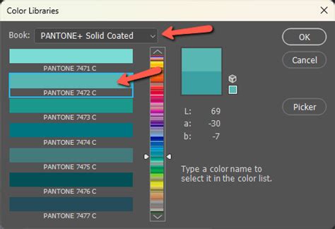
- In the "New Spot Channel" dialog box, click the "Color" swatch.
- In the Color Picker, click "Color Libraries" to choose from a custom color system and select your desired Pantone color.
- Enter a descriptive name for the spot channel (e.g., "Pantone 7471 C").
- Click OK.
The spot channel is now created and will appear in the Channels panel. This channel stores the specific ink definition for that Pantone color.
Applying Spot Colors as Tints:
To apply a spot color as a tint throughout an image, you can convert the image to Duotone mode:
- Ensure your image is in Grayscale mode.
- Go to Image > Mode > Duotone.
- In the Duotone Options dialog box, select "Pantone" from the Type dropdown.
- Click on the color swatch for one of the duotone plates (e.g., "Ink 1").
- Use the Color Picker and Color Libraries to select your desired Pantone color.
- You can then adjust the curve for that ink to control its density and application as a tint.
Spot colors are overprinted on top of the fully composited image. This means they are printed on top of the CMYK or other base colors. The interaction between the spot color and the underlying inks can be previewed in Photoshop, and software can simulate on-screen the density of the printed spot color.
Understanding "Out of Gamut" Warnings
When selecting a Pantone color, you might encounter an exclamation mark next to the color swatch with an accompanying message like "Out of gamut for printing." This warning indicates that the selected Pantone color cannot be accurately reproduced using the standard CMYK process inks.
If you are not printing with actual spot colors and are relying on CMYK, this warning is important. It signifies that the chosen Pantone color is outside the achievable range for CMYK. In such cases, designers often need to find the closest reproducible Pantone match within the CMYK gamut or adjust their design to accommodate CMYK limitations. If you are indeed printing with actual spot colors, this warning is less critical as the spot color will be printed directly.
The Importance of Color Accuracy in Design
The phrase "in professional design, a word like 'red' doesnât mean much on its own" highlights a core principle of color theory and application. Reds can lean warm or cool, orange or blue, and the subtle differences are crucial for brand identity and visual communication. Pantone colors provide a standardized language to define these nuances precisely.
Even in a digital-first world, the journey of a design often extends to print. Clients expect consistency across every touchpoint, from a website banner to a product package. A brand's established color palette, often defined by Pantone specifications, must be maintained rigorously. Therefore, the ability to accurately identify, select, and implement Pantone colors remains a critical skill for graphic designers.
Workarounds and Best Practices
The current landscape for using Pantone colors in Photoshop requires a more deliberate approach. Designers must adapt to the new workflows and leverage the available tools effectively.
- Mobile Tools for Inspiration: Use mobile apps to explore and extract colors from the environment or inspiration images.
- Web Finder for Precision: Rely on the Pantone Color Finder web tool when precise color identification is needed for print specifications.
- Plugins as Optional: Treat extensions like Pantone Connect as potentially useful tools, but be prepared for technical glitches and have alternative methods ready.
- Physical Swatches: For critical print jobs, holding a physical Pantone Formula Color Guide page and visually matching it to the color on the monitor remains a surprisingly effective, albeit "old school," method. Remember that monitor calibration plays a significant role in visual matching.
- Understand Your Output: Always be aware of your final output medium. If it's CMYK printing, be mindful of "out of gamut" warnings. If it's a spot color job, ensure your spot channels are correctly set up.
While the changes introduced in 2022 have added extra steps, they have not diminished the importance of Pantone. The key is knowing when to use each method and understanding that professional design often demands a multi-faceted approach to color management. The pursuit of color accuracy, whether for a client's brand book, a cross-platform design system, or simply a desire for consistency, continues to make Pantone an indispensable part of the designer's toolkit.