Adding text to images is a fundamental aspect of graphic design, and Photoshop offers a robust set of tools to achieve professional-looking results. This tutorial delves into various techniques for styling text and creating compelling backgrounds, ensuring your message stands out with clarity and visual appeal. Whether you're a beginner exploring Photoshop's text capabilities or an experienced designer looking to refine your workflow, this guide provides actionable steps and insights. While modern design workflows often leverage tools like Figma for web and UX/UI, understanding Photoshop's foundational text manipulation techniques remains invaluable for a wide range of design projects.
Understanding Photoshop's Text Styling Defaults
Before diving into creating text backgrounds, it's crucial to understand how Photoshop handles text styling. By default, Photoshop's type styling-including font, color, size, and other attributes-adopts the settings of the last text you selected or edited. This means that when you begin typing new text, it will inherit these properties. To manage this effectively, always pay attention to the Options bar at the top of the screen, which provides access to basic text settings, and the Character and Paragraph panels for more advanced control.
It's important to remember that the Options bar, while convenient, only offers a subset of text settings. For a more comprehensive control over your typography, the Character and Paragraph panels are indispensable. These panels allow for fine-tuning of leading, kerning, tracking, justification, and many other typographic elements that contribute to the overall readability and aesthetic of your text.
Adding a Main Page Title and Enhancing Readability
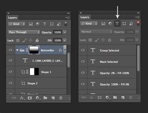
A clear and prominent main title is essential for any page, immediately conveying its purpose. When adding a new title, consider its placement and size relative to other elements on the page. In the Layers panel, navigating to specific folders, such as the "footer" folder, allows you to access and modify existing text layers. For instance, double-clicking the layer thumbnail (the 'T' icon) next to a layer like "Source: Wikipedia" will select that text for editing.
Once text is selected, you can deselect it by pressing the Esc key. To adjust the size of the text, you can click and drag an icon, slowly moving it to the right. The goal is to increase the text's width until it matches the width of the column of text below it. While precision isn't always necessary, aiming for a width of approximately 8 gray columns is a good visual target. For a font like Arial Black, a size around 83 pixels often achieves this.
TIP: For precise adjustments, utilize the Arrow keys to nudge the text 1 pixel at a time. This granular control is invaluable for achieving perfect alignment and spacing.
Darkening the Background Photo for Improved Text Legibility
One of the most effective ways to ensure text is easily readable over a photographic background is to adjust the background image itself. Darkening the photo can create a greater contrast, making lighter text pop and darker text recede, thus improving legibility.
Another method to enhance text readability involves using Photoshop's gradient tools. Within the "Basics" folder, you might find an option like "Foreground to Transparent." This icon, often depicted as a transition from black to a checkerboard pattern (representing transparency), can be instrumental. Clicking this option and then applying it can create a subtle darkening effect or a gradient overlay that gradually fades out, allowing text placed over it to be more prominent.

Applying Subtle Shadows for Text Emphasis
Subtle shadows can significantly enhance the visual separation of text from its background, making it appear to "pop" without being overpowering. This effect can be achieved using Photoshop's Layer Styles. Within the Layers panel, under a specific layer, such as "NEW YORK CITY," you can access the "Drop Shadow" effect. By clicking the eye icon next to "Drop Shadow," you can toggle the effect on and off to observe the immediate impact.
The beauty of Photoshop's shadow tools is the ability to visually manipulate the shadow's position. We aim for a subtle shadow that gently lifts the text off the background. Experiment with the shadow's opacity, distance, spread, and size to find the perfect balance. Unchecking and re-checking the "Preview" option within the Layer Style dialog box allows you to see the before and after effects in real-time, ensuring you achieve the desired subtle enhancement.
Creating Solid Color Backgrounds for Text
Beyond adjusting existing backgrounds, Photoshop offers direct methods for creating solid color backgrounds specifically for your text. This is particularly useful when the background image is too busy or when a clean, graphic look is desired.
Method 1: Using the Shape Tool
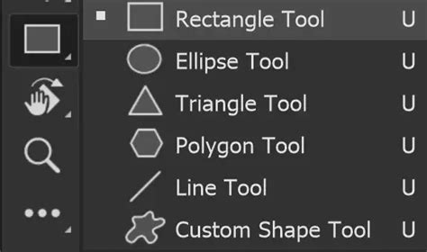
The most straightforward approach is to utilize Photoshop's Shape Tool, specifically the Rectangle tool.
- Select the Type Tool: Choose the Type tool (T) and click on your image to create a new text layer. Type the word or phrase you want to use.
- Choose a Font and Style: Find a font that effectively communicates your message. Use the Properties panel to adjust the text size and color so it's clearly visible against the background image.
- Create a Rectangle: Select the Rectangle Tool from the toolbar. In the Options bar, ensure that "Shape" is selected (not "Path" or "Pixels"). Choose a fill color that complements your design.
- Draw the Rectangle: Click and drag on your canvas to draw a rectangle that will serve as the background for your text. Position it behind your text layer in the Layers panel.
- Adjust and Align: You can resize and reposition the rectangle as needed. Use Photoshop's alignment tools to ensure the text is centered within the rectangle.
This method provides a solid block of color behind your text, creating a clear visual separation.
Method 2: Converting Text to Shapes for a Cohesive Background
A more advanced, yet highly effective, method involves converting your text layer into a shape. This allows the text itself to become the mask for a background color or even an image.
- Type Your Text: As before, select the Type tool and add your desired text to the image. Adjust its font, size, and color in the Properties panel for optimal visibility.
- Convert to Frame (or Shape): Right-click on your new type layer. You'll find an option like "Convert to Frame." This action essentially turns your text into a container. Alternatively, you can right-click and choose "Convert to Shape." The "Convert to Frame" option is particularly useful when you want to fill the text shape with another element.
- Duplicating and Transforming: If you chose "Convert to Shape," you can then duplicate this shape layer. With the duplicated shape layer selected, you can apply a color overlay or fill it with a pattern. If you used "Convert to Frame," you can then drag another layer (like an image or a solid color fill layer) into this frame.
- Creating a Cohesive Background: For a solid color background, you can duplicate your text layer, convert the duplicate to a shape, and then apply a solid color fill or color overlay to this shape layer. This shape layer, now representing the solid background, can be positioned behind the original text layer. This technique creates a unified text background that precisely follows the contours of your characters.
This method offers greater flexibility, allowing you to create intricate text backgrounds that are seamlessly integrated with the text itself.
How to Create Text Masking Effect in Photoshop | Photoshop Text Effect Tutorial
Advanced Text Background Techniques
Photoshop's capabilities extend beyond simple color overlays. You can use image elements, textures, and even other parts of your image to create dynamic text backgrounds.
Replacing Elements within Text
A creative technique involves replacing parts of your text with other elements from your composition. For example, you might want to replace a letter within a word with a specific image or graphic.
- Layer Masking: Start by typing your word. Then, place the image or graphic you want to use as a replacement above the text layer.
- Clipping Mask or Layer Mask: You can use a clipping mask to confine the replacement image to the shape of the text layer below it. Alternatively, you can use a layer mask on the replacement image layer. Select the layer mask thumbnail, choose the Brush tool, set its color to black, and paint over the areas of the replacement image you want to hide, revealing the text beneath.
- Selective Replacement: To replace a specific letter, such as the 'A' in a word, with a tent from another layer:
- Hide the tent layer from view initially.
- With the layer mask thumbnail of the tent layer selected, choose the Brush tool and set it to black.
- Paint over the 'A' on the original text layer to hide it.
- Make the tent layer visible. It will now appear where the 'A' was, effectively replacing it within the word.
This technique allows for highly customized and visually interesting text treatments.
Using Foreground to Transparent for Gradients
The "Foreground to Transparent" option, mentioned earlier, is also incredibly versatile for creating gradient backgrounds that interact with text. When applied, it creates a smooth transition from a chosen foreground color to transparency. This can be used as a background layer that fades in or out behind your text, adding depth and visual interest without obscuring the underlying image entirely.
Considerations for Web and UI Design
While this tutorial focuses on Photoshop, it's worth noting the evolution of design tools. For contemporary web and UX/UI design, platforms like Figma have become primary tools due to their collaborative features, vector-based nature, and focus on interactive prototyping. However, the principles of typography, contrast, and visual hierarchy learned in Photoshop are universally applicable across all design disciplines. Understanding how to manipulate text and its background in Photoshop provides a strong foundation for grasping these concepts, even when working in different software environments.
The ability to visually move a shadow, adjust text size with precision using arrow keys, and toggle layer effects on and off are all fundamental skills that translate directly to creating effective designs, regardless of the specific tool used. The core objective remains the same: to present information clearly and attractively.
The Importance of Font Choice
The selection of a font is paramount. It's not merely about aesthetics; the font choice influences the tone, readability, and overall message of your design. A bold, sans-serif font like Arial Black, as used in an example, conveys a strong, direct message, suitable for headings. For body text, a more readable serif or sans-serif font might be preferred. When choosing a font, consider its legibility at various sizes and its compatibility with the background.
Iterative Design and Previewing Changes
Photoshop's strength lies in its non-destructive editing capabilities and the ease with which you can preview changes. Whether you're adjusting a drop shadow, modifying text size, or applying a color overlay, the ability to instantly see the results of your actions is crucial. Toggling layers on and off, using the Preview function in Layer Styles, and stepping backward and forward through your history are all essential parts of an iterative design process that leads to a polished final product. This constant feedback loop allows for refinement and ensures that the design meets its intended goals.
tags: #photoshop #background #for #text