Working with color can be a challenging aspect of any creative endeavor. While understanding the fundamentals of color is crucial, the art of pairing colors effectively to create harmonious and impactful palettes is often where many artists find themselves struggling. If the process of building a color palette from scratch leaves you feeling uncertain, this tutorial will guide you through a systematic and creative approach using Adobe Photoshop. We will move beyond basic color theory and delve into practical techniques for generating a diverse range of color palettes, starting from a single base color.
The Foundation: Understanding Color Basics
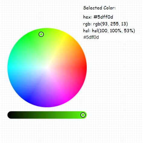
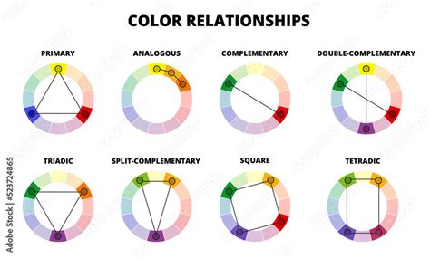
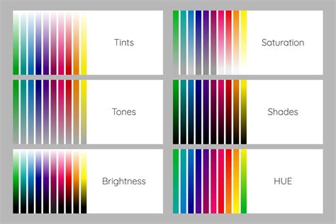
Before diving into palette creation, it's beneficial to have a foundational understanding of color. Color is not merely a visual attribute; it evokes emotions, sets moods, and conveys messages. Concepts such as hue, saturation, and brightness are fundamental. Hue refers to the pure color itself (e.g., red, blue, green). Saturation indicates the intensity or purity of the hue, while brightness determines how light or dark a color appears. Understanding these elements, along with color harmony principles like complementary (colors opposite each other on the color wheel), analogous (colors next to each other), and triadic (three colors evenly spaced), will serve as a strong basis for crafting effective color schemes.
Step 1: Choosing Your Base Color
The journey to building a rich color palette begins with a single, chosen color. This base color will be the anchor from which all other colors in your palette will be derived. When selecting your base color, it's advisable to avoid extremes. Colors that are too dark or overly saturated can limit your "wiggle room" in subsequent steps. Aim for a color that has a good balance of hue, saturation, and brightness, allowing for ample variation.
For instance, let's imagine we select a reddish-orange hue, which we'll affectionately name "Rusty." This choice provides a good starting point with potential for both warmer and cooler variations.
Step 2: Following the Curve for Tints and Shades
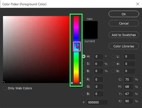
To expand beyond a single hue, we need to introduce tints (lighter versions) and shades (darker versions) of our base color. However, simply moving in parallel lines within the color picker can lead to predictable and often uninspiring results. A more dynamic approach involves moving along an arc.
Visualize a line that starts from the top-left of the color picker and curves down to the bottom-right, passing through your chosen base color. This arc represents a path through different values of saturation and brightness. By sampling colors along this curve, you can create tints and shades that offer a wider variance, resulting in richer and more engaging color pairings.
If we were to sample four colors to the left of "Rusty" (tints) and four to the right (shades) along this arc, we would obtain a set of colors that are related but possess a greater range of luminosity and saturation.
Step 3: Introducing New Hues for Greater Variety
While tints and shades of a single hue can create monochromatic palettes, you might desire more color diversity. To break free from this limitation, we can introduce new hues while still following the arc method for tints and shades.
As you move along the arc, you can subtly adjust the hue itself. For example, starting with "Rusty," moving left along the arc to create three tints could involve sampling colors that shift from orange towards yellow, and then towards green.
When moving to the right from "Rusty," if you reach the edge of the color spectrum within the picker, you can "wrap around" the color wheel. Since the color spectrum is 360°, you can transition from red hues at the bottom back to pink, violet, and blue at the top.
By sampling four tints and four shades while systematically changing the hue along this arc, you can generate a palette with a much broader range of colors. This process, when done with intentional hue shifts, often results in an analogous color harmony, where colors are adjacent on the color wheel, but mapped across a gradient of light to dark.
Quick Tip: Begin with small, incremental adjustments to the hue. As you become more comfortable, experiment with increasing the distance of the hue change to see how it impacts the resulting palette.
Step 4: Adding Value and Nuance
To further enrich your swatch library, you can introduce additional variations by adjusting the value (lightness and darkness) and saturation of the sampled colors. A common technique is to divide your sampled colors into sections.
For the top third of your sampled colors, you can lighten them and decrease their saturation. Simultaneously, you can subtly adjust the hue to make these lighter tones warmer.
Conversely, for the bottom third of your sampled colors, you can darken them and increase their saturation. In this case, you might adjust the hue to make these darker tones cooler. This deliberate manipulation of hue, saturation, and lightness adds depth and sophistication to your palette.
The pattern here is that you are applying the same principles of color manipulation-adjusting hue, saturation, and lightness-to create variations within your existing color families.
The result is a comprehensive swatch library where you have warm, desaturated tints at the top, a range of mid-tones, and cooler, more saturated shades at the bottom.
Step 5: Sampling and Pairing for Palettes
With a diverse library of swatches at your disposal, you can now begin to construct individual color palettes. Think of this library as a collection of building blocks. When assembling a palette, aim for a combination of 3-4 colors. It's often beneficial to select at least one color from each row of your swatch library (tints, mid-tones, shades) to ensure a good balance of value.
Incorporating a more neutral color, such as cream, beige, or gray, can also be highly effective. Neutrals act as grounding elements, allowing the more vibrant colors to stand out and preventing the palette from becoming overwhelming.
When pairing colors, consider the desired contrast. Do you want a stark, high-contrast look, or a softer, more pastel aesthetic? Look for combinations that offer visual interest and achieve the mood you intend to convey.
Step 6: Enhancing Palettes with Color Overlays
To further expand the utility of your swatch library and create even more unique color combinations, consider employing color overlays in Photoshop. This technique can tie your existing colors together and yield exciting new results.
To implement this, create a new Solid Color layer in Photoshop. Select a vibrant color for this layer and set its blending mode to "Overlay." Experiment with reducing the opacity of this layer, often starting around 70%, and adjust the color until you achieve a pleasing effect.
Applying different color overlays can dramatically alter the overall feel of your palette. For instance, an overlay of blue might introduce cooler tones, while a green overlay could add an earthy or natural feel. Brown overlays can lend a vintage or warm aesthetic, and pink overlays can evoke romance or playfulness.
The purpose of using overlays is to generate additional options for colors that pair well together, helping to create identifiable themes or moods within your designs. This method is particularly useful for developing cohesive visual identities for projects.
Step 7: Embracing Experimentation and Play
The most crucial element in the process of creating color palettes is to have fun and embrace experimentation. This exercise is designed to be a playful exploration of color pairing.
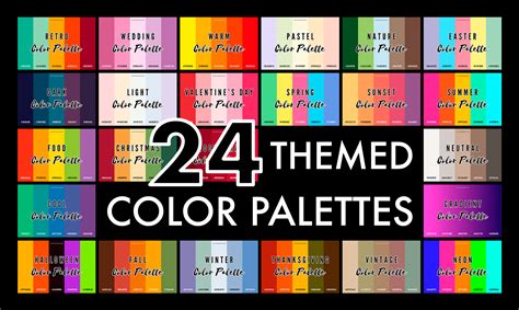
For those seeking to delve deeper into color theory and its practical application in Photoshop, consider exploring dedicated courses or tutorials. Resources like "Color Resource Guide," a PDF filled with helpful tools, and curated collections of free color palettes can provide further inspiration.
Create Color Palette from Any Image in Photoshop
Practical Application: Extracting Colors from Images
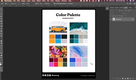
Another highly effective method for generating color palettes is to extract colors directly from existing images. This approach leverages the inherent color harmony found in photographs and can lead to unique and inspiring results.
- Open Your Image: Begin by opening the image you wish to draw inspiration from within Photoshop.
- Sample Colors: Utilize the Eyedropper tool (I) to sample colors directly from various areas of the image. Click on specific hues, tones, and shades that catch your eye.
- Create Swatches: As you sample colors, add them to your Swatches panel (Window > Swatches) by clicking the "Create New Swatch" icon. Organize these swatches to form a cohesive color palette.
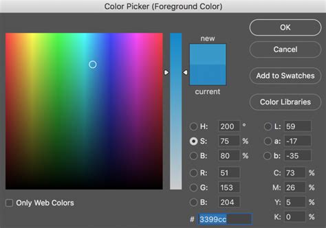
- Utilize the Color Picker and Swatches Panel: The Color Picker allows for precise selection and fine-tuning of colors using sliders for hue, saturation, and brightness. You can also input specific color values or sample colors from your image. The Swatches panel is your digital palette; save your sampled colors here for easy access and reuse across projects.
- Adobe Color Themes Integration: Photoshop integrates seamlessly with Adobe Color Themes, a web-based tool accessible via Window > Extensions > Adobe Color Themes. Here, you can browse thousands of user-generated palettes or create your own using various color rule options (Analogous, Monochromatic, Triad, Complementary, etc.). You can select base colors, refine them, and save them to your Adobe account or export them as ASE files for use in other Adobe applications.
Creating Custom Palettes within Photoshop
For those who prefer a more hands-on approach within Photoshop, you can create a custom workspace for palette generation.
- New Document: Start by creating a new document (File > New) with dimensions suitable for your needs (e.g., 1000x1000 pixels for web use).
- Rulers and Guides: Enable rulers (View > Rulers) and drag guides from the rulers to create divisions within your document, forming a grid to organize your sampled colors and reference image.
- Import Inspiration Image: Drag and drop your inspirational image into your Photoshop document. Use the Transform command (Command/Ctrl + T) to scale and position the image within your grid.
- Create Color Boxes: Use the Rectangle tool to draw boxes within the empty sections of your grid.
- Sample and Fill: Double-click on a rectangle's layer thumbnail to open the Color Picker. Use the Eyedropper tool within the Color Picker to sample colors directly from your imported image and apply them to the rectangles.
- Save for Web: Once your palette is complete, save it for web use (File > Save for Web) to optimize it for digital applications.
Advanced Color Manipulation Techniques
For artists looking to refine existing artwork or create multiple colorways of a single piece, Photoshop offers powerful tools:
- Hue & Saturation: This adjustment layer is invaluable for altering the overall color of an illustration. By manipulating the hue slider, you can shift the entire color spectrum, effectively creating an inverted or complementary color scheme. Adjusting saturation controls the intensity of the colors, and brightness affects the overall lightness or darkness.
- Color Balance: This tool allows for more nuanced control by enabling you to adjust the color balance of highlights, midtones, and shadows independently. This is particularly useful for correcting specific color casts or fine-tuning the mood of certain areas within your artwork.
- Colorize: When used in conjunction with Hue & Saturation, the "Colorize" option can transform grayscale elements into full color, or drastically alter the existing color of an object by applying a single hue.
- Magic Wand Tool: For targeted color changes within an illustration, the Magic Wand tool can be used to select specific areas. Once selected, you can apply Hue & Saturation or Color Balance adjustments to only that selected region, allowing for precise edits.
- Eyedropper Tool with Existing Palettes: If you have a pre-existing color palette you wish to emulate, you can import it into Photoshop. Then, using the Magic Wand tool to select areas of your artwork and the Eyedropper tool to sample from your imported palette, you can meticulously recreate or adapt the desired color scheme.
By mastering these techniques and embracing the creative potential of Photoshop's color tools, you can move beyond the struggle of color pairing and develop a confident and dynamic approach to building compelling color palettes for all your creative projects.