Creating authentic screen print effects in Photoshop is an art form that digitally replicates the rich, textured, and layered aesthetic of traditional printing methods. This process involves meticulous preparation, strategic application of filters, and a keen understanding of how ink interacts with fabric. Getting your artwork ready in Photoshop is a critical step for achieving realistic screen print effects. The journey from a digital design to a screen-printed masterpiece begins with careful setup and progresses through detailed color separation, texture application, and final refinement.
Preparing Your Artwork for Screen Printing
The foundation of any successful screen print effect in Photoshop lies in proper file preparation. Start by importing your design as a Smart Object through File > Place Embedded. This method is crucial as it maintains the quality of your original artwork and allows for non-destructive edits, meaning you can make changes later without degrading the image. Once imported, it's good practice to duplicate the layer and rename it, perhaps "Main Design." Hide the original layer and keep it at the bottom of your layer stack as a backup.
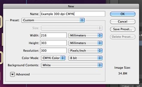
For enhanced control and organization, separate different elements of your design into individual layers. For example, place text on its own layer, graphics on another, and background elements on a separate layer. This modular approach makes adjustments and color separations much more manageable. Always work at 300 DPI; this is the industry standard for creating high-quality screen print effects and ensures your design has enough detail for printing.
When setting up a new document, choose canvas dimensions based on standard apparel print areas. These sizes correspond to the typical printable areas on most garments, such as t-shirts, hoodies, and hats. If your artwork is at a lower resolution, it's far better to recreate it at 300 DPI rather than attempting to upscale it, which often leads to pixelation and loss of detail.
Set the color mode to CMYK if your design is destined for commercial printing, as this mode aligns with the subtractive color mixing used in physical printing processes. For digital mockups or designs intended solely for web display, you can stick with RGB.
The Art of Color Separation
Mimicking traditional screen printing necessitates breaking down your design into individual color layers, each corresponding to a specific ink color that will be printed. For simple black and white separations, the Threshold adjustment layer is an invaluable tool. This adjustment converts your design into pure black and white pixels, which is ideal for creating the base layer of your screen print effect or for designs that will use a limited color palette.
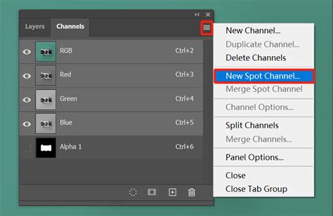
For more complex separations involving multiple colors, combine Black & White adjustment layers with layer masks. This approach provides precise control over how colors in your original design translate to individual ink layers. The Channels panel in Photoshop is another powerful tool for color separation. By viewing individual channels (Red, Green, Blue), you can observe how your design naturally breaks down based on color intensity. Often, one channel will provide an excellent starting point for a specific color separation.
If you're using professional mockup templates, such as those from Pixel Sauce, take advantage of their built-in color libraries. These templates frequently include pre-configured color separations that are already aligned with real-world screen printing processes, streamlining your workflow.
As you separate colors, create a new layer for each ink color you plan to use. Clearly label these layers with descriptive names like "Base White," "Red Ink," or "Black Details." It's best to keep each layer as a solid color initially. The application of halftone effects and textures will be applied to these solid color layers in the subsequent steps.
Adding Halftone Patterns and Textures
Once your color separations are meticulously prepared, the next crucial step is to add halftone patterns and textures. These elements are key to giving your digital artwork that classic, tactile screen-printed vibe.
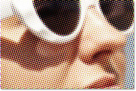
The Color Halftone filter is your primary tool for creating those iconic screen print dots. You can find it under Filter > Pixelate > Color Halftone. The maximum radius setting controls the dot size: smaller values yield a cleaner, more modern look, while larger values contribute to a retro aesthetic. To avoid unwanted moiré patterns, which are undesirable visual artifacts that can occur when two similar patterns overlap, carefully tweak the individual screen angles for each color channel. This alignment is critical for a clean print.
Screen prints often possess subtle imperfections that contribute to their charm and depth. To replicate this, start by incorporating texture. A simple yet effective method is using Photoshop’s Clouds filter. Create a new layer, fill it with 50% gray, and then navigate to Filter > Render > Clouds. For a more pronounced effect, explore the Pattern Overlay option within the Blending Options menu. Choose textures that mimic real materials, such as canvas or rough paper.
For an unparalleled level of authenticity, consider scanning an actual screen-printed garment. Convert the scanned image to grayscale and adjust the levels to clean up the texture. Once prepared, save this texture as a custom pattern for future use. Remember to keep the texture subtle; a low opacity setting often works best to enhance your design without overpowering it.
Layer masks are indispensable for controlling where textures and effects appear. Add a mask by clicking the mask icon in the Layers panel. Use a soft brush to paint on the mask: black areas will hide the texture, white areas will reveal it, and shades of gray will create partial transparency.
Refining with Blending Modes and Edge Control
Blending modes are another powerful set of tools that allow you to refine your design and achieve sophisticated interactions between layers, much like how inks behave in traditional printing. The Multiply blending mode is particularly effective for mimicking how ink layers interact in traditional screen printing. It works by darkening the base color by blending it with the layer above, creating depth and richness. The Overlay mode is excellent for adding texture while preserving the highlights and shadows of your design, giving it a more dynamic feel.
To finish your texture and halftone applications, refine the edges of your masks using the Feather slider, typically found in the Properties panel when a layer mask is selected. A slight feathering creates soft transitions, mimicking the natural way ink spreads slightly on fabric, resulting in a less rigid and more organic appearance.
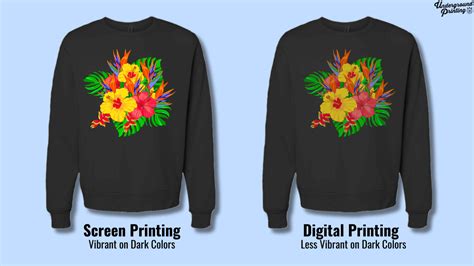
It's essential to take a close look at your design at 100% zoom. If the halftone dots appear too sharp or overpowering, consider lowering their opacity by 10-15%. For designs intended for dark garments, slightly increasing the contrast using the Brightness/Contrast settings can help your design stand out.
When working with color separations, the Color Balance tool can be used to fine-tune each individual color. A modest saturation boost of 5-10% can significantly help your design pop, as screen printing inks often appear more vibrant than they do on a digital screen.
Blending Modes - Photoshop for Beginners | Lesson 5
Organization and Export for Production
Maintaining order within your Photoshop file is paramount for a smooth workflow, especially with complex designs. Rename layers with clear, descriptive labels such as ‘Red Ink Halftone’ or ‘Black Detail Mask’. For more intricate projects, consider using color labels to code your layer groups. This can be done by right-clicking on a group in the Layers panel and selecting a label color.
After refining your design and meticulously organizing your layers, the next step is exporting your files correctly for their intended purpose. Always save your master file as a PSD (Photoshop Document). Including the date in the filename, for example, "DesignNameMMDDYYYY.psd," is a good practice to keep track of different versions and revisions.
For client review and for the actual print production, export a flattened TIFF file at 300 DPI. TIFF is a high-quality, lossless format suitable for printing. If you need a digital version for web use or online mockups, export a high-resolution PNG file at 150-200 DPI.
If you are utilizing professional mockup templates, such as those from Pixel Sauce, your screen print effects can be easily incorporated into their extensive libraries, which often contain thousands of high-resolution apparel mockups.
To ensure consistency across all your projects, it is highly recommended to document your export settings and file naming conventions in a simple text file. Save this document alongside your project files for easy reference.
Tailoring Effects for Different Garments
Paying close attention to detail is absolutely essential when striving for realistic screen print effects. Each type of garment requires a unique approach to achieve the best possible results. For lightweight fabrics like t-shirts, subtle halftone patterns and textures work exceptionally well, complementing the smooth texture of the material without overwhelming it.
On the other hand, thicker or more textured items, such as hoodies or sweatshirts, often demand bolder effects. This is to replicate how ink interacts with heavier fabrics, which can absorb more ink or have a surface that requires a more pronounced print.
To create realistic previews, high-quality mockup templates are a must. Platforms like Pixel Sauce offer a robust library of over 6,000 high-resolution templates, covering a wide range of garment styles, colors, and positions. For added realism, take advantage of features like 3D artwork mapping. This tool is invaluable as it helps your flat designs naturally conform to the curves and folds of the garment, making the mockup appear much more lifelike.
To further enhance the screen print effect in your mockups, consider duplicating your base design layer. Set one copy to the Screen blend mode for simulating highlights and the other to Multiply for shadows. This layering technique adds depth and dimension.
After tailoring your effects and utilizing quality templates, fine-tune your preview for maximum accuracy. Adjust color saturation to make your designs pop, align textures with the fabric’s grain to mimic a real print, and apply a subtle Gaussian blur to replicate the softened edges of printed ink, which is common in screen printing. Finally, review your design at different zoom levels to catch any inconsistencies.
Advanced Techniques and Workflow Organization
When working on screen print effects in Photoshop, keeping your workflow organized is key to efficiency and preventing errors. A highly effective method is to group related layers into a folder. Set the folder's blend mode to Multiply - this can help manage overlapping colors more effectively, especially when dealing with multiple ink layers.
Utilize adjustment layers for making non-destructive edits. This allows you to tweak colors, contrast, or textures without permanently altering the original artwork, giving you the flexibility to experiment and revert changes easily. To add a touch of depth or realism, consider applying layer effects such as subtle drop shadows or glows, which can mimic the slight thickness of ink. Lastly, consistently label your groups and layers clearly, as mentioned previously, to maintain clarity throughout the project.
Blending Modes - Photoshop for Beginners | Lesson 5
Understanding Fabric and Ink Interactions
To make your digital screen print designs truly pop on different types of garments, it’s essential to keep the fabric’s characteristics in mind. For instance, cotton and softer fabrics often pair nicely with water-based inks, which tend to have a softer hand feel. Rougher or synthetic materials might require specialized inks or techniques to achieve the desired effect and ensure proper adhesion. Always be mindful of the fabric’s texture, weight, and fiber content when selecting inks and prepping the garment. Pre-treating the material and using the right ink formulation are key to achieving bold, long-lasting prints that remain true to your original design.
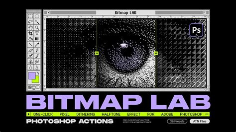
Mastering Halftone Effects and Avoiding Artifacts
When working with halftone effects in Photoshop, resizing your artwork to its final output dimensions before applying the halftone filter is a critical step. This ensures that the dot patterns are generated at the correct scale for the intended print size. To further refine your results, experiment with the halftone screen settings in Photoshop for smoother effects.
If moiré patterns persist, try using the Moiré Reduction slider, often found within Adobe Camera Raw, or slightly tweak the angle of the halftone dots for each color channel. Small adjustments can often make a significant difference in eliminating these visual artifacts.
For those looking to dive deeper into the intricacies of color separation, there are specialized courses available. A course guided by screen printing experts, such as Colin Huggins, can offer in-depth training in complex color separations like spot color and simulated process, among others. This goes beyond simply learning Photoshop tools; it's about mastering the art of color separation to create stunning, press-ready designs. Modules covering topics from Spot Color to Grayscale Separations are crafted to enhance your skills in making any artwork print-ready, serving as a gateway to professional-level screen printing design.
Preparing your artwork correctly to print is, in essence, half the battle when it comes to screen printing halftones. A common workflow for creating halftones involves several steps:
- Ensure your image is at the correct resolution.
- Navigate to
Image > Image Size. The resolution needs to be at least 300 DPI for quality output. - Convert the image to Grayscale:
Image > Mode > Grayscale. - If necessary, adjust the levels of the image using
Image > Adjustments > Levelsto ensure good contrast before converting to bitmap. - Convert the image to Bitmap:
Image > Mode > Bitmap. - In the Bitmap dialog box, you can set the halftone dot size and frequency. The lines per inch (LPI) can be determined by dividing the mesh count of the screen you are using by 4 or 4.5. For example, with a 230 mesh count screen, dividing by 4.5 yields approximately 51 LPI. It's often best to round down to a simpler number, like 50 LPI, for consistency.
A quick tip for transforming photos into screen-printed graphics involves a series of adjustments. Start by opening your chosen photo in Photoshop. Create a rough selection around the main subject. Desaturate the image by pressing Cmd+Shift+U (or Ctrl+Shift+U on Windows). Then, add noise using Filter > Noise > Add Noise. For the final step in this specific technique, convert the image to Grayscale (Image > Mode > Grayscale) and then to Bitmap (Image > Mode > Bitmap), selecting Halftone Screen as the method. You can then switch back to Grayscale mode and then back to RGB if needed. For integration into vector artwork, this graphic can be taken over to Illustrator and processed with an Auto Trace function.
Final Touches and Iterative Refinement
The process of creating screen print effects in Photoshop is iterative. After applying halftones, textures, and blending modes, take time for final touches. Adjust brightness, contrast, and opacity for a polished look. This stage is about fine-tuning the visual output to ensure it closely resembles the final printed product. With regular updates from professional mockup platforms and a consistent approach to file organization and export, you can refine your skills and stay aligned with industry trends, ensuring your digital designs translate beautifully to physical prints.