The landscape of the internet has undergone a dramatic transformation since its inception. From its humble beginnings as a tool for researchers to collaborate, the World Wide Web has evolved into an indispensable facet of daily life for billions. Web design, as an industry, has mirrored this growth, becoming both more vital and more popular. At the heart of this creative and technical process, for many professionals, lies Adobe Photoshop. While not a mandatory requirement for every web designer, Photoshop has cemented its position as a cornerstone tool, particularly for those crafting the visual elements and user interfaces of websites. This article will explore the multifaceted role of Photoshop in web design, from fundamental image manipulation to advanced layout creation, highlighting key tools and techniques essential for any aspiring or established web designer.
The Evolution of Web Design and the Rise of Photoshop
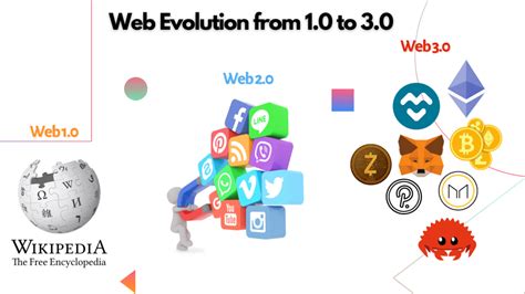
The genesis of the World Wide Web can be traced back to 1989 when Tim Berners-Lee developed the concept with the simple aim of fostering collaboration among geographically dispersed researchers. The first webpage emerged in 1991, and with the subsequent introduction of technologies like CSS and JavaScript, the internet began its journey towards widespread adoption. The year 2003 saw the advent of WordPress, which democratized content creation through blogging and fostered online interaction. A significant leap forward for user experience occurred in 2010 with the introduction of responsive design, a paradigm shift that ensured websites adapted seamlessly to various screen sizes, a development that coincided with the rise of smartphones.
In this dynamic and evolving field, where creativity meets technical execution, Adobe Photoshop has emerged as a critical piece of software for tech-savvy creatives. While some designers may also handle content creation or back-end coding, the visual aspect of web design often falls to those proficient in tools like Photoshop. A core function of web design involves ensuring that all visual assets are optimized for online use, and not all original images possess the requisite quality. Photoshop, at its core, is an image editing software, offering unparalleled potential for optimizing color, tone, and composition down to the most granular detail. This capability makes it an invaluable asset for web designers tasked with refining and preparing images for the web.
Setting Up Your Photoshop Workspace for Web Design
Embarking on a journey in web design necessitates a personalized approach to your work environment. Photoshop, being a pivotal tool in this domain, offers a plethora of options to boost your productivity right from the outset. A specialized workspace, often labeled as ‘Graphic and Web,’ is a pre-configured setup that includes toolbars and panels most pertinent to web design tasks. These commonly include the Layers panel, History, Adjustments, and Styles panels. Crucially, this workspace is not static; it is entirely customizable, allowing you to save your own preferred arrangements as presets for future use. This ensures that your most frequently used tools and panels are readily accessible, streamlining your workflow and allowing you to focus on the creative process rather than searching for essential functions. Fine-tuning your measurement units to pixels or percentages is another critical step for achieving exact precision in your web designs.
Optimizing Performance: Cache and Scratch Disk Settings
When undertaking large-scale web design projects, the proper configuration of Photoshop's cache settings becomes paramount for maintaining smooth performance. Cache levels in Photoshop refer to the number of history states the program can retain, which directly influences how swiftly it can process image information. Photoshop employs image caching to enable rapid redrawing of high-resolution images as you work. By adjusting the cache tile size, you can control how Photoshop segments an image into tiles for caching purposes. Equally important is the consideration of the cache's scratch disk settings. Photoshop utilizes your hard drive as a virtual memory extension when it exhausts your system's RAM. Optimizing these settings can significantly reduce lag and improve the overall responsiveness of the software, especially when working with complex or high-resolution files.
The Power of Layers and Groups: Organizing Your Designs
Web designers frequently find themselves navigating a dense thicket of layers, meticulously searching for that one elusive element. The concept of layers is foundational to Photoshop, enabling the modification of specific areas of an image without affecting others. Layer grouping in Photoshop is a fundamental organizational technique that simplifies the management of related elements within a project. By grouping layers, you can collectively move, transform, and apply adjustments to multiple elements simultaneously, thereby maintaining a clean and efficient workflow. This is particularly useful for components like navigation bars, footers, or distinct sections of a webpage, allowing for swift edits and structural changes.
When creating content, it's beneficial to use layers to create primary and secondary images. You can create content on one layer, then duplicate that layer and edit it to create similar content while ensuring alignment between the layers. This approach not only saves time but also promotes consistency throughout your design.
Smart Objects: Non-Destructive Editing for Web Assets
Smart Objects are powerful features within Photoshop that preserve an image's source content along with all its original characteristics. This preservation enables non-destructive editing, meaning you can make changes without permanently altering the original pixel data. In the context of web design, this is invaluable. For instance, if you import a logo or an icon as a Smart Object, you can scale it up or down multiple times without any loss of quality. This is crucial for responsive design, where elements need to adapt to various screen sizes. When you need to make a change, you can simply double-click the Smart Object to open its contents in a separate window, make your edits, save, and the changes will be reflected across all instances of that Smart Object in your main document.
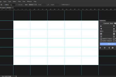
Grid Systems and Artboards: Crafting Structured Layouts
In web design, grid systems are indispensable for creating structured and harmonious layouts. They provide a foundational framework that ensures elements align consistently across different screen breakpoints. Custom grids offer precise control over the layout structure. Photoshop's 'New Guide Layout' feature allows designers to establish a custom grid by defining the number of columns, rows, and gutters, along with their respective sizes. This is crucial for maintaining visual hierarchy and balance.
Responsive design, a critical aspect of modern web development, requires a grid system that adapts fluidly to various screen sizes. To facilitate this, Photoshop designers can utilize artboards. Artboards function like separate canvases within a single Photoshop document, allowing you to simulate different device widths and effectively test how your grid layouts perform and adapt across various screen dimensions. This feature is invaluable for visualizing and refining responsive designs before development.
Precision Selection Tools for Web Elements
Web designers require a high degree of precision when selecting elements for their designs. Photoshop offers a suite of robust selection tools that are critical for this purpose. The Magic Wand tool, for instance, selects pixels based on their tone and color similarity. The Lasso tools (Lasso, Polygonal Lasso, Magnetic Lasso) allow for freehand, straight-line, or edge-detecting selections, respectively. The Quick Selection tool is particularly adept at quickly selecting areas with similar textures and colors.
Beyond initial selection, Photoshop's 'Refine Edge' command is a vital feature for web designers, enabling them to fine-tune the edges of selections for a professional finish. This tool provides options to smooth, feather, and contrast edges, as well as to shift the edge boundary inward or outward. For exceptionally intricate selections, particularly when dealing with complex backgrounds or fine details like hair, the Channels panel in Photoshop can be an invaluable resource for creating precise masks.
Mastering Color Management and Consistency
Effective color management is crucial for web designers aiming to create cohesive and visually appealing websites. Importing color swatches is a vital step toward ensuring color consistency across all elements of a design. By utilizing predefined color swatches, designers can apply exact color values consistently, maintaining a unified look and feel. The Swatches panel and the Adobe Color Picker are key areas for managing these colors.
The Eyedropper tool is an indispensable asset for matching colors with pixel-perfect accuracy. Simply click on any color within your design or even on your screen, and the Eyedropper tool will sample it, allowing you to replicate it precisely. Furthermore, Photoshop offers convenient ways to copy color values. You can select a color, then navigate to the Edit menu and choose 'Copy Color As HTML' or 'Copy Color's Hex Code.' Alternatively, within the Swatches panel or Adobe Color Picker, you can often right-click on a color swatch or its hexadecimal value and select the option to copy it. This ensures that the exact color intended can be easily communicated and implemented in development.
Unleashing Creativity with the Brush and Text Tools
Photoshop's brush tool is fundamental for creating custom graphics, textures, and unique visual effects. Mastery over brush settings, including size, hardness, spacing, and shape dynamics, is essential for achieving the desired aesthetic on web elements. Custom brushes allow designers to develop unique textures and effects that can be consistently applied across various web graphics, adding a distinctive touch to their work. The ability to draw straight lines and patterns with precision is also essential for creating geometrically accurate elements in web graphics.
Effective text handling is critical for website readability and overall user experience. While Photoshop is primarily an image editor, it offers robust text tools. Text wrapping in Photoshop allows designers to flow text around shapes or confine it within specific design elements, a capability crucial for crafting layouts that adapt to responsive designs. Choosing the right fonts is paramount for web design, impacting brand identity and user engagement. Photoshop provides a vast array of font options, and with the integration of Adobe Fonts, designers have access to over 30,000 fonts to create stylish designs that seamlessly combine images and text, from bold headlines and captions to eye-catching graphics for social posts and posters.
How to use Text tool in Photoshop CC Tutorial
Blending Modes and Layer Styles: Adding Depth and Flair
Blending modes are a powerful feature that dictates how two or more layers interact with each other, influencing how their colors and luminosity combine. Effects, on the other hand, are distinct attributes that can be applied to a single layer, such as shadows, inner shadows, gradients, glows, and bevels. These tools are essential for adding depth, dimension, and visual interest to web design elements.
For instance, when creating a rollover effect for buttons, you can manipulate a layer's style, visibility, or position. This might involve making color or tonal adjustments, or applying filter effects. Layer styles are particularly versatile; you can apply effects like color overlays, drop shadows, glows, or emboss to a primary layer to create visually engaging interactive elements. To construct a rollover pair, you can toggle layer styles on or off and save the image in each distinct state. The Styles panel offers preset button styles that can be quickly applied to automatically transform basic shapes into buttons with normal, mouseover, and mousedown states, significantly accelerating the design process for interactive elements.
Streamlining Workflow: Shortcuts, Zooming, and Panning
Efficiency in Photoshop is significantly enhanced by mastering keyboard shortcuts, zooming, and panning techniques. Learning shortcuts for common actions like moving, resizing, and transforming layers can drastically reduce the time spent on repetitive tasks. The Free Transform tool, for example, is frequently used for resizing and manipulating layers.
The ability to navigate around your design effectively is also crucial for inspecting details. The zoom tool allows you to magnify specific areas of your artwork, while panning enables you to move around the canvas. Mastering these two fundamental features of using Photoshop daily-zooming and panning-ensures that you can examine your work at various levels of detail without losing your bearings.
Text as a Design Element: Working with Typography in Photoshop
Text, while sometimes considered a tricky element in Photoshop due to its primary focus on raster graphics, can be handled effectively with the right techniques. The software provides easy ways to work with text, allowing designers to incorporate typography seamlessly into their web designs. This includes precise control over font choice, size, leading, kerning, and alignment. For designers who also code, understanding how to translate Photoshop text layers into HTML and CSS is a valuable skill. While some argue that dedicated design tools like Adobe Illustrator or InDesign might be more efficient for entire layouts, Photoshop remains a popular choice for mockups and visual element design due to its familiarity and powerful image manipulation capabilities.
Automating and Optimizing for the Web
Automation tools within Photoshop streamline the process of exporting images for the web, ensuring that all files adhere to specific format, quality, and size requirements. Image optimization is a key step in preparing visuals for online use, as it strikes a crucial balance between maintaining visual quality and ensuring fast load times, thereby enhancing user experience.
Photoshop's 'Export for Web (Legacy)' option, or the more modern Export As feature, allows designers to specify file formats (JPEG, PNG, GIF), compression levels, and dimensions. Utilizing Smart Objects is essential for preserving image resolution, ensuring that images retain their full quality and clarity even after resizing. Adjustment layers enable non-destructive editing, allowing designers to tweak brightness, contrast, saturation, and other visual properties without altering the original image data. This flexibility is invaluable during the iterative process of web design.
Photoshop for Web Design: A Matter of Preference and Workflow
The question of whether Photoshop is necessary for web designers often sparks debate. While it's not an absolute requirement, its widespread adoption stems from several factors. For many designers, mockups are an important part of the creative process, allowing them to experiment within a familiar environment. It is often easier and faster to write code once the end goal is clearly defined visually. Furthermore, the comfort level designers have with Photoshop, often built over years of use, makes it a natural choice for creating website elements and mockups.
Some designers opt to purchase templates online or utilize PSD templates that come with certain WordPress themes, modifying them to fit their needs. Photoshop's ability to easily modify hue/saturation and test color schemes is a significant advantage in these scenarios. Ultimately, the choice of tool often comes down to personal preference and workflow. However, when handing off designs to developers, it is crucial for designers to provide organized files. This means isolating necessary layers, flattening blending effects (or rasterizing them), and grouping layers logically. Providing a flattened JPG as a reference alongside well-organized Photoshop files ensures a smoother handover to the development team.
While some developers might express a preference for designs built in tools like Illustrator or InDesign, especially for vector assets or entire layouts that can translate more directly to responsive code, Photoshop's versatility in image editing and compositing makes it a powerful tool for many aspects of web design. The key is to treat Photoshop, like any other tool, as a means to an end-a "napkin sketch" that may evolve as it is translated into HTML, CSS, and JavaScript.
Learning Photoshop for Web Design
For beginners looking to enter the field of web design, acquiring proficiency in Photoshop is a realistic goal. It typically takes around two to three months of dedicated learning to gain the skills necessary to use Photoshop effectively for web design purposes. Various learning avenues exist, including in-person classes, live online learning, and specialized training. Reputable institutions offer comprehensive courses, such as Photoshop bootcamps or advanced retouching workshops, catering to all skill levels. For those who prefer remote learning, online courses provide a flexible and accessible option. Platforms often offer resources to simplify navigation through Photoshop, enhance the web design process, and aid in the creation of remarkable web content.
Conclusion
Photoshop remains a potent and versatile tool within the web designer's arsenal. From its foundational capabilities in image editing and optimization to its advanced features for layout creation, interactive element design, and precise typography, Photoshop empowers designers to bring their visions to life. While the digital landscape continues to evolve, and new tools emerge, Photoshop's enduring relevance in web design is a testament to its adaptability, comprehensive feature set, and the creative possibilities it unlocks for designers across all skill levels. By mastering its key tools and techniques, web designers can elevate their craft, ensuring the creation of visually stunning, user-friendly, and effective online experiences.