Halftone is a fascinating and historically significant technique that has found renewed popularity in modern graphic design. Originally developed as a method for printing images using limited ink palettes, halftone patterns simulate tone gradations and color variations through the strategic use of dots. These dots, varying in size, spacing, and sometimes shape, are the building blocks of this visually distinctive style. Understanding the principles of halftone is key to unlocking its creative potential in digital art.
At its core, the concept of halftone is simple: the density and size of dots dictate the perceived shade. Where dots are closer together and larger, the area appears darker. Conversely, where dots are smaller and more spread out, the area appears lighter, creating a gradient effect. This principle forms the foundation for both black and white and color halftone applications. While the traditional use of halftone was intrinsically tied to the limitations of printing presses, particularly those utilizing Cyan, Magenta, Yellow, and Black (CMYK) inks, its aesthetic appeal has transcended its printing origins. Today, halftone patterns are a staple in pop art, screen printing, and a wide range of graphic design work, offering a unique retro charm and tactile texture.
Understanding the Fundamentals of Halftone
Halftone patterns are a 20th-century printing technique where patterns of dots were used to create images. At a time when printing processes were limited, halftone was the method used to create the appearance of colors and shades. Early color presses used only cyan, magenta, yellow, and black (CMYK) inks. Printers developed the halftone as a way to print a wider spectrum of colors. Halftones were made up of fields of tiny dots in those four colors, positioned closely together. When grouped together, the dots appeared to mix and form other shades.
The term "halftone" itself refers to the ability to reproduce a continuous tone image (like a photograph) using discrete dots, thereby simulating the intermediate tones or "half tones" that would otherwise be lost. This was a revolutionary concept in printing, allowing for greater detail and a wider range of apparent colors than previously possible with simpler methods. The arrangement of these dots, often in specific screen angles, is crucial for achieving a visually pleasing result and avoiding unwanted patterns.
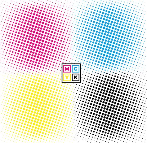
The Role of CMYK in Halftone
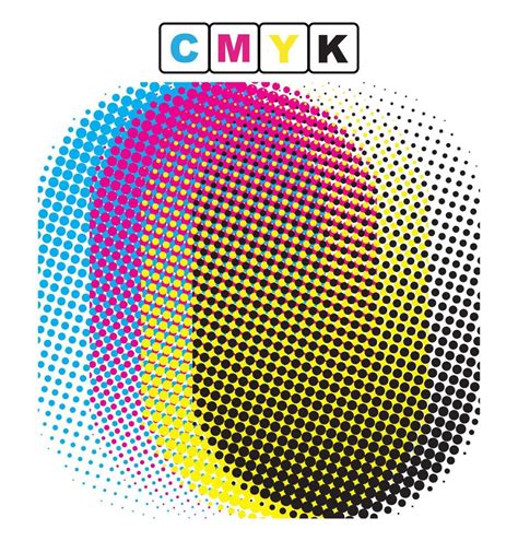
The foundation of color halftone lies in the CMYK color model. CMYK stands for Cyan, Magenta, Yellow, and Key (Black). These four inks are the standard for most professional printing processes. In traditional halftone printing, an image is separated into four distinct layers, one for each CMYK color. Each layer is then converted into a pattern of dots. The size and placement of these dots on each layer are carefully controlled to recreate the original image's colors and tones when viewed together.
For instance, a deep red area in an image might be represented by a dense pattern of magenta dots with a smaller number of yellow dots interspersed, and very few, if any, cyan or black dots. A darker shade would involve larger or more densely packed dots of the constituent colors. This layered approach allows for the creation of a vast spectrum of colors and shades from just these four basic inks.
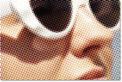
Moiré Patterns and Screen Angles
A critical aspect of color halftone printing is the use of specific screen angles for each CMYK color. When patterns of dots are laid on top of each other, especially if they are identical or nearly identical, they can create an undesirable interference pattern known as a moiré pattern. To avoid this, each of the CMYK color separations is printed at a different angle. The standard angles are typically 45 degrees for black, 75 degrees for red (which is often substituted for magenta in some contexts, or the magenta angle is offset), 15 degrees for yellow, and 0 or 90 degrees for cyan. These specific angles, when combined, create a visually pleasing rosette pattern that appears to blend smoothly, rather than a jarring moiré effect. The angles are essential for printing when halftoning is necessary.
Achieving Halftone Effects in Photoshop
Photoshop offers several powerful tools and filters to replicate the halftone effect digitally. These methods allow designers to incorporate this classic aesthetic into their work, whether for a retro feel or a unique textural element.
Using the Color Halftone Filter
One of the most direct ways to achieve a halftone effect in Photoshop is by using the "Color Halftone" filter. This filter is designed to simulate the traditional CMYK dot patterns.
- Prepare Your Image: Begin by dragging your desired image into Photoshop. It's often advisable to work on a duplicate layer or in a separate document to preserve your original image. For optimal results with the Color Halftone filter, it's highly recommended to convert your image to the CMYK color mode. To do this, go to
Image > Mode > CMYK Color. If you're concerned about making permanent changes, duplicate your image first (Image > Duplicate) and perform the conversion on the copy. - Apply the Filter: Navigate to
Filter > Pixelate > Color Halftone. - Adjust Settings: In the "Color Halftone" dialog box, you'll find key settings:
- Max. Radius: This setting dictates the maximum size of the halftone dots. A lower value will result in smaller dots and a more detailed, potentially "grungy" texture, while a higher value will produce larger dots and a bolder effect. The value you choose will depend on the size of your image and the desired level of detail. For example, if you're working with a large image, you might need to increase the radius to make the effect visible.
- Channels: These represent the Cyan, Magenta, Yellow, and Black channels. Each channel has a corresponding "Screen Angle" setting. You can adjust these angles to fine-tune the dot placement and the resulting rosette pattern. The default settings are often a good starting point, but experimenting with different angles can yield unique results. The angle creates moiré effects and rosette patterns that are useful for printing when halftoning is necessary.
By adjusting the "Max. Radius" and the "Screen Angle" for each channel, you can control the density, size, and overall appearance of the halftone pattern. The closer and bigger the dots on the halftone, the darker the image is. The smaller and more spread out the dots are, the lighter the image is. This method allows you to achieve both black and white and color halftone effects.
The Bitmap Option for Black and White Halftone
Another method for creating halftone effects, particularly for black and white images, is through the "Bitmap" mode. This technique can offer a more stylized, "cookie-cutter" approach to halftone.
- Convert to Grayscale: First, convert your image to grayscale:
Image > Mode > Grayscale. - Apply Bitmap Mode: Go to
Image > Mode > Bitmap. - Configure Halftone Screen: In the "Bitmap" dialog box, you'll be prompted to set the "Output" resolution. A common setting for web use is 72 Pixels/Inch, but for print, you'll want a higher resolution.
- Halftone Screen Settings: After setting the resolution, you'll see the "Halftone Screen" dialog box. Here, you can define:
- Frequency: This setting controls the density of the dots, similar to the "Max. Radius" in Color Halftone. It's usually measured in lines per inch (LPI). A lower frequency will result in fewer, larger dots, while a higher frequency will create more, smaller dots. For example, setting it to 3 Lines/Inch will create a very coarse pattern.
- Angle: This determines the angle of the halftone pattern. 45 degrees is a common default.
- Shape: This is where you can choose the shape of the dots. Common options include "Round," "Line," "Dot," and "Square." Selecting "Line" will produce a pattern of lines rather than dots, which, while not strictly a traditional halftone by definition (as it's not composed of dots), shares the same underlying principle of pattern-based image representation.
The Bitmap option allows you to create a black and white halftone effect and use different halftone shapes. This technique will maintain the edges of the image as a cookie-cutter to create the halftone pattern.
Halftone Dither Effect in PHOTOSHOP
Creating Custom Halftone Brushes in Photoshop
For greater control and the ability to integrate halftone effects seamlessly into your artwork, creating custom halftone brushes is an invaluable technique. This allows you to "paint" with halftone patterns, offering a more organic and artistic approach than applying a filter.
Defining a Halftone Brush Preset
- Select a Brush: Choose the "Brush Tool" (B) from the toolbar. Select a "Hard Round Brush." Set its "Size" to a large value (e.g., 500 px) and its "Hardness" to a moderate level (e.g., 25%). The exact settings can influence the initial feel of the brush.
- Apply Color Halftone (as a base): Go to
Filter > Pixelate > Color Halftone. Set the "Max. Radius" to a desired value (e.g., 20 Pixels) and all "Channels" to a specific angle (e.g., 45). This step essentially "bakes" a halftone pattern into the brush shape. - Define Brush Preset: Go to
Edit > Define Brush Preset. Give your brush a descriptive name, such as "Halftone Brush." - Refine Brush Settings: Open the "Brush Settings" panel by going to
Window > Brush Settings. Here, you can significantly alter the brush's behavior:- Spacing: Adjusting the "Spacing" is crucial. Setting it to 1% creates a smooth, continuous stroke, ideal for blending and gradients. Increasing it to 95% or higher will separate the individual halftone dots, allowing them to be applied more discretely.
- Other Dynamics: Explore other settings within the Brush Settings panel, such as "Shape Dynamics" (for jitter and angle control), "Scattering," and "Texture," to further customize the brush's appearance and application.
These custom halftone brushes can then be used to add great details to your artwork, offering a dynamic and responsive way to incorporate halftone textures. Halftone brushes (or any other pattern-based brush) are unlikely to always be the perfect size out of the box, but the Brush Settings panel provides the tools to adapt them.
Applying Halftone Brushes
Once you have defined your halftone brush, applying it is straightforward:
- Select the Brush Tool (B).
- Choose your custom halftone brush from the brush presets.
- Open the Brush Settings panel (
Window > Brush Settings) to fine-tune its parameters for your current task. For instance, changing the "Spacing" can drastically alter the effect. - Create a new layer in your document.
- Paint on your canvas. The pressure applied to your stylus can control the size of the dots if you have set up your brush with "Pen Pressure" enabled in the "Shape Dynamics" or "Transfer" sections of the Brush Settings. This allows for a more intuitive and nuanced application of the halftone effect, mimicking the control of traditional screen printing.
Creating Halftone Brushes in Illustrator
While Photoshop is excellent for raster-based halftone effects, Adobe Illustrator offers vector-based solutions, which can be advantageous for scalability and clean lines.
Building a Tileable Halftone Pattern
- Set up a New Document: Create a new document in Illustrator, preferably with print-oriented units like centimeters for precision. Set the orientation to horizontal.
- Create Ellipses: Use the "Ellipse Tool" (L) to create two circles. A larger one for the base and a smaller one to define the dot size. For example, a 1 cm width/height ellipse and a 0.3 cm width/height ellipse.
- Utilize Blend Tool: Select both circles. Use the "Blend Tool" (W). Click on one circle, then the other. In the "Blend Options," set the "Spacing" to "Specified Steps" and enter a number (e.g., 9). This creates a series of intermediate shapes between the two original ellipses.
- Expand the Blend: Go to
Object > Expand. Ensure both "Object" and "Fill" are selected. This converts the blend steps into individual objects. - Create a Repeating Tile: To make a brush that can tile seamlessly, you need to create a square that encompasses the pattern. Use the "Rectangle Tool" (M) to draw a square that covers the entire blended pattern, ensuring it is a perfect square.
- Define the Art Brush: Select all the elements (the blended pattern and the bounding square). Drag them into the "Brushes" panel (
Window > Brushes). In the "New Brush" window, select "Art Brush." - Configure Art Brush Options: Name your brush (e.g., "Halftone"). Set the "Width" to "Fixed" and "Brush Scale Options" to "Stretch to Fit Stroke Length." This ensures the pattern scales proportionally along any path.
- Apply the Brush: Use the "Pen Tool" (P) to create a path. Select your newly created halftone brush from the Brushes panel and apply it to the path. You can then adjust the "Stroke" weight in the "Strokes" panel (
Window > Strokes) to control the overall size and density of the halftone pattern applied to the path. You can also double-click the brush in the Brushes panel to further refine its settings.
This vector-based approach allows for infinitely scalable halftone patterns that can be applied to any vector path, offering a flexible and high-quality solution for graphic design.
Advanced Techniques and Considerations
Beyond the basic application of filters and brushes, several advanced techniques can enhance your halftone work and address common challenges.
Layer Masks for Targeted Effects
Layer masks are indispensable for applying halftone effects selectively. After applying a halftone filter or brush, you can use a layer mask to reveal or conceal the effect in specific areas of your image.
- Add a Layer Mask: In the "Layers" panel (
Window > Layers), select the layer with your halftone effect. Click the rectangle icon with a circle in the center to add a layer mask. - Paint on the Mask: Select the "Brush Tool" (B). Set your foreground color to black to mask areas (hide the effect) or white to reveal them. Use varying opacities and brush hardness to create smooth transitions and integrate the halftone effect naturally into your design.
Using Paper Textures for Authenticity
Paper textures are a fast and easy way to bring authenticity and warmth to digital art, especially when combined with halftone effects. Applying a subtle paper texture over your halftone design can mimic the look and feel of traditional print.
- Find a Paper Texture: Source a high-quality paper texture image.
- Place and Blend: Place the texture image on a new layer above your halftone artwork.
- Set Blending Mode: Experiment with different blending modes in the "Layers" panel. "Multiply" is often effective for paper textures, as it darkens the underlying layers while allowing the texture's details to show through. Adjust the layer's "Opacity" to control the intensity of the texture.
- Color Integration: For color halftones, consider how the paper texture might interact with the colors. Sometimes, creating separate layers for Red, Yellow, and Blue (or Cyan, Magenta, Yellow) channels and setting them to "Multiply" can help integrate the texture realistically.
Working with Solid Color Palettes
When planning a complex halftone design, especially one that mimics screen printing with distinct ink colors, using solid color palettes can be beneficial. This allows you to map out your color choices and experiment with different combinations before committing to the final halftone application.
- Define Your Palette: Decide on the specific colors you want to use for your halftone layers.
- Apply to Layers: Create separate layers for each color. Apply your chosen color as a solid fill or use your halftone brushes to "paint" the color onto each layer.
- Adjust Opacity: The opacity of each layer will determine how the colors blend and interact, allowing for fine-tuning of the overall color mix.
Combining Illustrator and Photoshop Workflows
For projects requiring both vector precision and raster effects, a combined workflow can be highly effective.
- Create Vector Elements in Illustrator: Design logos, text, or complex shapes in Illustrator, leveraging its vector capabilities.
- Transfer to Photoshop: Copy and paste these vector elements into Photoshop. Choose to paste them as "Smart Objects" to retain their vector scalability.
- Apply Halftone in Photoshop: Once in Photoshop, you can apply Photoshop's halftone filters or brushes to these Smart Objects. Because they are Smart Objects, you can re-edit the original vector artwork in Illustrator and have the changes update in Photoshop, or re-apply halftone filters as needed. This approach allows you to "Bring your precise Adobe Illustrator work into Photoshop and on a new layer add your halftones on top."
Common Pitfalls and Troubleshooting
While powerful, halftone techniques can sometimes lead to unexpected results. Understanding common issues can help you troubleshoot and achieve the desired outcome.
The "Bad" Color Halftone Filter Result
You might encounter situations where the "Color Halftone" filter in Photoshop doesn't produce the expected, high-quality halftone pattern, especially when working in RGB mode. This is because the filter is fundamentally designed to work with CMYK color separations.
- The Solution: As mentioned earlier, convert your image to CMYK color mode before applying the Color Halftone filter. This ensures that the filter is operating in an environment that aligns with its intended purpose, allowing the dots for each color channel to be placed and rendered correctly. After converting to CMYK, apply the filter, adjust the "Max. Radius," and observe the improved results. You can then convert back to RGB if needed for web use, but the initial creation in CMYK is key for authenticity.
Halftone Brushes Not Being the "Perfect Size"
Halftone brushes, like any pattern-based brush, might not always be the ideal size straight out of the box for every application.
- The Solution: The "Brush Settings" panel is your best friend here. You can adjust the "Spacing" to control dot separation, and within "Shape Dynamics" or "Transfer," you can often link "Size Jitter" or "Pen Pressure" to control the dot size dynamically. Furthermore, when applying the brush, you can adjust the brush size itself, or if you've created an Art Brush in Illustrator, control its size via the Stroke panel.
Understanding Halftone for Different Audiences
Explaining halftone can range from simple analogies to detailed technical explanations.
- For a 5th Grader: Imagine you're coloring a picture with only tiny stamps. If you use a lot of big stamps close together, the area looks dark. If you use only a few small stamps far apart, the area looks light. Halftone printing uses tiny colored dots like stamps to make pictures look like they have many colors and shades.
- For a Professional Designer: Halftone is a reprographic technique that simulates continuous-tone imagery through the use of dots of varying size, shape, or color. In traditional printing, this involves separating an image into CMYK channels, each rendered with a screen of dots at specific angles to prevent moiré interference. Digitally, this can be achieved via filters like Photoshop's Color Halftone (best used in CMYK mode) or by creating custom brushes and vector patterns in Photoshop and Illustrator, respectively, allowing for precise control over dot density, size, and placement for stylistic or print-emulation purposes.
By understanding these nuances and employing the right tools and techniques, you can effectively harness the power of halftone to add a distinctive and compelling aesthetic to your digital artwork. Whether you're aiming for a classic comic book look, a retro screen-print vibe, or a modern graphic design element, mastering halftone in Photoshop and Illustrator opens up a world of creative possibilities.